Interior Design

Paul Rudolph goes to the Dentist (but actually, it's the other-way around!)

Paul Rudolph’s organically curved floor plan for the dental office of Dr. Nathan Shore, in NYC—a work from the mid-1960’s. While Rudolph was known as a master of geometry and form (and their application to architecture, interiors, and furniture), this sinuous approach to planning was one to which he turned only occasionally. This “poche” version of the plan was used as a decorative graphic on the dental office receptionist station’s glass enclosure.

Paul Rudolph’s organically curved floor plan for the dental office of Dr. Nathan Shore, in NYC—a work from the mid-1960’s. While Rudolph was known as a master of geometry and form (and their application to architecture, interiors, and furniture), this sinuous approach to planning was one to which he turned only occasionally. This “poche” version of the plan was used as a decorative graphic on the dental office receptionist station’s glass enclosure.

CREATION WITHIN A VARIETY OF SCALES AND TYPES: TRUE MASTERS WILL TAKE-ON ALL CHALLENGES

One of the signs of a master architect-designer is their ability to create interesting work at all scales. English architect Charles Ashbee, the Arts & Crafts era designer, is a strong example: designing everything from a typeface -to-furniture -to- houses -to- the renovation of a war-damaged city. His American contemporary, Bertram Goodhue, worked in a similarly broad range of scales: from his design of a typeface that is still in wide use (“Cheltenham”) -to- his Nebraska State Capitol, a building big enough to be seen from a distance of 20 miles.

Paul Rudolph indicated that he would be willing to take on even humble projects, and said:

“‘It makes no difference to me the size of the project. I’ve always said, ‘I would be happy to make a dog house for you, if you would let me make it a unique and very good dog house.’”

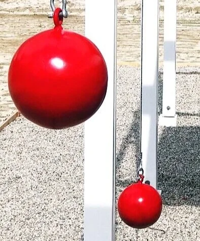
And, in fact, some famous architects have applied their architectural skills to dog house design: Frank Lloyd Wright (who called such a commission “an opportunity” in design), and Philip Johnson.

Young Jim Berger lived in a house designed by Frank Lloyd Wright for the Berger family in San Anselmo—and, at age 12, he asked Wright to design a doghouse for his pet labrador retriever. Wright sent a construction drawing and “Eddie’s House” was built. Here, in 2017, Mr. Berger is seen with a reconstruction of it, which was on display at the Wright-designed Marin County Civic Center.

Young Jim Berger lived in a house designed by Frank Lloyd Wright for the Berger family in San Anselmo—and, at age 12, he asked Wright to design a doghouse for his pet labrador retriever. Wright sent a construction drawing and “Eddie’s House” was built. Here, in 2017, Mr. Berger is seen with a reconstruction of it, which was on display at the Wright-designed Marin County Civic Center.

Philp Johnson’s 1997 design: a “dog house” on the Glass House estate. According to the National Trust for Historic Preservation’s website: “This small structure was created by Johnson as a conceptual project for a classically-inspired tomb. However, when completed the small wooden object turned out to be just the right size for his and [David] Whitney’s new puppies to inhabit. . . .”

Philp Johnson’s 1997 design: a “dog house” on the Glass House estate. According to the National Trust for Historic Preservation’s website: “This small structure was created by Johnson as a conceptual project for a classically-inspired tomb. However, when completed the small wooden object turned out to be just the right size for his and [David] Whitney’s new puppies to inhabit. . . .”

To our knowledge, Paul Rudolph never designed a dog house, but—across his half-century career, in which he engaged in hundreds of commissions—he was not above taking-on projects of a less-than-glamourous nature, or for clients with limited budgets.

One of the happy surprises we’ve encountered in the archives of the Paul Rudolph Heritage Foundation is an article from the Journal of the American Dental Association—and it’s about just such a project: Rudolph’s 1967 design for a dental office for Dr. Nathan Shore.

THE DENTIST GOES TO RUDOLPH

Rudolph’s client, Dr. Nathan Shore, was a dental pioneer in working on TMJ —and wrote this key book on the topic.

Rudolph’s client, Dr. Nathan Shore, was a dental pioneer in working on TMJ —and wrote this key book on the topic.

Dr. Nathan A. Shore (1914-1984), was a dental specialist and pioneer in correcting a jaw condition called temporomandibular joint syndrome—known more widely as TMJ—-a subject upon which he wrote numerous articles and a book (and for which he devised a test to determine whether the pain was medical or dental in origin.)

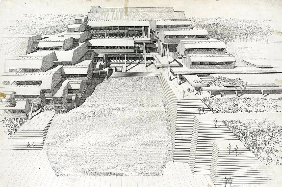
In he 1960’s, Dr. Shore asked Paul Rudolph to design his dental offices: they were to be located within a nearly windowless 1,830 square foot space on Central Park South, in the midtown section of Manhattan. Rudolph divided this area into 19 spaces: 

  • four dental operatories

  • two hygienist operatories

  • two con­sultation rooms

  • an audiovisual room (for patient education)

  • a business office

  • a reception room

  • a kitchen for staff use

  • an X-ray room

  • two laboratories

  • two washrooms

  • all the above spaces connected by a continuous corridor

  • all remaining spaces, between the walls of the rooms, were utilized for storage.

Placing all these rooms and functions into the available square footage was an tour-de-force of space-planning efficiency. Although suite corridors were narrow, circular mirrors mounted on walls, and varied ceiling heights created an illusion of space.

Paul Rudolph’s floor plan for the Nathan Shore dental offices—probably the “presentation drawing” which was shown to the client (and/or other parties, such as the building management) to explain the design and obtain their approval. Each space in this quarter-inch scale plan is labeled; overall dimensions of the space are shown; and the entry is indicated by an arrow shown toward the bottom-center of the drawing.

Paul Rudolph’s floor plan for the Nathan Shore dental offices—probably the “presentation drawing” which was shown to the client (and/or other parties, such as the building management) to explain the design and obtain their approval. Each space in this quarter-inch scale plan is labeled; overall dimensions of the space are shown; and the entry is indicated by an arrow shown toward the bottom-center of the drawing.

A screen capture from the Museum of Modern Art’s website, showing a 1961 Jason Seley sculpture which is part of their collection: “Masculine Presence”. Like the sculpture that was in the Shore Dental office, this example is made from auto parts—Seley’s most frequent medium.

A screen capture from the Museum of Modern Art’s website, showing a 1961 Jason Seley sculpture which is part of their collection: “Masculine Presence”. Like the sculpture that was in the Shore Dental office, this example is made from auto parts—Seley’s most frequent medium.

Furniture, in reception and some internal offices, included chairs by Charles and Ray Eames (from Herman Miller); and by Warren Platner (from Knoll International).

Desk lighting was provided by numerous “Lytegem” lamps (by Lightolier)—then and now, one of the most platonically pure lamp designs, made from a sphere and a cube—a composition strongly appealing to architects committed to the Modern aesthetic [This 1965 design, by Michael Lax, is in the collection of MoMA.]

The reception area contains a sculpture made of automobile hubcaps. It is by Jason Seley, a artist known for creating artworks from chromium steel automobile body parts.

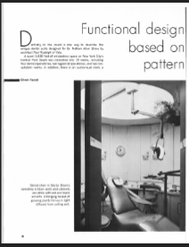
The constructed design received coverage—perhaps the only article about it—in a 1971 issue of The Journal of the American Dental Association. The article, "Functional Design based on Pattern of Work in a Dental Suite", spoke of Rudolph’s design approach to meet the challenges involved in such a project, and included a description of the results, photos, and a floor plan. The article’s author, Eileen Farrell, had been an editorial supervisor at the American Dental Association, and some of her observations included:

"Dentistry in the round is one way to describe the unique dental suite designed for Dr. Nathan Allen Shore by architect Paul Rudolph of Yale. . . .The circular motif is repeated in various ways that add to the total effect. Lighting in the operatories, for instance, is diffused from a circular well in the ceiling across which the dental light slides on a track integrated with the ceiling diffusor. A curved Plexiglass screen divides the business office from the recep­tion room, making each space seem larger. A circular rendition of aspects of the temporomandibular joint decorates the door leading to the operatories.”

"Besides creating an illusion of space, the design aims at quiet and a sense of privacy. To this end, circulation of pa­tients and staff is kept to a minimum, and although there are eight staff members and a steady stream of patients, the suite never seems to be crowded. One reason is that the movement of traffic is in the round rather than back and forth. . . .When a patient arrives for his appointment, the secretary opens the door by remote control and admits him to the recep­tion area."

"Doctor Shore finds that his staff is happy in the well-designed quarters. . . .Functional design, he says, seems well suited to a most progressive profession."

smallest First page.PNG
dental+article+page+2.jpg
dental article page 3.jpg
dental article page 4.jpg
dental article page 5.jpg
screen of recepition area.JPG

Above are small screen-captures of the pages of the article about the Rudolph-designed Nathan Shore dental office. At the lower-right is a slightly enlarged portion of one page, showing the reception area—and, at its right side, one can see that the suite’s floor plan has been incorporated into the reception desk’s window, as an intriguing ornamental pattern. The full article can be accessed through the JADA website, here.

RUDOLPH AND CURVILNEAR DESIGN

The work of Paul Rudolph presents difficulties for historians—at least for the ones who are uncomfortable with the great range of forms in his designs, and the multiple approaches Rudolph used when answering hundreds of architectural challenges. Attempts to pigeonhole a great creative force like Rudolph are doomed to futility—but some observations on his formal vocabulary are worthwhile, like our analysis of his use of crystalline shapes at Burroughs Wellcome.

But what about Rudolph’s use of curved forms? Rudolph could hardly be said to be afraid of curves: they show-up early in his practice: most notably in the Healy “Cocoon” house of 1950. But projects where “free form” or “biomorphic” curvilinear elements and planning dominate are not all-that-frequent in his career. Some notable exceptions are his sculptural handling of concrete in his Temple Street Parking Garage and the forms and spaces of the Boston Government Service Center. But even in Rudolph’s Endo Laboratories—one of his finest projects from the beginning of the 1960’s, which is well-known for its curved elements—or his Daiei Headquarters Building in Japan, most of the curves are carefully controlled portions of circles or ellipses. Thus when we do encounter designs in which Rudolph uses free and energetic organic lines (as in Dr. Shore’s offices), there is good reason to give such projects extra focus—and even to celebrate this branch of Rudolph’s creativity.

In the spirit of our start of this article—pointing-out that design masters can productively focus on projects of all scales—we end with an example at the smaller end of the range of objects which Paul Rudolph designed: a desk for Endo Laboratories. Thoughtfully designed for efficient function, and carefully drawn, detailed and specified (as the drawing shows)—it also fully embraces “free form” curvilinear design.

An “executive desk”, designed by Paul Rudolph for the offices of Endo Laboratories, his 1960 project in Garden City.

An “executive desk”, designed by Paul Rudolph for the offices of Endo Laboratories, his 1960 project in Garden City.

IMAGE CREDITS

NOTES:

The Paul Rudolph Heritage Foundation gratefully thanks all the individuals and organizations whose images are used in this non-profit scholarly and educational project.

The credits are shown when known to us, and are to the best of our knowledge, but the origin and connected rights of many images (especially vintage photos and other vintage materials) are often difficult determine. In all cases the materials are used in-good faith, and in fair use, in our non-profit, scholarly, and educational efforts. If any use, credits, or rights need to be amended or changed, please let us know.

When/If Wikimedia Commons links are provided, they are linked to the information page for that particular image. Information about the rights for the use of each of those images, as well as technical information on the images, can be found on those individual pages.

CREDITS:

Floor plans of the Nathan A. Shore dental office (both “poche” and linework versions), and the drawing of the desk for Endo Laboratories: © The Estate of Paul Rudolph, The Paul Rudolph Heritage Foundation; Frank Lloyd Wright-designed doghouse: photo courtesy of Marin County Civic Center, as shown on the city’s website; Philip Johnson-designed doghouse: photo by and courtesy of Sean Sheer of Urban Dog; Jason Seley sculpture, within the collection of the Museum of Modern Art in New York City: screen capture from a portion of the MoMA web page devoted to that sculpture; JADA article on the Nathan A. Shore dental office: screen captures from the 1971 issue, Volume 83, Issue 1; Cover of Dr. Shore’s book: from the Amazon page devoted to that book.

LONG ISLAND MODERNISM: a Book for Architecture Lovers (especially if you admire Paul Rudolph)

Paul Rudolph and Philip Johnson were friends for decades, and both are well represented in Caroline Rob Zaleski’s book on Modern architecture on Long Island. The book’s cover shows Johnson’s Leonhardt House, a work from 1956 in Lloyd's Harbor, NY—a design which combined platonic forms, structural daring, detailing elegance, and efficient planning.

Paul Rudolph and Philip Johnson were friends for decades, and both are well represented in Caroline Rob Zaleski’s book on Modern architecture on Long Island. The book’s cover shows Johnson’s Leonhardt House, a work from 1956 in Lloyd's Harbor, NY—a design which combined platonic forms, structural daring, detailing elegance, and efficient planning.

“With eye-opening photographs and surprising discoveries from a forgotten past … Long Island Modernism: 1930-1980 surveys a wealth of pioneering architecture produced locally by famous builders from around the world.”
— The Wall Street Journal

A LINE-UP OF ARCHITECTURAL STARS—AND THEY ALL DESIGNED FOR LONG ISLAND

Wright-Mies-Gropius-Rudolph-Johnson-Breuer-Meier-Harrison-Sert-Johansen-Pei-Raymond-Goodman-Nelson-Stone-Neutra-Lescaze— When it comes to famous architects working in America, did we leave anybody out? .

Within a 50 year period, all of the above-mentioned architects—a constellation of some of Modernism’s most celebrated designers—designed buildings and interiors for sites on Long Island, that island landmass which extends eastward from New York City and into the Atlantic.

To have all the above listed designers working within in the same area is an indication that, with respect to Modern architecture, it must be one of the culturally richest regions in the country. Clearly, this concentration of stellar talent and superb design had a history that needed to be revealed—and architectural historian Caroline Rob Zaleski delves into it, in her fascinating and visually rich book, LONG ISLAND MODERNISM 1930-1980

A rendering of Endo Laboratories, which was built in Garden City, Long Island— a Paul Rudolph design from the first half of the 1960’s. In 1964 it was the recipient of an award from the Concrete Industry Board of New York as “Concrete Building of the Year” for “representing the best in conception, originality, and applicability of concrete in both design and construction.” Caroline Rob Zaleski’s book, “Long Island Modernism,” delves into this fascinating and complex project.

A rendering of Endo Laboratories, which was built in Garden City, Long Island— a Paul Rudolph design from the first half of the 1960’s. In 1964 it was the recipient of an award from the Concrete Industry Board of New York as “Concrete Building of the Year” for “representing the best in conception, originality, and applicability of concrete in both design and construction.” Caroline Rob Zaleski’s book, “Long Island Modernism,” delves into this fascinating and complex project.

The Siegel Residence is one of several Paul Rudolph designs that are explored in “Long Island Modernism”

The Siegel Residence is one of several Paul Rudolph designs that are explored in “Long Island Modernism”

THE BOOK

LONG ISLAND MODERNISM 1930-1980 belongs in the library of anyone interested in the history of Modernism in the USA. It engages with the fascinating question: What motivated clients to commission Modern architects for their buildings—in a range of building types: commercial, residential, and institutional—and in an era when Modernism was still emerging as a style that was yet-to-be fully appreciated (and was not as comprehensively accepted as it is now.) As William L. Hamilton, in his positive review of the book in The Architect’s Newspaper put it:

Zaleski rises to the occasion, as architectural writers so often don’t, when pressed into play to give social context to builders and their buildings.”

The book includes an abundance archival photographs and drawings—often of surprising projects: real “discoveries” that are little-known even to design aficionados. Moreover the book itself, designed by Abigail Sturges, has an expansive character: its reproduced images and large format manifests some of the highest production values in architectural publishing.

Author, scholar, and preservation activist Caroline Rob Zaleski did extensive research to bring forth this book—one that is rich in history, and design excellence.

Author, scholar, and preservation activist Caroline Rob Zaleski did extensive research to bring forth this book—one that is rich in history, and design excellence.

THE AUTHOR

Caroline Rob Zaleski received her graduate degree in architectural preservation from Columbia University’s School of Architecture, Planning and Preservation, and soon after became a leading advocate for the preservation of modern architecture in New York City and on Long Island. Her book, LONG ISLAND MODERNISM 1930-1980, is based on her field survey for the Society for the Preservation Antiquities—recently re-named Preservation Long Island, where she is also a trustee. She has been chair of the Preservation League of New York State “7 to Save Endangered Sites Program” wherein she encouraged the inclusion of applications relating to twentieth-century Modernism and recent New York State history. Her proudest “Save” was working to place the Edward Durell Stone–designed A. Conger Goodyear House, in Old Westbury, Long Island, on the State and National Register and World Monuments Watch. She also led a successful campaign to raise awareness of and civic involvement in the preservation and repurposing of Eero Saarinen’s TWA Terminal at John F. Kennedy Airport.

ENDORSEMENTS & REVIEWS

LONG ISLAND MODERNISM has received significant, positive reviews—including:

“Not only highlights what the island offers in terms of modern architecture, it is an excellent primer on modernism itself.”
—  Regional Planning Association

“Stunningly illustrates how modernism is alive and well on Long Island.”
—  ON: A Global Lighting Publication

“Comprehensive, exhaustively researched, and carefully detailed . . . . This is a book that enriches our understanding of an important component of twentieth-century culture and belongs in the library of anyone interested in the history of Modern architecture in America.”
—  APT Bulletin: Journal of Preservation Technology

“A sweeping and authoritative new book, Long Island Modernism 1930-1980, by Caroline Rob Zaleski thoughtfully covers the astonishing architectural and landscape architectural achievements in the area.”
— Huffington Post

BOOK AVAILABILITY

Long Island Modernism is available through a variety of sellers—but a limited number of copies are still available at a significant discount through the Paul Rudolph Heritage Foundation’s Shop” page, HERE.

BOOK DATA

  • Title: Long Island Modernism 1930-1980

  • Author: Caroline Rob Zaleski

  • Publisher: W. W. Norton

  • Publisher’s web page for the book: here

  • ISBN: 978-0-393-73315-D

  • Cover Size: 12-1/4” tall × 9-1/4” wide

  • Format: Hardcover

  • Pages: 336

  • Illustrations:  200 black-and-white illustrations, 20 color illustrations


IMAGE CREDITS

NOTES:

The Paul Rudolph Heritage Foundation gratefully thanks all the individuals and organizations whose images are used in this non-profit scholarly and educational project.

The credits are shown when known to us, and are to the best of our knowledge, but the origin and connected rights of many images (especially vintage photos and other vintage materials) are often difficult determine. In all cases the materials are used in-good faith, and in fair use, in our non-profit, scholarly, and educational efforts. If any use, credits, or rights need to be amended or changed, please let us know.

When/If Wikimedia Commons links are provided, they are linked to the information page for that particular image. Information about the rights for the use of each of those images, as well as technical information on the images, can be found on those individual pages.

CREDITS, FROM TOP-TO-BOTTOM:

Book cover: provided by author; Perspective rendering of Paul Rudolph’s Endo Labs: rendering by Brian Conant, © The Estate of Paul Rudolph, The Paul Rudolph Heritage Foundation; Paul Rudolph’s Siegel Residence: photograph by Donald Luckenbill, © The Estate of Paul Rudolph, The Paul Rudolph Heritage Foundation; Author’s photo: provided by author

Halston's Legendary Space - and How it Looks Today (and Will Tomorrow)

The great fashion designer Halston, enthroned in his living room—within the famous “101”, the townhouse in New York’s Upper East Side neighborhood in Manhattan . Photo by Harry Benson, from a feature on Halston in Life Magazine.

UPDATE:

The below was written as Netflix was planning its 2021 series ‘Halston’ Since its gone live there has been a HUGE amount of interest about the designer and especially his legendary residence at 101 East 63rd Street in New York City.

We’ve noticed a lot of familiar photos of the interior circulating on social media and even some articles which have published incorrect information about the space.

We were hoping the series was going to rebuild the interior of the home on a soundstage, but appreciate the effort made by the production team to make a property in Brooklyn look as similar as possible (we do regret the handrails that Rudolph never used but understand why they are needed!).

A lot of articles mention Tom Ford’s 2019 purchase and his plans to restore the interiors. For those of you who want to know more, we are republishing the below:

A House with a History

Paul Rudolph designed the original residence at 101 East 63rd street for Mr. Alexander Hirsch in 1966. He created a Modernist oasis for his client, an intensely private person who wanted a place to escape to while still being in the heart of Manhattan. As Rudolph later described the project in Sibyl Moholy-Nagy’s 1970 book, The Architecture of Paul Rudolph:

A world of its own, inward looking and secretive, is created in a relatively small volume of space in the middle of New York City. Varying intensities of light are juxtaposed and related to structures within structures. Simple materials (plaster, paint) are used, but the feeling is of great luxuriousness because of the space. The one exposed facade reveals the interior arrangement of volumes by offsetting each floor and room in plan and section.

The house later went from being a private refuge to a celebrity hot spot known for its notorious parties when it was sold to the fashion designer Halston in the 1970’s. Halston himself spoke about the space in a recent documentary about his life that was featured on CNN:

I’m Halston and this is my home. The architect was Paul Rudolph and the day I saw it, I bought it. Its the only real modern house built in the city of New York since the second world war. Its like living in a three dimensional sculpture.

A video portion of Halston walking through 101 East 63rd from the CNN documentary. Halston’s description of the house begins at 0:46:50.

His lawyer upon visiting the house quipped, “I’m going to enjoy making money for you Halston because you know how to spend it.”

For more information about the house, you can find drawings and photos of it on our project page here.

Perspective Section Rendering. © The Estate of Paul Rudolph, Paul Rudolph Heritage Foundation

A Buyer as Famous as the House

As we reported in a previous blog post back in March, the house was finally sold to fashion designer Tom Ford after being on the market for a number of years. The sale, first reported in an article in Women’s Wear Daily after being the subject of rumors for a few weeks, was reported across social media and the design community. Articles appeared in Garage, Vogue, GQ, Mansion Global, the Daily Mail and New York Times.

Halston had hired Rudolph to renovate the space when he bought it. Wall to wall grey carpet, mirrored and Plexiglas furniture and chain-mail curtains were installed as a result. Members of the design community were pleased to learn that Tom Ford intended to restore the interior to the glamour that many remembered.

A Restoration, or Renovation?

Shortly before the sale was announced, The Paul Rudolph Heritage Foundation was approached by Mr. Ford’s architect, Atmosphere Design Group, to obtain copies of Rudolph’s original drawings. We were told ‘the client’ wanted to restore the interiors.

Paul Rudolph’s Mezzanine Floor Plan. © The Estate of Paul Rudolph, Paul Rudolph Heritage Foundation

Paul Rudolph’s Third Floor Plan. © The Estate of Paul Rudolph, Paul Rudolph Heritage Foundation

We asked the architect to consider consulting with the Paul Rudolph Heritage Foundation during the design process to ensure the design was faithful to Mr. Rudolph’s original vision. They said they would consider it and were never heard from again. Given the architect is generally known for Mr. Ford’s retail store design, we were concerned when we learned a demolition permit was issued in August, 2019.

Our request was not without precedent - the Paul Rudolph Heritage Foundation has given advice, free of charge, to owners of Rudolph-designed properties in the past. We were part of the design review of proposed replacement windows at the Mary Jewett Arts Center. We also helped a home owner in New Jersey find an architect to design an addition. In the end, he was able to hire Rudolph’s original project manager to construct the addition in way that fit into the original design.

A Cautious Optimism

We continued to hold out hope that - despite not hearing from the architect - the project was ‘in good hands.’ From online comments and at our public events, people were relieved to hear Mr. Ford had purchased the property as he was known for taking care of homes designed by significant architects, such as Richard Neutra.

Following the CNN documentary, Netflix announced that it too was going to do a story about Halston and were scouting locations to use for filming. Netflix location scouts visited us in the Rudolph-designed apartment at Modulightor and we spoke to them about Mr. Ford’s proposed changes and they said they would call us after seeing the original home for themselves. That was followed by the New York Times publishing the Halston interior as #19 on its ‘25 Rooms that Influence the Way We Design

As the iconic interior continued to be in the news, we waited to see what was being done to the space.

Then we got a call - “The space is gutted, Its unrecognizable.

What Will Change and What Will Stay the Same

The foundation immediately made phone calls and was able to obtain a set of the permit drawings. The following is what we learned about the work:

First Floor - Existing Plan. © The Estate of Paul Rudolph, Paul Rudolph Heritage Foundation

First Floor - Demolition Plan. Drawing by Atmosphere Design Group, from the NYC DOB.

First Floor - Construction Plan. Drawing by Atmosphere Design Group, from the NYC DOB.

Second Floor - Existing Plan. © The Estate of Paul Rudolph, Paul Rudolph Heritage Foundation

Second Floor - Demolition Plan. Drawing by Atmosphere Design Group, from the NYC DOB.

Second Floor - Construction Plan. Drawing by Atmosphere Design Group, from the NYC DOB.

What’s different:

  • All of the bathrooms are being gutted and some are combined to become larger. Looking at the elevations, we are pleased to learn it will include floor to ceiling mirrors with chrome vanities and toilets in some of them.

Mirrors, mirrors everywhere… reminds us of the note ‘melamine everything’ that was found during a renovation of Rudolph’s own 23 Beekman Place. We especially love the polished chrome toilet and vanity with undercounter lighting. Drawing by Atmosphere Design Group, from the NYC DOB.

  • The Kitchen will be enlarged (presumably for a menu greater than just ‘baked potatoes’)

Mirrors used for the kitchen back-splash are reminiscent of the kitchen designed by Paul Rudolph at the Modulightor’s duplex apartment. Drawing by Atmosphere Design Group, from the NYC DOB.

  • The Master Bedroom’s walk in closet is being removed and turned into a separate bedroom

What’s the same:

  • The main space for the most part is left alone. While this is a relief, it will disappoint anyone who was hoping the hardwood flooring, installed by a previous owner, would be replaced by Halston’s signature grey wall-to-wall plush carpeting.

The iconic living room will be left mostly as is. The furniture layout suggests it may be recreated to match Halston’s Rudolph-designed originals. Drawing by Atmosphere Design Group, from the NYC DOB.

The living room floor and stair treads are now wood. According to the plans, they will remain wood. Photo by Carl Bellavia, Archives of the Paul Rudolph Heritage Foundation.

The original funriture layout designed by Paul Rudolph for Halston. Photo by Harry Benson, from a feature on Halston in Life Magazine.

What could be a concern:

  • Despite being in a landmark district - and signed off by the Landmark’s Commission as having no affect on the building exterior - the drawings show the original garage door will be removed and replaced.

Note the garage door is dotted on the demolition plan, with a note calling for it to be replaced. Drawing by Atmosphere Design Group, from the NYC DOB.

  • The drawings call for renovations of the landscaping and roof to be filed separately

The Fourth Floor construction plan, showing no work to be done on the roof, but calling for new roof tree planters. Drawing by Atmosphere Design Group, from the NYC DOB.

The Paul Rudolph Heritage Foundation will continue to watch for future applications to see what is planned for these areas that fall under landmarks review and protection.

Music, Architecture — and Paul Rudolph

Paul Rudolph is primarily known as a architect—but he was also had a long-term commitment to music, and included a piano in all his own residences (at least since his 1961 High Street residence in New Haven.) Above is his piano: a Steinway “D”. It had been in Rudolph’s New Haven home, in the various versions of his NYC apartment on Beekman Place, and finally in his Quadruplex penthouse. It is now in the Rudolph-designed Modulightor Building, in the residence on the building’s upper floors (in the Living Room, as shown above.) A significantly large instrument (for a residence), it has been used by professional musicians for recitals that have taken place at the Modulightor Building.

Paul Rudolph is primarily known as a architect—but he was also had a long-term commitment to music, and included a piano in all his own residences (at least since his 1961 High Street residence in New Haven.) Above is his piano: a Steinway “D”. It had been in Rudolph’s New Haven home, in the various versions of his NYC apartment on Beekman Place, and finally in his Quadruplex penthouse. It is now in the Rudolph-designed Modulightor Building, in the residence on the building’s upper floors (in the Living Room, as shown above.) A significantly large instrument (for a residence), it has been used by professional musicians for recitals that have taken place at the Modulightor Building.

“Music is liquid architecture”

“Architecture is frozen music”

—attributed to Goethe

A 1692 engraving of the legend of “Pythagoras at the Smithy”: It shows the moment when the ancient philosopher, passing a blacksmith shop, noticed there was a relationship between the size of each the smiths’ hammers and and the tones they produced—thus inspiring  his ideas about the relationship between mathematics and music. The relationship between what we perceive (and find pleasing) and proportion has been extended to the visual arts—including in the work of architects.

A 1692 engraving of the legend of “Pythagoras at the Smithy”: It shows the moment when the ancient philosopher, passing a blacksmith shop, noticed there was a relationship between the size of each the smiths’ hammers and and the tones they produced—thus inspiring his ideas about the relationship between mathematics and music. The relationship between what we perceive (and find pleasing) and proportion has been extended to the visual arts—including in the work of architects.

Music and Architecturethey’ve been dancing together for a long time, and examples of their multiple connections abound:

  • As far back as the ancient Greeks, a connection was made between musical and the visual proportions. As architectural historian Rudolf Wittkower pointed out: Leon Battista Alberti invoked Pythagoras, contending that “Nature is sure to act consistently and with a constant analogy in all her operations. . . .and that “the numbers by means of which the agreement of sounds affects our ears with delight, are the very same which please our eyes and our minds”—a notion which he saw had implications for architectural design.

  • Musical terms overlap with architectural terms. If one were to ask an architect or architectural critic or historian to analyze a building’s composition, they’d probably speak in terms of: rhythm, harmony, proportion, modulation, unity, theme, recapitulation, and articulation—and indeed the term “composition” is fundamental to both disciplines. Rudolf Schwarz’s landmark book on religious architecture, The Church Incarnate, is filled with illustrations showing sequence of design themes used to create powerful sacred spaces—but they could just-as-easily be diagrams for architectural compositions.

  • Aside from seeking to design a concert hall, well-known architects have declared their affinity for music with regard to specific composers or types of music—For example: Wright declared for Beethoven; and Goff stated that he was continually inspired by Debussy. Kahn and Rudolph favored Bach. In addition, Kahn liked to play the piano—and, when young, earned money at the keyboard (and both of those facts were also true for Paul Rudolph.) Thomas Gordon Smith has a love of Bach, but prefers Purcell and Scarlatti. When archiect-composer Iannis Xenakis was programming the Philips Pavilion at the 1958 Brussels World’s Fair (based on a sketch by Le Corbusier) he included the music of Varèse (as well as a composition of his own.) Peter Eisenman is an opera fan—and his favorite is Wagner. And let’s not forget that a leading architect of the Renaissance, Carlo Rainaldi, was also an accomplished composer.

  • Wright was also fond of quoting Victor Hugo’s Notre-Dame de Paris (a.k.a. The Hunchback of Notre-Dame), whose most transcendent passage describes the rich architecture of medieval Paris—and culminates with a thrilling musical climax.

  • Architect Edgar Tafel (1912-2011)—a former apprentice of Wright—used to be able to look at a building and intone the pattern of its design, as though he were analyzing a musical composition.

  • Michael Trencher—scholar, architect, and educator—taught a design course at Pratt Institute’s School of Architecture, focused on exploring the resonance between music and architectural design.

  • And, when architects are interviewed by journalists, a frequent question asked is: What music are you playing when you’re at work?

em%2Bbuiding%2Bsketch%2B1.jpg
Two of Erich Mendelsohn’s musically-inspired sketches.

Two of Erich Mendelsohn’s musically-inspired sketches.

MUSIC AS DESIGN

Some artists and architects have gone further, creating designs that were explicitly linked to particular musical concepts, works, or composers.

Erich Mendelsohn (1887–1953) is most notable in this regard. Mendelsohn, Though he had a long and prolific career which spanned four decades and three continents, he’s most well-known today for his Einstein Tower. It is most often labeled as an example of “Expressionist” architecture, but one can readily see its formal linkage with another aspect of Mendelsohn’s creative output: his musically-inspired drawings. He created a series of sketches of musically-themed fantasy buildings—and these continue to fascinate. Here are two of those drawings—and the lower one is titled “Bach, Toccata in C Major”. [Note: Although Mendelsohn was avowedly inspired by music, he did have a practical viewpoint on how far the relationship could be pushed—e.g.: When a couple came to him and asked that he design a house for them “according to Beethoven”, Mendelsohn explained to them that architecture was “not that romantic.”]

Paul Rudolph’s parents, Eurie Stone Rudolph and Keener Rudolph, on a visit to the Wallace Residence in Athens, Alabama, which Paul Rudolph had designed in 1961. Placed within a rigorous grid of emphatically oversized columns, the swerving staircase might be considered a “scherzo” within the overall composition.

Paul Rudolph’s parents, Eurie Stone Rudolph and Keener Rudolph, on a visit to the Wallace Residence in Athens, Alabama, which Paul Rudolph had designed in 1961. Placed within a rigorous grid of emphatically oversized columns, the swerving staircase might be considered a “scherzo” within the overall composition.

PAUL RUDOLPH’S EARLY ENGAGEMENT WITH MUSIC

Paul Rudolph was serious about music, and his engagement with it goes all-the-way-back to his childhood. Below, from the archives of the Paul Rudolph Heritage Foundation, is a memoir written by Rudolph’s mother, Eurie Stone Rudolph (1890-1981). In it, Mrs. Rudolph described her son’s growing-up, initial (and increasing) fascination with architecture, his education, and her later visits with him (when he was an adult) in New York, Boston, and New Haven—along with observations on her son’s practice and success. In the course of the typescript she mentions visiting the 1964-65 New York World’s Fair, so we estimate that her memoir would have been written some time during (or shortly after) the span of that fair.

Part of her text mentions young Rudolph’s devotion to the piano—and the Paul Rudolph Heritage Foundation archives include a program, from his youth, showing that he was the accompanist for a local concert. You can read Mrs. Rudolph’s full text here—but below are the passages in which she focuses of Rudolph and music. [Note: in transcribing this text, we have retained most of Mrs. Rudolph’s grammar, spelling, capitalization, and construction.]

He always liked to paint pictures too, as well as he liked to play the piano. Had always loved Music, and would be drawing a model house or painting a picture, then suddenly get up from that work to and go to the piano and practice. We never had any trouble with him about his music. Often he would say he wished that his sisters would hurry and get through with their practice so he could practice. Music was play to him as well as his painting and drawing pictures.

Paul had three years in Athens College, taking piano and organ lessons, studying Art along with his other work in College.

At church they learned that he could play the organ, and as the regular Organist was not in good health, they would often call on Paul to substitute, for her. They finally decided to have Paul be the regular Organist, and paid him $20 per month. He already had three little girls that he was teaching music, as the home where he was staying had a little girl, and the mother wanted her to have music lessons, and asked if Paul would teach her. Then two other mothers wanted him to teach their little girls. So with his little music fee and his organist fee, the money situation helped him as well as us while he was in college.

RUDOLPH AT THE PIANO—BUT ALONE

Architects On Architects” is a book-length collection of essays by 24 prominent architects, each of whom wrote about an architect or building which the experienced as a profound inspiration. Four of them selected Paul Rudolph! (coming in a close second to Le Corbusier, who was chosen by five.) Der Scutt (1934–2010) was an architect who achieved his greatest prominence as a designer of skyscrapers in the 1980’s and 1990’s—and he was one of the architects in the book who chose to write about Rudolph. Scutt had been a student in the masters program at Yale (when Rudolph was chair of the department), and he also worked for Rudolph—first in New Haven, and later in New York. His essay is partly a memoir of his time with Rudolph, and also a reflection on how Scutt sees Rudolph’s significance. The memoir is warm and appreciative, but doesn’t stint on the quirky details—and music makes an appearance in this passage:

“He never paid a Christmas bonus, and his annual Christmas message was to stomp out, usually around three o’clock in the afternoon on December 23, without a word to anyone. He would go directly to his apartment to play the piano shortly thereafter. Other times, usually on weekends, he would fill his grand living area with sounds of lyrical pleasure but almost never in front of friends or anyone. He was quite musical an accomplished at the piano. I could frequently hear the music as I walked past his apartment to the rear parking lot.”

Note: the above scenes, described by Der Scutt, were in the building that Rudolph owned in New Haven—a combined office and apartment. [More on that below.]

RUDOLPH: ALWAYS A PIANO AT HAND

In all his self-designed residences, Rudolph included a piano—indeed, it was the same Steinway piano which he carried from home-to-home over the course of three decades. This goes at least as far back as the time he resided in New Haven, while he was Chair of the School of Architecture at Yale. In each of his homes, the piano’s location was carefully integrated into the overall design.

Paul Rudolph purchased a vintage New Haven Building at 31 High Street (represented by the large square at the top of this drawing) and used its top floor for his architectural office. He added a residential apartment for himself—the main floor plan of which is shown here (the living room, dining area, kitchen, and garden.) The location of Rudolph’s Steinway piano can be seen at the center.

Paul Rudolph purchased a vintage New Haven Building at 31 High Street (represented by the large square at the top of this drawing) and used its top floor for his architectural office. He added a residential apartment for himself—the main floor plan of which is shown here (the living room, dining area, kitchen, and garden.) The location of Rudolph’s Steinway piano can be seen at the center.

NEW HAVEN: 1961

When Paul Rudolph became the Chair of Yale’s School of Architecture in 1958 (a position he was to hold until 1963), he moved to the city which was the home of Yale: New Haven, Connecticut.

He wound-up his Florida office, and restarted it in his new home—he purchased a 1855 building at 31 High Street (not far from the architecture school), and altered and added to it—devoting part of the building’s existing space to his active office, and constructing an addition for his own living space.

At right is the floor plan. The large square box, at the top of the drawing, represents the existing, vintage building—and Rudolph’s newly-constructed two-level residence was grafted onto it. The plan shows the lower floor, with its exterior garden/courtyard, living, dining, and kitchen areas—-and Rudolph’s Steinway piano. Below is a view towards the piano, and to the left of it is the internal stair (which connected the more public living areas to the the private spaces above.). Behind the piano is a tall, freestanding wall: it screened the kitchen and dinette on the lower level; and a more cozy sitting area with a fireplace above. In the foreground, one can see a corner of a the Living Room’s large raised sitting platform.

The living room of Paul Rudolph’s New Haven residence—where his piano takes center stage.

The living room of Paul Rudolph’s New Haven residence: his Steinway piano takes center stage.

Above is a view of the Manhattan townhouse in which Rudolph was to reside for more than a third of his life. It fronts onto the east side of Beekman Place, and the nearest corner (at the right edge of the photo) is East 50th Street. This view is looking at the North-East corner, and the the building, 23 Beekman Place, is in the middle of the photo, one building to the left of the corner building.. Twice in New York’s history, photographs were taken of every building in the city (for tax records): between 1939 and 1941, and again in the mid-1980’s—and the above image is from the earlier set of photographs. These “tax photos” are an invaluable resource for researching New York’s architectural heritage—including the history of Paul Rudolph’s building.

Above is a view of the Manhattan townhouse in which Rudolph was to reside for more than a third of his life. It fronts onto the east side of Beekman Place, and the nearest corner (at the right edge of the photo) is East 50th Street. This view is looking at the North-East corner, and the the building, 23 Beekman Place, is in the middle of the photo, one building to the left of the corner building.. Twice in New York’s history, photographs were taken of every building in the city (for tax records): between 1939 and 1941, and again in the mid-1980’s—and the above image is from the earlier set of photographs. These “tax photos” are an invaluable resource for researching New York’s architectural heritage—including the history of Paul Rudolph’s building.

NEW YORK: 1960’S

Rudolph completed his time as chair at Yale in 1963, and sold his combined home & architectural office building in New Haven and moved to New York City. But, before that, he was already renting a pied-a-terre apartment in New York—a convenience for his trips there due to his expanding practice.

He resided in a floor-through apartment which he rented at 23 Beekman Place—a short, two-block street in the eastern part of mid-town Manhattan, not far from the United Nations. Although Beekman Place was to become—and remains—one the wealthiest stretches of real estate in Manhattan, at that time the neighborhood was more mixed [as recounted in Katherine Young’s memoir: “My Old New York Neighborhoods: Greenwich Village-Beekman Place”] and prices for renting and purchase were more reasonable.

Rudolph’s 4th floor apartment went through remarkable transformations: he redesigned it three times, using it as a place to experiment—to “sketch” 3-dimensionally. There, he tried-out different ideas in the use of space and materials, as well as innovating with lighting, storage techniques, and how to get the most out of a compact area.

Rudolph’s Steinway piano—brought to New York City after having been in New Haven—had a place in these various apartment incarnations. In the last and most developed version, he built the piano into a platform in the Living Room—-sinking its legs into into the platform’s top surface, and providing a circular recess into which the piano’s player—Rudolph himself—could lower his legs and reach the pedals.

Paul Rudolph’s sketch of the plan for one of the renovations of his floor-through apartment at 23 Beekman Place. His piano (and it’s unique placement within a platform in the Living Room) can be seen at the lower-left. Drawn at a scale of 1/2” = 1’-0”, the plan is highly detailed, and includes Rudolph’s proposed locations for various kinds of lighting (which he was experimenting with at the time.) An intriguing notion, included shown here, is where Rudolph proposed guests would sleep: they’d be accommodated in the Living Room, in the slot of space between the top of the platform and the bottom of he piano—and one can see a pair of supine figures drawn-in, at the lower-left.

Paul Rudolph’s sketch of the plan for one of the renovations of his floor-through apartment at 23 Beekman Place. His piano (and it’s unique placement within a platform in the Living Room) can be seen at the lower-left. Drawn at a scale of 1/2” = 1’-0”, the plan is highly detailed, and includes Rudolph’s proposed locations for various kinds of lighting (which he was experimenting with at the time.) An intriguing notion, included shown here, is where Rudolph proposed guests would sleep: they’d be accommodated in the Living Room, in the slot of space between the top of the platform and the bottom of he piano—and one can see a pair of supine figures drawn-in, at the lower-left.

Paul Rudolph’s “Quadruplex” apartment, atop (and growing upward from) 23 Beekman Place in NYC (the building is one-away from the corner.) As with his other homes, it included space for Rudolph’s Steinway piano.

Paul Rudolph’s “Quadruplex” apartment, atop (and growing upward from) 23 Beekman Place in NYC (the building is one-away from the corner.) As with his other homes, it included space for Rudolph’s Steinway piano.

NEW YORK: 1976-1997

Paul Rudolph—after being a tenant in the 23 Beekman Place townhouse for a number of years—purchased the building in 1976.

He proceeded to transform it, eventually renovating the entire building to his designs—including the shared spaces (the lobby, stairs, and elevator), the river-facing façade, and the rental units in the lower floors. The most notable (and noticeable) change was within and atop the building, where he built his famous “Quadruplex” penthouse residence While the “quad” in the name refers to the apartment’s four primary floors, actually there were numerous subtle level changes—a technique Rudolph used to define, modulate, and dramatize the spaces and functions within the complex design.

As with his previous homes, Rudolph’s new residence included a space for his Steinway piano. Below is a floor plan of the Quadruplex’s third level, and you can see the piano (and its piano stool) drawn in at the upper-right corner.

[Note: after Paul Rudolph’s passing, his piano was relocated to another of Rudolph’s designs: the residential duplex within the Modulightor Building in New York [see photograph at the top of this article.]

The plan of the “Third Level” of  Paul Rudolph’s “Quadruplex”  penthouse in Manhattan. The piano is at the upper-right.

The plan of the “Third Level” of Paul Rudolph’s “Quadruplex” penthouse in Manhattan. The piano is at the upper-right.

Paul Rudolph’s floor plan for the Jewett Arts Center at Wellesley College, a design from the mid-1950’s. As specified in the program, a variety of arts were to be accommodated: painting, theater, and music—and the large performance space can be seen within the left-hand wing of the building, situated at its’ heart.

Paul Rudolph’s floor plan for the Jewett Arts Center at Wellesley College, a design from the mid-1950’s. As specified in the program, a variety of arts were to be accommodated: painting, theater, and music—and the large performance space can be seen within the left-hand wing of the building, situated at its’ heart.

MUSICIANS RESPOND TO PAUL RUDOLPH

We’ve written of architects’ affinity for music, and established Paul Rudolph’s own long-term musical commitment—but what about the musical world’s reaction to Paul Rudolph?

Generally musicians react to an architect as a consequence of their encounter with the products of an architect’s work: their buildings—but that’s assuming that the architect has designed any spaces specifically for music: concert halls, chamber music spaces, opera houses, recording studios, or other performance venues. Musicians often have strong feelings about the spaces in which which they play—and can be perceptive architecture critics—as in musician-musicologist Ralph Kirkpatrick’s frank comments on the design of concert halls in the Yale architecture journal Perspecta 17 (1980)

Concert halls and opera houses (like other arts buildings, such as museums) have, as Philip Johnson observed, almost functioned as secular churches in our society—and such commissions are prized by architects. To our knowledge, Rudolph was never asked to design a space solely for music—but he did incorporate the multi-functional hybrid "auditorium” into several of his projects. That would be most often true for his numerous educational commissions, starting with a performance space within his Jewett Arts Center at Wellesley College (a design of the mid-1950’s). Also, the several sacred spaces he designed—from the Tuskegee Chapel of 1960 -to- the Emory University Cannon Chapel of 1975—were sites where instrumental and/or vocal music were integral to the buildings’ use.

Though none of those are quite the same as a building designed specifically for musical performance, the musical world has responded to Rudolph—in the form of musical compositions…

COMPOSERS THAT WERE INSPIRED BY RUDOLPH

JACOB GARCHIK: “CLEAR LINE”

CLEAR LINE, an album by Jacob Garchik—which includes “Line Drawings of Paul Rudolph”—is available through several venues—including Amazon Music, here.

CLEAR LINE, an album by Jacob Garchik—which includes “Line Drawings of Paul Rudolph”—is available through several venues—including Amazon Music, here.

Jacob Garchik, a multi-instrumentalist and composer, was born in San Francisco and resides in New York. He released 4 albums, works in a variety of styles and musical roles, and been a vital part of the New York scene, playing in groups ranging from jazz -to- contemporary classical -to- Balkan brass bands. He contributed numerous arrangements and transcriptions for the world-famous Kronos Quartet, composed a film score, created arrangements for distinguished performers, and taught arranging at the Mannes School of Music.

CLEAR LINE is an album by Garchik from 2020, and according to his web page devoted to the album:

“. . . .Through nine parts Garchik explores intersections and antecedents in architecture, graphic novels, and fine art.” . . . . “Garchik’s recent obsession with architecture has led to a new way of imagining. Every building he sees makes him picture, in his mind’s eye, the three dimensional shape of each floor (i.e. Visualization of Interior Spaces) . . . . “Clear Line” serves as an audio analogy to graphic artists’ and architects’ translation of 3d space to 2d drawings. Motives reoccur through the nine parts, like seeing a panel of a graphic novel that reminds one of a familiar building.”

The album is divided into nine parts:

  1. Visualization of Interior Spaces

  2. Ligne Claire

  3. Stacked Volumes

  4. Sixth Intro

  5. Sixth

  6. Hergé: Vision and Blindness

  7. Moebius and Mucha

  8. Line Drawings of Paul Rudolph

  9. Clear Line

In the wording of his titles, you can see Garchik is taking inspiration from form, design, and drawing, as well as geometry and art. Of course, we were fascinated by one of the selections: “Line Drawings of Paul Rudolph”—and you can hear a sample here.

STEVE GIAMBERDINO: “BYE-BYE, BRUTALISM !”

BYE-BYE, BRUTALISM, an album by Steve Giamberdino—which includes “Paul Rudolph (Architect)”—is available through several venues—including Amazon Music, here.

BYE-BYE, BRUTALISM, an album by Steve Giamberdino—which includes “Paul Rudolph (Architect)”—is available through several venues—including Amazon Music, here.

Stephen E. Giamberdino is a musician—a bassist and singer—and a composer and producer of several albums. He’s from Buffalo, NY, and continues reside and work there.

BYE-BYE, BRUTALISM is Giamberdino’s most recent album: it was both composed and produced by him, and was recorded in the latter half of 2020 and released in 2021.

Brutalism has become associated not only with architecture, but also with furniture and decoration—but perhaps it is surprising to see it invoked in music. Bye-Bye, Brutalism’s album cover features a photograph of a line of low-rise concrete buildings—ones that might be characterized as “brutalist.” Moreover, a video (which Giamberdino made in association with the album) includes views of concrete architecture.

The album embraces a broad range of styles and energy levels, a variety of which show the composer’s versatility of moods and modes. Giamberdino made the album in association with a dozen musicians (the album is, overall, credited to “Steve Giamberdino & Friends”)—and it not only uses instruments, but also embraces vocals, choral work, and narration.

The album’s offerings includes the title track, “Bye-Bye, Brutalism”—but what really intrigued us was another song on the album: “Paul Rudolph (Architect)” —and you can hear an excerpt from it here.

A FINAL NOTE. . .

“Paul Rudolph:  Inspiration, Design, And Friendship” is an essay, written by Ernst Wagner, for the 2018 birthday centennial celebration of Rudolph’s life and work—and it is included in the catalog published in association with the Rudolph centenary exhibition.

Ernst Wagner was Paul Rudolph’s friend for many years, and is the founder of the Paul Rudolph Heritage Foundation. His essay (which you can read, in-full, here) includes a revealing moment in which music and architecture intersect:

Rudolph’s 23 Beekman “Quadruplex” was his most spatially rich—and very personal—vision of the possibilities of design: intimate and Piranesi-like, soaring and layered—an orchestration of interlocking-interwoven spaces. It was his home, and his own design laboratory, where he’d constantly experiment with new variations—a composition of rich textures and reflective materials catching the light in magical ways. No less than 17 levels could be counted which, pinwheel-like, float and lead one to the next luminous experience.

At one point, I asked Paul, “Is it not going to be too complicated?” To which he replied, “No, no, you don’t understand! Architecture is like music! Do you think that a Bach fugue is too complicated?”


IMAGE CREDITS

NOTES:

The Paul Rudolph Heritage Foundation (a non-profit 501(c)3 organization) gratefully thanks all the individuals and organizations whose images are used in this non-profit scholarly and educational project.

The credits are shown when known to us, and are to the best of our knowledge, but the origin and connected rights of many images (especially vintage photos and other vintage materials) are often difficult determine. In all cases the materials are used in-good faith, and in fair use, in our non-profit scholarly and educational efforts. If any use, credits, or rights need to be amended or changed, please let us know.

When/If Wikimedia Commons links are provided, they are linked to the information page for that particular image. Information about the rights for the use of each of those images, as well as technical information on the images, can be found on those individual pages.

CREDITS, FROM TOP-TO-BOTTOM:

Piano in the living room of the Modulightor Building: photograph by Donald Luckenbill, Image © The Estate of Paul Rudolph, The Paul Rudolph Heritage Foundation; Pythagoras and the Smithy: vintage (1692) engraving from "Pythagorische Schmids-Fuencklein" by Johann Andreas Wolf, via Wikimedia Commons; Erich Mendelsohn sketches inspired by music or composers: vintage sketches, via Google Images;  Paul Rudolph’s parents at the Wallace Residence: Image © The Estate of Paul Rudolph, The Paul Rudolph Heritage Foundation;  Plan of Paul Rudolph’s High Street, New Haven residence: Image © The Estate of Paul Rudolph, The Paul Rudolph Heritage Foundation;  Interior of Paul Rudolph’s High Street, New Haven residence: photograph by Yugi Noga, from a print found within the archives of the Paul Rudolph Heritage Foundation;  Vintage exterior view of 23 Beekman Place: “tax photo” from NYC Department of Records archives;  Paul Rudolph’s sketch plan drawing of his Beekman Place floor-through apartment: Image © The Estate of Paul Rudolph, The Paul Rudolph Heritage Foundation;  Exterior of Beekman Place Penthouse: photo by R. D. Chin, Image © The Estate of Paul Rudolph, The Paul Rudolph Heritage Foundation;  Plan of Beekman Place Penthouse, third level: Image © The Estate of Paul Rudolph, The Paul Rudolph Heritage Foundation;  Plan of Jewett Arts Center at Wellesley: Image © The Estate of Paul Rudolph, The Paul Rudolph Heritage Foundation;  “Clear Line” album cover: from the Amazon web page for the Jason Garchik album; “Bye-Bye, Brutalism” album cover: from the Amazon web page for the Steven Giamberdino album.

Celebrating MIES van der ROHE

Mies van der Rohe’s Seagram Building, on Park Avenue in New York City. This photograph is unusual in that it allows us to see the building as-a-whole, in a straight-on elevation view. That’s something almost impossible for a camera to capture in a c…

Mies van der Rohe’s Seagram Building, on Park Avenue in New York City. This photograph is unusual in that it allows us to see the building as-a-whole, in a straight-on elevation view. That’s something almost impossible for a camera to capture in a conventional photograph (and even difficult for the human eye when viewing the building in-person.) But, through artful enhancements, this photographer has allowed us to see the building as a unique objet d’art—perhaps as Mies envisioned it!

CELEBRATING MIES vAN dER ROHE’s 135th BIRTHDAY

It’s no secret that Ludwig Mies van der Rohe (March 27, 1886 – August 17, 1969) is one of the 20th century’s most important architects. But let’s amend and extend that to included the 21stour—century too, as his influence continues ever onwards.

When, in he mid-1950’s, Phyllis Lambert was seeking an architect for her father’s company’s headquarters building—which all-the-world now knows as the Seagram Building—she considered a large number of names. The candidates ranged from the world-famous (Wright and Le Corbusier) —to— the established (Harrison & Abramovitz and Skidmore, Owings & Merrill) —to— the up-and-coming (Johnson, Saarinen, Pei, and Rudolph—and we wrote about Rudolph’s brief candidacy here). After much research and thought, the architect whom she ultimately arrived at was Mies—and she explained her conclusion with insight and forthrightness:

“Mies forces you to go in. You have to go deeper. You might think this austere strength, this ugly beauty, is terribly severe. It is, and yet all the more beauty in it.”

“The younger men, the second generation, are all talking in terms of Mies or denying him.”

It’s that second point which is pertinent today—even well into a new century. One might love or hate Mies (and all that was created in his wake), but he’s still one of architecture’s compass points: whether we sail toward-or-away from Mies, we still navigate by him.

REVISITING AN ICON

We all know the Barcelona Chair (and its matching stool)—but are you aware of another furniture design whose association with Mies is lesser known—and which, ironically, is an equally famous design? We’ll look at that, below.

We all know the Barcelona Chair (and its matching stool)—but are you aware of another furniture design whose association with Mies is lesser known—and which, ironically, is an equally famous design? We’ll look at that, below.

Most of us are familiar (maybe too familiar?) with Mies van der Rohe’s most famous designs - the Barcelona Pavilion, Seagram, the Farnsworth House, the Tugendhat house, Crown Hall, the New National Gallery in Berlin, the Monument to Luxemburg and Liebknecht, the Brick Country House, and his now-ubiquitous furniture. While scholars, critics, and philosophers will probably never run-out of things to say about these icons, perhaps it’s time for a “refresh”

The first major monograph on Mies was written by Philip Johnson—who was soon, with his own “Glass House” (done in the Miesian manner) to also become an internationally famous architect. The book was published in association with the 1947 Museum of M…

The first major monograph on Mies was written by Philip Johnson—who was soon, with his own “Glass House” (done in the Miesian manner) to also become an internationally famous architect. The book was published in association with the 1947 Museum of Modern Art’s retrospective exhibition on Mies van der Rohe’s work.

To do that, we’d like to introduce you to some Mies designs which you may never have heard of—or, if you have come across them, they may be ones to which you’ve not given much attention. Bringing forward these lesser-known works helps rejuvenate in our view of Mies’ already well-studied oeuvre.

Note: Several of these projects were shown in the book MIES VAN DER ROHE, published on the occasion of MoMA’s 1947 exhibition on Mies’ work. While the museum’s press release characterized the exhibit as a “retrospective,” Mies still had two decades of important work ahead of him—and many subsequent books have been written about his oeuvre. Even so, the 1947 volume still has fascinating material (and you can see it in-full here.) Written by Philip Johnson, it remains an significant contribution to studies of Mies and Modernism.

The six projects we’ll look at are:

  • TRAFFIC CONTROL TOWER

  • NUNS’ ISLAND GAS STATION

  • DRIVE-IN RESTAURANT

  • FURNITURE—The original “Parsons Table”?

  • “CHURCHILL VILLA” (VILLA URBIG)

  • REFRESHMENT STAND

TRAFFIC CONTROL TOWER

Mies’ tower design is in high contrast to the ones that had traditionally been used to control vehicular traffic. An example is this Beaux-Arts styled tower from the 1920’s. A distinguished structure (made of bronze,) it was one of seven placed alon…

Mies’ tower design is in high contrast to the ones that had traditionally been used to control vehicular traffic. An example is this Beaux-Arts styled tower from the 1920’s. A distinguished structure (made of bronze,) it was one of seven placed along the center of New York’s Fifth Avenue.

When we hear the term “traffic control tower,” we think of the kind one finds at airports, from which flights are directed to take-off and land. But the term had an earlier use; it also designating tall structures which controlled “traffic”—but that vintage meaning referred to the flow of ground-based vehicles: cars and trucks.

Today, such structures have been replaced with automatic traffic light systems, but (about a century ago) one would see such towers at major traffic intersections—like the example at right, which was situated at New York’s Fifth Avenue and 42nd Street. Police officers, stationed in the booths high above above street level, could accurately see and assess the traffic situation—and then utilize stop-and-go signals to regulate flow.

The design of these towers could range from utilitarian and banal -to- traditional and ornate. This was a new building type, and Mies van der Rohe offered his own Modern design design solution—as seen below. One reason this project is striking is that it almost seems like it could be the result of the Streamline Moderne approach to design. That movement was a cousin to Art Deco—coming later, and embracing an aesthetic of mechanized movement..

With that style’s inclusion of symbolism and ornament, it would be a mode which we’d expect Mies to avoid. Yet Mies’ tower has several of the key characteristics often found in Streamline Moderne designs: sweeping curves (at the front edge); the triplet of parallel lines that’s found so often in Deco/Streamline design (in this case: the railing, which merges into a triad of ribs on the base of the cabin); and an overall sense-of-movement and speed—even while standing still!

Perhaps, considering the overall thrust of Mies’ work, the tower’s non-purist look is why it was excluded it from the “definitive” Mies book mentioned above. Even so, it is a fascinating design—and it is fun to imagine what it would be like if the street intersections of major cities had these towering metallic sentinels.

Mies van der Rohe’s design for an automobile traffic control tower.

Mies van der Rohe’s design for an automobile traffic control tower.

NUNS’ ISLAND GAS STATION

Mies’ oeuvre certainly contains the highest level of “building types”—he even built a space for worship (the Carr Memorial Chapel on the campus of IIT)—as well as several monuments/memorials (both built and unbuilt.) He is often quoted as saying ”God is in the details.” That might refer not just to Mies van der Rohe's refined and superbly crafted construction details, but also to the details of the everyday life—including the design of less “noble” types of buildings.

Apropos the first design shown above, we’ll stay with the theme of vehicular traffic. Thus we present Mies’ design for a building of lesser “nobility”—but one that is elegant in conception and execution.

The Nuns’ Island Gas Station was built at the end of the 1960’s as a station for Esso (the firm now known as Exxon.) It is located on Nuns’ Island (an island located in the Saint Lawrence River), and is part of the Canadian city of Montreal. Joe Fujikawa, who worked for Mies, was the project architect. According to an article in the the Journal of the Society for the Study of Architecture in Canada, Fujikawa had been an architectural student of Mies, and later became one of his partners in his Chicago firm, and the local architect overseeing the project was Paul Lapointe. The article reports:

Fujikawa, now 67, still practices architecture in Chicago, and still remembers in detail the 23-year old Nun's Island project. He speaks affectionately about Mies, whom he describes as modest and human, in spite of others' assessment of him as cold and impersonal, like his architecture. Fujikawa noted that Metropolitan Structures [the developer which commissioned the project, as well as other buildings by Mies on the island] had worked with Mies on other projects, so it was natural they called on him to design their Nun's Island buildings. Of the station, Fujikawa stated it "is not very large, and it was never designed to be monumental. Imperial Oil was given the exclusive right to build a service station and they wanted it to be a prototype station, unique among stations."

e-architect gives the following description and speaks of its later use:

The station consists of two distinct volumes, one for car servicing and the other for sales, with a central pump island covered by a low steel roof that unifies the composition. The beams and columns were made of welded steel plates painted black that contrast with the white enameled steel deck and bare fluorescent tubes.

Over the years, the interiors have been modified to incorporate a car wash on the sales side, the finishes, built-in furniture and equipment have been replaced and the custom made pumps removed. It ceased to be commercially operated in 2008 and the city of Montreal listed it as a heritage building in 2009 before initiating the project of a youth and senior activity center.

The conversion was completed in 2011, and the center is now known as “La Station.” The architect of the conversion was Éric Gauthier of FABG—and you can see their page about the project (with photographs of the station’s converted state) here; as well as a news story about it here.

By-the-way: Mies was not the only distinguished architect to take-on the challenge of such auto-oriented building types. Frank Lloyd Wright designed at least two gas stations (one in Cloquet, Minn., and one in Buffalo, NY) as well as an auto showroom in Manhattan; and Paul Rudolph designed a parking garage and a garage manager’s office (both for New Haven).

The Nuns’ Island Gas Station, a design by Mies van der Rohe—which is now used as a community center.

The Nuns’ Island Gas Station, a design by Mies van der Rohe—which is now used as a community center.

DRIVE-IN RESTAURANT

We associate Mies van der Rohe with rather serious building types: office buildings, banks, schools, monuments, and exquisite residences (wherein one can only imagine lives of great refinement are being conducted!) But Mies did take-on the challenge of more utilitarian buildings (like the IIT campus Heating Plant), and more “democratic” buildings (as we can see, above)—-and what can more for the people than a drive-in, fast-food restaurant!

The design was intended for Indianapolis, and the circumstance of the commission was described by in an article, “Mies van der Rohe and the Creation of a New Architecture on the IIT Campus” by Lynn Becker (Chicago Reader, September 26, 2003). Becker writes:

An unlikely client had provided the precedent for the radical design [of IIT’s Crown Hall]. Lambert [a friend of the architect] describes how Mies was enlisted in 1945 by Indiana movie-house mogul Joseph Cantor to design a fast-food drive-in restaurant that would stand out from the banal clutter along the highway. Mies came up with a dramatically long, lanky building whose interior space was free of columns. Its all-glass walls let the interior glow, drawing diners in from the darkness like bugs to a zapper. The most stunning element was the ingenious structure: a pair of huge open trusses mounted on four thin end columns that spanned the entire length of the building and carried below them a flat slab roof that cantilevered out over the driveway.

The restaurant building was never constructed, but the design has an interesting afterlife: Becker contends that the exposed, raised horizontal structural members—originally proposed for this design—-were the seed for the similarly exposed & prominent structure Mies used for his Crown Hall architecture school building on the IIT campus.

Front view of a model of a drive-in: the Cantor “HIWAY” restaurant, designed by Mies Van der Rohe. The roof is supported by two large open trusses, and the roof plane cantilevers outward.

Front view of a model of a drive-in: the Cantor “HIWAY” restaurant, designed by Mies Van der Rohe. The roof is supported by two large open trusses, and the roof plane cantilevers outward.

Mies van der Rohe’s floor plan and elevation of a drive-in: the Cantor “HIWAY” restaurant, circa 1945-1950. The elevation (at the right edge of the paper) shows the broad cantilevering roof. Other than the layout of some of the “back of the house” f…

Mies van der Rohe’s floor plan and elevation of a drive-in: the Cantor “HIWAY” restaurant, circa 1945-1950. The elevation (at the right edge of the paper) shows the broad cantilevering roof. Other than the layout of some of the “back of the house” food preparation areas, the entire design is classically symmetrical.

FURNITURE (The origin of the “PARSONS TABLE”?)

There’s an ancient Roman saying, first appearing in Tacitus—and famously also used by President Kennedy:

The Parsons Table—a furniture “type” with its design distilled to its very essence (this creating a “platonic” or “ur” table)—here shown at the scale of a living room side table.

The Parsons Table—a furniture “type” with its design distilled to its very essence (this creating a “platonic” or “ur” table)—here shown at the scale of a living room side table.

“Success has many fathers, while Failure is an orphan”

This applies to the PARSONS TABLE, for no genric design has had as much (or as long-lasting) success: it shows-up in every kind of interior, and is capable of endless adaption via variation in size, proportion, and finish. And—like all success stories—there are numerous claims to its authorship:

  • Some design historians claim its origin in the thinking of Jean-Michel Frank (while he was teaching at the Parsons design school’s branch in France).

  • There’s also evidence of a design like this for children’s furniture by Marcel Breuer, circa 1923, during his time at the Bauhaus.

  • William Katavolos, who had taught at the Parsons School of Design in New York City, asserted that students would frequently insert such tables into their project drawings (since it could be conveniently drawn with their T-squares with little effort)—and that a building janitor, seeing so many of these diagrammatic tables in the students’ drawings, went ahead and constructed one.

But— Did Mies have anything to do with its origin?

The MoMA book on Mies shows examples of his famous chair designs (the Barcelona, Tugendhat, and Brno chairs), as well as sketches of some speculative designs for furniture to be made of plastic. But the most intriguing image in the book’s furniture section is the one below. It shows Mies’ couch—a design which became iconic from being seen in endless photos of the interior of Philip Johnson’s Glass House. Shown next to it is what can’t be called anything but a Parsons Table.

The image is dated 1930—and that’s well after Breuer’s 1923 children’s table—but the book doesn’t tell us any more bout this particular piece. While the text makes praising statements about Mies’ furniture, it does not address the table in particular, so we don’t get any information on when Mies started using this form of table . We also see this table design—in larger, taller versions—for other spaces which Mies designed in the same era.

Of course, there was also a constant and lively exchange of design ideas throughout the international design community—and that always makes it hard for historians to ultimately determine who influenced whom. Mies might possibly have seen the design elsewhere, and adapted it. Or perhaps the Parsons Table—a design of platonic essence—was bound to be “discovered” multiple times, by several designers? [This happens repeatedly in scientific and engineering invention—and why not in furniture design as well?] A further question is: Was Lilly Reich (1885–1947)—Mies’ close collaborator on exhibition and furniture design—involved in any way? So: Was Mies van der Rohe the/an originating designer of the Parson Table? That’s remains a question to be explored by design historians. We however, find this image endlessly intriguing.

Mies van der Rohe’s couch design is shown here—and it became famous for its inclusion in Johnson’s Glass House. Next to it is a table that has not often been remarked upon: a design which is usually labeled a “Parsons Table”. Its stripped-back, puri…

Mies van der Rohe’s couch design is shown here—and it became famous for its inclusion in Johnson’s Glass House. Next to it is a table that has not often been remarked upon: a design which is usually labeled a “Parsons Table”. Its stripped-back, purist form makes one wonder: How much might Mies van der Rohe have had to do with that design’s origin?

THE “CHURCHILL VILLA” (VILLA URBIG)

Churchill, Truman, and Stalin at the 1945 Postdam Conference. While there, Churchill resided in Villa Urbig.

Churchill, Truman, and Stalin at the 1945 Postdam Conference. While there, Churchill resided in Villa Urbig.

ABOVE: A vintage view of the front of the Villa Urbig.. BELOW: The house’s ground floor plan. with the main entry located at the bottom-center.

ABOVE: A vintage view of the front of the Villa Urbig.. BELOW: The house’s ground floor plan. with the main entry located at the bottom-center.

Before Mies launched upon his Modernist career, It is generally known that he designed some traditionally-styled residences. They often have massing or details of interest, and a few of his early (pre-World War One) works—like the Riehl House—have received some greater attention. Mies’ “Churchill Villa” (more formally known as Villa Urbig) has not received as much focus as Mies’ other architectural works, yet it is of historical as well as formal interest.

urbig+plan.jpg

It is located on the shores of a lake in Potsdam (a municipality which borders on Berlin) and was built from 1915 -to -1917 for Franz Urbig (1864-1944), a prominent German banker—hence the name of house: Villa Urbig. While the house was named after the family which commissioned and originally occupied it, it is more frequently known as the “Churchill Villa”—and that’s because Winston Churchill resided there during the nearby Potsdam Conference—a key meeting, among the leaders of the allies (Churchill, Truman, and Stalin) for planning the post-war world. But Churchill was there for less than ten days. A new Prime Minister had been elected: Clement Atlee, and so Churchill departed the house and that historic conference—and Atlee replaced him at both. Subsequently, the house, which was within the borders of the German Democratic Republic (“East Germany”), was used for guest accommodation and classrooms for an academy. It is now privately owned.

Between the two World Wars, one of the things which Mies focused upon was asymmetrical planning—and this is most clearly manifest in his several layouts for courtyard houses (as well as his celebrated plans of the Barcelona Pavilion and the Tugendhat house.) But Mies never completely abandoned a classical approach to planning—one that relies on symmetrical orderliness—and this can be seen in some of his larger projects for European sites, and in much of the work he did after his emigration to the United States (i.e.: Crown Hall on the IIT campus, and the Seagram Building in New York.) The Urbig Villa is wonderfully planned, and partakes in that classical orderliness: the layout has clarity and is easy to navigate, rooms are generously sized and well proportioned, door and window openings are arranged on axis (“enfilade”), and the most important walls have symmetrical elevations—all features which a careful/caring architect like Mies would bring to his designs, whether they be traditional or Modern. In addition, the exterior elevation, even though it uses traditional and ornamental elements, is handled with Miesian distillation and rigor.

A more recent, color photo of the villa. Though clearly a design which relies on traditional organization, hierarchies, and ornament, the house also shows the geometric discipline and restraint to be found in Mies’ later work. One can even see this …

A more recent, color photo of the villa. Though clearly a design which relies on traditional organization, hierarchies, and ornament, the house also shows the geometric discipline and restraint to be found in Mies’ later work. One can even see this in Mies'’ handling of ornament, whose use is contained within a tight grid of frames; and in the intensely simplified pilasters.

REFRESHMENT STAND “TRINKHALLE”

Of all of Mies van der Rohe’s many works, designed over a period of 60 years, perhaps the most surprising for us was the discovery of a little building that he designed in 1932: the “Trinkhalle” in Dessau, Germany. The literal translation of “trinkhalle” is “drinking hall”—but this was really a small refreshment stand (a kiosk), where patrons would go up to the window to place their orders.

MIes was the director of the Bauhaus from 1930, until its closing in 1933. When he started his directorship, the school was still located in Dessau (in its famous complex of buildings designed by Walter Gropius)—but political pressure led Mies to move the school to Berlin in 1932. Before leaving Dessau, the “Trinkhalle” was the only building realized by Mies van der Rohe in Dessau during the time he was associated with school. According to the official website of the Bauhaus Dessau Foundation:

This book, by Helmut Erfurth and Elisabeth Tharandt, is an in-depth study of the history and design of Mies’ intriguing little building.

This book, by Helmut Erfurth and Elisabeth Tharandt, is an in-depth study of the history and design of Mies’ intriguing little building.

The idea of having a kiosk in this location came from the city of Dessau’s urban planning authority. It was the Lord Mayor of Dessau himself, Fritz Hesse, who asked Mies van der Rohe to come up with a design, because he considered another work of Bauhaus architecture near the Bauhaus buildings a must—even if it were only a kiosk. Under supervision, Mies’ student Edward Ludwig drew up the plans for the architectonically distinctive Kiosk, which was built in 1932.

The Kiosk was not designed as a standard pavilion, but effectively builds on the two-metre-high garden wall surrounding the Gropius House. From outside the wall, all one sees is a window opening with a roof above it; from inside the garden it cannot be seen. The Kiosk became a point-of-sale for alcohol-free beverages, confectionery, tobacco goods and postcards.

The Kiosk survived the war largely intact, but for unknown reasons it was then demolished in the 1960s and replaced by a fence. With the repair of the urban planning environment of the Masters’ Houses completed in 2014 by Berlin-based architects BFM the kiosk also returned to the junction, reduced to its pure form in a contemporary interpretation.

The Kiosk opened again in June 2016 after having been closed for over 70 years. It has now regained its former function and supplies refreshing drinks and coffee at weekends throughout the summer months.

We are glad that Mies little building survived!

After being closed for nearly three-quarters of a century, Mie van der Rohe’s “Trinkhalle” in Dessau has reopened.

After being closed for nearly three-quarters of a century, Mie van der Rohe’s “Trinkhalle” in Dessau has reopened.

LUDWIG MIES Van Der ROHE, WE WISH YOU A HAPPY BIRTHDAY !

P.S. A LITTLE MORE ON MIES: HIS RELATIONSHIP WITH PAUL RUDOLPH

This snapshot was found in the archives of the Paul Rudolph Heritage Foundation. We recognized Mies sitting at the right, but what was the occasion?—and whose arm is that coming out of the left side of the photo?)  In an earlier article, we looked i…

This snapshot was found in the archives of the Paul Rudolph Heritage Foundation. We recognized Mies sitting at the right, but what was the occasion?—and whose arm is that coming out of the left side of the photo?) In an earlier article, we looked into this Miesian mystery…

In addition to our article about how Rudolph was, briefly, considered for the Seagram Building commission (mentioned earlier, and which you can see here), we’ve written several other times about the relationship between Mies and Rudolph.

We’ve addressed Paul Rudolph’s appreciation for Mies most profound work, the Barcelona Pavilion; the influence Mies had on Rudolph’s design work; and about a time Mies and Rudolph encountered each other.

You can read those 3 articles through these links:


IMAGE CREDITS

NOTES:

The Paul Rudolph Heritage Foundation (a non-profit 501(c)3 organization) gratefully thanks all the individuals and organizations whose images are used in this non-profit scholarly and educational project.

The credits are shown when known to us, and are to the best of our knowledge, but the origin and connected rights of many images (especially vintage photos and other vintage materials) are often difficult determine. In all cases the materials are used in-good faith, and in fair use, in our non-profit scholarly and educational efforts. If any use, credits, or rights need to be amended or changed, please let us know.

When Wikimedia Commons links are provided, they are linked to the information page for that particular image. Information about the rights to use each of those images, as well as technical information on the images, can be found on those individual pages.

CREDITS, FROM TOP-TO-BOTTOM:

Seagram Building: photo by Ken OHYAMA, via Wikimedia Commons;  Barcelona Chair and Stool: photo from moDecor Furniture Pvt Ltd., via Wikimedia Commons;  Cover of 1947 Mies van der Rohe monograph: published by the Museum of Modern Art, in association with their 1947 exhibit on Mies;  Traffic Tower perspective rendering, designed by Mies van der Rohe: original source unknown;  Nun’s Island Gas Station: photo by Kate McDonnell, via Wikimedia Commons;  “HIWAY” drive-in restaurant model, designed by Mies van der Rohe: as shown in the 1947 Mies van der Rohe monograph: published by the Museum of Modern Art, in association with their 1947 exhibit on Mies;  “HIWAY” drive-in restaurant model, designed by Mies van der Rohe: pencil drawing by Mies, in the collection of the Museum of Modern Art;  Parsons Table: Woodwork City;  Couch and Table, as shown in the 1947 Mies van der Rohe monograph: published by the Museum of Modern Art, in association with their 1947 exhibit on Mies;  Churchill, Truman, and Stalin at the Potsdam Conference in 1945: U.S. National Archives and Records Administration, via Wikimedia Commons; Churchill Villa (black & white photo): as shown in the 1947 Mies van der Rohe monograph: published by the Museum of Modern Art, in association with their 1947 exhibit on Mies; Churchill Villa (floor plan): as shown on the archINFORM page devoted to the building; Churchill Villa (color photo): photo by Heike Vogt, via Wikimedia Commons;  Ice Cream Stand: photo by airbus777, via Wikimedia Commons;  Snapshot of Mies van der Rohe, seated at table: from the archives of the Paul Rudolph Heritage Foundation, © The estate of Paul Rudolph, The Paul Rudolph Heritage Foundation

Rudolph's BIGGS RESIDENCE: Demolition (but No Permission?)

The Biggs Residence—a Rudolph design of 1955-1956, in Delray Beach, Florida—has just now been demolished. It is pictured here from the time it received a Merit Award in the 1959 Homes for Better Living Awards sponsored by the AIA.

The Biggs Residence—a Rudolph design of 1955-1956, in Delray Beach, Florida—has just now been demolished. It is pictured here from the time it received a Merit Award in the 1959 Homes for Better Living Awards sponsored by the AIA.

AN ACCELERATING RATE OF DESTRUCTION

The Burroughs Wellcome headquarters building and research center, in Durham, North Carolina—one of Paul Rudolph’s most iconic designs, and a structure of historic importance—has been turned into demolition debris.

The Burroughs Wellcome headquarters building and research center, in Durham, North Carolina—one of Paul Rudolph’s most iconic designs, and a structure of historic importance—has been turned into demolition debris.

In the last several years, it seems like we’ve experienced an acceleration in the destruction and threats to our architectural heritageand this has hit the works of Paul Rudolph especially hard. Several important Rudolph buildings are now threatened, or have been outright destroyed or removed—and they are some of Paul Rudolph’s profoundest, key works:

  • Burroughs Wellcome: DEMOLISHED

  • Walker Guest House: REMOVED—taken apart, and moved to an unknown location

  • Orange County Government Center: DEMOLISHED—partially, with the balance changed beyond recognition

  • Niagara Falls Main Library: THREATENED

  • Boston Government Service Center: THREATENED

  • Milam and Rudolph Residences: SOLD -or- ON THE MARKET—with no assurances that new owners won’t demolish or change them beyond recognition

The Paul Rudolph Heritage Foundation advocates for the preservation and proper maintenance of buildings designed by Rudolph—and is available to consult with owners about sensitive adaptive reuse, renovation, and redevelopment of Rudolph buildings (especially as an alternative to demolition!)

But, vigilant as we are, sometimes we’re taken aback by news of a precipitous demolition or marring of one of Rudolph’s great designs.

THE LATEST DESTRUCTION OF A RUDOLPH BUILDING

The opening of Mike Diamond’s article about the demolition of the Biggs Residence, which appeared in the March 12, 2021 issue of the Palm Beach Post.

The opening of Mike Diamond’s article about the demolition of the Biggs Residence, which appeared in the March 12, 2021 issue of the Palm Beach Post.

We’re shocked that yet another of Paul Rudolph’s fine works of architecture has been demolished—and, if the news report is accurate, it’s been allegedly done without even a permit.

The Biggs Residence is a Rudolph-designed residence in Delray Beach, Florida, from 1955-1956. Over the years, the subsequent owner or owners have not been kind to it: there have been numerous and highly conspicuous changes and additions which cannot be called sympathetic to Paul Rudolph’s original design. New owners have, in the last few years, been planning to remove the offending changes and accumulated construction—and have been lauded for their good intentions. Repairs and restorations were to be done, as well as alterations and additions that were to be sympathetic to the building (and be resonant with Paul Rudolph’s approach to planning and construction.) Plans were filed, and the owner’s architect—an award winning firm—produced a well-composed “justification statement” which offers some interesting and convincing thinking about how they intended to proceed with the project, their design strategies and solutions, and how they were to have the property “rehabilitated.”

But—

But, according to March 12th article in the Palm Beach Post, much more has actually happened at the site. Their reporter, Mike Diamond, reports that the current owners “. . . .were found to have violated the city’s building code by demolishing the house without a permit from the city’s Historic Preservation Board.”

This site photo shows that, as of the moment it was taken, some of the Biggs Residence’s structural steel was still in place—but most of the rest of the house (exterior and interior walls, windows, ceilings, finishes, cabinetry, fittings…) has been …

This site photo shows that, as of the moment it was taken, some of the Biggs Residence’s structural steel was still in place—but most of the rest of the house (exterior and interior walls, windows, ceilings, finishes, cabinetry, fittings…) has been demolished and removed.

The article further says that the owners “. . . .must obtain an after-the-fact demolition permit. . . . They also face steep fines for committing and ‘irreversible’ violation of the city’s building code.” The owners are disagreeing, and claiming that the city misinterpreted their documents and, in the article’s words, their lawyer claims that “. . . .the city should have realized that the approvals for renovation could have resulted in the house being demolished based on its deteriorating condition….”

That is a claim which an attorney for the city and a city planner both dispute.

SERIOUS QUESTIONS

Perhaps there were good reasons for the owners to proceed this way—but there are serious questions:

  • What were their compelling reasons?

  • What were the building’s actual conditions, which led them to decide for demolition?

  • What alternatives were considered?

  • Could there have been other approaches?

  • What did the architect think of this decision to demolish?

No doubt, there will be further developments in this case, and we will be following it.

PAUL RUDOLPH’S DESIGN AT tHE BIGGS RESIDENCE: PURITY OF CONCEPT

The Biggs Residence was—and now, unfortunately, we’ll have to speak of it in the past tense—an important part of Paul Rudolph’s oeuvre. There he continued exploring several design themes he’d been working on, ever since he’d returned from service in World War II and restarted practice in Florida—and at Biggs, perhaps, he brought one of those themes to its most perfect realization.

Rudolph’s perspective rendering for the Biggs Residence—a drawing which shows his original platonic intent: a pure “rectangular prism” floating above the ground.

Rudolph’s perspective rendering for the Biggs Residence—a drawing which shows his original platonic intent: a pure “rectangular prism” floating above the ground.

Illustrations from Le Corbusier’s manifesto, “Vers une Architecture” (“Towards An Architecture”), in which he speaks of the compelling beauty of pure forms.

Illustrations from Le Corbusier’s manifesto, “Vers une Architecture” (“Towards An Architecture”), in which he speaks of the compelling beauty of pure forms.

As you can see from Rudolph’s perspective rendering (above-left), his conception was quite “platonic”: he was intent on creating a pure form, “floating” above the earth, and tethered to it as lightly as possible—in this case, by an open staircase and a few slender uprights. Even the service block (presumably to contain or screen the boiler, and maybe an auto,) sheltering below, was fully detached from the prime living volume. Such a conception (and goal) comes out of one of the root obsessions of the Modern movement in architecture: a kind of purism which is animated by a love of geometric forms, and which eschews all that might obscure that purity. Le Corbusier, in his foundational book, “Vers une Architecture” (“Towards An Architecture”) puts it boldly:

“Architecture is the masterly, correct and magnificent play of masses brought together in light. Our eyes are made to see forms in light; light and shade reveal these forms; cubes, cones, spheres, cylinders or pyramids are the great primary forms which light reveals to advantage; the image of these is distinct and tangible within us without ambiguity. It is for this reason that these are beautiful forms, the most beautiful forms. Everybody is agreed to that, the child, the savage and the metaphysician.”

Of course, interest in (and obsession with) such “pure” geometric forms goes back to the ancients (i.e.: the term “platonic”), and even in the 18th century—a time when classical architecture was dominant, including its full ornamental armamentarium—architects like Claude-Nicolas Ledoux and Étienne-Louis Boullée produced visionary drawings of architectural projects that embraced such purity (with perhaps the most famous being Ledoux’s design for a spherical villa.)

Claude-Nicolas Ledoux’s view of a spherical country house. He fully developed the design, including plans and sections.

Claude-Nicolas Ledoux’s view of a spherical country house. He fully developed the design, including plans and sections.

Paul Rudolph, born during Modernism’s heroic years. was educated by the founder of the Bauhaus himself, Walter Gropius (who was head of the architecture program at Harvard while Rudolph was a student there). He could not have helped being immersed, taught, and saturated in such aesthetic ideals—and he brought them into his work.

Looking at Rudolph’s oeuvre, we can see that he tried this platonic approach to residential design prior to Biggs: with the Walker Residence project of 1951—but that remained unbuilt; and the Leavengood Residence of 1950—but that building had a more complex program, and thus many more appurtenances outside of the house’s main body (and it also had visually firmer connections to the ground.) So Leavengood did not approach the platonic ideal anywhere as closely as Biggs.

THE AESTHETICS (AND DRAMATICS) OF STRUCTURE

An view of the interior of the Galerie des Machines, one of the exhibition buildings erected for the 1889 world’s fair in Paris. The architects (headed by Ferdinand Dutert) and the engineers (headed by Victor Contamin) dramatically showed the potent…

An view of the interior of the Galerie des Machines, one of the exhibition buildings erected for the 1889 world’s fair in Paris. The architects (headed by Ferdinand Dutert) and the engineers (headed by Victor Contamin) dramatically showed the potentials of steel and iron—both as spanning structure and as an expressive medium. The size of the building can be judged from the figures in the distance.

In the initial decades of Rudolph’s career—given the simplicity of the programs for which he was asked to design, and the often limited budgets—structure was one of the few ways that he could explore the potentials of architectural design, and he fully used it as an expressive tool. Whether by doubling vertical members (as he did at the 1951 Maehlman Guest House and the 1952 Walker Guest House), or by using a dramatic suspended catenary roof system (as at the 1950 Healy (“Cocoon”) Guest House), or anticipating the utilization of curved plywood for structural roof arches (as at the 1951 Knott Residence project), Rudolph was always looking at ways to transcend structure’s function, and raise it to the poetics of design.

Certainly, this expressive use of structure has always been a concern of architects, from Gothic cathedral builders to the creators of the titanic structures of iron and steel which emerged during the 19th Century (especially in France, England, and the US).

The “masters” of modernism—having abandoned expressive styles, modes, and motifs available to previous generations—often turned to using structural systems as an important part of their architectural palette, and they did so in inventive ways. Mies van der Rohe’s Farnsworth House ((1945-1951) is an icon of Modern architecture and residential design—and one of the most notable aspects of his design is the relationship he set-up between the planes of the floor and roof, and the building’s vertical steel columns. The columns are, or course, supporting elements—yet Mies plays with their role, having them visually slide past the floor and roof’s perimeter steel members. This confers a partially floating quality to those planes—possibly one of Mies’ prime goals. [It’s also notable that Philip Johnson, at his Glass House (1947-1949), took yet another direction with these relationships. He placed the vertical steel structural members inside the house’s volume, and integrating them with the frames which held the walls of glass—and thus absorbed the structure into the design of the building’s envelope.]

The eyes of the architectural world were on Mies’ design (and Johnsons!)—and Rudolph would have known them well. At Biggs, in contrast to Mies or Johnson, Rudolph chose to pull the perimeter structural frame noticeably inward from the outer edge house’s main floor volume above. Thus, instead of experiencing the building as a pair of planes (as with Mies), Biggs main living area is perceived as a separate volume (reinforcing its “platonic-ness”), only resting upon the structure. Moreover, instead of placing the beams in an overlapping relationship (as Mies did), he intersects them boldly—and they appear to be penetrating through each other.

farnsworth%25252Bcapture.jpg
LEFT:  The Farnsworth House (1945-1951) by Mies van der Rohe. Its vertical steel columns visually “pass by” the floor’s and roof’s horizontal structural steel “C” members. ABOVE:  In contrast to the Farnsworth House, the Biggs' steel columns and bea…

LEFT: The Farnsworth House (1945-1951) by Mies van der Rohe. Its vertical steel columns visually “pass by” the floor’s and roof’s horizontal structural steel “C” members. ABOVE: In contrast to the Farnsworth House, the Biggs' steel columns and beams appear to pass through each other.

Not only can this be seen on Biggs’ exterior, but it is experienced on the inside as well: the large ceiling beams, which dramatically span the living room, also have the same interpenetrating relationship to the interior’s steel columns.

Those column-beam relationships did not exhaust Rudolph’s exploration of structure at Biggs. He had one more occasion in which he used exterior steel elements in an intriguing way: When the perimeter beams met at the outside corners, instead of butting them (as would be done in standard steel construction), he mitered them at the corners. [You can see this in an exterior photo below.] In this way, the upper and lower flanges of the steel beams were not just there for their structural role, but—via this mitering connection—their visual power as a pair of parallel planes was revealed.

THE PRACTICALITIES OF COMFORT AND CONVENIENCE

Even with such geometric ideals, structural intrigues, and the other fascinations in which creative architects like Rudolph engage, he was also a very practical designer—and sensitive to his client’s needs. At the point when he received the Biggs commission, he had nearly three dozen constructed projects “under his belt.” So, whatever his interest in building pure forms, his planning of the Biggs Residence included features which the owners would find gracious and practical.

The main (upper) floor contained:

  • two bedrooms (well separated, providing for excellent spatial and acoustic privacy, and each with a significant amount of closets and its own bath)

  • a central living/dining area (with large amounts of windows for good cross-ventilation—and the ability to catch breezes from the house’s raised design)

  • a kitchen adjacent to the dining area (with a wise balance of openness and enclosure)

  • a broad “storage wall” in the central area—a feature of American post-World War II residential design, pioneered by George Nelson

Paul Rudolph’s floor plan of the upper (main volume) level of the Biggs Residence, exhibiting his practical and gracious sense of planning.

Paul Rudolph’s floor plan of the upper (main volume) level of the Biggs Residence, exhibiting his practical and gracious sense of planning.

The ground floor was also well thought out, and included:

  • An exterior sitting area (well shaded from the Florida sun)

  • A covered parking area (also shielding the car from solar overheating, as well as Florida’s occasional heavy rains)

  • The entry and stairs (up to the main level)

  • Additional storage or mechanical space (always useful)

The Biggs living room, in which some segments of the house’s structural steel can be seen—especially the pair of long beams which span the living space.

The Biggs living room, in which some segments of the house’s structural steel can be seen—especially the pair of long beams which span the living space.

Another view of the living area—this time, towards the dining table at the end of the room, which sits near the storage wall. At the far right is the entry passage to the kitchen. In this photograph, one of room’s pair of large steel ceiling beams i…

Another view of the living area—this time, towards the dining table at the end of the room, which sits near the storage wall. At the far right is the entry passage to the kitchen. In this photograph, one of room’s pair of large steel ceiling beams is strongly emphasized.

Raising the body of the building liberates space at the ground level, which is left open for shaded outdoor seating and parking. Structural steel—for the columns, and the inset perimeter and intermediary beams—is exposed, and the connections are com…

Raising the body of the building liberates space at the ground level, which is left open for shaded outdoor seating and parking. Structural steel—for the columns, and the inset perimeter and intermediary beams—is exposed, and the connections are composed and detailed with care.

FURTHER DEVELOPMENTS (AND WHAT YOU CAN DO)

rudolph%2Bportrait.jpg

We’ll keep looking into the Biggs case, and let you know how this develops.

If you have any information on this situation—or know of any other Paul Rudolph buildings that might be threatened—please contact us at: office@paulrudolphheritagefoundation.org

We can keep you up-to-date with bulletins about the latest developments—and to get them, please join our foundation’s mailing list. You’ll get all the updates, (as well as other Rudolph news.)—and you can sign-up at the bottom of this page.


IMAGE CREDITS

The Paul Rudolph Heritage Foundation gratefully thanks all the individuals and organizations whose images are used in this scholarly and educational project.

The credits are shown when known, and are to the best of our knowledge. If any use, credits, or rights need to be amended or changed, please let us know.

Note: When Wikimedia Commons links are provided, they are linked to the information page for that particular image. Information about the rights to use each of those images, as well as technical information on the images, can be found on those individual pages.

Credits, from top-to-bottom, and left-to-right:

Biggs exterior view: photo by Ernest Graham, from a vintage issue of House & Home magazine, June 1959, courtesy of US Modernist Library;  Section-perspective drawing of Burroughs Wellcome building: by Paul Rudolph, © The Estate of Paul Rudolph, The Paul Rudolph Heritage Foundation;  Demolition photo of Burroughs Wellcome building: photography by news photojournalist Robert Willett, as they appeared in a January 12, 2021 on-line article in the Raleigh, NC based newspaper The News & Observer;  Perspective rendering of Biggs Residence: drawing by Paul Rudolph, © The Estate of Paul Rudolph, The Paul Rudolph Heritage Foundation;  Mies’ Farnsworth House column-beam relationship: photo by Benjamin Lipsman, via Wikimedia Commons;  Plan of Biggs Residence: © The Estate of Paul Rudolph, The Paul Rudolph Heritage Foundation;  Photographs of interiors and exterior of Biggs Residence: photo by Ernest Graham, from a vintage issue of House & Home magazine, June 1959, courtesy of US Modernist Library;  Photograph of Paul Rudolph: © The Estate of Paul Rudolph, The Paul Rudolph Heritage Foundation

Happy 119th Birthday to Luis Barragán !

The Torres de Satélite ("Satellite Towers",) located outside of Mexico City—one of the country’s first major monumentally sized Modern sculpture groups (whose highest tower is 170 feet.) It is the result of a combination of input from…

The Torres de Satélite ("Satellite Towers",) located outside of Mexico City—one of the country’s first major monumentally sized Modern sculpture groups (whose highest tower is 170 feet.) It is the result of a combination of input from architect Luis Barragán, painter Jesús Reyes Ferreira, and sculptor Mathias Goeritz., and was inaugurated in 1958.

LUIS BARRAGAN WOULD HAVE BEEN 119 oN MARCH 9, 2012—AND TODAY WE CELEBRATE HIS BIRTHDAY!

If any architect’s work truly exemplifies Dieter Rams’ saying, “Less but Better”, it would be the Mexican architect Luis Barragán (1902–1988). Barragán’s oeuvre was known for an asceticism of form, and an utter avoidance of the casual or frivolous. Yet the buildings and spaces he created were brought to vivid life by careful composition, devoted detailing, keen juxtapositions and choices of materials, and—most famously—a florid use of color.

His work encompassed whole residential districts, artwork (like the Torres de Satélite show above), a chapel and convent, and other projects—but he is probably most well-known for individual homes he created, both for clients and for himself.

WITH BARRAGAN, MATERIAL BECOMES SPIRITUAL

Architect Luis Barragán (1902–1988)

Architect Luis Barragán (1902–1988)

Barragán is often classified as a “Minimalist”—but this would be an error, as the interior and exterior spaces he created are alive with a sensuous serenity. His is a body of work that aspires to embrace (and invoke) the spiritual. As Barragán himself put it:

“…the words beauty, inspiration, enchantment, magic, sorcery, charm and also serenity, silence, intimacy and amazement have disappeared at an alarming rate in publications devoted to architecture. All of them have found a loving welcome in my soul, and even if I am far from claiming to have made them complete justice in my work, they have never ceased to be my beacon.”

And:

“Any work of architecture which does not express serenity is a mistake.”

For those not familiar with Barragán’s oeuvre, here is a mosaic of images which may serve to convey the flavor—and, as important, the atmosphere—of his work:

Casa Gilardi

Casa Gilardi

Fuente de los Amantes

Fuente de los Amantes


Fountain spout and pool at Casa Barragán

Fountain spout and pool at Casa Barragán

Roof patio at Casa Barragán

Roof patio at Casa Barragán

Casa Gilardi

Casa Gilardi

A close-up of the Torres de Satélite

A close-up of the Torres de Satélite

A stair within Casa Barragán

A stair within Casa Barragán

Faro del Comercio

Faro del Comercio

FAME, INFLUENCE—AND THE AFTERLIFE OF AN ARCHITECT

The book, by Emilio Ambasz, which accompanied the Museum of Modern Art’s 1976 landmark exhibit on Barragán

The book, by Emilio Ambasz, which accompanied the Museum of Modern Art’s 1976 landmark exhibit on Barragán

Luis Barragán received the Pritzker Architecture Prize in 1980 (and you can read his insight-filled acceptance speech here)—but he had not been very well-known, outside of Mexico, until the 1976 retrospective exhibition of his work at New York’s Museum of Modern Art. That exhibition was accompanied by a book, “The Architecture of Luis Barragan”—also published by the MoMA—whose complete text (by Emilio Ambasz, who curated the exhibit) and luminous photographs and informative drawings you can see here.

He was a direct influence on Louis Kahn (who received advice from him about the great open space at the heart of Kahn’s Salk Institute) and he was consulted by designers from both Mexico and other parts of the world.

Barragán—besides the inspiration which can, ongoingly, be taken from his work—has had another kind of afterlife. After he passed in 1988, his will directed that his estate be divided into different categories of materials, and allocated to several people who had been important in his life. The legacy that comprised his professional archives and copyrights went through more-than-one ownership, until this important body-of-work reached its current residence in Switzerland at the Barragan Foundation.

But that was not the end of the story. Jill Magid is an artist (working in various media), writer, and film-maker—who has had exhibitions at major venues around-the-world. She became fascinated with the numerous facets of the Barragán estate—-not the least of which include its location an ocean away from the architect’s homeland, Mexico; and (at the time Magid was doing her work) the perceived restrictions on access to the archive. Her artistic activism on this topic resulted in works in a number of forms: several exhibits, a 2016 book, and a 2018 film (both titled “The Proposal”)—and Magid’s project achieved further prominence when it was written about in a series of articles in The New Yorker.

Her project asked important questions about art, creativity, relationships, identity (both personal and national,) and artistic legacies (both their control and protection). We know that these are complex matters, and all sides can bring forth pertinent evidence and cogent arguments. Moreover, there seems to have been further developments since Magid’s exhibits, book and film came out—so we can offer no pronouncement about the important issues she raises. Nevertheless, what Magid presents is compellingly told (and includes a strikingly unorthodox proposal!) and you might find it of interest to view the film. You can see the trailer here; as well as view a more recent symposium about her project here.

BARRAGAN: AN ARCHITECT TO CELEBRATE !

Whatever the issues around the archives—and however their status may stand or change—the important thing about Luis Barragán is the amazing body-of-work which created during more than a half-century of practice. So, for this, the 199th anniversary of his natal day, we wish him a HAPPY BIRTHDAY !

A twilight view of the Torres de Satélite, a project on which Barragán collaborated.

A twilight view of the Torres de Satélite, a project on which Barragán collaborated.


IMAGE CREDITS

The Paul Rudolph Heritage Foundation gratefully thanks all the individuals and organizations whose images are used in this scholarly and educational project. If any use, credits, or rights need to be amended or changed, please let us know.

Note: When Wikimedia Commons links are provided, they are linked to the information page for that particular image. Information about the rights to use each of those images, as well as technical information on the images, can be found on those individual pages.

Credits, from top-to-bottom, and left-to-right:

Torres de Satélite: photo by Octavio Alonso Maya Castro, via Wikimedia Commons;  Photo portrait of Luis Barragán: photo by Tomjc.55, via Wikimedia Commons;  Casa Gilardi with pool: photo by Ulises00, via Wikimedia Commons;  Fuente de los Amantes: photo by Susleriel, via Wikimedia Commons;  Fountain spout and pool at Casa Barragán: phot by Daniel Case, via Wikimedia Commons;  Roof patio at Casa Barragán: photo by  Ymblanter, via Wikimedia Commons;  Casa Gilardi interior: photo by Ulises00, via Wikimedia Commons;  A close-up of the Torres de Satélite: photo by ProtoplasmaKid, via Wikimedia Commons;  A stair within Casa Barragán: photo by  Francesco Bandarin, via Wikimedia Commons;  Faro del Comercio: photo by Cvmontuy, via Wikimedia Commons;  A twilight view of the Torres de Satélite: phot by Correogsk, via Wikimedia Commons  

The Plan's The Thing: Comparing the Plans of Master Architects (including Rudolph)

IMG_9175.jpg

COMPARING ARCHITECTS: DIFFICULT AND DANGEROUS

Trying to compare architects (or more precisely: comparing their bodies of work) is a dangerous game—for the challenge immediately brings up a number of thorny, imponderable questions:

Balancing the factors to be judged, as listed at left, is part of the challenge.

Balancing the factors to be judged, as listed at left, is part of the challenge.

  • Where would one begin?

  • What exactly is one comparing? [Technical mastery? Efficient planning? Aesthetic delight? Spatial variation? Contextual sensitivity? How much they changed the direction of architectural history? Diversity of building types? Energy efficiency? The satisfaction of their clients?. . . ]

  • If one is looking for an assessment of overall excellence, judging on a multi-factorial basis (including the above items), how does one balance and weight the factors?

  • For each factor, hat would one measure?

  • On what scale would one measure?

  • Is the notion of “measurement” meaningful in this domain?

  • Who are to be the judges?'

  • What values do the judges (the ones doing the comparing) bring to their decision-making?

All of these questions become ever more fraught in the context of our present culture, one whose behavior vibrates between two modes: pluralist, permissive non-judgementalism -vs- abrupt severity when making judgements. In architectural matters, we often feel sure of the rightness of our assessments (even the ones offered off-the-cuff) —yet we can crumble if ever asked to seriously and patiently address the questions of Who are we to judge? and Where do our standards originally derive from?

THE UNAVOIDABLITY OF JUDGEMENT

Philip Johnson: “We cannot Not know history” —a point which Johnson and Rudolph could both agree upon (but these long-time friends each used that lesson in very different ways.)

Philip Johnson: “We cannot Not know history” —a point which Johnson and Rudolph could both agree upon (but these long-time friends each used that lesson in very different ways.)

Paul Rudolph’s friend, Philip Johnson once scandalized the Modern architecture community by asserting:

“WE CANNOT NOT KNOW HISTORY.”

When offered, at mid-century, it seemed an outrageous claim. At that time many architects believed that (with the advent of Modernism) architecture had left history behind as something irrelevant to current practice.

[By-the-way: Johnson’s claim is one which we believe Rudolph would have agreed with—though with his own, very different ideas about what to do with such historical knowledge.]

Just as Johnson is reminding us that history is something that an honest and cultured architect cannot pretend to ever transcend, we also cannot pretend that we are exempt from making judgements—however difficult it is to try to make them.

Not only is it in our nature to offer judgement, but we are constantly called upon to do so in numerous domains and occasions, as when we are selecting collaborators, teaching, assessing what’s worth preserving, participating in juries, and prioritizing what to focus upon when working on a design (including where to allocate the budget). Most consequent of all judgements is when a client, about to enter upon a building project, makes the judgement about which architect to select for the commission. So we can make a parallel assertion to Johnson’s:

WE CANNNOT NOT MAKE JUDGEMENTS

—and, since in our education, work, and personal development, we model ourselves after the designers we admire, that inevitability of judgement applies to architects: we’ll never stop comparing them.

MAKING THE TASK A LITTLE LESS IMPOSSIBLE

Even though we’ll never stop trying to compare architects (judging their relative worth), we’ll never arrive at a broadly agreed-upon method for making “final and ultimate” assessments—and that’s owing to the fact that the scales-of-value shift in each era, as does the culture’s changing mood about what it finds interesting or crucial.

So the task is impossible—and even if it wasn’t impossible, it would be overwhelming because there are too many factors to consider. The good news is that the path is sometimes made a bit smoother for us by researchers who focus-in on a single aspect of architecture. By doing so—by showing how various architects have dealt with a specific issue—-these writers bring some clarity to the discussion. The seeming narrowness of their investigations calms the storm of mental overwhelm, and opens-up space for clearer thinking.

An excellent example is the work done by Kevin Bone and his associates, shown in the book “Lessons from Modernism,” which looked at the various ways that Modern architects—Wright, Aalto, Bo Bardi, Niemeyer, , Rudolph, and others—dealt with environmental issues, especially how they handled solar loads.

better+energy+book+cover.jpg
Lessons from Modernism, edited by architect and educator Kevin Bone, focused on strategies several prominent architects used when dealing with environmental concerns—especially solar loading. Two of Rudolph’s houses are analyzed in the book, and his…

Lessons from Modernism, edited by architect and educator Kevin Bone, focused on strategies several prominent architects used when dealing with environmental concerns—especially solar loading. Two of Rudolph’s houses are analyzed in the book, and his Walker House is shown above.

aluminum%2Bbook.jpg

Another example of this type of highly focused study are books which highlight the use of a particular architectural material (i.e.: glass, concrete, ceramics, metalwork…) and show a banquet of photos and drawings of how various architects used and detailed them. “Design With Glass” and the two-volume “Aluminum in Modern Architecture (see image at right), both by architectural writer John Peter, are classic examples of such books from the “mid-century Modern” period—and the one he wrote about glass included Paul Rudolph’s Jewett Arts Center at Wellesley College.

COMPARING ARCHITECT’S PLANS

IMG_9176.jpg

Hideaki Haraguchi’s book— A COMPARITIVE ANALYISIS OF 20TH-CENTURY HOUSES — is in this tradition of studies which concentrate on one aspect of architectural creation. The author focuses-in on floor plans designed by the most prominent and creative architects of the Modern period—and he shares his research and conclusions in three illuminating ways:

  • Chapter essays (“Tripartite Composition”, “The English Tradition”, “Towards Universal Space”…) about the various families of approaches used in the the design of house plans—richly illustrated with many examples from each era

  • An extensive timeline, from the 1400’s to the 1980’s, showing transformations in the design of residential plans—with examples of representative plans inserted within the chart

  • Numerous illustrations of the houses, based of the plans: over 100 axonometric drawings

Paul Rudolph’s work is cited in the chapter in which the author analyzes how Mid-century designers began to depart from the use of the “Universal Space” concept for residential planning (an approach which had previously been favored among Modern arc…

Paul Rudolph’s work is cited in the chapter in which the author analyzes how Mid-century designers began to depart from the use of the “Universal Space” concept for residential planning (an approach which had previously been favored among Modern architects.)

The book includes a fold-out timeline to show the evolution in Modern architects’ approaches to residential planning. Rather than just name the architects (or the houses), the author places small images of the each of the plans on the chart—a graphi…

The book includes a fold-out timeline to show the evolution in Modern architects’ approaches to residential planning. Rather than just name the architects (or the houses), the author places small images of the each of the plans on the chart—a graphically helpful method.

GRAPHIC AND SPATIAL ANALYSIS

The author’s depiction of two levels of Frank Lloyd Wright’s Robie House—one of the numerous drawings in the book which use the axonometric drawing technique to convey spatial quality as well as the plan layout.

The author’s depiction of two levels of Frank Lloyd Wright’s Robie House—one of the numerous drawings in the book which use the axonometric drawing technique to convey spatial quality as well as the plan layout.

The author, via those 3 ways of telling the story of the changes in house design, offers rich insights into master architects’ planning philosophies, techniques, and styles—and the historical context in which they operated.

But the real glory of this study are the abundance of drawings which the Haraguchi created for the book. These drawings show the plans, but also convey a sense of the each house’s spaces by also showing the walls, columns, and window & door openings—and the author does this in through axonometric drawings.

That’s a type of drawing where it looks like the walls are being extruded upward from the plan—so it an axonometric drawing not only shows the layout of the rooms, but also tangibly suggests the type of spaces which the layout gives rise to. [Although Paul Rudolph was known as a master of perspective drawing, he sometimes also utilized the axonometric drawing technique—and we posted an article about that here.]

In addition to using this explanatory drawing technique, Haraguchi’s drawings are reproduced as white images on a black background. This not only evokes the authority of traditional architectural blueprints, but this graphic approach also adds a sense of visual drama which focuses the reader’s attention.

RUDOLPH, IN WHITE ON BLACK

Those drawings are the real treasures of this book. Using that technique, Haraguchi drew over 100 axonometric plans of house designs, by forty-five 20th Century architectural masters, including:

Wright, Hoffmann, Lutyens, Niemeyer, Taut, Sharoun, Le Corbusier, Rietveld, van Doesburg, Chareau, Mies, Breuer, Neutra, Kahn, Venturi, Eisenman, Tigerman, Botta, Rossi—and Rudolph!

Paul Rudolph is represented by houses designed across a quarter-century of his prolific career—from the 1948 Siegrist Residence -to- the 1972 Micheels Residence. The author gives emphasis to one of Rudolph’s finest designs: the Milam Residence of 1959, showing both levels of the house.

The two-page spread wherein Haraguchi explores—via axonometric drawings—three of Rudolph’s house designs. LEFT-HAND PAGE: the 1959 Milam Residence (showing both levels.) RIGHT-HAND PAGE: the 1972 Micheels Residence (shown lower-left), and the 1948 S…

The two-page spread wherein Haraguchi explores—via axonometric drawings—three of Rudolph’s house designs. LEFT-HAND PAGE: the 1959 Milam Residence (showing both levels.) RIGHT-HAND PAGE: the 1972 Micheels Residence (shown lower-left), and the 1948 Siegrist Residence (shown upper-right.)

A closer view of the page with the Haraguchi’s drawings of Rudolph’s Milam Residence in Ponte Verda Beach, Florida. It shows the house’s two levels, and the use of axonometric drawings convey information not only abut the layout of the rooms, but al…

A closer view of the page with the Haraguchi’s drawings of Rudolph’s Milam Residence in Ponte Verda Beach, Florida. It shows the house’s two levels, and the use of axonometric drawings convey information not only abut the layout of the rooms, but also about how the walls, windows balconies (and double-height planning) shape the interior spaces.

THE POWER OF COMPARISONS

Brian Sewell was one of Britain’s most perceptive art critics (and one of the most controversial.) In this powerful video segment, about developing one’s aesthetic sense, he cites the effective use of comparison.

Comparison can be a powerful tool—especially when a scholar provides opens up the question by providing materials which allow us to intensely focus-in on an aspect of architectural design.

Brian Sewell (1931-2015), the British art critic known for his fiery opinions, as well as the depth and sensitivity of his knowledge, spoke inspiringly about the importance of comparison—what he called “a repeat experience”—for developing a deeper sense of what’s significant and beautiful. He was speaking of painting and sculpture—and the same approach can be applied to the art of architecture.

For gaining an in-depth knowledge of the approaches that were used in designing the Modern masterworks of residential architecture—how such strategies evolved, varied, an reflected larger issues and philosophies in the architecture of that century—Hideaki Haraguchi’s A Comparative Analysis of 20th-Century Houses is an indispensable resource, guide and well of insight. That he included several examples of Paul Rudolph’s work is additional evidence of the author’s wisdom.

Returning to our original theme—the difficulty of comparing architects—and the multiple obstacles entailed in such a task: this book’s concentrated examination of a single aspect of architects’ work is the sort of study that can aid—via its focus and profound clarity—in making such challenging assessments.

BOOK INFORMATION AND AVAILABILITY:

  • TITLE: A Comparative Analysis of 20th-Century Houses

  • AUTHOR: Hideaki Haraguchi

  • PUBLISHER: In Great Britain: Academy Editions; In the US: Rizzoli International

  • FORMAT: Paperback, 11-1/2” x 11-1/2”, 92 pages, hundreds of illustrations

  • YEAR OF PUBLICATION: Great Britain: 1988; US: 1989

  • ISBN: 0-8478-1023-2

  • AMAZON PAGE: here

  • ABEBOOKS PAGE: here

A broader view of the timeline in Haraguchi’s book, in which the author traces the evolution of architects’ residential planning over the course of the several centuries. Plans, representative of changing philosophies of design, are inserted into th…

A broader view of the timeline in Haraguchi’s book, in which the author traces the evolution of architects’ residential planning over the course of the several centuries. Plans, representative of changing philosophies of design, are inserted into the chart—aiding the clarity of the presentation.

IMAGE CREDITS:

Balance scale: photo by Poussin jean, via Wikimedia Commons; Photo portrait of Philip Johnson: photograph by Carl Van Vechten, from the Van Vechten Collection at the Library of Congress

John Waters Loves Brutalism !

In John Waters’ latest book, “Mister Know-It-All,” this image accompanies his Brutalism-o-philic chapter, “My Brutalist Dream House.” The collage is titled “Monstrosity Manor” and was created by the multi-talented Marnie Ellen Hertzler. Courtesy of …

In John Waters’ latest book, “Mister Know-It-All,” this image accompanies his Brutalism-o-philic chapter, “My Brutalist Dream House.” The collage is titled “Monstrosity Manor” and was created by the multi-talented Marnie Ellen Hertzler. Courtesy of Marnie Ellen Hertzler

WHAT HAVE WE COME TO EXPECT FROM JOHN WATERS?

John Waters:  avowed Brutalism-o-phile.

John Waters: avowed Brutalism-o-phile.

The multiple accomplishments and talents of John Waters—simultaneously controversial and celebrated—are known world-wide. Cultural provocateurs thrive on surprising their audience—but, with John Waters, we are all so familiar with his oeuvre that we already have expectations about what his upcoming productions and pronouncements will—more-or-less—be like:

  • Edgy filmmaking— depend on it.

  • Writing and repartee that’s witty and subversively insightful— of course.

  • Art Direction that’s visually luscious and a bit shocking (though always fitting)— certainly.

  • A delightful (if occasionally disturbing) presence— yes, and that’s been well-cultivated over several decades.

Waters, no fool, is well aware of the problem:

“Somehow I became respectable. . . .I used to be despised but now I’m asked to give commencement addresses at prestigious colleges, attend career retrospectives at both the Film Society of Lincoln Center and the British Film Institute, and I even got a medal from the French government for “furthering the arts in France.” This cockeyed maturity is driving me crazy!. . . .Suddenly the worst thing that can happen to a creative person has happened to me. I am accepted. . . .How can I whine about my films being hard to see when Warner Bros. now handles many of my titles and Criterion, the classiest of all DVD distributors, is restoring some of my rudest celluloid atrocities? . . .How could that be? How?”

But John Waters has one more surprise for us: he’s come out as an avowed lover of Brutalism.

We didn’t see that one coming.

“LOVING” BRUTALISM?—YES! (BUT IN WHAT WAYS?)

smaller+love+book+cover.jpg

The term “lovable” is rarely connected to Brutalism—-and when it is (as in the title of John Grindrod’s book, “How To Love Brutalism”) one can sense the writer’s (and maybe the reader’s) frisson at putting the words Love and Brutalism in close proximity.

When “love” is used in association with Brutalism, usually it’s not in the sense of a loving personal warmth (of the type we’d direct at, lets say, our families)—and there isn’t much “hygge”-like quality in Brutalism. So expressing “love” for Brutalism is using the word in another, more colloquial sense, for the times when one finds something compelling and intriguing—like one might say: “I love the intensity in Picasso’s ‘Guernica’ ” -or- “I love the way Beckett’s ‘Waiting for Godot’ depicts the human condition” -or- “I love Winter mountain camping at high altitudes.”

WATERS’ LATEST

Waters+book+cover.jpg

So when John Waters expresses his deep love for Brutalism—and in a rather personal way—we think we’re on to his game: by embracing an unlikely combination, he’s once more grabbed the reins of the 5th Horse of the Apocalypse—nose thumbing at convention—and riding forth at full gallop.

This comes up in his book, Mr. Know-It-All — his recent and abundant collection of gleaming essays. In it, he covers topics as diverse as his own adventures with filmmaking, love, writing, success (or the lack of it), bad behavior, publicity, food, Andy Warhol, music, taste—and much more. Even if one’s not pre-disposed to be interested in John Water’s doings, each chapter manifests his abilities as a storyteller and thinker—so the quality of writing, and the incisiveness of his observations, makes this a book that deserves a readership which transcends his regular fan base.

An additional feature of the book is that it’s punctuated by photos, images, and ephemera from his own collection. That would be a treat for any Waters-o-phile—but even if you’re not in that blessed category, what he’s chosen has visual punch. His chapter on Brutalism is headed by a collage composed from architectural images, titled “Monstrosity Manor”—and the picture has a haunting, forbidding power. It was created by Marnie Ellen Hertzler [see top of this article.]

WATERS’ BRUTALIST DREAM

One chapter is titled “My Brutalist Dream House”—and, naturally, that’s what got our attention!

Waters considers how one needs to transcend normal, there-by-default homes (the kind most of us end-up living in)—and he goes at the topic with gusto:

In the chapter on his ideal Brutalist home, Waters mentions that the living room would feature the “cement laden” furniture of Doris Salcedo.

In the chapter on his ideal Brutalist home, Waters mentions that the living room would feature the “cement laden” furniture of Doris Salcedo.

“You need to move beyond any kind of taste to a new level of architectural defiance. There’s only one way to start over. Brutalism.”

Waters is aware that Brutalism has had a revival, with new and sympathetic interest in its planet-spanning manifestations—and he’s not happy about that development:

“Yet these days brutalism is making a comeback. I’m distressed that this style of architecture has become cool.”

Waters asserts that Peter Chadwick’s “This Brutal World” is his “favorite coffee table book”—a most essential part of his Brutalist dream house’s book collection—and he mentions it at the climax of his essay.

Waters asserts that Peter Chadwick’s “This Brutal World” is his “favorite coffee table book”—a most essential part of his Brutalist dream house’s book collection—and he mentions it at the climax of his essay.

Always wanting to be contra—on the outside of accepted tastehe’d prefer to contrastingly stand out, and be

“. . . .the only one left with a brutalist home. Can’t somebody stop all these I Love Brutalism websites from celebrating this once-loathed style of architecture?”

Not to be defeated by the recent emergence of Brutalism-philia, Waters proceeds along a satirical path by imagining his own Brutalist dream house—a place he calls “Monstrosity Manor.” Its forbidding, fortress-like exterior leads to threatening interiors, and he describes its uninviting parts as though they’re attractive features (at least to him.) Contrasting it to Wright’s Fallingwater, Waters characterizes his design aspirations:

“. . . .think of Monstrosity Manor as tougher. . . . Nobody’s coming over to borrow a cup of sugar. The grounds would be unforgiving even for students of architecture. . . .A No Trespassing sign would be totally redundant.”

And here’s an example of the house’s Addams-esque (in Modern mode) features—and this is perhaps the mildest of them:

“. . . .you might need to settle yourself on the stairs. . . .There’s no handrail to balance yourself, and if you’re not careful, you could trip over the sculptor Carl Andre’s twelve small copper tiles that were purposely designed to be hidden on the sides or back of the steps for your minimalist artistic danger and enjoyment.”

[Does that passage indicate that Waters was aware of Paul Rudolph’s occasional omission of stair railings in some projects? (something Rudolph did for dramatic effect, mainly in residential projects, in an era of looser building codes.) Clearly, Waters is aware of Rudolph: near the end of the essay he namechecks Rudolph, and mentions his Temple Street Garage at a peak moment in the chapter’s narrative.]

“My Brutalist Dream House” is lots of fun—especially if one is knowledgeable of the architectural references, motifs, and conventions which Waters gleefully satirizes via hyper-exaggeration. Even if his stance is not a surprise, once again the guru of gross-out has managed to stimulate and delight us.

John+Waters+chapter+title+page.jpg

BOOK INFORMATION AND AVAILABILITY:

  • TITLE: Mr. Know-It-All

  • AUTHOR: John Waters

  • PUBLISHER: Picador

  • PRINT FORMAT: paperback, 5-1/2 x 8-1/3 inches , 384 pages, numerous black & white illustrations

  • ISBN: 9781250619464

  • ALTERNATIVE FORMATS: hardcover and digital versions are available

  • PUBISHER’S WEB PAGE FOR THE BOOK: here

  • AMAZON PAGE: here

  • BARNES & NOBLE PAGE: here

IMAGE CREDITS

Photo portrait of John Waters: courtesy of PEN American Center, via Wikimedia Commons; Concrete furniture: Image by Kapelusz, courtesy of Wikimedia commons

Paul Rudolph is ICONIC— in the New Book on American Houses !

cover+--+the-iconic-american-house.jpg

We already knew that Paul Rudolph’s work is “iconic”—especially if one goes by the dictionary definition:

widely known and recognized, and acknowledged especially for distinctive excellence

title+page+spread.jpg

But it’s always good to have that affirmed by others—and we’re even more delighted when that assessment takes the form of a beautiful new book on residential architecture:

THE ICONIC AMERICAN HOUSE

The time-scale which the book covers is from 1900 to the present—well over a century of innovative, forward looking, elegant, and striking designs. Introducing it, Dominic Bradbury writes:

“The houses in this book chart a journey across America and across time, embracing many different aesthetics and expressions of form. . . .They are shining landmarks. . . .full of life, drama, and invention.”

The book manifests excellence by several criteria:

Sample spreads from the book—the ones above and below are of Rudolph’s Healy (“Cocoon”) Guest House; and the two spreads below that are of Rudolph’s Hiss (“Umbrella”) House.

Sample spreads from the book—the ones above and below are of Rudolph’s Healy (“Cocoon”) Guest House; and the two spreads below that are of Rudolph’s Hiss (“Umbrella”) House.

Hurley+third+spread.jpg
Umbrella%2BHouse%2Bfirst%2Bspread.jpg
Umbrella+Hose+second+spread+-+first+version.jpg
  • Selection and surprise: Many of the fifty houses profiled are well-known to all lovers of architecture (Fallingwater, the Eames House, the Glass House….) But part of the delight of this book is that one discovers houses that are unfamiliar, or designs that you’d only vaguely-but-intriguingly heard about. Thus, in this volume, you can finally visit the near-legendary High Desert House (Joshua Tree, CA) by Kendrick Bangs Kellogg"; and get to look inside houses you’d previously only known by a single glimpse—like the Sculptured House (Golden, CO) by Charles Deaton.

  • Freshness of View: Bradbury brings keen insight, and offers key information for every project—but it’s the book’s visual sense that stands-out for us. Even with buildings which we’ve looked at over-and-over, Richard Powers’ photographs help us see them with a first-time freshness—and that allows us to discover new aspects of buildings and interiors which had been as familiar as the faces of old friends.

  • Production Values: Reinforcing the sense of the specialness, of the houses chosen for inclusion, are the physical aspects of the book: the volume’s overall size (allowing one to even see details with clarity), the choice of paper (of a luxurious thickness), and the careful color balance of the printed images (neither dry nor saturated).

  • Highlighting Paul Rudolph: Of course, the book is filled with he work of some of he most famous architects of the 20th Century—boldface names like Wright, Johnson, Niemeyer, Venturi, Kahn, Shindler… But Rudolph is one of the few architects to have two houses in the book: the Healy (“Cocoon”) Guest House, and the Hiss (“Umbrella”) House (both in Sarasota, FL, where Rudolph started his career.)

Each of the book’s 50 residences is presented across several pages, with photos, descriptive text, and informative captions.

Shown here are some of the page spreads, from the sections on the two Rudolph’s houses chosen for the book. [But Note: our photos of the book cannot begin to convey the richness, sharpness, and careful color balance of the photographs in the actual book!]

WHERE CREDIT IS DUE

Our only quibble with the book—but one worth noting in the interest of historical accuracy—is in the identification of Rudolph’s design work with his early partner, Ralph Twitchell. The book seems to give an equal measure of credit for the late 1940’s Healy (“Cocoon”) Guest House to both Ralph Twitchell and Paul Rudolph. It’s true that they were partners at that time, and that Twitchell had the “contacts” to bring in work, and that he was a highly knowledgeable presence on the construction site. But the consensus among historians is that Rudolph was the firm’s prime designer—and certainly the creative source for the kind of architectural innovation shown in the Healy project. As historians, we reject any attempts to erase figures from architectural history, or to underplay authentic contributions to the design process—but we also seek accuracy, and we hope that this point about design responsibility will be adjusted in any future editions of this fine book.

RELATED VOLUMES

Writer Dominic Bradbury and photographer Richard Powers—both energetic participants in covering the world of design—have partnered on numerous other books on architecture and interiors. This new book might be considered to be part of a series, as they’ve previously published two volumes on related topics, with the same publisher, and in a matching format: The Iconic House and The Iconic Interior.

Two other of their design-focused books, forming an…

Two other of their design-focused books, forming an…

…“ICONIC” series, published by Thames & Hudson.

…“ICONIC” series, published by Thames & Hudson.

THE AUTHORS

DOMINIC BRADBURY - WRITER

Prolific author of books with a strong focus on architecture and design, Dominic Bradbury is a writer, journalist, consultant, and lecturer—including having been guest speaker at the Victoria & Albert Museum. His abundant books (many done with photographer Richard Powers) include: Mid-Century Modern Complete, The Iconic House, The Iconic Interior, Atlas of Mid-Century Modern Houses, and The Secret Life of the Modern House—and as a journalist he has contributed to magazines and newspapers internationally, including The Financial Times, House & Garden, World of Interiors, The Guardian, and Architectural Digest.

RICHARD POWERS - PHOTOGRAPHER

In his quarter-century of professional experience, Richard Powers has developed a remarkable oeuvre, specializing in the photography of interiors, architecture, and the built environment. With a portfolio that shows a worldwide scope, he has received commissions from design firms and publications such as Architectural Digest, The Wall Street Journal, World of Interiors, and publishers like Thames & Hudson and Rizzoli. His photographs are featured in over 20 books (many done with Dominic Bradbury), including The Iconic Interior, New Natural Home, Superhouse, and Waterside Modern.

BELOW are two further spreads from The Iconic American House, from the section on Wright’s Fallingwater—additional evidence of the beautiful and informative work of this talented partnership.

fallingwater%2Bfirst%2Bspread.jpg
image.jpg

BOOK INFORMATION AND AVAILABILITY:

  • TITLE: The Iconic American House

  • AUTHORS: Dominic Bradbury, with photography by Richard Powers

  • PUBLISHER: Thames & Hudson

  • FORMAT: Hardcover; 11-1/4 x 10-1/2 inches; 320 pages; 400 illustrations

  • ISBN: 9780500022955

  • PUBISHER’S WEB PAGE FOR THE BOOK: here

  • AMAZON PAGE: here

  • BARNES & NOBLE PAGE: here

Shown below are the book’s Contents pages, with a grid of photos of the 50 houses which the authors chose to include—and above is a portion of one of those pages, showing Rudolph is in very good company with Frank Lloyd Wright, Eero Saarinen, the Ea…

Shown below are the book’s Contents pages, with a grid of photos of the 50 houses which the authors chose to include—and above is a portion of one of those pages, showing Rudolph is in very good company with Frank Lloyd Wright, Eero Saarinen, the Eames, Alden B. Dow…

first%252Bcontents%252Bspread.jpg
contents%2Bspread.jpg

Rudolph And His Architectural Photographers — PART TWO

P. J. McDonnell’s photograph of the Burroughs Wellcome building, in its current state, shows how great architecture has the power to always maintain its dignity. Photograph courtesy of © PJ McDonnell, The Paul Rudolph Heritage Foundation Archives

P. J. McDonnell’s photograph of the Burroughs Wellcome building, in its current state, shows how great architecture has the power to always maintain its dignity. Photograph courtesy of © PJ McDonnell, The Paul Rudolph Heritage Foundation Archives

In the first part of this study, Paul Rudolph And His Architectural Photographers—PART ONE, we looked at some of the most important architectural photographers of the 20th Century—Stoller, Kidder Smith, Molitor…—ones whose work had included a focus on the architecture and interiors of Paul Rudolph.

PART TWO—this article—will look at architecture & interiors photographers of the current era (almost all of whom are now very active!) whose work has also focused upon Rudolph. While this is not an exhaustive review of every photographer who has taken on that fascinating subject, it does show that an impressive range of talents have turned their attentions to Rudolph.

Above: Paul Rudolph’s bedroom, within his penthouse apartment. Below: an interior of the Modulightor Building. Photographs © Peter Aaron / OTTO, Archives of the Paul Rudolph Heritage Foundation

Above: Paul Rudolph’s bedroom, within his penthouse apartment. Below: an interior of the Modulightor Building. Photographs © Peter Aaron / OTTO, Archives of the Paul Rudolph Heritage Foundation

Aaron%2BModulightor%2Bbuilding.jpg

PETER AARON

Peter Aaron writes of his work: “I have been shooting architecture and interiors for thirty-five years. I started my career as a cinematographer, but consistently found myself more attracted to still photography. After working for designers Ward Bennett and Joseph d’Urso as they developed their High Tech style, I began a transformational apprenticeship with the great architectural photographer Ezra Stoller. After two years I began working on my own, adopting Ezra’s strong compositional approach while developing an individual style through the use of dramatic camera angles, theatrical lighting, and cinematic techniques. Since that time I have photographed structures by many of the most influential and groundbreaking architects of the last thirty years, including Robert A.M. Stern, Rem Koolhaas, Charles Gwathmey, Michael Graves, Peter Eisenman, Robert Venturi, Skidmore, Owings and Merrill, and Raphael Vinoly. I have been a contributing photographer for Architectural Digest and my images frequently appear in other magazines and books.” You can see an extensive selection of his work here, and learn about his recent book here.

AARON AND PAUL RUDOLPH: In 2018, the Paul Rudolph Heritage Foundation created two exhibits to celebrate Rudolph’s centenary, and also published corresponding catalogs for each. In preparation for these exhibits, while researching within our archives, we came across a beautiful image of Rudolph’s own bedroom within his Beekman Place Quadruplex penthouse—and that photograph was by Peter Aaron. We contacted Mr. Aaron and he graciously gave us permission to use the photograph. This opened up a dialogue with him, the result of which is that he has gone on to make light-filled photographs of the interiors of Paul Rudolph’s Modulightor Building (which you can see on that building’s project page.) Mr. Aaron has written of his goals: “As a photographer, my mission is to provide an image that’s a sort of ‘Platonic ideal’ of each structure, to show the building as the architect originally envisioned it…” —and we believe that his photographs of the work of Paul Rudolph are superb examples of the achievement of that aim.

One of the spectacular interiors of Paul Rudolph’s Deane Residence. Photograph © John Dessarzin

One of the spectacular interiors of Paul Rudolph’s Deane Residence. Photograph © John Dessarzin

JOHN DESSARZIN

Mr. Dessarzin is a professional photographer of many decades experience, whose work has hardly been restricted to architectural subjects. As his impressive portfolio shows, his photography has focused on the human form, nature, news events, the famous and the anonymous, the foreign and the domestic—as well as architecture. Of that subject, he says: “At times [he pictures] the ineffable splendor in modern architecture as a haunting, commercial phantom among the iconic, storied skyscrapers of profit. In other instances, he presents ancient stone singularities as a charismatic existence that amply forges, but also devours human character in shades of ambivalence suggesting confused or decadent aspects of civilization.” Clearly, this is a photographer who is using his visual work to reach beyond the tangible to the ineffable—a commendable goal for any artist. You can learn more about him, and see his artistry in light and color, here.

DESSARZIN AND PAUL RUDOLPH: Paul Rudolph’s Deane Residence—a design he commenced at the end of the 1960’s—is known for its empathic use of structure, with geometrically composed framework expressed on both the exterior and interior. We came across a suite of photos of this dramatic design—images of spectacular color and drama—and it was the work of John Dessazin. He has graciously allowed us to include them on the Paul Rudolph Heritage Foundation’s project page for this house.

FDR cover.jpg

ED CHAPPELL

Ed Chappell, based in Florida, is a photographer with a special eye for the splendor of color in shooting architecture, fashion, landscape, and other subjects. He says of his work “I capture images. Make visions visible. Bring concepts to light. . . .I’m faced with challenges of every description—each of which calls for a unique solution, and all of which present the same demand: make it work. . . .You have to know the rules to break the rules, which may be exactly what is required. Experimentation and thinking ahead always pays off.” His website, here, displays a great range of his work.

CHAPPELL AND PAUL RUDOLPH: Paul Rudolph’s home in New York City, his “Quadruplex” penthouse, has been photographed a number of times. Perhaps the best article (with the most complete set of pictures) that has ever been published on it—as it looked the way that Rudolph had occupied and furnished it—was in a 2007 issue of Florida Design Review (and it was the cover story.) Richard Geary, a great admirer of Rudolph, wrote the text; and Ed Chappell did the photographs. The article conveys the sensual-layered composition of the spaces which Paul Rudolph created and in which he lived. Unfortunately, the Florida Design Review is no longer published, but you can still get a copy of that issue here.

A view of the opening spread of an article in an issue of Architectural Digest, in which Rudolph’s Deane Residence is profiled—with photographs by Cervin Robinson.

A view of the opening spread of an article in an issue of Architectural Digest, in which Rudolph’s Deane Residence is profiled—with photographs by Cervin Robinson.

CERVIN ROBINSON

(1928-) One of the most celebrated of the second generation of great architectural photographers, Mr. Robinson was born in Boston, and started photographing at the age of 12. He attended Harvard University and in the 1950’s worked as an assistant to one of America’s most distinguished photographers, Walker Evans. He has said that “pictures of buildings seem to me as satisfying as pictures of people were frustrating”—and architectural photography became the focus of his long, creative, and prolific career. He traveled widely and has worked in a freelance capacity as a photographer for architects and design magazines since 1958—as well as himself being the author and illustrator of several books. Robinson’s work has been shown in many gallery and museums, including the Brooklyn Museum, the Ammon Carter, and the Philadelphia Museum. His website can be found here.

ROBINSON AND PAUL RUDOLPH: In a career that created some of the most dramatic formal solutions in Modern architecture, Paul Rudolph’s Deane Residence is among the most striking that he designed—famous for its rhythm of polygonal structural frames. Cervin Robinson photographed it for an article in Architectural Digest (with text by the late architect, Frank Israel). This master photographer was able to capture the variety of experiences inherent in this the house’s multi-level organization of overlapping spaces, and complex exterior geometries.

annie book cover.jpg

ANNIE SCHLECHTER

Ms. Schlechter says of herself and her work that she is “. . . .a native New Yorker who has been working as a photographer since 2000. Her clients include House Beautiful, New York Magazine, Better Homes & Gardens, Veranda, CN Traveler, The World of Interiors. Her commercial work ranges from hotel groups such as The Bowery Hotel and The Greenwich Hotel Group to designers and architects such as Marianna Kennedy, Chiarastella Cattana, Joe Serrins Studio, Inc Architecture & Design among others.” You can see Annie Schlechter’s splendid work here.

schlechter+book+spread.jpg

SCHLECHTER AND PAUL RUDOLPH: Ms. Schlechter collaborated with well-known writer Polly Devlin to create a book on amazing interiors in New York City—but, being largely private, these were spaces which the public had rarely or never known about or seen. The result was a book rich in story and color, “New York: Behind Closed Doors". They approached Ernst Wagner, the owner of the Paul Rudolph-designed Modulightor Building, about including it in the book—to which he not only agreed, but he also worked with them to provide the full background story, including Paul Rudolph’s intent for building, as well as Wagner’s reflections on it. Ms. Schlechter has graciously allowed the Paul Rudolph Heritage Foundation to include her photographs of the building and its interiors on their project page for the Modulightor Building.

The Modulightor Building—as seen in the evening, within its urban context. Photograph © Joe Polowczuk, The Paul Rudolph Heritage Foundation Archives

The Modulightor Building—as seen in the evening, within its urban context. Photograph © Joe Polowczuk, The Paul Rudolph Heritage Foundation Archives

JOE POLOWCZUK

Among the younger generation of design-focused photographers, those who have a sensibility that makes for great architectural images, is Joe Polowczuk. We may say “younger,”, but to look at his portfolio—which is full of variation in subject and varieties of visual delight—is to see someone with great experience and an exceptional eye for the possibilities of light. You can learn more about Joe, and see a beautiful selection of his work here—and you can read our article about him here (in which you can also see some of the photos he took of the exterior and interiors of Rudolph’s Modulightor Building).

POLOWCZUK AND PAUL RUDOLPH: In 2019, in cooperation with the Paul Rudolph Heritage Foundation, Joe made some luminous photographs of Paul Rudolph’s Modulightor Building, as well as the Rolling Chair that was also designed by Rudolph for use in his own penthouse home.

Ms. Broder captured the sense of deep space and spreading light, within one of the upper floors of the Modulightor Building. Photograph © Anne Broder, The Paul Rudolph Heritage Foundation Archives

Ms. Broder captured the sense of deep space and spreading light, within one of the upper floors of the Modulightor Building. Photograph © Anne Broder, The Paul Rudolph Heritage Foundation Archives

ANN BRODER

Anne Broder is a photographer who works both in the professional world, making photographs of interiors with an unerring eye for composition and color, and also uses photography to create moving artistic images of architecture, sculpture, and abstract forms. Of her work, she says “Today, I freelance as a real estate photographer and work the camera for architects, interior designers, retail shops, portraiture and for my own joy of photography.” You can see her beautiful work here.

BRODER AND PAUL RUDOLPH: Ann. Broder had become aware of the light-filled and varied spaces of Paul Rudolph’s Modulightor Building in New York City—a project that Rudolph had commenced in 1988. She approached us about photographing the building, and we were delighted to have Ms. Broder bring her eye and skills for recording this amazing building (especially, but not limited to, the recently finished uppermost floors of the building.)

An interior of Paul Rudolph’s penthouse apartment, in its current state. Photograph © Francis Dzikowski / OTTO, Archives of the Paul Rudolph Heritage Foundation

An interior of Paul Rudolph’s penthouse apartment, in its current state. Photograph © Francis Dzikowski / OTTO, Archives of the Paul Rudolph Heritage Foundation

FRANCIS DZIKOWSKI

Mr. Dzikowski writes of his himself and his work that he “. . . .attended Virginia Polytechnic Institute’s foundation program in architecture and studied photography at the University of the Arts in Philadelphia Pennsylvania. He spent a decade living and traveling abroad photographing historical restoration projects and archaeological excavations. While photographing in Egypt’s Valley of the Kings for the Theban Mapping Project, Francis also taught photography at the American University in Cairo. He currently lives in Brooklyn, New York working as an architectural and interiors photographer. In 2009 he completed publication of a book titled, Public Art New York. . . .” You can see his work here, and learn more abut his book here.

DZIKOWSKI AND PAUL RUDOLPH: Paul Rudolph’s own home in New York City, his “Quadruplex”, has been photographed at various times over the decades. But it has been relatively inaccessible in recent years—so it was a great delight when the building’s current owners allowed the Paul Rudolph Heritage Foundation to visit it at the beginning of 2020. Francis Dzikowkski was present during that visit, creating a vivid portfolio of images to document the current state of that fascinating set of spaces.

A middle-distant view of a side elevation of the Burroughs Wellcome building, stately sitting within North Carolina’s landscape. Photograph © PJ McDonnell, The Paul Rudolph Heritage Foundation Archives

A middle-distant view of a side elevation of the Burroughs Wellcome building, stately sitting within North Carolina’s landscape. Photograph © PJ McDonnell, The Paul Rudolph Heritage Foundation Archives

P. J. McDONNELL

Mr. McDonnell, who is based in North Carolina, says of himself: “I am a photographer, originally from New Jersey. I came across the Burroughs Wellcome building while browsing maps of the Research Triangle. Learning about the building is what sparked my interest and appreciation for Paul Rudolph's work.” You can see more of his photography—which certainly displays his strong interest in architecture, but which also embraces other visually fascinating subjects—on his Instagram page, here.

McDONNELL AND PAUL RUDOLPH: We came to really appreciate the work of P. J. McDonnell during our current campaign to save the Burroughs Wellcome building in North Carolina. The building had been the US headquarters and research center of the pharmaceutical giant, but it is now under threat of demolition. While the most familiar and frequently published published images of the building show it pristine and new, P. J. McDonnell’s photographs—made much more recently—show it in its current state. These powerful images share with us a building which, while needing work, also shows that great architecture can always maintain its power and dignity. McDonnell states “Like all of his work, the Burroughs Wellcome building is otherworldly, awe inspiring, and a one-of-a-kind building that could never be replaced.”

Rudolph And His Architectural Photographers — PART ONE

A compelling photo by G. E. Kidder Smith of Paul Rudolph’s Burroughs Wellcome US headquarters and research center, shown near the time of the building’s completion. Here, the photographer gives us an image which simultaneously captures the architect…

A compelling photo by G. E. Kidder Smith of Paul Rudolph’s Burroughs Wellcome US headquarters and research center, shown near the time of the building’s completion. Here, the photographer gives us an image which simultaneously captures the architecture’s play of volumes, structural and geometric adventurousness, aspects of its siting, and scale. Photo courtesy of the Massachusetts Institute of Technology

PHOTOGRAPHIC POWER

What’s more important: a great building -or- a great photograph of it?

It’s an impossible question to answer—not because of its difficulty, but rather: because the question itself attempts to compare such different entities. The “actuality” of architecture—the way one would come to know a building, in-person, by entering and moving through it and experiencing the spaces sequentially (truly a four-dimensional phenomenon), and also through other senses (sound and touch)—is wholly different from the way that one takes-in the information embodied in a two-dimensional photograph.

Then how are architectural photographs important?

The answer: in their potential for influence.

ENDURING AND WIDESPREAD INFLUENCE

No matter how many people see a building in-person, an uncalculable greater number can see it in photographs—-and those viewings continue onward, even if the building ceases to exist.

Probably the most famous case is Mies van der Rohe’s Barcelona Pavilion. It was built for a 1929 international exposition, and—from the time of its inauguration-to- its demolition—it only existed for less than a year. Since then, it has been known from a handful of photographs and its plan.

Mies’ Barcelona Pavilion, was built in 1929 and demolished within the following year. Of the handful of photographs recording what it looked like when extant, this is probably the most famous image.

Mies’ Barcelona Pavilion, was built in 1929 and demolished within the following year. Of the handful of photographs recording what it looked like when extant, this is probably the most famous image.

Mies van der Rohe’s Barcelona Pavilion of 1929 was built for an international exposition. It is preponderantly known only through a handful of photographs and two drawings (the plan, above, and a detail of a typical column.) Yet on the strength of t…

Mies van der Rohe’s Barcelona Pavilion of 1929 was built for an international exposition. It is preponderantly known only through a handful of photographs and two drawings (the plan, above, and a detail of a typical column.) Yet on the strength of this small group of images, it gained—and retains!—world-class status as one of the ultimate icons of architectural Modernism.

Of that small group of photographs, the most famous image is probably the one shown above. Those photos, combined with the plan drawing, have been included in countless books, articles, lectures, curricula—-and, even more important: they’ve become integrated into the thinking of every Modern architect. [We’ve written here about Rudolph’s own interest in the Barcelona Pavilion, and also here about his relationship to Mies’ work.] Now, coming-up on a century since it’s demolition, this iconic building continues to resonate through architectural education, scholarship, and practice— mainly because of photographs.

Further: try as we may to visit the great, iconic examples of architecture, they are just too dispersed. So even a devoted architectural traveler could spend decades just trying to see most of them. So, practically speaking, we have to experience and learn about most of of the world’s architecture from photographs.

THE GREAT PHOTOGRAPHERS OF MODERN ARCHIECTURE—CREATING THE ICONS WE REMEMBER

The 20th and early 21st centuries have been graced with architectural photographers that can be considered “artists-in-their-own-right”. That’s because they’ve not only been able to capture the formal essence of architectural works, but—like visual alchemists—they have also created images which (through their choices of point-of-view, lighting, focus, and composition) have virtually created the vital identities of those buildings.

Prime examples would be the powerful photo that Ezra Stoller took of Paul Rudolph’s Yale Art & Architecture Building—it’s the image we “have in our head” when we think of the building; Yukio Futagawa’s chroma-rich capturing of the interior of Rudolph’s Tuskegee Chapel; and Balthazar Korab’s photos of the soaring wings of Saarinen’s TWA “Flight Center” terminal at Kennedy Airport. To many of us, those images are the building.

Ezra Stoller’s photograph of the exterior of Paul Rudolph’s Yale Art & Architecture Building became the iconic image of it—and it’s included on the cover of his book on that famous building.

Ezra Stoller’s photograph of the exterior of Paul Rudolph’s Yale Art & Architecture Building became the iconic image of it—and it’s included on the cover of his book on that famous building.

Each issue of Futagawa’s journal, GA (Global Architecture) focused on one or two buildings. This one is on Rudolph’s Tuskegee Chapel and Boston Govt. Service Center—and Tuskegee is on the cover.

Each issue of Futagawa’s journal, GA (Global Architecture) focused on one or two buildings. This one is on Rudolph’s Tuskegee Chapel and Boston Govt. Service Center—and Tuskegee is on the cover.

Balthazar Korab photographed a number of designs by Eero Saarinen, including the TWA terminal for Kennedy airport. His photographic work on that project ranged from recording the Saarinen office’s working models, to construction photos (like the one…

Balthazar Korab photographed a number of designs by Eero Saarinen, including the TWA terminal for Kennedy airport. His photographic work on that project ranged from recording the Saarinen office’s working models, to construction photos (like the one above), to the finished building. Even in its construction stage, when it was only raw concrete, Korab was able to capture the drama of the building. Photo courtesy of the Balthazar Korab Photographic Archive, Library of Congress, Prints and Photographs Division.

RUDOLPH AND HIS PHOTOGRAPHERS

Paul Rudolph worked with some of the century’s greatest architectural photographers—the ones who are celebrated for working with the leading figures in the world of architectural Modernism. While Rudolph might have been directly involved with some photographers—commissioning them, or requesting that they focus on certain aspects of a building—in other cases, even without Rudolph’s involvement, great photographers have been engaged (by others) to shoot his work; or have done so just out of their own interest in his oeuvre.

While not exhaustive, we’ll review a round-up of many of the photographers who have been focused on the work of Paul Rudolph—and we’ll do this in two parts:

  • PART ONE (this article) looks at the great architectural photographers of the early-to-late 20th Century, who have worked on Rudolph’s oeuvre.

  • PART TWO will look at photographers—most still very active—who have more recently focused on Rudolph’s work.

florida+houses+book+cover.jpg
ezra%2525252Bstoller%2525252Bbook%2525252Bcover.jpg

EZRA STOLLER

(1915-2004) When one thinks of architectural photography in America, the name—or rather: the images—of Ezra Stoller are what probably first come to mind. For decades, he photographed many of the 20th Century’s most significant new buildings in the US (by the country’s premier architects), thereby creating an archive of the achievements of Modern American Architecture. More than that, Stoller’s views are some of the most iconic images of that era.

STOLLER AND PAUL RUDOLPH: Of the several photographers that Rudolph worked with, Ezra Stoller is probably the one with which he had the most involvement and lasting relationship. Stoller photographed much of his residential work in Florida—including some of Rudolph’s greatest and most innovative houses like the Milam Residence (as seen on the over of Domin and King’s book on the Florida phase of Rudolph’s career—see image at right), the Walker Guest House, the Umbrella House, and the Healy “Cocoon” House—the Yale Art & Architecture Building in New Haven, Sarasota Senior High School, the Temple Street Parking Garage in New Haven, Endo Labs, the UMass Dartmouth campus, Tuskegee Chapel in Alabama, the Hirsch (later: “Halston”) townhouse in New York City , the Wallace House, Riverview High School in Florida, the Sanderling Beach Club in Florida, and numerous others—including the Burroughs Wellcome US headquarters and research center in North Carolina’s Research Triangle Park. One can access the extensive and fascinating archive of Ezra Stoller’s work (including the Rudolph projects that he photographed) here—and an extensive selection from throughout Stoller’s career (including numerous images of Rudolph’s work) can be viewed in the book “Ezra Stoller, Photographer” (see cover at right).

The first monograph on Rudolph which featured extensive color photography, all of which was done by Futagawa.

The first monograph on Rudolph which featured extensive color photography, all of which was done by Futagawa.

YUKIO FUTAGAWA

(1932-2015) The dean of architectural photography in Japan, and with a world-wide reputation, for over six decades Futagawa made magnificent and memorable photos of important buildings (new and traditional) around the world. Interestingly, he created his own “platform” to publish his work: he founded GA (“Global Architecture”), GH (“Global Houses”), and published other series and individual books. Those contained not only of photography, but also architectural drawings and full project documentation of distinguished works of architecture.

FUTAGAWA AND PAUL RUDOLPH: Futagawa traveled the US to make the photographs for the monograph, “Paul Rudolph” (part of the Library of Contemporary Architects series published by Simon and Schuster)—and the archives of the Paul Rudolph Heritage Foundation posseses a note by Rudolph, testifying to his appreciation of Futagawa’s work. In the GA series, he published one on the Tuskegee Chapel and the Boston Government Service Center. Futagawa extensively photographed the work of Frank Lloyd Wright and, as part of the GA series, he asked Rudolph to contribute the introductory essay to the issue on Wright’s Fallingwater. He also published the large monograph on Rudolph’s graphic works (copiously including his famous perspective drawings): Paul Rudolph: Architectural Drawings.

Kidder Smith’s two-volume “A Pictorial History of Architecture in America,” published in 1976, includes Rudolph’s work. Below: one of his photographs of the Niagara Falls Central Library, taken near the time of its completion. Photo courtesy of the …

Kidder Smith’s two-volume “A Pictorial History of Architecture in America,” published in 1976, includes Rudolph’s work. Below: one of his photographs of the Niagara Falls Central Library, taken near the time of its completion. Photo courtesy of the Massachusetts Institute of Technology

Niagara%2BKidder%2BSmight.jpg

G. E. KIDDER SMITH

(1913-1997) Along with the other ultra-prominent names we’ve been mentioning, in the world of architectural photography, we must include G. E. (George Everard) Kidder Smith. Trained as an architect, Kidder Smith was not only a photographer of architecture, but also an historian-writer, exhibit designer, and preservationist (helping to save/preserve the Robie House and the Villa Savoye.) His numerous books are still important resources for anyone doing research on the architecture of America and Europe His series of “Build” books (“Brazil Builds” “Italy Builds” “Switzerland Builds” “Sweden Builds”) provide abundant images and information about the rise of Modern architecture in each of those countries.

KIDDER SMITH AND PAUL RUDOLPH: Kidder Smith’s A Pictorial History of Architecture in Americais a 2-volume work that was published in 1976, and—utilizing the photographs that Kidder Smith had made—it covers all eras of American architectural history, region-by-region. Kidder Smith must have admired Paul Rudolph’s work, for it shows up throughout this major, encyclopedic work, and includes: Rudolph’s Boston Government Service Center, Tuskegee Chapel, Niagara Falls Central Library, UMass Dartmouth, the Orange County Government Center—and Burroughs Wellcome (whose double-page spread image is the photographic climax at the end of Volume One.). This set of buildings are of particular poignance and and meaning to us, as they include a major Rudolph building that has been altered/disfigured (Orange County); and three which are currently threatened (Boston, Niagara Falls, and Burroughs Wellcome.)—and we are using Kidder Smith’s images to help fight for their preservation.

This monograph from 1984 shows work from the several generations of photographers who have worked for Hedrich-Blessing, and  the book includes an image of Paul Rudolph’s Christian Science Student Center. An even larger monograph of Hedrich-Blessing’…

This monograph from 1984 shows work from the several generations of photographers who have worked for Hedrich-Blessing, and the book includes an image of Paul Rudolph’s Christian Science Student Center. An even larger monograph of Hedrich-Blessing’s work was published in 2000, which also included that photo of Rudolph’s building.

HEDRICH-BLESSING

(1929-Present) The other photographers of Rudolph’s work, mentioned in this article, were primarily based on or towards the US’ East Coast. But for the middle of the country, the kings of architectural photography were Hedrich-Blessing. The firm was founded in 1929 by Ken Hedrich and Henry Blessing and—though based in Chicago and famous for photographs of buildings in that region—they have done work all over. Among the distinguished architects, whose work they photographed, were: Wright, Mies, Raymond Hood, Keck and Keck, Albert Kahn, Adler & Sullivan, SOM, Harry Weese, Breuer, Saarinen, Gunnar Birkets, Yamasaki, and Alden Dow. Since its founding, the firm has employed several generations of photographers, and is still very much active today.

HEDRICH-BLESSING AND PAUL RUDOLPH: To our present knowledge, Hedrich-Blessing did not photograph many of Paul Rudolph’s buildings. [Perhaps because Rudolph did not build much in their part of the country. That may have been different had Rudolph become dean of IIT’s School of Architecture in Chicago—an offer he briefly considered.] We do know of at least one superb photo Hedrich-Blessing took of his Christian Science Student Center. This building, which Rudolph designed in 1962 near the University of Illinois Champaign-Urbana, was unfortunately demolished in the mid-1980’s. So it is important that we have Hedrich-Blessing’s photograph, which was taken by their staff photographer Bill Engdahl in 1966: it shows the building at night: dramatically shadowed on the outside, but enticingly glowing from within.

Above: Shulman’s extensive oeuvre is documented in a three-volume monograph published by Taschen.   Below: One of Shulman’s photographs of Rudolph’s Temple Street Parking Garage. © J. Paul Getty Trust. Getty Research Institute, Los Angeles (2004.R.1…

Above: Shulman’s extensive oeuvre is documented in a three-volume monograph published by Taschen. Below: One of Shulman’s photographs of Rudolph’s Temple Street Parking Garage. © J. Paul Getty Trust. Getty Research Institute, Los Angeles (2004.R.10)

shulman+temple+street+perspective.jpg

JULIUS SHULMAN

(1910-2009) Shulman was an almost exact contemporary of some of the other legendary architectural photographers on this list (i.e.: Stoller and Kidder Smith), and his professional career extended over 7 decades—from the 1930’s into the 2000’s. The body of work for which he is most well known is the large set of photographs he took of Modern architecture in California—centered in Los Angeles, but extending to cover buildings in other parts of the state. His clients included some of the most famous makers of Modern architecture: Pierre Koenig (for whom he took a night time photo of the Stalh House which became the iconic emblem of modern living in Southern California,) Neutra, Wright, Soriano, the Eames, and John Lautner. Christopher Hawthorne, of the Los Angeles Times, said of his work: “His famous black-and-white photographs. . . .were not just, as [Thomas] Hines noted, marked by clarity and high contrast. They were also carried aloft by a certain airiness of spirit, a lively confidence that announced that Los Angeles was the place where architecture was being sharpened and throwing off sparks from its daily contact with the cutting edge.” Shulman also had commissions in other parts of the country, as in: his photographs of Lever House in New York, a house by Paolo Soleri in Arizona, and work by Mies in Chicago—and he worked internationally, for example: photographing a residence by Lautner in Mexico. He authored 7 books, participated in 10 others, and his extensive archive is in the Getty Research Institute.

SHULMAN AND PAUL RUDOLPH: While Julius Shulman is identified with the photography of key examples of architectural Modernism in California, he also took assignments for other locations, and his images of Paul Rudolph’s works in New Haven are strong examples of Shulman’s image making. Several can be seen on the Paul Rudolph Heritage Foundation’s project pages for the Temple Street Parking Garage, and the Yale Married Students Housing. The photographs of the garage are intense with visual drama, highlighting its scale and sculptural qualities.

Above: Molitor’s photo of UMass Dartmouth. Below: Niagara Falls Central Library. Images courtesy of Columbia University, Avery Architectural and Fine Arts Library, Joseph W. Molitor Photograph Collection

Above: Molitor’s photo of UMass Dartmouth. Below: Niagara Falls Central Library. Images courtesy of Columbia University, Avery Architectural and Fine Arts Library, Joseph W. Molitor Photograph Collection

Molitor%252BNiagara%252Btwo.jpg

JOSEPH W. MOLITOR

(1907-1996)  We are fortunate that the the Joseph W. Molitor Photograph Collection is now part of the Avery Architectural & Fine Arts Library, where it is made available to scholars, researchers, writers, and students. The Avery Library describes Molitor and his career: “Joseph Molitor, recognized as a peer of such leading 20th-century American architectural photographers as Hedrich-Blessing, Balthazar Korab, Julius Shulman, and Ezra Stoller, documented the work of regional and national architects for fifty years. Trained as an architect, he practiced for twelve years before briefly working in advertising. Molitor turned exclusively to architectural photography in the late 1940s, maintaining his studio in suburban Westchester County, New York. Working primarily in black and white, Molitor's images appeared in Architectural Record, The New York Times, House & Home, and other national and international publications.”

MOLITOR AND PAUL RUDOLPH: Avery’s text also mentions “His iconic photograph of a walkway at architect Paul Rudolph’s high school in Sarasota, Florida, won first place in the black and white section of the American Institute of Architects’ architectural photography awards in 1960.” You can find Joseph Molitor’s photographs on several of the project pages within the Paul Rudolph Heritage Foundation’s website, including the pages devoted to the Milam Residence in Florida, and the Niagara Falls Central Library—and his book, Architectural Photography, published in 1976, features an abundance of images of Rudolph’s work. Recently, the Paul Rudolph Heritage Foundation has been focused upon Molitor’s work because of the endlessly intriguing set of photographs he made of the Burroughs Wellcome building—showing them with a crispness and sense of drama that few other photographers have approached.

Above and Below: two of Henry L. Kamphoefner’s photographs of interiors within the Burroughs Wellcome building in North Carolina—both images displaying the striking geometries which Rudolph used in the design.

Above and Below: two of Henry L. Kamphoefner’s photographs of interiors within the Burroughs Wellcome building in North Carolina—both images displaying the striking geometries which Rudolph used in the design.

BW+interior.jpg

HENRY L. KAMPHOEFNER

(1907-1990) Unlike the above figures, Henry Leveke Kamphoefner is not primarily known as an architectural photographer—but he was well-known in the South as a champion of Modern architecture, especially in North Carolina. Graduating from the Univ. of Illinois with a BS degree in architecture in 1930, in the following years he received a MS in architecture from Columbia and a Certificate of Architecture from the Beaux Arts Institute of Design in New York. From 1932 until 1936, he practiced architecture privately, and one of his most well-known works is a municipal bandshell Sioux City (which was selected by the Royal Institute of British Architects as one of "America's Outstanding Buildings of the Post-War Period.") In 1936 and 1937, he worked as an associate architect for the Rural Resettlement Administration, and during summers after that he was was employed as an architect for the US Navy. He had an ongoing and significant involvement with architectural education: in 1937 he became a professor at the Univ. of Oklahoma and during 1947 was also a visiting professor at the Univ. of Michigan. In 1948 Kamphoefner became the first dean of the North Carolina State College School of Design, creating strict admissions policies and instituting a distinguished visitors program which brought in architects such as Frank Lloyd Wright. He remained dean until 1973, but continued teaching until 1979. From 1979 to 1981 he served as a distinguished visiting professor at Meredith College. Kamphoefner’s importance has been highlighted in a new book, Triangle Modern Architecture, by Victoria Ballard Bell.

KAMPHOEFNER AND PAUL RUDOLPH: The Paul Rudolph Heritage Foundation has included several of Kamphoefner’s photographs of the Burroughs Wellcome US headquarters and research center on its project page for that building. It is natural that, as a resident of North Carolina, and as an advocate for Modern architecture, that he would be focused on that building. His photographs of the interiors highlight the striking diagonal geometries that Paul Rudolph incorporated into the project. We have included his images of Burroughs Wellcome in several of our blog articles, as part of our fight to preserve this great work of architecture.

COMING SOON: PART TWO

Be sure to look for PART TWO of this study of Paul Rudolph And His Architectural Photographers. It which will look the more recently active photographers, each of whom have focused on the work of Paul Rudolph.

The GIFT GUIDE for Architecture Lovers (and especially for Rudolph fans!)

Even the counterweights at Paul Rudolph’s Walker Guest House seem to have the festive, holiday spirit! Glory Curtis Williams took this intriguing detail photograph of the replica of the building, when it was on display during the 2019 Palm Springs M…

Even the counterweights at Paul Rudolph’s Walker Guest House seem to have the festive, holiday spirit! Glory Curtis Williams took this intriguing detail photograph of the replica of the building, when it was on display during the 2019 Palm Springs Modernism Week.

Philip Johnson—a long-time friend of Rudolph—most famous work is his own home: the Glass House. Even this building—a work of architecture of world-wide renown—has become “giftable” in the form of this snow globe, offered by National Trust for Histor…

Philip Johnson—a long-time friend of Rudolph—most famous work is his own home: the Glass House. Even this building—a work of architecture of world-wide renown—has become “giftable” in the form of this snow globe, offered by National Trust for Historic Preservation.

With the arrival of the Holiday Season, our thoughts turn to gifts. For the very young, it’s the the anticipation of receiving them—but for the rest of us, the focus (and sometimes agony) is on search, selection, and shopping for presents that are simultaneously available, affordable, and appropriate—and, we hope, something that’s un-anticipated: a real and pleasurable surprise.

How hard can that be? Very—if the intended recipient is a design-savvy architect or fan of architecture. They’re probably already aware of most of the design/building-themed books, accessories, and “lifestyle” tools. But help is available…

That assistance is in the form of the gift guides. Published annually, this proliferating phenomenon proffers guides for almost every interest, from those who obsessed with cooking -to- those who (like in our group) are aficionados of concrete. More than ever, one can find annually-issued gift guides for architects—and this year, so far, we’ve encountered at least four that are abundant with attractive ideas:

“Concrete After Lightning”—a concrete-scented candle to light up the holidays.

“Concrete After Lightning”—a concrete-scented candle to light up the holidays.

ARCHITECT MAGAZINE

Architect is the official journal of the American Institute of Architects, and they have issued their “Gift Guide 2020

It offers numerous choices, and included is a shirt which highlights the contributions of women in architecture, a set of modular lights that pulsate with different colors, Lamy’s Safari fountain pen (always a favorite among designers), the beautiful series of Ruth Asawa stamps issued by the United States Postal Service, and some colorful bowls made from recycled skateboards.

The items that will no doubt delight Rudolphians most are a concrete-scented candle made by D.S. & Durga; and the two cleverly shaped, architecturally-themed concrete planters from Rosenwood Studio.

Borson’s list of “essential” books includes monographs on Corb, Scarpa, Lutyens, and Saarinen, several volumes by Frank D. K. Ching, and key works by Christopher Alexander and on Dieter Rams.

Borson’s list of “essential” books includes monographs on Corb, Scarpa, Lutyens, and Saarinen, several volumes by Frank D. K. Ching, and key works by Christopher Alexander and on Dieter Rams.

LIFE OF AN ARCHITECT

Bob Borsons’s always interesting blog (in which he shares about the realities of the profession) has an established track record for issuing annual gift guides—ones in which he is quite articulate about what would make each suggested gift meaningful and useful.

This year, his “Holiday Gift Guide For Architects” is his 11th such entry. It has some of the things that one might already have guessed could be included (like an Aalto vase or the Vignelli wall calendar—both staples in the homes and offices of the tasteful demographic), and something delightfully outrageous: a $55,000 utility vehicle. Best for this year, he gives us a selection of 40 books—and what makes that book list distinctive is that they’re volumes which are in his own personal collection. Borson tells us that he’s been building up his library for decades—and these are the books which he personally recommends as “essentials”.

The Architray, which can hold pens, pencils, and other such items—and makes them easily accessible.

The Architray, which can hold pens, pencils, and other such items—and makes them easily accessible.

ARCHITECTURE LAB MAGAZINE

Their list, “47 of the Best Gifts for Architects in 2020,” has a large number of Alessi products—particularly ones designed by Zaha Hadid. Her centerpiece, composed of 5 repositionable parts, captures the adventurous form-making of that architect—as does another Alessi suggestion: a rattan centerpiece by the Campana brothers.

The other kind of gift which is prominent in this list are various types of “blocks” construction sets: not just Lego (though they are included), but also two different ones in the Blockitecture series, as well as a house from Wise Elk (which is composed of parts made from real plaster and ceramic.) Concrete-o-philes will appreciate the “Brutalist Concrete Architray” which was designed by 7thFl Studio.

The “My Little Architect” set, with it’s colorful and flexible system, might well intrigue all age groups.

The “My Little Architect” set, with it’s colorful and flexible system, might well intrigue all age groups.

GIFTHEM

Gifthem is a site that specializes in creating gift lists for different professions and interests—a practical and useful service. Thus they have lists for almost any domain of practice or interest, including Judges, Dentists, Basketball Enthusiasts, Minecraft Fans, Barbers, Quilters, Doctors…—and yes, Architects. This year’s list starts by acknowledging that “…architects are too picky and investigative in everything due to the nature of their field so finding the gifts for architects is a bit tricky”—and one will not find a more honest assessment of the situation!

They do come up with some unique suggestions, like a pair of socks whose pattern suggests avantgarde architectural plans from Italy in the 1960’s, a wallet whose exterior faces are printed with a residential floor plan, frameable prints that show patent drawings for traditional drafting tools, and—for the younger members of the profession—a “My Little Architect” building set, composed of colorful, transparent plastic tiles which assemble via a clever system of magnets.

The Paul Rudolph Heritage Foundation includes a “SHOP” page on it’s website—which is useful year-round, but especially for the holiday shopper.

The Paul Rudolph Heritage Foundation includes a “SHOP” page on it’s website—which is useful year-round, but especially for the holiday shopper.

A BETTER CHOICE: GIVE RUDOLPH tHIS HOLIDAY!

With all the suggestions contained in the above gift guides, one might think that the possibilities have been exhausted. True, a number of the choices in those lists include items that are cleverly made of concrete—and whose interest, in part, rely on the power of surprise, as such objects rarely use that herculean material.

But if the person you’re shopping for has tastes and interests which lean in the direction of the work of Paul Rudolph, there are gifts which are more focused on him—his life and career—and the great body of work he created.

The Paul Rudolph Heritage Foundation’s website has a “SHOP” page, which offers a variety of items which will illuminate the vast range of creation that emerged from Rudolph’s innovative and prolific career. During his half-century of practice, he was engaged in architecture, interior design, product design, furniture design, lighting design, education, issues of urbanism, mentorship, and the invention of systems of construction. Rudolph—for those who look into the prodigious number of projects he took on—is an endless resource of interest and inspiration.

The books, offered through our SHOP page, highlight and investigate his many contributions. Here are four studies which are prime sources for leaning about Rudolph’s multiple talents and accomplishments.

Celebrating Rudolph’s 100th birthday, this pair of catalogs are the official publication of the centennial exhibitions: “Paul Rudolph: The Personal Laboratory” -and- “Paul Rudolph: The Hong Kong Journey.” The former exhibit looked at how Rudolph use…

Celebrating Rudolph’s 100th birthday, this pair of catalogs are the official publication of the centennial exhibitions: “Paul Rudolph: The Personal Laboratory” -and- “Paul Rudolph: The Hong Kong Journey.” The former exhibit looked at how Rudolph used his own residences as places for experimentation with space, materials, and light—truly as “laboratories” of design. Though Rudolph was based in the US, he was called upon by clients in Asia to design a variety of projects, both commercial and residential. In the latter exhibit there was a focus on Rudolph’s work in Hong Kong, with an emphasis on the Bond Centre: the double-skyscraper towers which he designed, that are prominent on the Hong Kong’s skyline. The set of catalogs are available HERE.

Paul Rudolph’s creative & prolific half-century career extended to nearly the end of the 20th century—and this book focuses on the work from the latter part of his oeuvre. It includes: buildings for many parts of the US, fascinating ambitious pr…

Paul Rudolph’s creative & prolific half-century career extended to nearly the end of the 20th century—and this book focuses on the work from the latter part of his oeuvre. It includes: buildings for many parts of the US, fascinating ambitious projects for Asia, the Modulightor Building (the headquarters for the lighting business which he co-founded, and whose lines of light fixtures he designed), and the design of his own intriguing residence (his “Quadruplex” penthouse on Beekman Place in New York City). Hand-picked by Rudolph himself, the 27 projects profiled in Roberto de Alba’s book are shown through a broad selection of drawings, sketches, photographs, plans, and perspective views. The book includes illuminating introductory texts by Roberto De Alba, Mildred F. Schmertz, and Robert Bruegmann; as well as a fascinating in-depth interview with Rudolph by Peter Blake. It is available HERE.

On of Paul Rudolph’s most interesting later projects is the “Quadruplex” penthouse which he built for himself in New York City, with dramatic views of the East River. That residence was the cover story of this issue of “FDR: The FLORIDA DESIGN REVIE…

On of Paul Rudolph’s most interesting later projects is the “Quadruplex” penthouse which he built for himself in New York City, with dramatic views of the East River. That residence was the cover story of this issue of “FDR: The FLORIDA DESIGN REVIEW”, and the article included the most complete photographic documentation ever published of the rich set of spaces within that project. Copies of this rare publication are available HERE.

Moleskine, in collaboration with Princeton Architectural Press, has brought out a series of books focusing on the drawings and sketches of innovative designers—-including this volume on Paul Rudolph. It features an insightful introduction by John Mo…

Moleskine, in collaboration with Princeton Architectural Press, has brought out a series of books focusing on the drawings and sketches of innovative designers—-including this volume on Paul Rudolph. It features an insightful introduction by John Morris Dixon. It is available HERE.

OTHER GIFT BOOKS FROM oUR SHOP

While the monographs on Rudolph, above, are exceptional gifts, also available through the SHOP page are several other works of profound interest. These studies are impressive in the depth of their research, and stimulating in their insights and revelations.

R.D. Chin is an architect who worked for Paul Rudolph, and knew him well. Mr. Chin’s career has included working on numerous building types—and he then trained to become a Feng Shui master (whose practice includes consulting on a variety of architec…

R.D. Chin is an architect who worked for Paul Rudolph, and knew him well. Mr. Chin’s career has included working on numerous building types—and he then trained to become a Feng Shui master (whose practice includes consulting on a variety of architectural projects.) In this well-illustrated and colorful volume, he shares the wisdom of that system, and how it can be applied to the practical challenges of architecture and interior design. It is available HERE.

Beatriz Colomina explores the enormous impact of medical discourse and imaging technologies on the formation, representation and reception of twentieth-century architecture. It challenges the normal understanding of modern architecture by proposing …

Beatriz Colomina explores the enormous impact of medical discourse and imaging technologies on the formation, representation and reception of twentieth-century architecture. It challenges the normal understanding of modern architecture by proposing that it was shaped by the dominant medical obsessions of its time—and traces the psychopathologies of 20th century architecture, suggesting that if we want to talk about the state of architecture today, we should look to the dominant obsessions with illness and the latest techniques of imaging the body. It is available HERE.

Caroline Rob Zaleski’s “Long Island Modernism 1930-1980” belongs in the library of anyone interested in the history of Modernism in America. It has eye-opening archival photographs and surprising discoveries about pioneering architecture by visionar…

Caroline Rob Zaleski’s “Long Island Modernism 1930-1980” belongs in the library of anyone interested in the history of Modernism in America. It has eye-opening archival photographs and surprising discoveries about pioneering architecture by visionary architects, such as Rudolph, Breuer, Wallace Harrison, Wright, and Albert Frey with A. Laurence Kocher. The Architects Newspaper praised It, saying: “Zaleski rises to the occasion, as architectural writers so often don’t, when pressed into play to give social context to builders and their buildings.” It is available HERE.

Celebrating Modernism in North Carolina (the home of Burroughs Wellcome)

Victoria Ballard Bell’s new book, TRIANGLE MODERN ARCHITECTURE. Her well-illustrated and deeply-researched history covers the movement to bring Modern architecture to the “Triangle” region of North Carolina. The book shows Modernism’s flourishing—an…

Victoria Ballard Bell’s new book, TRIANGLE MODERN ARCHITECTURE. Her well-illustrated and deeply-researched history covers the movement to bring Modern architecture to the “Triangle” region of North Carolina. The book shows Modernism’s flourishing—and the generations of architects who have practiced in that area.

ARCHITECTURAL MODERNISM iN NORTH CAROLINA— INCREASING (AND WELL-DESERVED) ATTENTION

The Carolinas have always attracted significant architectural scholarship: from Plantations of the Carolina Low Country, Samuel Galliard Stoney’s study of the great antebellum mansions and their estates -to- Charleston Architecture 1670-1860 by Gene Waddell—and, of course, the books by that comprehensive historian of the buildings of the Old South: Mills Lane. All are magisterial studies, but they focus on the architecture of earlier eras. It is only in recent years that the richness and range of Modern architecture in North Carolina has received the attention which it deserves.

NC+modernist+logo.jpg
US%2Bmodernist%2Blogo.jpg

Pioneering the appreciation of Modern architecture in the state was the organization founded in 2007 by George Smart. Originally named Triangle Modernist Houses, it was renamed North Carolina Modernist (also known as NCMODERNIST) in 2013. It has grown to be active on many fronts, including: tours, preservation, archiving, education, providing technical and legal assistance, and encouraging scholarship—in all ways moving to open people’s eyes to the excellence and depth of Modern architecture in North Carolina. In 2016 they created USModernist, an award-winning educational organization for the documentation, preservation, and promotion of residential Modernist architecture. With their archive, podcasts, tours, and an unparalleled on-line magazine library (making available nearly 3,000,000 pages of architecture journals,) USModernist is America's largest open digital archive of Modernist houses and their architects—an accessible and treasured resource for all researchers.

Up to now, there’s been no book-length study which focuses, in-depth, on the beginnings and flourishing of Modern architecture in state. Such a book, Triangle Modern Architecture, has recently been published—and we report on (and welcome) it here. But first: a little background on what’s meant by “Triangle.”

THE NORTH CAROLNA “TRIANGLE”

You’ll hear references to the Triangle—indeed, the word was part of the original name of NCMODERNIST. The Tringle term has two primary uses:

  • A region within the state of North Carolina: approximately defined by a triangle with three cities at its points: Durham, Chapel Hill, and Raleigh.

  • Research Triangle Park: the celebrated research development—founded in 1959, and still flourishing today—which is the site of many of the country’s most dynamically innovative companies and research centers. It is located within the above, geographically larger triangle.

There’s a strong relationship between these two senses of the term, as the "Triangle" name was cemented in the public consciousness in the 1950’s with the creation of Research Triangle Park, home to numerous tech companies and enterprises. Although the name is now used to refer to the geographic region, the “Triangle" originally referred to the universities—whose research facilities, and the educated workforce they provide, has historically served as a major attraction for businesses to locate in the region.

The North Carolina “Triangle”—a triangular region roughly defined by Durham, Chapel Hill, and Raleigh.

The North Carolina “Triangle”—a triangular region roughly defined by Durham, Chapel Hill, and Raleigh.

41ILNM9i4tL._SX331_BO1%2C204%2C203%2C200_.jpg
LEFT: Alex Sayf Cummings fascinating history of Research Triangle Park: the US’s largest research development—located within North Carolina’s “Triangle” region. Read our article about the book here.   ABOVE: Paul Rudolph’s Burroughs Wellcome buildin…

LEFT: Alex Sayf Cummings fascinating history of Research Triangle Park: the US’s largest research development—located within North Carolina’s “Triangle” region. Read our article about the book here. ABOVE: Paul Rudolph’s Burroughs Wellcome building (shown circled), within North Carolina’s Research Triangle Park. Only a portion of Research Triangle Park is shown here, but even this partial view captures some of Burroughs Wellcome’s distinguished neighbors: IBM, Cree, Toshiba, RTI, the North Carolina Biotechnology Center, United Therapeutics, and the National Humanities Center.

THE “TRIANGLE” AS A HOME FOR MODERNISM

Catalano%252Bhouse%252Bcover.jpg

All the above is prologue to celebrating the publication of a new book, TRIANGLE MODERN ARCHITCTURE by Victoria Ballard Bell. A licensed architect and writer who has lived in North Carolina for decades, she is the author (with Patrick Rand) of two other architecture books: Materials for Design and Materials for Design 2.

Bell recounts:

“When we first moved here. . . .I heard snippets about architects and Kamphoefner. I wondered: ‘Why has someone not written a book?’ Nobody’s told the story.”

record%2Bhouses%2B1957.jpg

And tells it she has! Bell is referring to Henry Kamphoefner, and architect who—primarily in role of a long-time, dynamic educator—was key to the seeding and growth of Modern architecture in the Triangle region of North Carolina. He, and architects he brought to the School (now College) of Design at North Carolina State University, and other architects who came to settle and/or work in the region, created a body of buildings which are diverse and elegant, caring in their detailing and contextual in their character.

Milton%2BSmall%2Bbuilding%2BDec%2B1969%2BArch%2BRecord.jpg

Architects of international stature (Frank Lloyd Wright, Matthew Nowicki, Buckminster Fuller, Paul Rudolph) are, in varying degrees, part of the story. But where the book excels is how it reveals, though depthful research and careful telling, the overall story of the migration into the culture of what must have originally seemed like radically modern design (when contrasted with the existing design traditions of the region.)

Bell shows how lesser-known designers brought forth a wealth of work that can now be proudly considered part of the the state’s (and country’s) cultural heritage.

Several of the excellent works of that are included in TRIANGLE MODERN ARCHITECTURE:TOP-TO-BOTTOM: Architect Eduardo Catalano’s own residence, in Raleigh, as featured on the cover of the August, 1955 issue of House + Home magazine;  Architect George…

Several of the excellent works of that are included in TRIANGLE MODERN ARCHITECTURE:

TOP-TO-BOTTOM: Architect Eduardo Catalano’s own residence, in Raleigh, as featured on the cover of the August, 1955 issue of House + Home magazine; Architect George Matsumoto’s own house, in Raleigh, was on the cover of 1957’s Record Houses (the annual issue in which Architectural Record published what they considered to be each year’s most significant residential designs); Architect G. Milton Small’s own architectural office building in Raleigh, which was included in a Architectural Record’s 1969 article on the design of architect’s offices; Paul Rudolph’s perspective rendering of Burroughs Wellcome, situated within Research Triangle Park.

These architects, who practiced in the Triangle region, should be better-known and studied, but they have not had the attention they deserve. A few, like Catalano and Harris, did achieve recognition in during their career, but have fallen out of the “repertoire” of recent architectural historians’ thinking. Others never had more than a very local renown. All deserve to be commemorated, and Triangle Modern Architecture brings salutary attention to the work of this group, among them—

  • G. Milton Small

  • George Masumoto

  • Eduardo Catalano

  • Harwell Hamilton Harris

  • Arthur Cogswell Jr.

  • Jon Andre Condoret

—and several others.

The latter half of the book profiles contemporary firms who are carrying on in this tradition. There is certainly some diversity among them—via their affinity for varying palettes of materials, uses of color, and their choices about the proportion of glazed to solid areas, as well as the different building types (residential/institutional/commercial) with which they’re each engaged. But they all are clearly working within the formal vocabulary established by the first generation of Modern architects who worked in North Carolina’s Triangle region. Among the architects in this section is Frank Harmon, who wrote the book’s preface—and that’s book-ended by George Smart, who writes this volume’s moving epilogue.

TRIANGLE MODERN ARCHITECTURE has a profusion of illustrations, both in black & white and color. Unlike many architecture books, this one is not afraid of including drawings, ranging from Rudolph’s perspective drawing of Burroughs Wellcome -to- a colorful pastel by Nowicki -to- Macon Strother Smith’s study-sketch for a building corner detail. Photos are abundant, including lively snapshots of Frank Lloyd Wright visiting the area, architectural models, and mid-century Modern interiors.

Marlon Blackwell, FAIA, recipient of the 2020 AIA Gold Medal, has said of the book:

“Triangle Modern Architecture provides us a timely insight into the rich history and bold future of modern architecture in North Carolina, reminding us that the modernist project here is alive and well and most vital in its interpretations and adaptations to local places and typologies.”

We congratulate Victoria Ballard Bell, and her publisher, for bringing out TRIANGLE MODERN ARCHITECTURE, her new (and much needed) book on the origin and growth of Modern architecture in that region.

BURROUGHS WELLCOME —THE TRIANGLE’S MOST IMPORTANT MODERN BUILDING— IS THREATENED

Above and Below:  the Burroughs Wellcome building, designed by Paul Rudolph, and located within North Carolina’s Triangle Research Park

Above and Below: the Burroughs Wellcome building, designed by Paul Rudolph, and located within North Carolina’s Triangle Research Park

P.%252BJ.%252BMcDonnell%252Bgreen%252Bphoto.jpg

YOU CAN HELP SAVE IT!

The Burroughs Wellcome building is threated with imminent demolition.

Its loss would be a disaster—a titanic waste of our nation’s cultural heritage. Remember:

When a great building is destroyed, there are no second chances.

NOW— THERE ARE TWO THINGS YOU CAN DO:

  • Sign the petition to save Burroughs Wellcome— Please sign it HERE.

  • We can keep you up-to-date with bulletins about the latest developments—

    To get them, please join our foundation’s mailing list: you’ll get all the updates, (as well as other Rudolphian news)—you can sign-up at the bottom of this page.


IMAGE CREDITS

North Carolina Triangle map: U.S. Geological Survey; Aerial view of a part of Research Triangle Park: courtesy of Google Maps; House + Home (Catalano House), Record Houses (Matsumoto House), and Architectural Record (Small office building): courtesy of US Modernist Library; Burroughs Wellcome perspective rendering by Paul Rudolph: © The Estate of Paul Rudolph, The Paul Rudolph Heritage Foundation; Photograph of Burroughs Wellcome building (black and white): photograph courtesy of Columbia University, Avery Architectural and Fine Arts Library, Joseph W. Molitor Photograph Collection ; Photograph of Burroughs Wellcome building (color): photograph courtesy of © PJ McDonnell, The Paul Rudolph Heritage Foundation Archives

DOCOMOMO's “Auction For Modernism” (and we’re donating something you’ll definitely want to bid on!)

PRHF%252B-%252Bauction.jpg

DOCOMOMO US HAS A CLEAR AND COMPELLING MISSION:

Enriching our communities and our culture through the understanding, appreciation and preservation of modern architecture and design.

better%2Bnews%2Bexample.jpg

DOCOMOM US does that through advocacy, education, documentation, and providing leadership and knowledge to demonstrate the importance of modern design principles for these important parts of American history and culture.

They’re energetic, creative, resourceful—and they never stop!

Whether it’s fighting to preserve significant buildings, advising on adaptive reuse, or serving as a resource for local groups and activists, they’re always ready to generously share their knowledge and positive energies. At right you can see part of their recent newsletter, with some updates on what they’ve been involved with—including our fight to save Paul Rudolph’s Burroughs Wellcome building.

THE AUCTION FOR MODERNISM (IT’S STARTING NOW)

Full+auction+logo.jpg

To keep their DOCOMOMO US’ work going forward, they’re having the most amazing fundraising auctionThe Auction For Modernism—and we’re proud that the Paul Rudolph Heritage Foundation is participating.

What can you bid for? Superb examples of Modern Design: furniture, architect’s original drawings, rare books, architectural prints and photos, private tours, original artworks, jewelry, ceramics, overnight or weekend stays in modern masterworks (and even an I.M. Pei doll!)

BID FOR: A VIP TOUR OF A PAUL RUDOLPH MASTERWORK

We’re helping: the Paul Rudolph Heritage Foundation is donating—for you to bid on—a private tour of the Paul Rudolph-designed Modulightor Building, and the winning bidder will also receive two books on Rudolph’s life and legacy.

At the top of this post and below you can see photos of some of the richly layered private interiors in the Modulightor Building. You and your guests will get a VIP tour, and have time to explore these intriguing, intimate spaces in a building designed by Rudolph at the height of his powers.

Broder%252Bimage%252Bof%252Bdining%252Barea.jpg
broder%2Bgeneral%2Bview%2Bof%2B5th%2Bfloor.jpg
broder%252Bobjects%252Bwall.jpg
Modulightor%2Bat%2Bnight.jpg

To see all of auction’s many tempting items, go here.

But if you want to go directly to bid for your Modulightor Building tour and book package, go here.

Auction%252Blogo%252Bedited.jpg

PHOTO CREDITS:

Evening view of the exterior of the Modulightor Building: Photograph © Joe Polowczuk, The Paul Rudolph Heritage Foundation Archives

Interiors of the Modulightor building: Photographs © Anne Broder, The Paul Rudolph Heritage Foundation Archives

Auction page view (at top) of an interior of Modulightor Building with Picasso sculpture and staircase: Photograph by Donald Luckenbill © The Paul Rudolph Heritage Foundation Archives


Burroughs Wellcome: Let the CRITICS & USERS speak!

Entry court of the Burroughs Wellcome building. Image courtesy of Joseph W. Molitor architectural photographs. Located in Columbia University, Avery Architectural & Fine Arts Library, Department of Drawings & Archives

Entry court of the Burroughs Wellcome building. Image courtesy of Joseph W. Molitor architectural photographs. Located in Columbia University, Avery Architectural & Fine Arts Library, Department of Drawings & Archives

NOW IT’S THE CRITICS’ & USERS’ TURN TO SPEAK…

In a recent post, we shared the various views, assessments, and judgements, made by several architectural historians, of the Burroughs Wellcome building. Historians have several roles, and one of the main thrusts of their work is to take “the long view”—striving to show how any one building can be understood within broader context of the architect’s overall career (and the architectural culture of the time). But there are other viewpoints which call for our attention:

  • Critics have a different role. Yes, architectural journalists/critics/bloggers also seek to share deeper understandings of a work of architecture. But their writings are usually more of-the-moment—a result of their immediate interaction with building (and of news about it.)

  • Users are the ultimate critics. The actual occupants of the building (those who lived or worked there, day-after-day—but also including visitors) have an intimacy with the architecture which cannot be exceeded. Their voices must be heard.

Here, we present the examples of architectural criticism/journalism from the era when the Burroughs Wellcome’s design was first presented (and the building finished), as well as more recent thoughts by members of the architectural-critical community. The last example, below, includes copious comments from people who worked for Burroughs Wellcome—those who had an ongoing experience of the building, and warm memories of being there.

Arch+Recored%2C+November+1970+-+first+page.jpg

PAUL RUDOLPH: WORK IN PROGRESS

Architectural Record, November, 1970

This article, by Architectural Record’s distinguished editor-writer Mildred Schmertz, showcased three new projects by Rudolph: a large central library, to be built in Niagara Falls (and the article leads off with his tour de force isometric drawing of the building, shown at right); a housing development which was partially built in Buffalo (“Shoreline”); and the Burroughs Wellcome building. The article begins with an articulate assessment of Rudolph’s design concerns & commitments—and then it provides text about each project. Below are excerpts from both sections.

It has been said before that Rudolph's superb drawings so enchant the eye that one is diverted from the designs themselves into contemplation of the wonders of his draftsmanship. To counteract this tendency, it may be useful to set forth those attributes of his work which form its essential design content and which Rudolph himself considers most characteristic.

For him the site is a key consideration. His design is a response to the site and its environment. Where a strong environmental ambiance exists, he reinforces it. Where it does not, he creates it.

His concern with the environmental aspects of design leads him to freshly restate the design problem each time, and causes him to utilize a great variety of forms, scales and materials. His buildings are designed to be read from varying distances and from the air. Buildings are often dramatically articulated from story to story. Clearly expressed and essentially simple structural systems are juxtaposed to specific elements such as stairs, elevators and mechanical and toilet shafts which have been elaborated as forms. ln general, fixed elements are juxtaposed to more flexible generalized uses. The fixed elements often play a dual role acting as "hinges" and "joints" as his buildings sinuously move to follow a street pattern, turn a corner or form a plaza. Frequently these elements are used to lead the eye around the building. Such elements are essential means by which Rudolph manipulates scale. They take many shapes, thus a small conference room might be circular, elliptical, square, a rectangle or a triangle. Often the choice of shape becomes a highly personal one and leads to qualities which Rudolph realizes are easily misinterpreted as arbitrary.

Rudolph designs buildings which simultaneously defer to the past, yet accommodate the future. He creates definable exterior spaces which relate to existing buildings which are to remain, but he indicates the future by open-ended concepts, infinitely expansible in every direction. His buildings always embody broader design concerns than those represented by the building itself. They are conceived as interventions in behalf of tomorrow—the walls, gates, landmark towers and bridges of a higher urban order to come. Rudolph's interiors are characterized by the flow of space-horizontally, vertically and diagonally. Again his primary principle is one of juxtaposition—agitated space is opposed to quiet, contented space, tight coves of space flow into multistoried central space, diagonal space passes through vertical space. The control of natural light within the interior is a major concern of Rudolph's. ln most cases it is indirect, admitted by almost invisible skylights and reflected from broad sloping planes.

A final characteristic by which Rudolph's work may be readily recognized is his use of space modules as integral elements forming the building complex. . . . Those projects by Rudolph in which space modules are clearly articulated, although not totally prefabricated, can be considered prototypes being developed to hasten the arrival of this technological advance.

Burroughs Wellcome

This building may be considered a summation of the characteristics by which Rudolph's architecture may be identified. The site has been a key consideration and the building is essentially topographical, single stories are clearly articulated to define scale, specific elements are elaborated within a clear and regular structural system, the plan is infinitely expansible in each of its three major blocks, and great attention has been paid to the flow of interior space as well as to the handling of reflected light. The building, although it doesn't actually consist of totally prefabricated space modules inserted within a structural frame, almost looks as though it does, and thus it prefigures and helps lay the groundwork for future technological development.

Architercural+Record+-+June+1972+-+Cover.jpg

SCULPTURAL FORMS FOR PHARMECEUTICAL RESEARCH

Architectural Record, June, 1972

This cover story was the major presentation of the finished building in US architectural journals. Below are excerpts from the unsigned article: these were chosen because they focused on the critic’s/journalist’s assessment of the design.

Springing in inclined forms from the summit of a long ridge in North Carolina's Research Triangle Park, the laboratory and corporate headquarters of the Burroughs Wellcome Co. is marked by the sculptural invention that has long made Paul Rudolph's work so arresting. It is also filled with the characteristic complexities that make his work, in some quarters, controversial.

The client wanted a building that was shaped to his needs but remained architecturally distinctive-a building that would leave a forceful after-image in the minds of all who see it. Rudolph wanted the building to be a man-made extension of the ridge. He also wanted an opportunity to explore the variety of spatial relationships that diagonal framing could produce.

With only minor reservations, both owner and architect are well pleased with the final product.

Flexibility was a primary programmatic goal. Each major area in Rudolph's plan-laboratories, administration and support services-can be expanded by simple, linear addition. To prepare for this eventuality, the architect left the expansible ends of the building expressed in a somewhat random pattern of flattened hexagons. Any of the elements can be extended horizontally without disturbing the building's visual order. This device, combined with an elaborate articulation of parts, complicates the elevations considerably but gives the building an agreeable scale and plunges it squarely into the realm of dynamic architectural sculpture. The complications of the exterior assert themselves inside with no less force. The three-story lobby space closes dramatically overhead in a turbulent and visually compelling spatial composition. The administrative offices are shaped at the exterior wall to receive skylights that admit daylight from an unseen and unexpected source. The board room, over the cafeteria, opens out through a canted window wall to one of the fairest scenes in North Carolina: a timbered Piedmont plain with the spires of Chapel Hill in the distance.

The spaces are particularized and personal; as much the opposite of universal space as Rudolph could make them. A simple and consistent vocabulary of finishes gives the administrative areas an easy continuity and flow.

The Burroughs Wellcome building is not for those who are disturbed by departures from the norm. The sharp-eyed visitor may find details that are not completely resolved. But if there is bravura here, it is more than balanced by solid accomplishment. The building is functional—probably no more and no less so than similar facilities of more routine design. What is best about Burroughs Wellcome is the sense of exhilaration and spatial excitement it awakens. That it achieves so much of each is a tribute to both architect and owner.

The+Architect%27s+Newspaper+-+Liz+comment.jpg

PAUL RUDOLPH’S BURROUGHS WELLCOME HEADQUARTERS BUILDING IN NORTH CAROLINA THREATENED WITH DEMOLITION

Architect’s Newspaper, September 11, 2020

Matt Hickman, associate editor of The Architect’s Newspaper, wrote one of the first major articles about the current threat to the Burroughs Wellcome building. In it, he quotes from Liz Waytkus of Docomomo US.

“Burroughs Wellcome is a significant design of architecture that rises to the level of exceptional. There is absolutely nothing else like it and it would be devastating to Paul Rudolph’s canon of built works to lose it,” said Liz Waytkus, executive director of Docomomo US, when reached for comment. “While Rudolph’s homes continue to be highly valued, many of his civic and commercial designs have been severely compromised, threatened and destroyed. Docomomo US has advocated for years if not decades for the preservation of many of his major projects and we are frustrated as to what it will take for this country to recognize this true American Master of modernism.”

topics+of+Meta+article.jpg

INTO THE SPACESHIP: A VISIT TO THE OLD BURROUGHS WELLCOME BUILDING

Tropics of Meta, June 13, 2016

Alex Sayf Cummings is an associate professor and director of graduate studies in the History Department at Georgia State University. Dr. Cummings, who is senior editor of the history blog, Tropics of Meta, recently published a study of Research Triangle Park (in which the Burroughs Wellcome building resides): Brain Magnet: Research Triangle Park and the Idea of the Idea Economy. In June, 2016, she was part of a tour of the Burroughs Wellcome building—which is currently unoccupied—and below are excerpts from her post, reporting on the visit. Her post elicited numerous responses: many from people who, having worked Burroughs Wellcome, knew the building well and had warm memories of being there—and we also include a selection of those comments.

No longer supplied with power, the building becomes a dark warren of workspaces and hallways, occasionally illumined by natural light from outside. Undoubtedly [the building] felt different when it was electrified and occupied, with the presence of people and the trappings of business, work, and research. . . . tour participant Cynthia de Miranda—an architectural historian whose father was a scientist at Burroughs Wellcome—averred that the building always struck her as warm and pleasant during her visits as a child.

As scholars and lovers of architecture, we look forward to the day when the building’s remainder is restored to its former greatness, an emblem of the wild aesthetic ambitions of modernism in its late heyday and the information economy at the moment of its emergence. Love it or hate it, Rudolph’s design remains an impressively audacious creative gesture and an important part of the history of both architecture and Research Triangle Park.

COMMENTS:

Simply amazing, I worked in this building for many years, very fond memories of it.

I never found it claustrophobic during my 25 years. The building was alive with interesting people.

I will never forget the first time I drove up and saw this “out of this world spaceship!” I spent many good years there, and was fortunate to be employed in such an incredible building, with incredible people. I still feel honored to have been part of the Burroughs Wellcome family.

. . . .all of us who recall the vibrancy of this building . . . .I count myself very fortunate to have worked there. It was an amazing structure. We were young, and life was full of hope and promise. We were all witnesses, if not direct contributors, to amazing scientific discoveries and their promotion, during an exciting time for medical research.

I spent 32 years with [Burroughs Wellcome]. . . .and helped work on the layout of the labs to fit the 22.5 degree sloping walls of bright orange and blue. At that time, if any space was conceived to bring out the creative, inspirational, thoughts—this was it, in my opinion. I loved working there. We invented and developed more pharmaceutical products in those years. . . .We were “family” but more to the point we were colleagues who were allowed to trust the expertise of each other.

I have such special memories of my time at Burroughs-Wellcome. . . .Every Christmas there was a huge Christmas Tree in the lobby that almost reached the ceiling and the bottom was covered with several rows of the most beautiful poinsettia plants. With only about 400-500 employees in the entire building, it felt like a large family. The colors in the building were bold and bright, mostly dark blue and orange. As you entered the research area the carpet was orange and the administration side of the building had blue carpet. On the top floor of the administration wing the custom seats that ran around the walls were covered in a dark tan suede leather. The conference table in the boardroom was huge. The bottom was thick plexiglass and the top was covered in tan leather strips that were woven together. . . . it was a fabulous experience to work at Burroughs-Wellcome and one that I will never forget. The people I worked with changed my life and I have nothing but fond memories.

This is fascinating! When I was 9, my parents took me to the opening of the building, and for many years I wanted to be an architect because of it.

According to the Historic American Building Survey’s report the building (from which this image comes): “Archival records reveal that a softball field was positioned behind the Burroughs Wellcome building for leisure activities.”

According to the Historic American Building Survey’s report the building (from which this image comes): “Archival records reveal that a softball field was positioned behind the Burroughs Wellcome building for leisure activities.”

YOU CAN HELP SAVE BURROUGHS WELLCOME !

Burroughs Wellcome’s loss would be a disaster—a titanic waste of our nation’s cultural heritage.

When a great building is destroyed, there are no second chances.

NOW, THERE ARE TWO THINGS YOU CAN DO:

  • Sign the petition to save Burroughs Wellcome. You can sign it here.

  • We’ll send you bulletins about the latest developments. To get them, please join our foundation’s mailing list: you’ll get all the updates, (as well as other Rudolphian news.)—you can sign up at the bottom of this page.

The Burroughs Wellcome building presents multiple impressive facets. Image courtesy of the Massachusetts Institute of Technology, photograph by G. E. Kidder Smith

The Burroughs Wellcome building presents multiple impressive facets. Image courtesy of the Massachusetts Institute of Technology, photograph by G. E. Kidder Smith

Burroughs Wellcome: Let the Historians Speak!

Photograph courtesy of © PJ McDonnell, The Paul Rudolph Heritage Foundation Archives

Photograph courtesy of © PJ McDonnell, The Paul Rudolph Heritage Foundation Archives

GREAT BUILDINGS: FROM BIOGRAPHY -TO- HISTORY

In our first earlier posts about the Burroughs Wellcome Building, we’ve looked at it from multiple viewpoints: its most significant features, its overall history, its use in Film and Television, and as an example of the creative process in architecture (from concept-to-details).

Buildings have biographies—just like people—and those articles could be said to be primarily “biographical”. But, just like any a person’s life story, a building is also subject to assessment—the judgement of discerning historians, as well as it’s occupants, visitors, critics, and journalists. This process starts from the time the design is unveiled, and continues through the years of its existence and memory.

Here, we’ll let several architectural historians speak: offering their insights into the building’s design, physical presence, spatial-sensual qualities, and its relation to the users’ needs and experiences.

better+tony+monk+cover.jpg

THE ART AND ARCHITECTURE OF PAUL RUDOLPH

By Tony Monk

“Stretching expansively across a wooded hillside ridge in North Carolina, this large corporate headquarters and laboratory complex for the intranational Burroughs Wellcome company typified Paul Rudolph’s dramatically sculptural style. In response the the client’s need for a distinctive image to represent the company’s performance, Rudolph designed a building which was intended to be a forceful extension of the hillside itself. Inside he created a spatial and structural solution that was uniquely original and possessed ultra-modern space-age characteristics.”

“The most dramatic feature of this design was the all-pervading characteristics that were created by the sharply angular slopes to the walls and columns. Surprisingly these were built at 22-1/2 degrees to the vertical, a device which Rudolph said echoed step inclines of the hills around the site. These interesting geometric forms were repeated extensively around the building—in windows angled downward, in the sloping seats and solid balustrades. Even the cupboards and service doors in the corridors . . . . were all built at this very steep angle.”

“A decade after this development was completed (in 1972), Paul Rudolph as asked to extend the premises to incorporate medical offices and a large dining room for the staff. He continued the theme of the angled supports, but this time used V-shaped twin columns, which created a crystalline rhythm throughout the extension. The sizeable restaurant was generally single-storey around the perimeter but then rose up dramatically to five storeys in the middle to provide roof lighting at the center with various mezzanine levels skirting this interesting space.”

“Together, the soaring internal areas, punctuated by the balconied walkways, and multi-level offices, pierced with unexpected floods of light, all contribute to make this one of Paul Rudolph’s best works.”

“The headquarters is both a credit to and a reward for the enlightened client who commissioned and then recommissioned Paul Rudolph to design this amazingly original modern building. . . .” — excerpted from: The Art and Architecture of Paul Rudolph, by Tony Monk, West Sussex, Wiley-Academy, 1999

colorful%2Bde%2Balba%2Bcover.jpg

PAUL RUDOLPH: THE LATE WORK

by Roberto de Alba

The “new wing” of the Burroughs Wellcome building (with V-shaped frames), referred to by historian Roberto de Alba. Image © the estate of Paul Rudolph, The Paul Rudolph Heritage Foundation

The “new wing” of the Burroughs Wellcome building (with V-shaped frames), referred to by historian Roberto de Alba. Image © the estate of Paul Rudolph, The Paul Rudolph Heritage Foundation

“…Rudolph devised an elongated hexagonal module that gives the building a strong horizontal reading on the long elevations. The module reveals its hexagonal geometry in the short elevations., pulling out of the building in interesting ways to express its ability to expand.”

“The interior spaces are a direct by-product of the diagonal structural geometry and are simply stunning. The entry lobby is a thing of the future. The space soars, exposing three levels of balconies, which maintain the diagonal lines of the A-frame. The lab spaces are unusual in their high ceilings and natural illumination (by skylights). It is not surprising that the futuristic interiors of the building were the setting for the movie Brainstorm.”

“The new wing adopts some of the themes of the original building, transforming them in interesting ways. The hexagonal module reappears in the long elevation, reinforcing the linearity of the wing. The A-frame of the original turns into a V that is exposed and repeated in parallel along the length of the wing.” — excerpts from: Paul Rudolph: The Late Work, by Roberto de Alba, New York, Princeton Architectural Press, 2003

The “ziggurat” character of the building, mentioned by Stimpson, is captured in this photograph. Image courtesy of Joseph W. Molitor architectural photographs. Located in Columbia University, Avery Architectural & Fine Arts Library, Department o…

The “ziggurat” character of the building, mentioned by Stimpson, is captured in this photograph. Image courtesy of Joseph W. Molitor architectural photographs. Located in Columbia University, Avery Architectural & Fine Arts Library, Department of Drawings & Archives

A FIELD GUDE TO LANDMARKS OF MODERN ARCHITECTURE IN THE UNITED STATES

by Miriam f. Stimpson

“A dynamic and expressive design was created for this administrative headquarters. Rhythm and space are achieved through the use of strong external forms arranged in a contemporary “ziggurat fashion.” Lighting within the interior spaces effectively adds to the building’s design. The interaction of bold forms with the rolling hillside is intriguing as well as harmonious. The building is one of its kind in the nation.” — adapted from: A Field Guide to Landmarks of Modern Architecture in the United States, by Miriam F. Stimpson, Englewood Cliffs, Prentice Hall, 1985

HABs+logo.jpg

HABS: THE HISTORIC AMERCAN BUILDINGS SURVEY

The Historic American Buildings Survey (HABS), founded in 1933, is part of the Historic Documentation Programs administered under the National Parks Service. HABS is charged with documenting America's architectural heritage. Their report on Burroughs Wellcome (Report No. NC-418), written by architectural historian Vyta Baselice, is currently the most comprehensive survey and assessment of of the complex.

The full report can be accessed here. It is well worth quoting extensively—and it is our pleasure to present a selection of excerpts from it:

“The Burroughs Wellcome Corporation Headquarters in Research Triangle Park, North Carolina was designed by Paul Rudolph starting in 1969 and completed by the Daniels Construction Company in 1972. Planned as an “M.I.T. of North Carolina” this area between Raleigh and Durham was developed starting in the 1950s as a center for high-tech corporate research to attract and keep a highly educated, white-collar population in a Jim Crow state. Research Triangle’s ability to lure the pharmaceuticals giant Burroughs Wellcome, a company with roots in nineteenth century England, away from their suburban New York headquarters solidified the area’s status as a significant economic center no longer merely on the regional, but now also on the national scale. The design and construction of the new Wellcome Headquarters building was a significant affair and was meant to make a statement regarding the company’s new modern image and illustrate the advanced state of laboratory research and pharmaceutical work in the Research Triangle. Paul Rudolph worked with the corporation to design facilities that would accommodate a wide range of functions. . . .”

“The building is notable for its futuristic design, frequently described as Brutalist, marked by an exposed concrete and aggregate exterior and slanted steel columns that intersect in V-shapes and give the structure its distinctive appearance.”

“The structural system employed in the building also showcases the architect’s interest in industrial construction methods and the use of prefabricated panels for exterior and interior partitions. Rudolph likewise experimented with the integration of novel materials and exterior treatments. . . .”

“In terms of interior design, the building offers expansive multi-story gathering spaces with spot lighting exposing the irregular structural system. Bright carpets that blended red, orange, and pink colors were installed in communal areas to add to the drama of the headquarters. Other spaces that received extensive attention include research laboratories with state of the art equipment and custom-fitted cabinetry. . . .”

“. . . . raised in the South, the architect had the ideal background to design a world-class building in North Carolina that was global and radical in its approach yet sensitive to local work and life patterns. In addition to his professional expertise and reputation, Rudolph brought excellent customer service. Burroughs Wellcome leadership noted the architect’s “bedside manner of a sympathetic physician” and his ability to “cushion us against the shock-waves of certain mundane realities that have a habit of looming larger and larger.”

“Despite the challenging construction process, Burroughs Wellcome was nonetheless completed in 1972 and applauded instantly for its bold appearance. The structure’s distinctive architectural character is most clearly visible at the entrance to the building. The façade is a playful arrangement of angular forms that appear to grow out of the core structure. While visually provocative, the façade fails to reveal its organizational logic. It instead suggests that the sculptural complex must serve an intrinsically futuristic and forward-thinking function whose true nature cannot be fully comprehended from the exterior. One therefore must enter the structure and learn about its activities in order to understand the architectural arrangement. In this way, Rudolph’s design contradicts the famous “form follows function” rule, first suggested by Louis Sullivan in the nineteenth century. The exterior’s formal gymnastics are accomplished through a careful arrangement of exposed structural members. Indeed, the bold white columns that sit at a 22.5-degree angle are particularly important in breaking up the building’s forceful horizontality. Other design elements, like the white window beams, repetition of the concrete panels, and even the flag pole, echo the slanted verticality of the structural columns and add to the productive tension of the design.”

“In addition to the structure, Rudolph’s careful selection of construction materials, which were limited primarily to metal, glass, and concrete, add to the building’s distinctive appearance. As discussed above, the metal superstructure, comprised of A-frames that are painted white, breaks up the building’s horizontality. Rudolph did not treat the building’s windows in a conventional manner – instead, they appear as entire surfaces that follow and accentuate the building’s shape. At times, they wrap around the structure, much like Le Corbusier’s ribbon windows at Villa le Lac. The glass is also tinted and the scale and positioning of the windows follows a rhythm established by the concrete panels. Finally, the precast concrete panels with a carefully selected medium-size grey tint gravel contribute most significantly to the design’s distinctive character. And the concrete mix is employed not only on the façade, but all throughout the building’s interior as well as some of the sidewalks that are immediately adjacent to the structure. Most notably the aggregate was also used for the reception desk.”

“Although the building is visually compelling, Rudolph’s interest in curating the visitor’s experience by playing with scale and volume is significant and typically understated, especially in photographic representations. However, this is an important aspect of the overall architectural experience, particularly the entrance, and reflects the influence that Frank Lloyd Wright had upon Rudolph’s work. Upon climbing up a set of concrete stairs up to the level of the structure (or by exiting one of the two executive carports), the visitor will encounter the large structural columns. The first columns and space encountered are distinctly smaller and compressed. As the visitor proceeds to the entrance, both the volumes and columns progressively increase in scale until the first major gathering space opens up to reveal the grand scale of the building. The third-floor balcony, which hovers over this front plaza, adds to the drama and spectacle of the design. Archival photographs reveal that the main plaza was used as an events space with seating arranged facing the glazed wall. The door to the building is notably missing from this grand space and instead is situated to the side out of sight, underneath a sizeable horizontal plane. “

“Upon entering the building, the visitor’s movement and experience are once again carefully curated in a familiar arrangement of volumes that progressively increase in size, finally revealing an impressive lobby whose height extends three levels. While undoubtedly striking, the lobby appears to be taller than it actually is due to Rudolph’s design of openings that employ the 22.5-degree angle and decrease progressively thus heightening the visitor’s sense of verticality. The lobby is an architecturally distinctive space, notably different in character from the exterior forms, that creates a cave-like environment. The laboratory wing of the structure contains a similarly open multi-level communal space.”

“Modernist architects often hoped that unusual architecture that challenged common work and living practices would encourage greater creativity and efficiency. Paul Rudolph and Burroughs Wellcome were not an exception. The design integrated some novel solutions for creating multi-purpose spaces. For example, the large auditorium located off the lobby had a mechanism that would have brought about partitions to bifurcate the large space into two for smaller viewing audiences. While actual creative output is difficult to measure, the company’s attitudes were clearly displayed in photographs of workers and their daily activities. For example, company photographs commonly featured the building as a framing device, which in one case took up more of the portrait than the workers themselves. Similarly, when advertising one of the company’s products, employees were shown interacting with the building in a creative way, climbing atop the different layered roofs and hanging out with their colleagues. Even when engaging in other types of work-unrelated leisurely activities, like participating in company-sponsored health programs or playing softball, workers could not avoid the presence of the distinctive structure. The building’s design therefore served as a tool to maintain company presence throughout the workers’ daily experiences.”

Pages from the HABS report on Burroughs Wellcome, like the one shown above, have intriguing illustrative material, generally not found outside of archives.

Pages from the HABS report on Burroughs Wellcome, like the one shown above, have intriguing illustrative material, generally not found outside of archives.

This page from the report includes a drawing produced by Rudolph’s office: a sketch showing how offices would be arranged along the building’s angled window walls.

This page from the report includes a drawing produced by Rudolph’s office: a sketch showing how offices would be arranged along the building’s angled window walls.

Heyer+american+architecture+cover.jpg

AMERICAN ARCHITECTURE: IDEAS AND IDEOLOGIES IN THE LATE TWENTIETH CENTURY

By Paul Heyer

“The dynamics of diagnonal, tapered space are further explored in the more complex program for the corporate headquarters of Burroughs Wellcome. Here, within the diagonal movement of interior space, Rudolph says that “growth and change is implicit in the concept. It is the idea of a building never finished where one can pull out parts.” Architecturally it is a delineated and tightly resolved attitude that, in spirit at least, somewhat parallels that of [John] Johansen’s more “as built,” loosely conceived and less seemingly-manipulated and open-ended approach. The building’s diagonal volume is an upward extension of the crest of a ridge on which it is built. The set back floors allow for a continuous system of skylights at each floor to pull light deep into interior spaces while enabling ceiling heights to be raised to fifteen feet at the building’s exterior edges, increasing the sense of space in movement with the interiors. As the linear planes of the building are bunched in an end expression of solid, shifting, tubelike elements, they visually evoke the idea of modular elements, although in fact they are the product of conventional steel frame construction. The groping and combining of modular elements as and expression of a technological capability, a sound idea if one not so economically possible in reality, is a notion that continues to preoccupy Rudolph and in many ways give impetus to the shifting planes that impinge upon rather than elementally define space.” — excepted from: American Architecture: Ideas and Ideologies in the Late Twentieth Century, by Paul Heyer, New York, Van Nostrand Reinhold, 1993

NORMAN FOSTER

Finally, since Rudolph’s drawings for the Burroughs Wellcome building are so compelling, here is a quote from Norman Foster. He has the advantage of a long perspective on Paul Rudolph—an historical viewpoint—going all-the-way back to the time when he had been a student and employee of Rudolph’s, while studying at Yale.

“Many of the these drawings, especially the perspective sections, would encapsulate in a single image the range of Rudolph’s concerns as an architect. There was his quest to define and model space with light and planar surfaces; his interest in climate and the relationship between structure and services; his exploration into modularity and the potential of prefabrication—a later interest in high density urban mega-structures.” — Norman Foster, from the foreword to: The Art and Architecture of Paul Rudolph, by Tony Monk, West Sussex, Wiley-Academy, 1999

Rudolph’s perspective-section drawing through the body of the building (with its famous entry lobby), indicating the dynamic spaces within. Image © the estate of Paul Rudolph, The Paul Rudolph Heritage Foundation

Rudolph’s perspective-section drawing through the body of the building (with its famous entry lobby), indicating the dynamic spaces within. Image © the estate of Paul Rudolph, The Paul Rudolph Heritage Foundation

YOU CAN HELP SAVE BURROUGHS WELLCOME !

Burroughs Wellcome’s loss would be a disaster—a titanic waste of our nation’s cultural heritage.

When a great building is destroyed, there are no second chances.

NOW, THERE ARE TWO THINGS YOU CAN DO:

  • Sign the petition to save Burroughs Wellcome. You can sign it here.

  • We’ll send you bulletins about the latest developments. To get them, please join our foundation’s mailing list: you’ll get all the updates, (as well as other Rudolphian news.)—you can sign up at the bottom of this page.

A good example of the powerful drawings, in which Rudolph explored and conveyed his vision—as spoken of in Norman Foster’s quote above. This is his perspective rendering of the dining area (about which historian Tony Monk wrote)—a dynamic space whic…

A good example of the powerful drawings, in which Rudolph explored and conveyed his vision—as spoken of in Norman Foster’s quote above. This is his perspective rendering of the dining area (about which historian Tony Monk wrote)—a dynamic space which was constructed as part of the 1976 extension. That addition has been demolished, and now the main part of the building is under threat too. Image © the estate of Paul Rudolph, The Paul Rudolph Heritage Foundation

McMansion Hell's Kate Wagner on Open Plans vs. Walls [And its resonance with Paul Rudolph's spatial archetypes]

The floor plan of Paul Rudolph’s Revere Quality House, used as an example of residential open-space planning in Kate Wagner’s article. The house was built in 1948 in Siesta Key, Florida, and was widely published. © The Estate of Paul Rudolph, The Pa…

The floor plan of Paul Rudolph’s Revere Quality House, used as an example of residential open-space planning in Kate Wagner’s article. The house was built in 1948 in Siesta Key, Florida, and was widely published. © The Estate of Paul Rudolph, The Paul Rudolph Heritage Foundation

KATE WAGNER STRIKES AGAIN

Everyone loves Kate Wagner’s site, McMansion Hell—well, almost everyone, for we can imagine the chagrin of being subject to her clear-eyed assessments of “McMansions” which have saturated the housing market. We’ll skip showing a picture of the house which was the focus of one of her analyses—but here’s a sample text from Kate Wagner and one can get a clear idea of her tone:

“If you combine all of the insipid elements of the other houses: mismatched windows; massive, chaotic rooflines; weird asphalt donut landscaping; pompous entrances, and tacked on masses; you’d get this house. The more one looks at this house the more upsetting it becomes . . . . What sends this one over the top is its surroundings: lush trees and clear skies that have been desecrated in order to build absolute garbage.”

More—much more—can be seen at her site, as well as the site’s archives. But it’s important to know that her work is not just about take-downs of dimwitted design and comatose construction. Ms. Wagner has delved into other design-related topics of significance—like land use, urbanism, and the history of architectural styles—and she’s one of the few writers on design to give a fascinating (but accessible) look at the intersection of acoustics and residential design. Nor is her work published only on her own website—Wagner has been a featured writer in Architectural Digest, The Atlantic, Curbed, and other venues.

It is an article by her, on the ever-fascinating CITYLAB website, that has our attention, as it intersects with a aspects of Paul Rudolph’s work and philosophy—and, as noted at the top of this post, a Rudolph house plan was used as one of the article’s illustrations.

“THE CASE FOR ROOMS”

Her post, The Case for Rooms is subtitled: It’s time to end the tyranny of open-concept interior design.

A screen-shot of the opening of “The Case for Rooms”, an article by Kate Wagner on the CITYLAB website. The illustration—showing diverse activities through the house—makes a case for the usefulness of separate rooms.

A screen-shot of the opening of “The Case for Rooms”, an article by Kate Wagner on the CITYLAB website. The illustration—showing diverse activities through the house—makes a case for the usefulness of separate rooms.

She opens by clarifying the definition of her topic:

“Much has been written about the open floor plan: how it came to be, why it is bad (or good), whether it should or shouldn’t be applied to existing housing. The open floor plan as we currently understand it—an entry-kitchen-dining-living combination that avoids any kind of structural separation between uses—is only a few decades old.”

She then gives a history of the [pre-“open concept”] development of separate rooms for different functions and family members—a significant evolution in residential design—and then covers the reasons (historic, social, economic, industrial, and aesthetic) why there has been a departure from such spacial differentiation. That departure is manifest in the open concept arrangement of so many houses and apartments today: where living-dining-cooking spaces meld into each other.

The Revere Quality House, a 1948 design by Paul Rudolph, was widely published—and is used in the article as an illustration of “open concept” home planning which began to permeate residential design in the housing boom after World War II.

While Rudolph’s elevations for the Revere Quality House are not included in the article, it is worth looking at them to see that design’s large expanses of “see-through” areas (at the Porch, Living Room, and Dining Room)/ They confirm the characteri…

While Rudolph’s elevations for the Revere Quality House are not included in the article, it is worth looking at them to see that design’s large expanses of “see-through” areas (at the Porch, Living Room, and Dining Room)/ They confirm the characterization of the house as an open plan (or “open concept”) design. Those rooms are examples of Rudolph’s “fishbowl” spaces. By contrast, the Kitchen, Bedrooms, and Bath use more solid walls and partitions—conferring on them the protective spatial quality of what Rudolph called “caves.” © The Estate of Paul Rudolph, The Paul Rudolph Heritage Foundation

Today—to judge from the floor plans, photos, and renderings seen in real estate advertising, the “open concept” approach prevails in the layout of houses and apartments.

The article goes on to question open concept planning on practical terms:

  • whether houses laid-out this way can give their residents the visual, acoustic, and mental privacy that is useful and healthy

  • whether they promote (or get in-the-way of) communication

  • whether they are energy-wise

  • whether the fixes that have been invented to compensate for their problems (like having a separate “mess kitchen” which is visually hidden from the open-plan areas) are just masking an overall planning mistake

Another Paul Rudolph design, from the post-World War II building boom era: the Lamolithic House of 1948, built in Siesta Key, Florida. As shown in Rudolph’s perspective rendering, the Living Room, Dining Room, and Kitchen merge into each other, and …

Another Paul Rudolph design, from the post-World War II building boom era: the Lamolithic House of 1948, built in Siesta Key, Florida. As shown in Rudolph’s perspective rendering, the Living Room, Dining Room, and Kitchen merge into each other, and are primarily bounded by large (and openable) glazing. This arrangement is a manifestation of the open planning approach which was becoming increasingly popular—and also worked well to allow for cross-ventilation in a hot region like Florida (and a pre-AC era). The Bedrooms and Bath are more conventionally enclosed with walls and shuttable doors. These two sets of rooms adhere to Rudolph’s differentiation of “fishbowl” and “cave” spaces. © The Estate of Paul Rudolph, The Paul Rudolph Heritage Foundation

The article provides a deep (and wonderfully-illustrated) dive into these issues, the emergence of the open plan approach, and its permutations through the 20th (and now 21st) Centuries.

Kate Wagner’s right, as always: open plans can have problems—and this has been observed not only in residential design, but also about the quality-of-life within open plan offices (though a recent study is beginning to challenge that), schools, health facilities, restaurants, and architecture/design/art studios. In all of these, the lack of acoustical privacy and its evil twin—noise—are prime offenders. But so is the absence of visual privacy. Moreover, in a set of joined open plan spaces, missing are the strong visual cues which gives that sense of security that helps occupants feel situated in the world. Peninsula shaped built-in seating and conversation pits try to make up (though not always completely) for absent walls and doors.

FINDING A BALANCE

As with many design problems, perhaps the real issue is disproportion—a lack of balance in the various forces and approaches: plans which rely almost exclusively on open planning will have the above-mentioned problems. But plans which only include closed-off spaces—having one door-shuttable-room-after-the-other—are doomed to architectural claustrophobia, and maybe induce a kind of over-privacy that is also destructive.

RUDOLPH ARTICULATED THE POLARITY (AND VARIETY) OF SPATIAL NEEDS

It’s one of Paul Rudolph’s most provocative quotes:

“We desperately need to relearn the art of disposing our buildings to create different kinds of space: the quiet, enclosed, isolated, shaded space; the hustling, bustling space, pungent with vitality; the paved, dignified, vast, sumptuous, even awe-inspiring space; the mysterious space; the transition space which defines, separates, and yet joins juxtaposed spaces of contrasting character. We need sequences of space which arouse one’s curiosity, give a sense of anticipation, which beckon and impel us to rush forward to find that releasing space which dominates, which acts as a climax and magnet, and gives direction.”

There, Rudolph was challenging the aridity of mainstream Modernism’s approach to city planning—but he might as well have been talking about the need for such variety within residences—and, as his career went on, he’d practice what he preached.

Distilling this even further, Rudolph spoke of the two archetypal spaces which humans create and need—the poles on the range of spaces that we inhabit. He called them The Fishbowl and conversely, The Cave.

We can describe and give examples for each:

THE FISHBOWL is the open/exposed space. Sometimes it is the type of residence where a Living Room flows into a Dining Room and then into the Kitchen (the planning approach for homes, which is the topic of Kate Wagner’s article)—but it could describe places as civically grand as the podium of the Pantheon or the balcony from which the Pope addresses the crowd in St. Peter’s square. The most frequent way that the entry spaces of an opera house are characterized are as “places to see and be seen”—a perfect example of this spatial type! You’ve probably seen the way the offices of a newspaper newsroom or a police precinct interior are depicted in films and on TV: there’s a glazed-in office within which sits the editor or police captain (observing and directing the action—but also being the object of observation).

THE CAVE is the enclosed space—maybe cozy, maybe fortress-like in its defensibleness—but above all protective and evoking security. A place where one is not exposed, but where one can be (and share) one’s private self. The most frequently cited room-type would be a bedroom—and every child who has ever built a “sofa cushion fort” will know the sought-after feeling of security of such spaces. But ‘the Cave” would also apply to other kinds of spaces: entry vestibules where potential visitors are vetted (and, if necessary, warded-off), rooms for medical examinations and healing, offices and studios for quiet creation, library spaces for study, chapels for contemplation, galleries for art appreciation, and restaurant booths for sharing confidences.

Rudolph knew (and preached) that well-planned residences, workplaces, museums—indeed whole cities, and all the places we live—need to have both.

A RUDOLPH DESIGN WHICH ACHIEVES BOTH

Early in his career (in his first independent commission) Rudolph designed a house which allows the owner to have either the character of a Fishbowl -or- a Cave—and every graduation in-between. His Walker Guest House—a work from 1952 which was built in Sanibel, Florida—had adjustable flaps on most of the house’s perimeter, and they provided almost infinite options for achieving a sense of enclosure -or- openness.

Paul Rudolph’s drawings of his Walker Guest House, showing how the exterior flaps work: the hinged panels (balanced by a simple counterweight system) swing open and closed, and can be set at almost any angle. This allows for flexibility in dealing w…

Paul Rudolph’s drawings of his Walker Guest House, showing how the exterior flaps work: the hinged panels (balanced by a simple counterweight system) swing open and closed, and can be set at almost any angle. This allows for flexibility in dealing with changes in sun, wind, and rain, and desire for privacy or openness. © The estate of Paul Rudolph, The Paul Rudolph Heritage Foundation

RUDOLPH’S DEPARTS FROM THE OPEN PLANNING APPROACH

It is interesting that, as Rudolph’s career progressed, the open concept approach appears less frequently in his residential designs. This may have been due to several factors:

  • The more complex programs for which he was asked to design

  • The increased budgets he was given to work with

  • Much of his early work was in Florida was designed & built well before air conditioning was widely and economically available—so open plans that allowed for cross-breezes were a practical (and “green”) way to work within that subtropical climate. As Rudolph did less work in Florida (and as AC became more affordable) open layouts were less needed.

  • The evolution of his own thinking about the Modern movement in architecture. Rudolph made his first trip to Europe at the end of the 1940’s. His experiences of the spatial and formal variety of traditional cities and buildings spurred him to seek for a a richer approach to the making, shaping, and modulation of spaces.

Paul Rudolph’s axonometric-plan drawing for the Edersheim Apartment in New York. which was built in the early 1970’s. Separate spaces for the Dining Room, Living Room, and Library-Office occupy the right-most third of the plan—and Bedrooms and other…

Paul Rudolph’s axonometric-plan drawing for the Edersheim Apartment in New York. which was built in the early 1970’s. Separate spaces for the Dining Room, Living Room, and Library-Office occupy the right-most third of the plan—and Bedrooms and other spaces are each accessed off a central corridor. In contrast to his early residential works in Florida, the spaces here are almost hyper-differentiated by function—and privacy is readily available to each family member. © The Estate of Paul Rudolph, The Paul Rudolph Heritage Foundation

In Paul Rudolph’s civic work, he used a range of spatial archetypes (including the Cave and the Fishbowl) to create spaces appropriate for each of a building’s functions. A building with as varied a program as Rudolph’s Boston Government Service Center is a prime example of this—and in their July, 1973 issue, Architectural Record published an article which highlighted this way of analyzing the complex.

The cover of Architectural Record’s July 1973 issue, on which is shown a staircase within Rudolph’s Boston Government Service Center. That area’s enveloping shape, the organic curves, and its warm lighting come together to create a space which can b…

The cover of Architectural Record’s July 1973 issue, on which is shown a staircase within Rudolph’s Boston Government Service Center. That area’s enveloping shape, the organic curves, and its warm lighting come together to create a space which can be characterized as belonging to the “Cave” spatial archetype. Image courtesy of US Modernist Library

The article on the Boston Government Service Center, in Architectural Record, analyzed the building complex in terms of a range of spatial archetypes. Using text by Carl John Black, photographs, and Rudolph’s renderings and sketches, it culminated w…

The article on the Boston Government Service Center, in Architectural Record, analyzed the building complex in terms of a range of spatial archetypes. Using text by Carl John Black, photographs, and Rudolph’s renderings and sketches, it culminated with “The Cave”—as exemplified by the building’s chapel. Image courtesy of US Modernist Library

THE OPEN PLAN REMAINS MANIFEST IN RUDOLPH’S WORK

But Rudolph did not totally abandon the open plan approach. He could (and did) deploy it in some projects—but with increased spatial variety, and a more developed sophistication than in his early Florida work. In these buildings’s public areas, he often used changing levels (as well as varied ceilings) to delineate different spaces. This provided the occupants a sense of spatial grounding—a sense of “here-ness” (if not always complete acoustical privacy.)

A prime example of his use of open planning—but with intense spatial variation through level and ceiling changes—would be his Deane Residence, a house design from the late 1960’s. The house’s rooms may flow into each other, but the occupant is made aware of the shift in uses—Living Room, Dining, Library, Music, and various Sitting Areas—by a banquet of level and ceiling changes (and articulations), almost unrivaled in Rudolph’s oeuvre.

An architectural model of the Deane Residence—a residence designed by Paul Rudolph in the late 60’s and built in Long Island, NY. It shows the volumetric and compositional complexity that he was achieving in his buildings—and contrasts with the more…

An architectural model of the Deane Residence—a residence designed by Paul Rudolph in the late 60’s and built in Long Island, NY. It shows the volumetric and compositional complexity that he was achieving in his buildings—and contrasts with the more platonic forms he used near the beginning of his career (like the two houses in Florida, that were cited earlier in this article). But even the sumptuousness of its exterior forms only hints at the richness of the spaces inside. © The Estate of Paul Rudolph, The Paul Rudolph Heritage Foundation

Paul Rudolph’s section-sketch for the Dean Residence more than hints at the variety of levels he used to differentiate the house’s various spaces—and Rudolph’s scale figures (which he sprinkled throughout the drawing) assist in perceiving his intent…

Paul Rudolph’s section-sketch for the Dean Residence more than hints at the variety of levels he used to differentiate the house’s various spaces—and Rudolph’s scale figures (which he sprinkled throughout the drawing) assist in perceiving his intentions. © The Estate of Paul Rudolph, The Paul Rudolph Heritage Foundation

Paul Rudolph’s floor plan of the Deane Residence’s main interior area—or rather, areas-plural: the spaces for various functions—Living Room, Library, Dining Room, and various nooks and areas for study, music, and sitting—flow together, but are also …

Paul Rudolph’s floor plan of the Deane Residence’s main interior area—or rather, areas-plural: the spaces for various functions—Living Room, Library, Dining Room, and various nooks and areas for study, music, and sitting—flow together, but are also delineated by multiple changes in level and ceiling heights. Plan © The Estate of Paul Rudolph, The Paul Rudolph Heritage Foundation

John Dessarzin’s lushly photographed view of the Living Room of the Deane Residence gives as sense of the house’s spatial variety—and that’s a quality which allows it to use open planning, while not giving up a sense of distinction between the space…

John Dessarzin’s lushly photographed view of the Living Room of the Deane Residence gives as sense of the house’s spatial variety—and that’s a quality which allows it to use open planning, while not giving up a sense of distinction between the spaces (and the sense of that some of them are “fishbowls” and some spaces are “caves.”) Photograph by John Dessarzin - Copyright Reserved

Halston meets tom ford - what is being done at 101 east 63rd

The great fashion designer Halston, enthroned in his living room—within the famous “101”, the townhouse in New York’s Upper East Side neighborhood in Manhattan . Photo by Harry Benson, from a feature on Halston in Life Magazine.

The great fashion designer Halston, enthroned in his living room—within the famous “101”, the townhouse in New York’s Upper East Side neighborhood in Manhattan . Photo by Harry Benson, from a feature on Halston in Life Magazine.

A House with a History

Paul Rudolph designed the original residence at 101 East 63rd street for Mr. Alexander Hirsch in 1966. He created a Modernist oasis for his client, an intensely private person who wanted a place to escape to while still being in the heart of Manhattan. As Rudolph later described the project in Sibyl Moholy-Nagy’s 1970 book, The Architecture of Paul Rudolph:

A world of its own, inward looking and secretive, is created in a relatively small volume of space in the middle of New York City. Varying intensities of light are juxtaposed and related to structures within structures. Simple materials (plaster, paint) are used, but the feeling is of great luxuriousness because of the space. The one exposed facade reveals the interior arrangement of volumes by offsetting each floor and room in plan and section.

The house later went from being a private refuge to a celebrity hot spot known for its notorious parties when it was sold to the fashion designer Halston in the 1970’s. Halston himself spoke about the space in a recent documentary about his life that was featured on CNN:

I’m Halston and this is my home. The architect was Paul Rudolph and the day I saw it, I bought it. Its the only real modern house built in the city of New York since the second world war. Its like living in a three dimensional sculpture.

A video portion of Halston walking through 101 East 63rd from the CNN documentary. Halston’s description of the house begins at 0:46:50.

A video portion of Halston walking through 101 East 63rd from the CNN documentary. Halston’s description of the house begins at 0:46:50.

His lawyer upon visiting the house quipped, “I’m going to enjoy making money for you Halston because you know how to spend it.”

For more information about the house, you can find drawings and photos of it on our project page here.

Perspective Section Rendering. © The Estate of Paul Rudolph, Paul Rudolph Heritage Foundation

A Buyer as Famous as the House

As we reported in a previous blog post back in March, the house was finally sold to fashion designer Tom Ford after being on the market for a number of years. The sale, first reported in an article in Women’s Wear Daily after being the subject of rumors for a few weeks, was reported across social media and the design community. Articles appeared in Garage, Vogue, GQ, Mansion Global, the Daily Mail and New York Times.

Halston had hired Rudolph to renovate the space when he bought it. Wall to wall grey carpet, mirrored and Plexiglas furniture and chain-mail curtains were installed as a result. Members of the design community were pleased to learn that Tom Ford intended to restore the interior to the glamour that many remembered.

A Restoration, or Renovation?

Shortly before the sale was announced, The Paul Rudolph Heritage Foundation was approached by Mr. Ford’s architect, Atmosphere Design Group, to obtain copies of Rudolph’s original drawings. We were told ‘the client’ wanted to restore the interiors.

Paul Rudolph’s Mezzanine Floor Plan. © The Estate of Paul Rudolph, Paul Rudolph Heritage Foundation

Paul Rudolph’s Third Floor Plan. © The Estate of Paul Rudolph, Paul Rudolph Heritage Foundation

We asked the architect to consider consulting with the Paul Rudolph Heritage Foundation during the design process to ensure the design was faithful to Mr. Rudolph’s original vision. They said they would consider it and were never heard from again. Given the architect is generally known for Mr. Ford’s retail store design, we were concerned when we learned a demolition permit was issued in August, 2019.

Our request was not without precedent - the Paul Rudolph Heritage Foundation has given advice, free of charge, to owners of Rudolph-designed properties in the past. We were part of the design review of proposed replacement windows at the Mary Jewett Arts Center. We also helped a home owner in New Jersey find an architect to design an addition. In the end, he was able to hire Rudolph’s original project manager to construct the addition in way that fit into the original design.

A Cautious Optimism

We continued to hold out hope that - despite not hearing from the architect - the project was ‘in good hands.’ From online comments and at our public events, people were relieved to hear Mr. Ford had purchased the property as he was known for taking care of homes designed by significant architects, such as Richard Neutra.

Following the CNN documentary, Netflix announced that it too was going to do a story about Halston and were scouting locations to use for filming. Netflix location scouts visited us in the Rudolph-designed apartment at Modulightor and we spoke to them about Mr. Ford’s proposed changes and they said they would call us after seeing the original home for themselves. That was followed by the New York Times publishing the Halston interior as #19 on its ‘25 Rooms that Influence the Way We Design

As the iconic interior continued to be in the news, we waited to see what was being done to the space.

Then we got a call - “The space is gutted, Its unrecognizable.

What Will Change and What Will Stay the Same

The foundation immediately made phone calls and was able to obtain a set of the permit drawings. The following is what we learned about the work:

First Floor - Existing Plan. © The Estate of Paul Rudolph, Paul Rudolph Heritage Foundation

First Floor - Demolition Plan. Drawing by Atmosphere Design Group, from the NYC DOB.

First Floor - Construction Plan. Drawing by Atmosphere Design Group, from the NYC DOB.

Second Floor - Existing Plan. © The Estate of Paul Rudolph, Paul Rudolph Heritage Foundation

Second Floor - Demolition Plan. Drawing by Atmosphere Design Group, from the NYC DOB.

Second Floor - Construction Plan. Drawing by Atmosphere Design Group, from the NYC DOB.

What’s different:

  • All of the bathrooms are being gutted and some are combined to become larger. Looking at the elevations, we are pleased to learn it will include floor to ceiling mirrors with chrome vanities and toilets in some of them.

Mirrors, mirrors everywhere… reminds us of the note ‘melamine everything’ that was found during a renovation of Rudolph’s own 23 Beekman Place. We especially love the polished chrome toilet and vanity with undercounter lighting. Drawing by Atmosphere Design Group, from the NYC DOB.

  • The Kitchen will be enlarged (presumably for a menu greater than just ‘baked potatoes’)

Mirrors used for the kitchen back-splash are reminiscent of the kitchen designed by Paul Rudolph at the Modulightor’s duplex apartment. Drawing by Atmosphere Design Group, from the NYC DOB.

  • The Master Bedroom’s walk in closet is being removed and turned into a separate bedroom

What’s the same:

  • The main space for the most part is left alone. While this is a relief, it will disappoint anyone who was hoping the hardwood flooring, installed by a previous owner, would be replaced by Halston’s signature grey wall-to-wall plush carpeting.

The iconic living room will be left mostly as is. The furniture layout suggests it may be recreated to match Halston’s Rudolph-designed originals. Drawing by Atmosphere Design Group, from the NYC DOB.

The living room floor and stair treads are now wood. According to the plans, they will remain wood. Photo by Carl Bellavia, Archives of the Paul Rudolph Heritage Foundation.

The original funriture layout designed by Paul Rudolph for Halston. Photo by Harry Benson, from a feature on Halston in Life Magazine.

The original funriture layout designed by Paul Rudolph for Halston. Photo by Harry Benson, from a feature on Halston in Life Magazine.

What could be a concern:

  • Despite being in a landmark district - and signed off by the Landmark’s Commission as having no affect on the building exterior - the drawings show the original garage door will be removed and replaced.

Note the garage door is dotted on the demolition plan, with a note calling for it to be replaced. Drawing by Atmosphere Design Group, from the NYC DOB.

garage door 03.jpg
  • The drawings call for renovations of the landscaping and roof to be filed separately

The Fourth Floor construction plan, showing no work to be done on the roof, but calling for new roof tree planters. Drawing by Atmosphere Design Group, from the NYC DOB.

The Paul Rudolph Heritage Foundation will continue to watch for future applications to see what is planned for these areas that fall under landmarks review and protection.

A HALF-CENTURY LATER—AND RUDOLPH IS STILL AVANT GARDE

Underground Interiors, published in 1972, showcased some of the world’s most unique, quirky, and creative new interior designs—tangible manifestations of that experimental late 60’s/early 70’s era. A work of Rudolph’s was included—of course!.

Underground Interiors, published in 1972, showcased some of the world’s most unique, quirky, and creative new interior designs—tangible manifestations of that experimental late 60’s/early 70’s era. A work of Rudolph’s was included—of course!.

UNDERGROUND—AND FAMOUS

We sometimes speak of Underground Culture: productions by independent makers, groups, and communities, which were created apart from the mainstream—and often in pointed challenge to it. The most well-known application of the term underground is in “Underground films”—like the kind originally associated with Andy Warhol and other independent filmmakers. Calling them “underground” allegedly came about because of where such films were first screened: literally, in basements—though the association of “underground” with secrecy and daring (and even Dostoevsky) may have given them some cachet.

Poster advertising several underground films, featuring one by Andy Warhol’s, for a showing in 1967. Poster courtesy of the Underground Film Journal.

Poster advertising several underground films, featuring one by Andy Warhol’s, for a showing in 1967. Poster courtesy of the Underground Film Journal.

The use of the term spread, and—while it certainly had a political face—”underground” was applied to all kinds of new and experimental things happening in the 60’s and 70’s:

  • Underground Press

  • Underground Music

  • Underground Comics (of which Robert Crumb is the most famous practitioner)

  • Underground Clubs

  • And even a popular guide to offbeat restaurants, The Underground Gourmet

An example of “underground” culture extending into wider use: the great designers, Milton Glaser and Jerome Snyder, had a column in New York Magazine about restaurants that were out of the mainstream. Their recommendations were collected into a book…

An example of “underground” culture extending into wider use: the great designers, Milton Glaser and Jerome Snyder, had a column in New York Magazine about restaurants that were out of the mainstream. Their recommendations were collected into a book, which used the zesty graphic style which they had pioneered. Image: Design of the book: by Glaser and Snyder

Even if you were labeled “underground”, that didn’t mean you couldn’t become famous—and Warhol, Pink Floyd, and Crumb are probably the most recognized example of that. Today marketers speak of an “underground brand” —and it’s a useful association (especially when promoting to the mainstream) to connect ones product with, in Ian Volmer’s superb phrase, “a soupçon of subversion.”

 UNDERGROUND DESIGN?

If films, music,media, and even restaurants could be “underground”, then why not design too?

By the mid-60’s, a spirit of cultural rebellion and lifestyle adventurousness was sprouting in every domain—and in just a few years designs with “experimental” color, layout, materials, and function were beginning to appear in design magazines. Ultimately, this included architecture—but buildings are expensive and clients are, on-the-whole, conservative. So this explosion of colorful creativity first manifest in interiors: after all, they’re more personal, temporary, and (compared to whole buildings) lower-budget—and thus more likely to be the sites, at least initially, for adventurous design.

A collection of these interiors was brought together for a 1972 book, Underground Interiors: Decorating For Alternative Lifestyles. It showed some of the most exciting designs to date, and the book was published by The New York Times.

The book’s writer-editor was Norma Skurka, Home Editor of the New York Times. The photographer, Oberto Gili, has a distinguished career taking photos of a great range of subjects—including interiors.

The book’s writer-editor was Norma Skurka, Home Editor of the New York Times. The photographer, Oberto Gili, has a distinguished career taking photos of a great range of subjects—including interiors.

Oberto Gili—still an active photographer, with a creative portfolio—started the book project for the publisher L’Esperto. When they dropped the venture, it was picked-up by the New York Times’ long-time Home Editor (and prolific author) —who no doubt (having also worked for House Beautiful, Interior Design, and Contract magazines,) was aware of the most exciting interiors then being done—and together they completed the book.

 SURREALIST, RADICAL, POP, SPACE AGE…

Those are not our descriptions of the work they included in the book—they were the author’s, appearing unabashed on their contents page. While some of the designers and artistic personalities they included have fallen into obscurity, a number of them were already gaining prominence.

Before he achieved ultra-stardom in the world of fashion, Karl Lagerfeld was already making fascinating juxtapositions, as in his own apartment:

A spread from the book, showing Karl Lagerfeld’s combination bath-sitting room, and gym-bedroom, for his Paris apartment.

A spread from the book, showing Karl Lagerfeld’s combination bath-sitting room, and gym-bedroom, for his Paris apartment.

Dream, parade, or baking contest?—this Paris home offered them all at once:

A spread showing the Paris home of Antony and Dorothee Miralda offers treats that are visual (and possibly edible)

A spread showing the Paris home of Antony and Dorothee Miralda offers treats that are visual (and possibly edible)

The book came out at in the midst of the US space program’s most active period—and some interiors embodied that futuristic flavor:

A spread from the “Space Age Habitations” section of the book, showing the home Victor Lukens designed for himself.

A spread from the “Space Age Habitations” section of the book, showing the home Victor Lukens designed for himself.

One of the most influential designers included in the book was Gamal El-Zoghby. “Minimalism” does not do justice to the careful thought and planning he brought to each project. His modulated spaces, carpet-covered platforms, deftly-detailed built-ins, and hidden storage (designed to lower the distractions of everyday life) inspired a generation of designers—and helped create the vocabulary for multi-level living spaces.

A page from the book showing an El-Zoghby design: a NY apartment for entertainer Jackie Mason.

A page from the book showing an El-Zoghby design: a NY apartment for entertainer Jackie Mason.

RUDOLPH: AVANT GARDE AND TIMELESS ?

Paul Rudolph, most known for his muscular buildings, was also focused on interiors. He used his own home and office spaces as laboratories, trying out different spatial arrangements, lighting techniques, materials, and details—and, if pleased by the results of those experiments, he’s apply some of those lessons to the work he did for clients. [This was the subject of the Rudolph centennial exhibit, Paul Rudolph: The Personal Laboratory] Rudolph had a significant number of commissions for interior design, most often residential, but sometimes commercial (including an innovative dental office!)

In Rudolph’s design for a home of Mr. & Mrs. Elman in Manhattan, the walls remained unchanged—but he was able to shape the existing spaces through the placement of hanging light fixtures (of his own design) on an unexpectedly low plane, textures that flowed from floors to furnishings, and the creation of a living room that partakes more of landscaping than of traditional notions of room design.

Rudolph’s shows up too: a page in the Underground Interiors book.

Rudolph’s shows up too: a page in the Underground Interiors book.

Here’s the book’s caption, with what the author’s had to say about Rudolph’s interior:

Rudolph capton.JPG

Many of the rooms in the book (a sample of which we’ve shown above) are amusing, but also like they’re “of their time” [and maybe a bit too much so?] If “timelessness” is one of the criteria for good design, It’s hard to imagine—with some exceptions, like El-Zoghby—later designers choosing to create them.

What about Rudolph’s design?

It is nearly 50 years since he received the commission. Yes, back then, it was an era identified with “shag carpets”—and we all make fun of that. So if Rudolph were doing this interior today, he might dial-back the woolly-mammoth textures a bit.

But—

But the room still looks striking, enticing, fun—and quite livable and flexible: a place one would like to visit and hang-out. A place that could accommodate a large party, yet maintains a sense of intimacy. A place to unwind—and a place to be theatrical. A place to shock—and a place to relax. We contend that Rudolph’s design, overall, holds-up rather well, even a half-century after its conception—another sign of a master.