

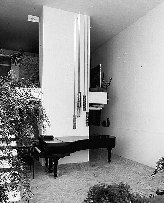
Paul Rudolph is primarily known as a architect—but he was also had a long-term commitment to music, and included a piano in all his own residences (at least since his 1961 High Street residence in New Haven.) Above is his piano: a Steinway “D”. It had been in Rudolph’s New Haven home, in the various versions of his NYC apartment on Beekman Place, and finally in his Quadruplex penthouse. It is now in the Rudolph-designed Modulightor Building, in the residence on the building’s upper floors (in the Living Room, as shown above.) A significantly large instrument (for a residence), it has been used by professional musicians for recitals that have taken place at the Modulightor Building.
“Music is liquid architecture”
“Architecture is frozen music”
—attributed to Goethe

A 1692 engraving of the legend of “Pythagoras at the Smithy”: It shows the moment when the ancient philosopher, passing a blacksmith shop, noticed there was a relationship between the size of each the smiths’ hammers and and the tones they produced—thus inspiring his ideas about the relationship between mathematics and music. The relationship between what we perceive (and find pleasing) and proportion has been extended to the visual arts—including in the work of architects.
Music and Architecture — they’ve been dancing together for a long time, and examples of their multiple connections abound:
As far back as the ancient Greeks, a connection was made between musical and the visual proportions. As architectural historian Rudolf Wittkower pointed out: Leon Battista Alberti invoked Pythagoras, contending that “Nature is sure to act consistently and with a constant analogy in all her operations. . . .and that “the numbers by means of which the agreement of sounds affects our ears with delight, are the very same which please our eyes and our minds”—a notion which he saw had implications for architectural design.
Musical terms overlap with architectural terms. If one were to ask an architect or architectural critic or historian to analyze a building’s composition, they’d probably speak in terms of: rhythm, harmony, proportion, modulation, unity, theme, recapitulation, and articulation—and indeed the term “composition” is fundamental to both disciplines. Rudolf Schwarz’s landmark book on religious architecture, The Church Incarnate, is filled with illustrations showing sequence of design themes used to create powerful sacred spaces—but they could just-as-easily be diagrams for architectural compositions.
Aside from seeking to design a concert hall, well-known architects have declared their affinity for music with regard to specific composers or types of music—For example: Wright declared for Beethoven; and Goff stated that he was continually inspired by Debussy. Kahn and Rudolph favored Bach. In addition, Kahn liked to play the piano—and, when young, earned money at the keyboard (and both of those facts were also true for Paul Rudolph.) Thomas Gordon Smith has a love of Bach, but prefers Purcell and Scarlatti. When archiect-composer Iannis Xenakis was programming the Philips Pavilion at the 1958 Brussels World’s Fair (based on a sketch by Le Corbusier) he included the music of Varèse (as well as a composition of his own.) Peter Eisenman is an opera fan—and his favorite is Wagner. And let’s not forget that a leading architect of the Renaissance, Carlo Rainaldi, was also an accomplished composer.
Wright was also fond of quoting Victor Hugo’s Notre-Dame de Paris (a.k.a. The Hunchback of Notre-Dame), whose most transcendent passage describes the rich architecture of medieval Paris—and culminates with a thrilling musical climax.
Architect Edgar Tafel (1912-2011)—a former apprentice of Wright—used to be able to look at a building and intone the pattern of its design, as though he were analyzing a musical composition.
Michael Trencher—scholar, architect, and educator—taught a design course at Pratt Institute’s School of Architecture, focused on exploring the resonance between music and architectural design.
And, when architects are interviewed by journalists, a frequent question asked is: What music are you playing when you’re at work?


Two of Erich Mendelsohn’s musically-inspired sketches.
MUSIC AS DESIGN
Some artists and architects have gone further, creating designs that were explicitly linked to particular musical concepts, works, or composers.
Erich Mendelsohn (1887–1953) is most notable in this regard. Mendelsohn, Though he had a long and prolific career which spanned four decades and three continents, he’s most well-known today for his Einstein Tower. It is most often labeled as an example of “Expressionist” architecture, but one can readily see its formal linkage with another aspect of Mendelsohn’s creative output: his musically-inspired drawings. He created a series of sketches of musically-themed fantasy buildings—and these continue to fascinate. Here are two of those drawings—and the lower one is titled “Bach, Toccata in C Major”. [Note: Although Mendelsohn was avowedly inspired by music, he did have a practical viewpoint on how far the relationship could be pushed—e.g.: When a couple came to him and asked that he design a house for them “according to Beethoven”, Mendelsohn explained to them that architecture was “not that romantic.”]

Paul Rudolph’s parents, Eurie Stone Rudolph and Keener Rudolph, on a visit to the Wallace Residence in Athens, Alabama, which Paul Rudolph had designed in 1961. Placed within a rigorous grid of emphatically oversized columns, the swerving staircase might be considered a “scherzo” within the overall composition.
PAUL RUDOLPH’S EARLY ENGAGEMENT WITH MUSIC
Paul Rudolph was serious about music, and his engagement with it goes all-the-way-back to his childhood. Below, from the archives of the Paul Rudolph Heritage Foundation, is a memoir written by Rudolph’s mother, Eurie Stone Rudolph (1890-1981). In it, Mrs. Rudolph described her son’s growing-up, initial (and increasing) fascination with architecture, his education, and her later visits with him (when he was an adult) in New York, Boston, and New Haven—along with observations on her son’s practice and success. In the course of the typescript she mentions visiting the 1964-65 New York World’s Fair, so we estimate that her memoir would have been written some time during (or shortly after) the span of that fair.
Part of her text mentions young Rudolph’s devotion to the piano—and the Paul Rudolph Heritage Foundation archives include a program, from his youth, showing that he was the accompanist for a local concert. You can read Mrs. Rudolph’s full text here—but below are the passages in which she focuses of Rudolph and music. [Note: in transcribing this text, we have retained most of Mrs. Rudolph’s grammar, spelling, capitalization, and construction.]
He always liked to paint pictures too, as well as he liked to play the piano. Had always loved Music, and would be drawing a model house or painting a picture, then suddenly get up from that work to and go to the piano and practice. We never had any trouble with him about his music. Often he would say he wished that his sisters would hurry and get through with their practice so he could practice. Music was play to him as well as his painting and drawing pictures.
Paul had three years in Athens College, taking piano and organ lessons, studying Art along with his other work in College.
At church they learned that he could play the organ, and as the regular Organist was not in good health, they would often call on Paul to substitute, for her. They finally decided to have Paul be the regular Organist, and paid him $20 per month. He already had three little girls that he was teaching music, as the home where he was staying had a little girl, and the mother wanted her to have music lessons, and asked if Paul would teach her. Then two other mothers wanted him to teach their little girls. So with his little music fee and his organist fee, the money situation helped him as well as us while he was in college.
RUDOLPH AT THE PIANO—BUT ALONE
“Architects On Architects” is a book-length collection of essays by 24 prominent architects, each of whom wrote about an architect or building which the experienced as a profound inspiration. Four of them selected Paul Rudolph! (coming in a close second to Le Corbusier, who was chosen by five.) Der Scutt (1934–2010) was an architect who achieved his greatest prominence as a designer of skyscrapers in the 1980’s and 1990’s—and he was one of the architects in the book who chose to write about Rudolph. Scutt had been a student in the masters program at Yale (when Rudolph was chair of the department), and he also worked for Rudolph—first in New Haven, and later in New York. His essay is partly a memoir of his time with Rudolph, and also a reflection on how Scutt sees Rudolph’s significance. The memoir is warm and appreciative, but doesn’t stint on the quirky details—and music makes an appearance in this passage:
“He never paid a Christmas bonus, and his annual Christmas message was to stomp out, usually around three o’clock in the afternoon on December 23, without a word to anyone. He would go directly to his apartment to play the piano shortly thereafter. Other times, usually on weekends, he would fill his grand living area with sounds of lyrical pleasure but almost never in front of friends or anyone. He was quite musical an accomplished at the piano. I could frequently hear the music as I walked past his apartment to the rear parking lot.”
Note: the above scenes, described by Der Scutt, were in the building that Rudolph owned in New Haven—a combined office and apartment. [More on that below.]
RUDOLPH: ALWAYS A PIANO AT HAND
In all his self-designed residences, Rudolph included a piano—indeed, it was the same Steinway piano which he carried from home-to-home over the course of three decades. This goes at least as far back as the time he resided in New Haven, while he was Chair of the School of Architecture at Yale. In each of his homes, the piano’s location was carefully integrated into the overall design.

Paul Rudolph purchased a vintage New Haven Building at 31 High Street (represented by the large square at the top of this drawing) and used its top floor for his architectural office. He added a residential apartment for himself—the main floor plan of which is shown here (the living room, dining area, kitchen, and garden.) The location of Rudolph’s Steinway piano can be seen at the center.
NEW HAVEN: 1961
When Paul Rudolph became the Chair of Yale’s School of Architecture in 1958 (a position he was to hold until 1963), he moved to the city which was the home of Yale: New Haven, Connecticut.
He wound-up his Florida office, and restarted it in his new home—he purchased a 1855 building at 31 High Street (not far from the architecture school), and altered and added to it—devoting part of the building’s existing space to his active office, and constructing an addition for his own living space.
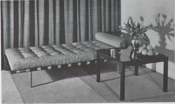
At right is the floor plan. The large square box, at the top of the drawing, represents the existing, vintage building—and Rudolph’s newly-constructed two-level residence was grafted onto it. The plan shows the lower floor, with its exterior garden/courtyard, living, dining, and kitchen areas—-and Rudolph’s Steinway piano. Below is a view towards the piano, and to the left of it is the internal stair (which connected the more public living areas to the the private spaces above.). Behind the piano is a tall, freestanding wall: it screened the kitchen and dinette on the lower level; and a more cozy sitting area with a fireplace above. In the foreground, one can see a corner of a the Living Room’s large raised sitting platform.
The living room of Paul Rudolph’s New Haven residence: his Steinway piano takes center stage.

Above is a view of the Manhattan townhouse in which Rudolph was to reside for more than a third of his life. It fronts onto the east side of Beekman Place, and the nearest corner (at the right edge of the photo) is East 50th Street. This view is looking at the North-East corner, and the the building, 23 Beekman Place, is in the middle of the photo, one building to the left of the corner building.. Twice in New York’s history, photographs were taken of every building in the city (for tax records): between 1939 and 1941, and again in the mid-1980’s—and the above image is from the earlier set of photographs. These “tax photos” are an invaluable resource for researching New York’s architectural heritage—including the history of Paul Rudolph’s building.
NEW YORK: 1960’S
Rudolph completed his time as chair at Yale in 1963, and sold his combined home & architectural office building in New Haven and moved to New York City. But, before that, he was already renting a pied-a-terre apartment in New York—a convenience for his trips there due to his expanding practice.
He resided in a floor-through apartment which he rented at 23 Beekman Place—a short, two-block street in the eastern part of mid-town Manhattan, not far from the United Nations. Although Beekman Place was to become—and remains—one the wealthiest stretches of real estate in Manhattan, at that time the neighborhood was more mixed [as recounted in Katherine Young’s memoir: “My Old New York Neighborhoods: Greenwich Village-Beekman Place”] and prices for renting and purchase were more reasonable.
Rudolph’s 4th floor apartment went through remarkable transformations: he redesigned it three times, using it as a place to experiment—to “sketch” 3-dimensionally. There, he tried-out different ideas in the use of space and materials, as well as innovating with lighting, storage techniques, and how to get the most out of a compact area.
Rudolph’s Steinway piano—brought to New York City after having been in New Haven—had a place in these various apartment incarnations. In the last and most developed version, he built the piano into a platform in the Living Room—-sinking its legs into into the platform’s top surface, and providing a circular recess into which the piano’s player—Rudolph himself—could lower his legs and reach the pedals.

Paul Rudolph’s sketch of the plan for one of the renovations of his floor-through apartment at 23 Beekman Place. His piano (and it’s unique placement within a platform in the Living Room) can be seen at the lower-left. Drawn at a scale of 1/2” = 1’-0”, the plan is highly detailed, and includes Rudolph’s proposed locations for various kinds of lighting (which he was experimenting with at the time.) An intriguing notion, included shown here, is where Rudolph proposed guests would sleep: they’d be accommodated in the Living Room, in the slot of space between the top of the platform and the bottom of he piano—and one can see a pair of supine figures drawn-in, at the lower-left.

Paul Rudolph’s “Quadruplex” apartment, atop (and growing upward from) 23 Beekman Place in NYC (the building is one-away from the corner.) As with his other homes, it included space for Rudolph’s Steinway piano.
NEW YORK: 1976-1997
Paul Rudolph—after being a tenant in the 23 Beekman Place townhouse for a number of years—purchased the building in 1976.
He proceeded to transform it, eventually renovating the entire building to his designs—including the shared spaces (the lobby, stairs, and elevator), the river-facing façade, and the rental units in the lower floors. The most notable (and noticeable) change was within and atop the building, where he built his famous “Quadruplex” penthouse residence While the “quad” in the name refers to the apartment’s four primary floors, actually there were numerous subtle level changes—a technique Rudolph used to define, modulate, and dramatize the spaces and functions within the complex design.
As with his previous homes, Rudolph’s new residence included a space for his Steinway piano. Below is a floor plan of the Quadruplex’s third level, and you can see the piano (and its piano stool) drawn in at the upper-right corner.
[Note: after Paul Rudolph’s passing, his piano was relocated to another of Rudolph’s designs: the residential duplex within the Modulightor Building in New York [see photograph at the top of this article.]

The plan of the “Third Level” of Paul Rudolph’s “Quadruplex” penthouse in Manhattan. The piano is at the upper-right.

Paul Rudolph’s floor plan for the Jewett Arts Center at Wellesley College, a design from the mid-1950’s. As specified in the program, a variety of arts were to be accommodated: painting, theater, and music—and the large performance space can be seen within the left-hand wing of the building, situated at its’ heart.
MUSICIANS RESPOND TO PAUL RUDOLPH
We’ve written of architects’ affinity for music, and established Paul Rudolph’s own long-term musical commitment—but what about the musical world’s reaction to Paul Rudolph?
Generally musicians react to an architect as a consequence of their encounter with the products of an architect’s work: their buildings—but that’s assuming that the architect has designed any spaces specifically for music: concert halls, chamber music spaces, opera houses, recording studios, or other performance venues. Musicians often have strong feelings about the spaces in which which they play—and can be perceptive architecture critics—as in musician-musicologist Ralph Kirkpatrick’s frank comments on the design of concert halls in the Yale architecture journal Perspecta 17 (1980)
Concert halls and opera houses (like other arts buildings, such as museums) have, as Philip Johnson observed, almost functioned as secular churches in our society—and such commissions are prized by architects. To our knowledge, Rudolph was never asked to design a space solely for music—but he did incorporate the multi-functional hybrid "auditorium” into several of his projects. That would be most often true for his numerous educational commissions, starting with a performance space within his Jewett Arts Center at Wellesley College (a design of the mid-1950’s). Also, the several sacred spaces he designed—from the Tuskegee Chapel of 1960 -to- the Emory University Cannon Chapel of 1975—were sites where instrumental and/or vocal music were integral to the buildings’ use.
Though none of those are quite the same as a building designed specifically for musical performance, the musical world has responded to Rudolph—in the form of musical compositions…
COMPOSERS THAT WERE INSPIRED BY RUDOLPH
JACOB GARCHIK: “CLEAR LINE”

CLEAR LINE, an album by Jacob Garchik—which includes “Line Drawings of Paul Rudolph”—is available through several venues—including Amazon Music, here.
Jacob Garchik, a multi-instrumentalist and composer, was born in San Francisco and resides in New York. He released 4 albums, works in a variety of styles and musical roles, and been a vital part of the New York scene, playing in groups ranging from jazz -to- contemporary classical -to- Balkan brass bands. He contributed numerous arrangements and transcriptions for the world-famous Kronos Quartet, composed a film score, created arrangements for distinguished performers, and taught arranging at the Mannes School of Music.
CLEAR LINE is an album by Garchik from 2020, and according to his web page devoted to the album:
“. . . .Through nine parts Garchik explores intersections and antecedents in architecture, graphic novels, and fine art.” . . . . “Garchik’s recent obsession with architecture has led to a new way of imagining. Every building he sees makes him picture, in his mind’s eye, the three dimensional shape of each floor (i.e. Visualization of Interior Spaces) . . . . “Clear Line” serves as an audio analogy to graphic artists’ and architects’ translation of 3d space to 2d drawings. Motives reoccur through the nine parts, like seeing a panel of a graphic novel that reminds one of a familiar building.”
The album is divided into nine parts:
Visualization of Interior Spaces
Ligne Claire
Stacked Volumes
Sixth Intro
Sixth
Hergé: Vision and Blindness
Moebius and Mucha
Line Drawings of Paul Rudolph
Clear Line
In the wording of his titles, you can see Garchik is taking inspiration from form, design, and drawing, as well as geometry and art. Of course, we were fascinated by one of the selections: “Line Drawings of Paul Rudolph”—and you can hear a sample here.
STEVE GIAMBERDINO: “BYE-BYE, BRUTALISM !”
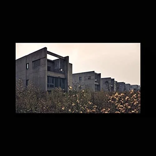
BYE-BYE, BRUTALISM, an album by Steve Giamberdino—which includes “Paul Rudolph (Architect)”—is available through several venues—including Amazon Music, here.
Stephen E. Giamberdino is a musician—a bassist and singer—and a composer and producer of several albums. He’s from Buffalo, NY, and continues reside and work there.
BYE-BYE, BRUTALISM is Giamberdino’s most recent album: it was both composed and produced by him, and was recorded in the latter half of 2020 and released in 2021.
Brutalism has become associated not only with architecture, but also with furniture and decoration—but perhaps it is surprising to see it invoked in music. Bye-Bye, Brutalism’s album cover features a photograph of a line of low-rise concrete buildings—ones that might be characterized as “brutalist.” Moreover, a video (which Giamberdino made in association with the album) includes views of concrete architecture.
The album embraces a broad range of styles and energy levels, a variety of which show the composer’s versatility of moods and modes. Giamberdino made the album in association with a dozen musicians (the album is, overall, credited to “Steve Giamberdino & Friends”)—and it not only uses instruments, but also embraces vocals, choral work, and narration.
The album’s offerings includes the title track, “Bye-Bye, Brutalism”—but what really intrigued us was another song on the album: “Paul Rudolph (Architect)” —and you can hear an excerpt from it here.
A FINAL NOTE. . .
“Paul Rudolph: Inspiration, Design, And Friendship” is an essay, written by Ernst Wagner, for the 2018 birthday centennial celebration of Rudolph’s life and work—and it is included in the catalog published in association with the Rudolph centenary exhibition.
Ernst Wagner was Paul Rudolph’s friend for many years, and is the founder of the Paul Rudolph Heritage Foundation. His essay (which you can read, in-full, here) includes a revealing moment in which music and architecture intersect:
Rudolph’s 23 Beekman “Quadruplex” was his most spatially rich—and very personal—vision of the possibilities of design: intimate and Piranesi-like, soaring and layered—an orchestration of interlocking-interwoven spaces. It was his home, and his own design laboratory, where he’d constantly experiment with new variations—a composition of rich textures and reflective materials catching the light in magical ways. No less than 17 levels could be counted which, pinwheel-like, float and lead one to the next luminous experience.
At one point, I asked Paul, “Is it not going to be too complicated?” To which he replied, “No, no, you don’t understand! Architecture is like music! Do you think that a Bach fugue is too complicated?”
IMAGE CREDITS
NOTES:
The Paul Rudolph Heritage Foundation (a non-profit 501(c)3 organization) gratefully thanks all the individuals and organizations whose images are used in this non-profit scholarly and educational project.
The credits are shown when known to us, and are to the best of our knowledge, but the origin and connected rights of many images (especially vintage photos and other vintage materials) are often difficult determine. In all cases the materials are used in-good faith, and in fair use, in our non-profit scholarly and educational efforts. If any use, credits, or rights need to be amended or changed, please let us know.
When/If Wikimedia Commons links are provided, they are linked to the information page for that particular image. Information about the rights for the use of each of those images, as well as technical information on the images, can be found on those individual pages.
CREDITS, FROM TOP-TO-BOTTOM:
Piano in the living room of the Modulightor Building: photograph by Donald Luckenbill, Image © The Estate of Paul Rudolph, The Paul Rudolph Heritage Foundation; Pythagoras and the Smithy: vintage (1692) engraving from "Pythagorische Schmids-Fuencklein" by Johann Andreas Wolf, via Wikimedia Commons; Erich Mendelsohn sketches inspired by music or composers: vintage sketches, via Google Images; Paul Rudolph’s parents at the Wallace Residence: Image © The Estate of Paul Rudolph, The Paul Rudolph Heritage Foundation; Plan of Paul Rudolph’s High Street, New Haven residence: Image © The Estate of Paul Rudolph, The Paul Rudolph Heritage Foundation; Interior of Paul Rudolph’s High Street, New Haven residence: photograph by Yugi Noga, from a print found within the archives of the Paul Rudolph Heritage Foundation; Vintage exterior view of 23 Beekman Place: “tax photo” from NYC Department of Records archives; Paul Rudolph’s sketch plan drawing of his Beekman Place floor-through apartment: Image © The Estate of Paul Rudolph, The Paul Rudolph Heritage Foundation; Exterior of Beekman Place Penthouse: photo by R. D. Chin, Image © The Estate of Paul Rudolph, The Paul Rudolph Heritage Foundation; Plan of Beekman Place Penthouse, third level: Image © The Estate of Paul Rudolph, The Paul Rudolph Heritage Foundation; Plan of Jewett Arts Center at Wellesley: Image © The Estate of Paul Rudolph, The Paul Rudolph Heritage Foundation; “Clear Line” album cover: from the Amazon web page for the Jason Garchik album; “Bye-Bye, Brutalism” album cover: from the Amazon web page for the Steven Giamberdino album.


.jpg)
.jpg)