

The plan of the Twitchell Residence: Ralph Twitchell’s residence in Sarasota, Florida, a design of 1941. It is Paul Rudolph’s second built design, and his first in association with the senior architect. What might one learn (or speculate about) from studying such a floor plan?

Ralph Spencer Twitchell, Architect (1890-1978)
RALPH TWITCHELL
It is the birthday of Ralph Spencer Twitchell (July 27, 1890 – January 30, 1978)—and we take this moment to celebrate this architect, one who not only played a key part in the life and career of Paul Rudolph, but who contributed to the Sarasota community.
TWITCHELL AND RUDOLPH
Even to those who have a deep interest in the history of Modern architecture, Ralph Twitchell is not known much beyond a brief summary that peppers many biographies of Rudolph. What one often reads is that the senior architect gave Rudolph his start (Twitchell was nearly 3 decades older than Rudolph), bringing the young designer into his practice, and (and, as soon as Rudolph obtained his architectural license, taking him into partnership).
To this alliance, Twitchell is seen as having contributed an established position in the Sarasota community, a track record of successful projects, a way with clients, and a firm knowledge of construction—and Rudolph was the ultra-talented (and hardworking and prolific) youthful design genius. A productive period ensued, with many houses built and proposed—some of them among Paul Rudolph’s most striking designs, including: the widely-published Healy (“Cocoon”) House; the innovative Knott Residence; and the proposal for a complex of houses for the Revere Development (which showed Rudolph working skillfully within the vocabulary of Mies van der Rohe's “courtyard house” design experiments).

The Knott Residence, proposed for Yankeetown, Florida

The Healy (“Cocoon”) House, built in Sarasota, Florida

The Revere Development, proposed for Siesta Key, Florida
But, after about a half-decade of intense and successful work, Rudolph splits with Twitchell—apparently after a disagreement. Rudolph went on to found his own firm, attaining amazing success in the coming decades—both professionally and artistically.
ARCHETYPAL STORIES
So the impression one gets, from this highly condensed duo-biographical sketch, is that Twitchell provided the assets of the establishment: boring but practical and useful; whereas Rudolph injected the artistically energetic ingredients which really made their work interesting. Then, ultimately, it is the young genius who rebels and pursues his own path: an adventurous road to great achievement. From then on, we hear no more of Twitchell.
It is an appealing story, with its depiction of the talented and irrepressible “rebel”—and one wouldn’t have to search very hard into the work of Joseph Campbell to find, within the world of comparative mythology, that this is tale that can be found in all ages and cultures across the globe: the archetypal “Hero’s Journey”.
DEEPER AND BROADER
But, if there’s one thing that historians learn, it is that no story is simple—and, if one has the interest to dig, and to challenge the received wisdom, all stories keep opening up new questions and possibilities. The honest historian always wants—needs—to go deeper into the evidence, and look ever more broadly at what might have influenced/created a situation.
So let’s see if we can open-up (or as historians say, “unpack”) the above story. To do that, let’s consider the Twitchell Residence: how much is Twitchell and how much is Rudolph? We’ll probably never know the exact ratio and nature of their contributions to the design, but we can consider some of the factors that might have affected its planning and form. Items to consider include:
This is Twitchell’s personal home—and it is a natural feeling to be particularly focused on the design of one’s own home—and that’s especially true for architects! No matter how talented his young associate (Rudolph), is it plausible that a senior architect would hand-over the full responsibility for the architecture of his own home to someone else? Or is it more likely that he had important and key input into the design?
The building was completed in 1941. War is raging in Europe and Asia, and tremors of possible US involvement in the war—and a general national nervousness—are pervasive. Twitchell was old-enough to recall what happened during the previous World War: labor and materials had been in short-supply, and most construction was put on-hold for the duration of the fighting. Twitchell might have wanted to get his house built while it was still possible to do so—and he’d have only one chance to get it right. So—for this one chance—would he completely abdicate design responsibly for that to another?
There are many striking similarities between the Living-Dining area of the Twitchell Residence, and the famous drafting room at Frank Lloyd Wright’s Taliesin West—too many to be just a coincidence [See comparison photos, below.]
There are other Wrightian aspects of the Twitchell House: the compactness of the bedrooms (Wright thought bedrooms should be small, almost cabin-like, and primarily for sleeping—and that residents would/should spend their time outside of them); Dining and Living Room Areas that merge into each-other; the primacy of a solid, prominent fireplace wall, as one of the defining elements of the Living Room; and the set of visually solid piers which define the parking area, which create a strong entry sequence to the house.
We know that Paul Rudolph was an ardent admirer of Wright—and that visiting a Wright home, at an early age, had been a decisive moment in Rudolph’s development. Rudolph’s devotion to Wright is something he’d acknowledge for his whole life. But—

The drafting room of Frank Lloyd Wright’s Taliesin West —and iconic part of the Taliesin complex. Key features—the ones that create it’s overall character are: the open, uninterrupted space; the inclined ceiling; the expressed structure inclined beams across that ceiling: the directionality of the space, with one side opening to the exterior; the V-shaped, angled columns, at the open side of the room, which support the beams above.

Both Twitchell and Paul Rudolph were aware of Wright’s work—and, from a young age, Rudolph was especially influenced by Wright’s designs (something he’d warmly acknowledge all his life). Above is the main living space of the Twitchell Residence: one is looking South into the Living Room, with the Dining area in the foreground. Was it Rudolph who urged that it follow so many of the features of Wright’s Taliesin drafting room?
But Twitchell could equally have been aware of Wright. Frank Lloyd Wright was a relentless self-promoter and had been widely published for decades—so it would be impossible for any architect, of Twitchell’s era and age, to be ignorant of Wright. Further, given Wright’s decades of fame, Twitchell’s awareness of Wright’s work would have started well before he met Paul Rudolph.
But, beyond familiarity, there’s a strong affinity between Wright’s work and another Twitchell project: one of his largest works, the Lido Beach Casino in Sarasota. The complex—an extensive structure with multiple parts and functions—was built in 1940, and probably planned in the previous year(s)—well before Rudolph was engaged by Twitchell. It was a venue for beach and pool swimming, dining, dancing, a nightclub, and shopping—and events of all kinds (beauty contests, swim meets, school and social) were held there.
The project bears a striking similarity to Wright’s Midway Gardens: excluding swimming, both the Lido Beach Casino and Midway are of similar scale, encompass nearly matching programs, and were aimed at the same type of audience.

Frank Lloyd Wright’s Midway Gardens in Chicago

Ralph Twitchell’s Lido Beach Casino in Sarasota
The two entertainment complexes share a “parti" (their basic architectural organization): both having a large, central, open space—which is enclosed and defined by structures for various functions, and which is anchored at one side by a taller main building.

Beachside view of the Lido Beach Casino—a view from circa 1956—showing the main, central structure that visually anchored the complex.
Other aspects of the building display possible Wrightian influences, such as—-
The pronounced horizontality of the composition—both overall, and in its elements: the low, hipped roofs of the two towers (and in the linear detail at their mid-areas), and the disc-shaped cantilevered roof at the center of the beach elevation
The detailing of the columns
The use of block—and prominently including a pattern of penetrations in the block masonry walls
The creation of deep colonnades—not only offering protection from the sun, but also creating dramatically shadowed areas
The almost Mayan “introverted” feel of the building—like Wright’s Hollyhock House, due to the solidity of the massing and of individual elements like the columns
The display/celebration of structure—as in the rafters over the beachside elevation’s central roof, the hefty piers supporting that roof, and the line of columns
Altogether, one cannot ignore the possible Wright influences in this Twitchell-before-Rudolph project.
So the question becomes: If we see Wrightian influences here, could Twitchell also have brought such design input into his work with Rudolph?


WITHER RALPH TWITCHELL?
In the standard history of their Twitchell and Rudolph’s partnership, Twitchell is known as the “business partner” -or- the “public face” (who charmed clients) -or- “the [construction] site guy”. But though he was all those things (and, apparently, excelled in those roles), perhaps he was more than that. He had an extensive career both before and after his partnership with Rudolph, and—as looked-at in the above two cases (his 1941 Residence, and the Lido Beach Casino) there are reasons to contend that he might have had more of a design talent and sensibility than he’s usually given credit for. The import of this is: his input into projects in the Twitchell and Rudolph partnership might possibly have been stronger than previously assumed.
THE HISTORIAN’S PERSPECTIVE
To be fair to both sides, we should mention that we do have Paul Rudolph’s counter-testimony to such an idea (Rudolph said that whatever was good and interesting in their work was attributed to himself alone!). We don’t mean to assail the integrity of Rudolph’s claim—but part of the work of history is to question such self-contained, categorical statements. “Meta-narratives”—the big, central stories by which we’ve long understood the course of events (at world, local, and personal scales)—are never quite inclusive-enough of all the facts: there always dissonant evidence (“out-of-place artifacts”), clues, even “hints” that stubbornly won’t go away, and a real historian will never ignore them. So the question of Twitchell’s ability and input as a designer is an open one.
CELEBRATING TWITCHELL
So today,. on his birthday, we give Twitchell some renewed attention and consideration—”giving him a little love” that he’s rarely received in the soundbite assessment that he often gets.
A talented, energetic, and enterprising figure—and one who may have had more focus on design than usually acknowledged—it is worth celebrating this important architect: RALPH SPENCER TWITCHELL
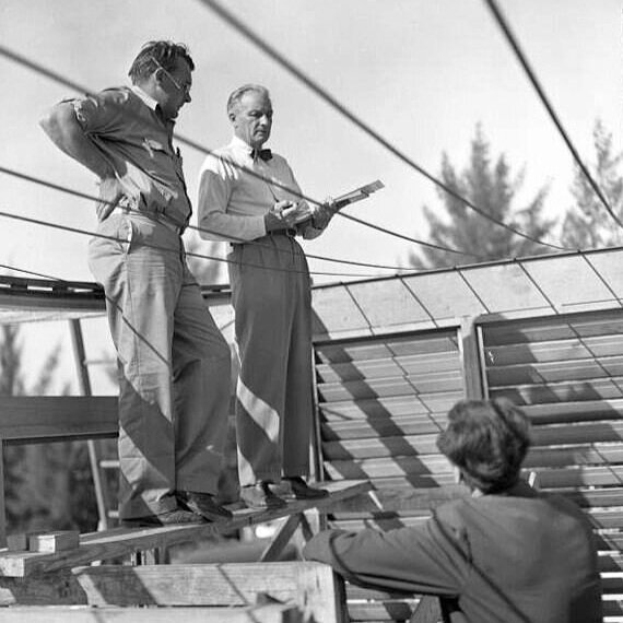
Ralph Twitchell (center) consulting with builders on-site. What’s intriguing about this image is that it shows the Healy (“Cocoon”) House under construction—and one can see the catenary metal straps, upon which house’s curved roof (its most pronounced feature) was to be suspended. Healy was the most famous building completed during Twitchell and Rudolph’s partnership, but after Rudolph departed, Twitchell continued to practice until at least the mid-1960’s, and lived until 1978—long enough to see his former partner, Rudolph, achieve stratospheric success and fame. One wonders what Twitchell thought of that: was he jealous, bitter, tranquil—or glad that he’d fostered such a profound and prodigious talent as Paul Rudolph?
IMAGE CREDITS
NOTES:
The Paul Rudolph Heritage Foundation gratefully thanks all the individuals and organizations whose images are used in this non-profit scholarly and educational project.
The credits are shown when known to us, and are to the best of our knowledge, but the origin and connected rights of many images (especially vintage photos and other vintage materials) are often difficult determine. In all cases the materials are used in-good faith, and in fair use, in our non-profit, scholarly, and educational efforts. If any use, credits, or rights need to be amended or changed, please let us know.
When/If Wikimedia Commons links are provided, they are linked to the information page for that particular image. Information about the rights for the use of each of those images, as well as technical information on the images, can be found on those individual pages.
CREDITS, FROM TOP-TO-BOTTOM and LEFT-TO-RIGHT:
Floor plan of the Twitchell Residence: © The Estate of Paul Rudolph, The Paul Rudolph Heritage Foundation; Photo portrait of Ralph Twitchell: by Joseph Steinmetz, from the State Library & Archives of Florida, via Wikimedia Commons; Perspective renderings by Paul Rudolph of the Knott Residence, Healy (“Cocoon”) House, and the Revere Development: © The Estate of Paul Rudolph, The Paul Rudolph Heritage Foundation; Taliesin West drafting room: photo by Steven C. Price, via Wikimedia Commons [Note: to help facilitate comparisons between this space and the Twitchell Residence Living Room (the next picture), this photo of the drafting room has been flipped, and color was removed.]; Ralph Twitchell Residence Living Room: by Joseph Steinmetz, from the State Library & Archives of Florida; Midway Gardens: vintage post card. circa 1915, via Wikimedia Commons; Beachside view of Lido Beach Casino, circa 1956: photo, circa 1956, via Wikimedia Commons; Post cards and photos of Lido Beach Casino: vintage images; Photo portrait of Ralph Twitchell at Healy construction site: by Joseph Steinmetz, from the State Library & Archives of Florida, via Wikimedia Commons


.jpg)
.jpg)
.jpg)
.jpg)
.jpg)
.jpg)