Architectural Style

Introducing the Paul Rudolph Institute for Modern Architecture

Paul Rudolph’s representation of the human figure used as the logo for the Paul Rudolph Institute for Modern Architecture.

The Paul Rudolph Heritage Foundation and the Paul Rudolph Estate are excited to announce the launch of the Paul Rudolph Institute for Modern Architecture.

The Paul Rudolph Institute for Modern Architecture (PRIMA) will replace the Paul Rudolph Heritage Foundation and expand its mission to provide outreach and information to educators, students, design professionals and the broader public interested in learning about the design principles of modern architecture exemplified in Paul Rudolph’s architectural work and teachings.

“Principles are principles. Principles don’t change. Styles change; attitudes change. Things are in a constant state of flux. The only grasp one can have on the profession is to get a handle on great principles.” - Paul Rudolph

Rudolph referred to these principles as the ‘DNA’ of architecture and they include issues of site, function, space, structure/materials, scale and style (referred to as the spirit of the times). These principles are timeless and are not just found in Rudolph’s own buildings: they are not restricted to any one style of construction, location or material.

“Modern architecture’s range of expression is today from A to B. We build isolated buildings with no regard to the space between them, monotonous and endless streets, too many goldfish bowls, too few caves. We tend to build merely diagrams of buildings.”

”One can say that the present tendency to reduce everything to a system of rectangles, both in plan and elevation, is an outgrowth of the modular concept and machine processes. We accept this discipline but we still long innately for the old play of light and shadow, for something curved.” - Paul Rudolph

Rudolph realized that for architecture to be successful, it must solve modern problems and reflect modern times with a respect for a traditional way of seeing and feeling space.

“People, if they think about architecture at all, usually think in terms of the materials. While that’s important, it’s not the thing that determines the psychology of the building. It’s really the compression and release of space, the lighting of that space—dark to light—and the progression of one space to another. Because one remembers in that sense.” - Paul Rudolph

As architecture and design adapt to the changing needs of our modern world - sustainability and climate change; urbanism; affordable housing to name a few - these principles can help us to design and build a better future that keeps and learns from the best of the past.

The New York City-based non-profit 501(c)3 organization was founded by Ernst Wagner, Paul Rudolph’s heir and executor of his estate, to fulfill Rudolph’s wish that an organization be created to preserve and educate others about his architectural legacy. The Institute will promote Rudolph’s design principles through preservation and advocacy efforts, educational programs, public events and maintaining and developing an archive of materials related to modern architecture.

The Institute’s logo is Rudolph’s representation of a human figure in the pen and ink drawings that made his work celebrated around the world. It represents Rudolph’s humanistic view of architecture that emphasizes the power of human beings to create, improve, and reshape their environment with the aid of scientific knowledge, technology and practical experimentation.

Rudolph described architecture as “used space formed to satisfy people’s psychological needs.” This definition places the user at the center of architectural experience and considers human beings as the starting point for any architectural philosophical inquiry.

The Paul Rudolph Institute for Modern Architecture will continue to act as the exclusive worldwide representative for The Estate of Paul Rudolph LLC with regard to licensing third parties for any and all uses of the intellectual property rights of the Works of Paul Rudolph.

If you are interested in becoming involved with the work of the Paul Rudolph Institute, or to find out more about our programs as they develop, please complete the “Contact Us” form and note your interest in this work so we may contact you.

Paul Rudolph goes to the Dentist (but actually, it's the other-way around!)

Paul Rudolph’s organically curved floor plan for the dental office of Dr. Nathan Shore, in NYC—a work from the mid-1960’s. While Rudolph was known as a master of geometry and form (and their application to architecture, interiors, and furniture), this sinuous approach to planning was one to which he turned only occasionally. This “poche” version of the plan was used as a decorative graphic on the dental office receptionist station’s glass enclosure.

Paul Rudolph’s organically curved floor plan for the dental office of Dr. Nathan Shore, in NYC—a work from the mid-1960’s. While Rudolph was known as a master of geometry and form (and their application to architecture, interiors, and furniture), this sinuous approach to planning was one to which he turned only occasionally. This “poche” version of the plan was used as a decorative graphic on the dental office receptionist station’s glass enclosure.

CREATION WITHIN A VARIETY OF SCALES AND TYPES: TRUE MASTERS WILL TAKE-ON ALL CHALLENGES

One of the signs of a master architect-designer is their ability to create interesting work at all scales. English architect Charles Ashbee, the Arts & Crafts era designer, is a strong example: designing everything from a typeface -to-furniture -to- houses -to- the renovation of a war-damaged city. His American contemporary, Bertram Goodhue, worked in a similarly broad range of scales: from his design of a typeface that is still in wide use (“Cheltenham”) -to- his Nebraska State Capitol, a building big enough to be seen from a distance of 20 miles.

Paul Rudolph indicated that he would be willing to take on even humble projects, and said:

“‘It makes no difference to me the size of the project. I’ve always said, ‘I would be happy to make a dog house for you, if you would let me make it a unique and very good dog house.’”

And, in fact, some famous architects have applied their architectural skills to dog house design: Frank Lloyd Wright (who called such a commission “an opportunity” in design), and Philip Johnson.

Young Jim Berger lived in a house designed by Frank Lloyd Wright for the Berger family in San Anselmo—and, at age 12, he asked Wright to design a doghouse for his pet labrador retriever. Wright sent a construction drawing and “Eddie’s House” was built. Here, in 2017, Mr. Berger is seen with a reconstruction of it, which was on display at the Wright-designed Marin County Civic Center.

Young Jim Berger lived in a house designed by Frank Lloyd Wright for the Berger family in San Anselmo—and, at age 12, he asked Wright to design a doghouse for his pet labrador retriever. Wright sent a construction drawing and “Eddie’s House” was built. Here, in 2017, Mr. Berger is seen with a reconstruction of it, which was on display at the Wright-designed Marin County Civic Center.

Philp Johnson’s 1997 design: a “dog house” on the Glass House estate. According to the National Trust for Historic Preservation’s website: “This small structure was created by Johnson as a conceptual project for a classically-inspired tomb. However, when completed the small wooden object turned out to be just the right size for his and [David] Whitney’s new puppies to inhabit. . . .”

Philp Johnson’s 1997 design: a “dog house” on the Glass House estate. According to the National Trust for Historic Preservation’s website: “This small structure was created by Johnson as a conceptual project for a classically-inspired tomb. However, when completed the small wooden object turned out to be just the right size for his and [David] Whitney’s new puppies to inhabit. . . .”

To our knowledge, Paul Rudolph never designed a dog house, but—across his half-century career, in which he engaged in hundreds of commissions—he was not above taking-on projects of a less-than-glamourous nature, or for clients with limited budgets.

One of the happy surprises we’ve encountered in the archives of the Paul Rudolph Heritage Foundation is an article from the Journal of the American Dental Association—and it’s about just such a project: Rudolph’s 1967 design for a dental office for Dr. Nathan Shore.

THE DENTIST GOES TO RUDOLPH

Rudolph’s client, Dr. Nathan Shore, was a dental pioneer in working on TMJ —and wrote this key book on the topic.

Rudolph’s client, Dr. Nathan Shore, was a dental pioneer in working on TMJ —and wrote this key book on the topic.

Dr. Nathan A. Shore (1914-1984), was a dental specialist and pioneer in correcting a jaw condition called temporomandibular joint syndrome—known more widely as TMJ—-a subject upon which he wrote numerous articles and a book (and for which he devised a test to determine whether the pain was medical or dental in origin.)

In he 1960’s, Dr. Shore asked Paul Rudolph to design his dental offices: they were to be located within a nearly windowless 1,830 square foot space on Central Park South, in the midtown section of Manhattan. Rudolph divided this area into 19 spaces: 

  • four dental operatories

  • two hygienist operatories

  • two con­sultation rooms

  • an audiovisual room (for patient education)

  • a business office

  • a reception room

  • a kitchen for staff use

  • an X-ray room

  • two laboratories

  • two washrooms

  • all the above spaces connected by a continuous corridor

  • all remaining spaces, between the walls of the rooms, were utilized for storage.

Placing all these rooms and functions into the available square footage was an tour-de-force of space-planning efficiency. Although suite corridors were narrow, circular mirrors mounted on walls, and varied ceiling heights created an illusion of space.

Paul Rudolph’s floor plan for the Nathan Shore dental offices—probably the “presentation drawing” which was shown to the client (and/or other parties, such as the building management) to explain the design and obtain their approval. Each space in this quarter-inch scale plan is labeled; overall dimensions of the space are shown; and the entry is indicated by an arrow shown toward the bottom-center of the drawing.

Paul Rudolph’s floor plan for the Nathan Shore dental offices—probably the “presentation drawing” which was shown to the client (and/or other parties, such as the building management) to explain the design and obtain their approval. Each space in this quarter-inch scale plan is labeled; overall dimensions of the space are shown; and the entry is indicated by an arrow shown toward the bottom-center of the drawing.

A screen capture from the Museum of Modern Art’s website, showing a 1961 Jason Seley sculpture which is part of their collection: “Masculine Presence”. Like the sculpture that was in the Shore Dental office, this example is made from auto parts—Seley’s most frequent medium.

A screen capture from the Museum of Modern Art’s website, showing a 1961 Jason Seley sculpture which is part of their collection: “Masculine Presence”. Like the sculpture that was in the Shore Dental office, this example is made from auto parts—Seley’s most frequent medium.

Furniture, in reception and some internal offices, included chairs by Charles and Ray Eames (from Herman Miller); and by Warren Platner (from Knoll International).

Desk lighting was provided by numerous “Lytegem” lamps (by Lightolier)—then and now, one of the most platonically pure lamp designs, made from a sphere and a cube—a composition strongly appealing to architects committed to the Modern aesthetic [This 1965 design, by Michael Lax, is in the collection of MoMA.]

The reception area contains a sculpture made of automobile hubcaps. It is by Jason Seley, a artist known for creating artworks from chromium steel automobile body parts.

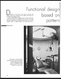
The constructed design received coverage—perhaps the only article about it—in a 1971 issue of The Journal of the American Dental Association. The article, "Functional Design based on Pattern of Work in a Dental Suite", spoke of Rudolph’s design approach to meet the challenges involved in such a project, and included a description of the results, photos, and a floor plan. The article’s author, Eileen Farrell, had been an editorial supervisor at the American Dental Association, and some of her observations included:

"Dentistry in the round is one way to describe the unique dental suite designed for Dr. Nathan Allen Shore by architect Paul Rudolph of Yale. . . .The circular motif is repeated in various ways that add to the total effect. Lighting in the operatories, for instance, is diffused from a circular well in the ceiling across which the dental light slides on a track integrated with the ceiling diffusor. A curved Plexiglass screen divides the business office from the recep­tion room, making each space seem larger. A circular rendition of aspects of the temporomandibular joint decorates the door leading to the operatories.”

"Besides creating an illusion of space, the design aims at quiet and a sense of privacy. To this end, circulation of pa­tients and staff is kept to a minimum, and although there are eight staff members and a steady stream of patients, the suite never seems to be crowded. One reason is that the movement of traffic is in the round rather than back and forth. . . .When a patient arrives for his appointment, the secretary opens the door by remote control and admits him to the recep­tion area."

"Doctor Shore finds that his staff is happy in the well-designed quarters. . . .Functional design, he says, seems well suited to a most progressive profession."

smallest First page.PNG
dental+article+page+2.jpg
dental article page 3.jpg
dental article page 4.jpg
dental article page 5.jpg
screen of recepition area.JPG

Above are small screen-captures of the pages of the article about the Rudolph-designed Nathan Shore dental office. At the lower-right is a slightly enlarged portion of one page, showing the reception area—and, at its right side, one can see that the suite’s floor plan has been incorporated into the reception desk’s window, as an intriguing ornamental pattern. The full article can be accessed through the JADA website, here.

RUDOLPH AND CURVILNEAR DESIGN

The work of Paul Rudolph presents difficulties for historians—at least for the ones who are uncomfortable with the great range of forms in his designs, and the multiple approaches Rudolph used when answering hundreds of architectural challenges. Attempts to pigeonhole a great creative force like Rudolph are doomed to futility—but some observations on his formal vocabulary are worthwhile, like our analysis of his use of crystalline shapes at Burroughs Wellcome.

But what about Rudolph’s use of curved forms? Rudolph could hardly be said to be afraid of curves: they show-up early in his practice: most notably in the Healy “Cocoon” house of 1950. But projects where “free form” or “biomorphic” curvilinear elements and planning dominate are not all-that-frequent in his career. Some notable exceptions are his sculptural handling of concrete in his Temple Street Parking Garage and the forms and spaces of the Boston Government Service Center. But even in Rudolph’s Endo Laboratories—one of his finest projects from the beginning of the 1960’s, which is well-known for its curved elements—or his Daiei Headquarters Building in Japan, most of the curves are carefully controlled portions of circles or ellipses. Thus when we do encounter designs in which Rudolph uses free and energetic organic lines (as in Dr. Shore’s offices), there is good reason to give such projects extra focus—and even to celebrate this branch of Rudolph’s creativity.

In the spirit of our start of this article—pointing-out that design masters can productively focus on projects of all scales—we end with an example at the smaller end of the range of objects which Paul Rudolph designed: a desk for Endo Laboratories. Thoughtfully designed for efficient function, and carefully drawn, detailed and specified (as the drawing shows)—it also fully embraces “free form” curvilinear design.

An “executive desk”, designed by Paul Rudolph for the offices of Endo Laboratories, his 1960 project in Garden City.

An “executive desk”, designed by Paul Rudolph for the offices of Endo Laboratories, his 1960 project in Garden City.

IMAGE CREDITS

NOTES:

The Paul Rudolph Heritage Foundation gratefully thanks all the individuals and organizations whose images are used in this non-profit scholarly and educational project.

The credits are shown when known to us, and are to the best of our knowledge, but the origin and connected rights of many images (especially vintage photos and other vintage materials) are often difficult determine. In all cases the materials are used in-good faith, and in fair use, in our non-profit, scholarly, and educational efforts. If any use, credits, or rights need to be amended or changed, please let us know.

When/If Wikimedia Commons links are provided, they are linked to the information page for that particular image. Information about the rights for the use of each of those images, as well as technical information on the images, can be found on those individual pages.

CREDITS:

Floor plans of the Nathan A. Shore dental office (both “poche” and linework versions), and the drawing of the desk for Endo Laboratories: © The Estate of Paul Rudolph, The Paul Rudolph Heritage Foundation; Frank Lloyd Wright-designed doghouse: photo courtesy of Marin County Civic Center, as shown on the city’s website; Philip Johnson-designed doghouse: photo by and courtesy of Sean Sheer of Urban Dog; Jason Seley sculpture, within the collection of the Museum of Modern Art in New York City: screen capture from a portion of the MoMA web page devoted to that sculpture; JADA article on the Nathan A. Shore dental office: screen captures from the 1971 issue, Volume 83, Issue 1; Cover of Dr. Shore’s book: from the Amazon page devoted to that book.

Rudolph On Fire: July 14th, 1969

Saturday, 3:38 AM, July 14, 1969 — the moment that New Haven police were alerted that the Yale Art & Architecture Building was on fire. The blaze was quickly contained, but serious damage —from fire, smoke, and water—extended across several floors of Rudolph’s most iconic building.

Saturday, 3:38 AM, July 14, 1969 — the moment that New Haven police were alerted that the Yale Art & Architecture Building was on fire. The blaze was quickly contained, but serious damage —from fire, smoke, and water—extended across several floors of Rudolph’s most iconic building.

When we say that someone’s “on fire”, it usually means something positive— that they’re in a state of great productivity, or they’re achieving their goals, or they’re becoming famous—or sometimes all of those. In that sense, the late 50’s and the 1960’s was certainly a period when Paul Rudolph was “on fire”: important commissions—often large scale, with significant budgets, and in a variety of building types—were coming into the office in abundance, and Rudolph was creating some of his most iconic buildings.

Rudolph was widely published, and seen as the face of a lively and creative American Modernism—and in 1957, at age 39, he was appointed Chair of the school of architecture at Yale (taking office in 1958). Soon after his appointment, he was given the commission to design Yale’s new Art & Architecture Building.

In February, 1964. something occurred which had probably never happened in the history of architectural publishing (and may never happen again): All three major American architectural journals—Architectural Record, Architectural Forum, and Progressive Architecture—had the same building as their cover story: Rudolph’s Yale Art & Architecture Building. John Morris Dixon, an editor at Progressive Architecture at the time, told us that there was no coordination for this—and, given that magazines generally avoid covering the same projects (and would certainly never want to make the same project their “cover story”), it is all-the-more evidence that this building was powerful enough to warrant such across-the-board coverage.

Rudolph’s Yale A&A Building on the cover of the February 1964 issue of ARCHITECTURAL FORUM

Rudolph’s Yale A&A Building on the cover of the February 1964 issue of ARCHITECTURAL FORUM

Rudolph’s Yale A&A Building on the cover of the February 1964 issue of ARCHITECTURAL RECORD

Rudolph’s Yale A&A Building on the cover of the February 1964 issue of ARCHITECTURAL RECORD

Rudolph’s Yale A&A Building on the cover of the February 1964 issue of PROGRESSIVE ARCHITECTURE

Rudolph’s Yale A&A Building on the cover of the February 1964 issue of PROGRESSIVE ARCHITECTURE

Reports on the building were nearly ecstatic—and the venerable critic Sibyl Moholy-Nagywhose Modernist credentials could not be questioned—had an essay in Architectural Forum that can be taken as emblematic of the design’s initial reception. With insight and numerous historical references, she plumbed the building’s formal and spatial roots—and offered some qualifications—but her overall assessment was glorious. Here ae some of her remarks:

Architectural Forum’s February 1964 issue gave extensive coverage to all aspects of the Yale building. Shown here is a page from that issue, with Rudolph’s famous perspective-section drawing, as well as the main floor plan.

Architectural Forum’s February 1964 issue gave extensive coverage to all aspects of the Yale building. Shown here is a page from that issue, with Rudolph’s famous perspective-section drawing, as well as the main floor plan.

“It is gratifying to know that the world of academic honors and medals has so profusely acknowledged the Bauhaus doctrine of architectural education as taught at Harvard since 1937; because never before has a curriculum turned out such a star roster of infidels. Johnson, Lundy, Barnes, Rudolph, Franzen, and others have revered their teacher [Gropius—ed.] while confounding his teaching. They all have left the safe anchorage of functionality, technology and anonymous teamwork to start the long voyage home to architecture as art. A few faithfuls still repeat the old incantations, but the guns by which they struck have stopped firing while those of the apostates are blazing.”

“. . . . [Rudolph’s] latest building. It is a splendid achievement, crystallizing potential solutions for some of the most vexing propositions facing architecture today.”

“The concrete surface has been widely criticized as being arty in an age of technology. However, the visual relief from the beton brut cliché of random formwork in the wake of Le Corbusier's revolution is so pleasing, and the purpose of the building so nontechnological, that the artifice seems wholly justified.”

“Space is an abstraction that must be conceived for its specific purpose. Every user is a judge. It is from their total involvement in this dichotomy of idea and realization that the architectural students will learn the essence of their profession. The Yale school is Paul Rudolph's confessional proof that architecture is not a commodity but an infinite potential of art, and therefore free and imperishable.”

“Earthrise”—probably the most famous photograph to come out of the US space program. The photo was taken in 1968 during the Apollo 8 mission—the first time a manned ship had gone to the moon-and-back.

“Earthrise”—probably the most famous photograph to come out of the US space program. The photo was taken in 1968 during the Apollo 8 mission—the first time a manned ship had gone to the moon-and-back.

GOOD TIMES, AND…

After 6 years as chair, during which he revolutionized architectural education at Yale, Rudolph left in 1964—relocating his home and office in New York City (where he’d reside for the rest of his life). The later 60’s continued to be a good period for him, and in a previous article we surveyed how a representative year—1968—was both a time of cultural and political churning in the country, and a creatively rich time for Rudolph.

Things were going well in the US economy, and technology and culture [including architecture] were advancing in multiple directions—but that cultural & political “churning” (referred-to above) also involved protests of increasing number and intensity: of the war in Vietnam, the lack of rights for Women and minorities, the devastation of the environment, and of inequalities in wealth and community resources.

The Yale’s Art & Architecture Building’s main atrium drafting room, after the 1969 fire. The space’s signature statue of Minerva, though streaked by smoke, was undamaged.

The Yale’s Art & Architecture Building’s main atrium drafting room, after the 1969 fire. The space’s signature statue of Minerva, though streaked by smoke, was undamaged.

…FIERY TIMES

Moreover, the very consumer/conformist culture which was so celebrated in mainstream media—and the values on which it was founded—were being questioned by a younger (and increasingly activist) generation. This led to campuses ablaze with protest.

The 1960’s—with all its growing openness and freedoms, as well as its clashing bitterness—is the subject of numerous historical-cultural studies, and has been dramatized in literature. For our purposes, we just want to note that it is within this heated atmosphere that Rudolph’s Yale Art & Architecture Building caught fire.

[RETROSPECTA 40 (the 2016-2017 issue), published by the Yale School of Architecture, has a section on the campus cultural context within which the fire occurred—as does Robert A. M. Stern and Jimmy Stamp’s history of a century of architectural education at Yale, “Pedagogy and Place” (which also covers the fire’s aftermath).]

Paul Rudolph, in the uniform of an officer in the US Navy during World War II. He was stationed at the Brooklyn Navy Yard, and engaged in the repair of damaged ships.

Paul Rudolph, in the uniform of an officer in the US Navy during World War II. He was stationed at the Brooklyn Navy Yard, and engaged in the repair of damaged ships.

DID RUDOLPH CAUSE THE YALE A&A FIRE?

Rudolph left Yale in 1964, and his stated reason was to deal with his expanding professional practice—and, given the number and complexity of the commissions he was receiving, one can see that as a legitimate reason. Yet there may be an additional cause—emerging from Rudolph himself.

The sensitive and reticent country fellow, who went into the Navy during World War II, emerged as an experienced 0fficer who had commanded hundreds, working in a navy yard on the repair of damaged warships. Rudolph retained that mood and mode of command for the rest of his career. Even his look changed: gone was his pre-war bouffant, replaced by a severe flat-top cut that he wore for another half-century. While he was capable of showing warmth and generosity, he was known to students, faculty, and employees as a leader who was assertive and demanding. This brought forth superb achievements from students and staff—and often evoked life-long appreciation and loyalty to Rudolph—but, as the 60’s got going, the culture was changing: anything that had an authoritarian feel was ripe for questioning and push-back. Perhaps Rudolph began to feel this—and wanted none of it. So 1964 was the right time for him to depart.

Moreover, Rudolph’s own building—his great legacy to Yale—conveyed that same feeling of forcefulness. By the later 60’s, it too was being questioned—both functionally and conceptually—with its almost aggressive use of materials and “overdetermined” spaces were being undermined by the way it was used (and, some say, abused) during the chairmanship of Charles Moore, Rudolph’s successor as chair.

So if there was on-campus anger in the air (directed at a menu of legitimate grievances), there was also anger at the building—or rather, what it represented: power and authority, and the society (the campus and beyond) in which that was solidified and wielded.

Rudolph may have been gone, but his building felt like a tangible manifestation of what was wrong with the world.

The photographer of this scene, taken within Yale’s Art and Architecture Building in 2008, labeled it as having “crowded desks” and “littered with food, models, draft designs, and instruments of architectural design”. The studios in 1969—also a time of widespread smoking—were even denser with combustible materials.

The photographer of this scene, taken within Yale’s Art and Architecture Building in 2008, labeled it as having “crowded desks” and “littered with food, models, draft designs, and instruments of architectural design”. The studios in 1969—also a time of widespread smoking—were even denser with combustible materials.

WHAT REALLY CAUSED THE YALE A&A FIRE?

Many causes were advanced for the fire. Several that have been put forth are:

  • The boiling, angry atmosphere, in that era of campus protest, was the context for student acts of violence and possibly arson.

  • The above—a period of profoundly “anti-establishment” (anti-authoritarian) protest—combined with the almost aggressively powerful character of Rudolph’s design, made the building itself an attractive target for a protesting act of destruction.

  • The building was permeable, and known to be subject to occasional petty theft, so local “kids”—delinquent teenagers—have been alleged to have started the fire.

  • The studios were allowed—during Moore’s chairmanship—to become “favelas”: divided up by makeshift partitions of highly combustible materials—an environment of tinder, and in an era when smoking by students and faculty was still prevasive.

  • The materials used by students—-paper, cardboard, glue, brushed and sprayed paint, wood, rubber cement…—are highly flammable. Moreover, as anyone who has ever visited an architecture school studio will report, these environments often become anarchic with scraps and debris on every surface.

Investigations of the fire were conducted, but never identified a distinct culprit. The local fire marshal said the cause was “undetermined” and possibly accidental, and cited the mass and density of combustible materials—but the local fire chief publicly said it was “of suspicious origin".

The Yale Art & Architecture Building did eventually receive a thorough renovation (and upgrading of systems), and was rededicated as Rudolph Hall in 2008.

The Yale Art & Architecture Building did eventually receive a thorough renovation (and upgrading of systems), and was rededicated as Rudolph Hall in 2008.

REBIRTH OF THE PHOENIX

When Rudolph was asked about his reaction to the fire, he said:

“I felt as if somebody had died.”

Others reflected on the fire as symbol and message. A student said:

“. . . .the building burst into flames out if its own psychic guilt. It was the only solution.”

Peter Blake—an architect, journalist, and architectural magazine editor (and friend of Rudolph) wrote:

“The Yale fire did dramatize a state of concern. . . .a profound uneasiness among students (and some faculty) about the priorities that today govern American architecture and American architectural education”

In the fall of 1988, Yale students created an exhibit about the building—one to which Rudolph gave his full cooperation (including lending drawings.) The catalog had essays by Alan Plattus, George Ranailli, and Thomas L. Schumacher—each expressing their insights about (and appreciation of) the building—but the contribution by the late Michael Sorkin, “Auto da Fe”, meditated on the fire, and ends by evoking the mythical and immortal phoenix bird that regenerates out of fire:

“Too soon, but not too late for the Phoenix. The ruin waits to blaze again.”

The fire left the building was unusable, and the school had to move-out while repairs were done—not returning until 1971. Even without the fire, Rudolph had not been happy with way the building had been left subject to poor maintenance, and allowed to fall into disrepair. This was compounded by the way the subsequent administration (Moore’s) seemed to encourage a disrespect for the building and the values—Rudolph’s values—it represented. It was many years before Rudolph would even visit the building.

The building continued to decline, and Yale even considered demolition. Fortunately, it eventually received a complete and respectful interior & exterior renovation, undertaken with the support of Sid R. Bass (for whom Rudolph had designed an elegant residence, as well as other projects)—and in 2008 it was rededicated as

RUDOLPH HALL

Another view, taken after the 1969 fire, showing internal damage to the Art & Architecture Building. When Rudolph later remarked about his reaction to the fire: “I felt as if somebody had died.”

Another view, taken after the 1969 fire, showing internal damage to the Art & Architecture Building. When Rudolph later remarked about his reaction to the fire: “I felt as if somebody had died.”


IMAGE CREDITS

NOTES:

The Paul Rudolph Heritage Foundation gratefully thanks all the individuals and organizations whose images are used in this non-profit scholarly and educational project.

The credits are shown when known to us, and are to the best of our knowledge, but the origin and connected rights of many images (especially vintage photos and other vintage materials) are often difficult determine. In all cases the materials are used in-good faith, and in fair use, in our non-profit, scholarly, and educational efforts. If any use, credits, or rights need to be amended or changed, please let us know.

When/If Wikimedia Commons links are provided, they are linked to the information page for that particular image. Information about the rights for the use of each of those images, as well as technical information on the images, can be found on those individual pages.

CREDITS:

Yale Art & Architecture Building, during the 1969 fire: courtesy of Yale University; Photo of earth from space: photograph by US astronaut William Anders; Covers of the February, 1964 issues of Architectural Forum, Architectural Record, and Progressive Architecture, courtesy of USModernist Library; Yale Art & Architecture section and plan: page from Architectural Forum, courtesy of USModernist Library; Interior views of the Yale Art & Architecture Building, showing fire damage: courtesy of Yale University; Rudolph in US Navy officer’s uniform: © The Estate of Paul Rudolph, The Paul Rudolph Heritage Foundation; Renovated Yale Art & Architecture Building (Rudolph Hall): photo by Sage Ross, via Wikimedia Commons; Studio interior, within the Rudolph Hall (the Yale school of architecture building): photo by Ragesoss, via Wikimedia Commons

Coffee (and Concrete) with Paul Rudolph

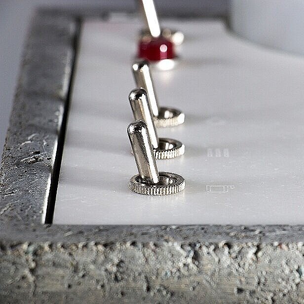
Inspiration can be found anywhere—and the designers of this new, concrete-encased expresso maker have expressed admiration for the work of Paul Rudolph. Like Rudolph’s Yale Art & Architecture building, their design uses contrasting materials & finishes—each of which helps enhance the presence of the others.

Inspiration can be found anywhere—and the designers of this new, concrete-encased expresso maker have expressed admiration for the work of Paul Rudolph. Like Rudolph’s Yale Art & Architecture building, their design uses contrasting materials & finishes—each of which helps enhance the presence of the others.

Rudolph’s Yale Art & Architecture Building is a design which can be characterized in many ways—and one of them is that the building is a celebration of concrete’s multiple potentials, both in form and texture.

Rudolph’s Yale Art & Architecture Building is a design which can be characterized in many ways—and one of them is that the building is a celebration of concrete’s multiple potentials, both in form and texture.

NEW ADVENTURES IN CONCRETE

In recent years we’ve seen an outpouring of new uses for concrete—including for functions and places where it was never expected to go: jewelry, watches, desk accessories, toys, a prototype model for an airplane—and even in candles and cologne (both of which claim to integrate the spirit of concrete into their aromas.)

Concrete jewelry, and…

Concrete jewelry, and…

a concrete watch, and…

a concrete watch, and…

toy blocks, and…

toy blocks, and…

a concrete candle!

a concrete candle!

But within Kitchens, other than for surfaces (countertops or floors), we’ve never seen concrete used in any way for food preparation. Until now—

AnZa is a small-but-enterprising, California-based company (founded by a designer.) They have an intriguing approach to the use of materials—and their unusual choices caught our eye in the form their prime product: an Espresso Maker.

Here are some photos of AnZa’s concrete incarnation of their expresso machine:

snip%25252Bof%25252Bgeneral%25252Bview%25252Bwith%25252Bflower.jpg
Concrete_corner_Hero.jpg
front%2Bview.jpg
close-up+of+top+controls.jpg

As you can see in this wonderful object, concrete has finally made it into the realm of food preparation. We are delighted that Anza has taken this unexpected plunge into bringing together what must—up-until-now—have seemed the most unlikely pairing of function and material.

AnZa’s designers—Per Selvaag and Andrew Smith—used a range of unexpected materials (for an espresso maker): concrete, Corian, porcelain, brass, and wood, and Anza’s stated aim is to “. . . .deliver a machine as functional as it is aesthetically innovative. A sculptural fixture on any countertop…”

But let Andrew Smith speak tell us a bit more. When we asked him if he was aware of Rudolph’s work, he responded:

“This is amazing! Love Paul Rudolph’s work. . . .I have been aware of Rudolph since I studied design in the early 90s. I have a bit of fascination with concrete. Sverre Fehn + Lautner + Calatrava stand out for me.”

close+up+of+cross-valve.jpg

A MATERIAL VISION

He explained their design intent for using concrete:

“We wanted to provide a more human welcoming interaction than is available with a stainless steel / metal espresso machine. We want imperfection in the surface, we want the machine to emit a gentle heat when it's working, for it to have presence and the owners to admit they made a different choice to the pragmatic default.”

They further state about their choice of materials:

“AnZa Concrete is the opposite of bent stainless steel. It’s not shiny, precise, or smooth. It’s matte, rough, organic, and heavy. The precision of the ceramic steam knob and portafilter handle complement the concrete. You won’t find your usual black plastic knobs here.”

After offering the espresso maker in two versions—concrete -or- a smooth, white Corian—he also mentioned their surprise:

Anza’s alternative design for the espresso maker: it is beautifully made in smooth Corian, but—to their surprise—it was less popular than the concrete version.

Anza’s alternative design for the espresso maker: it is beautifully made in smooth Corian, but—to their surprise—it was less popular than the concrete version.

“We made a machine out of white Corian as we thought no one would buy a concrete espresso machine. The Concrete machine has outsold the Corian machine especially in Europe, so maybe people are less pragmatic and more romantic than we thought?”

In case one is worried about this “more romantic” approach to the selection of materials—in this case, concrete—Anza gives supplementary data on its use and care. Included among the information they provide is the following point:

“The concrete shell has been treated with a sealer to protect the surface. Due to its rough and porous surface the concrete will naturally develop a patina over time which will be impossible to prevent or remove. Wiping down areas of the shell which are in contact with coffee grounds and water will reduce the build up of patina.”

Having coffee with Rudolph, or your favorite architectural aficionado? Or rather: something stronger—espresso! Then we can’t imagine a more appropriate way to obtain it than from this strikingly designed, concrete expresso maker.

atmospheric+view.jpg

IMAGE CREDITS

NOTES:

The Paul Rudolph Heritage Foundation gratefully thanks all the individuals and organizations whose images are used in this non-profit scholarly and educational project.

The credits are shown when known to us, and are to the best of our knowledge, but the origin and connected rights of many images (especially vintage photos and other vintage materials) are often difficult determine. In all cases the materials are used in-good faith, and in fair use, in our non-profit, scholarly, and educational efforts. If any use, credits, or rights need to be amended or changed, please let us know.

When/If Wikimedia Commons links are provided, they are linked to the information page for that particular image. Information about the rights for the use of each of those images, as well as technical information on the images, can be found on those individual pages.

CREDITS:

All images of the AnZa espresso machines: courtesy of AnZa; Yale Art & Architecture Building: photo by G. E. Kidder Smith, courtesy of and © the Massachusetts Institute of Technology; Images of concrete jewelry, watch, toy, and candle: see previous blog posts about alternative uses of concrete.

Paul Rudolph the Artist? -or- When is a "Rudolph" not a Rudolph?

Definitely designed by Paul Rudolph: the General Daniel “Chappie” James Center for Aerospace Science and Health Education, at Tuskegee University—a architectural project from the early 1980’s—shown here being dedicated by President Reagan.

Definitely designed by Paul Rudolph: the General Daniel “Chappie” James Center for Aerospace Science and Health Education, at Tuskegee University—a architectural project from the early 1980’s—shown here being dedicated by President Reagan.

Although it has similarities to a number of Rudolph buildings (and the architect-of-record, Desmond & Lord, was a close associate of Rudolph on several projects), our assessment is that this college library is not a Paul Rudolph design.

Although it has similarities to a number of Rudolph buildings (and the architect-of-record, Desmond & Lord, was a close associate of Rudolph on several projects), our assessment is that this college library is not a Paul Rudolph design.

IS IT A REALLY A RUDOLPH? - THE TASK OF ATTRIBUTION

From time-to-time, the Paul Rudolph Heritage Foundation is asked whether something is really a work of Paul Rudolph’s. That “something” might be from any facet of the great range of work to which Rudolph applied his creative energies: a building, a drawing, an object (i.e.: a light fixture), or—most intriguingly—an artwork.

In fact, we’ve recently been asked to comment on whether a painting is (or is not) by Rudolph. We’ll examine that possibility—but first: We’ll need to consider some of challenges of attribution, and also look at Paul Rudolph’s relationship to fine art.

There seems to be some cachet in having Rudolph’s name is attached to a house that’s for sale—and this even applies to houses that are not on-the-market, as some enthusiastic owners may want their home to be associated with the great architect. But not every such claim is true—and sometimes our assessment is that a building—to the best of our current knowledge—is not a Rudolph.

A CHALLENGING CASE

There are also cases where the relationship of Paul Rudolph to a project is not abundantly clear—and the matter needs investigation.

A drawing of a college library, done in Paul Rudolph’s perspective-section technique. Close inspection led us to assess that this is probably not actually a drawing by him—but rather: a drawing done in Rudolph’s spirit, possibly by someone that had …

A drawing of a college library, done in Paul Rudolph’s perspective-section technique. Close inspection led us to assess that this is probably not actually a drawing by him—but rather: a drawing done in Rudolph’s spirit, possibly by someone that had worked closely with him.

For example: A staff member from a college library approached us. Their building was about to celebrate a half-century “birthday”—and they’d heard that it was designed by Paul Rudolph, and they asked us about it.

So was it? Well, it wasn’t on any of our lists of Paul Rudolph projects—but those lists were, over decades, edited and re-edited numerous times by Rudolph himself—and it’s possible that a project of his might have been left off those lists for any number of reasons. Another factor we considered was that the building’s architect-of-record had done other, important projects in close association with Rudolph. Moreover, the library building did exhibit some very Rudolph-like features. Also, the perspective-section drawing of the building was done in a manner resembling Rudolph’s graphic technique. But, after carefully looking at the building and the documents available to us, and also after consulting with some of Paul Rudolph’s past staff members, we concluded that the building was: “Rudolphian—but not a Rudolph.”

MULTIPLE RUDOLPHS?

There are other factors which, when working out an attribution, can lead one astray. One of them is when another person, with the same name, is also working in the same field and during the same era.

For example: For a long while, we were wondering about a rendering of a large, wholesale market facility for NYC: the Hunts Point Market. That’s a project which Rudolph had been asked to design—and we had documentation to prove that: the archives of the Paul Rudolph Heritage Foundation has an official press release from Mayor Lindsay’s office, explicitly announcing that Rudolph had received the commission.

The only image we’d ever seen of the proposed project looked nothing like a Rudolph design, nor was it done in his rendering style. Moreover, the rendering was done in tempera-gouache—a drawing medium which Paul Rudolph reputedly detested. Yet the drawing was signed “Rudolph”! Here was an architectural mystery.

renderings+book.jpg
ABOVE: A rendering found when researching Rudolph’s Hunts Point Market project. It is signed by “Rudolph”—but is nothing like a Paul Rudolph drawing.  LEFT: A book celebrating winners of the Birch Burdette Long Memorial Prize for architectural rende…

ABOVE: A rendering found when researching Rudolph’s Hunts Point Market project. It is signed by “Rudolph”—but is nothing like a Paul Rudolph drawing. LEFT: A book celebrating winners of the Birch Burdette Long Memorial Prize for architectural rendering. The work of two different “Rudolphs”—the maker of the rendering above, and Paul Rudolph—are both in the book.

So was it? Only later did we come to understand that the Hunts Point Market rendering was by Rudolph, but a quite different one. The mysterious drawing was by George Cooper Rudolph (1912-1997)—an architect who was an almost exact contemporary of Paul Rudolph. George Cooper Rudolph’s main professional activity was as a renderer: he and his office were primarily engaged in making perspectives of proposed buildings for other architects and designers. He provided views for a large number of projects—and his prime medium was tempera-gouache, which was very popular at that time for such presentation drawings (although he did other things too.)

There’s another connection (beside the Hunts Point Market project) between the two Rudolphs. The Birch Burdette Long Memorial Prize was awarded annually for excellence in architectural rendering, and a book was published in 1966 showing drawings by 22 prominent winners. This work shown was by some of the best draftsmen/renderers of the 20th century. Here the two Rudolphs came together: included was a selection of work by George Cooper Rudolph—and on the book’s cover showed Paul Rudolph’s proposed design for the tower of the Boston Government Service Center [but, ironically, it was rendered someone else: Helmut Jacoby—yet another prize winner]

WHAT ABOUT FINE ART?

In the last few years, we’ve encountered several paintings which were attributed to Paul Rudolph. We believe these claims are made with total sincerity, and that the galleries offering these works have had some reason to assert that these are by the famous architect..

We’ll look at the three examples which we’ve come across—but before we do, we have to ask:

WAS RUDOLPH EVER KNOWN TO MAKE ART?

We come across little evidence that, as an adult, Paul Rudolph engaged in the making of fine art—and in the rare cases that he did so, it was only in connection with an architectural commission. It’s true that he appears, in his youth, to have loved to make art—and the archives of the Paul Rudolph Heritage Foundation has a vintage newspaper clipping showing a young Rudolph with a figurative sculpture that he’d made (for which he had won an award.) A memoir by his mother (also in our archives, and which you can read here) further testifies that he loved to make art when young. Doubtless, his higher education—including at architecture school—included one-or-more fine arts courses.

PAUL RUDOLPH BROUGHT ART INTO HIS BUILDINGS

An interior, circa 1963, within the recently completed Yale Art & Architecture Building—showing a large wall mural which Rudolph included in the building.

An interior, circa 1963, within the recently completed Yale Art & Architecture Building—showing a large wall mural which Rudolph included in the building.

You can find Rudolph, several times, inserting art into his architectural renderings, showing where artworks might be located as part of a project’s overall design.

Not all such proposals were fulfilled, but some of his buildings did have art prominently incorporated into the architecture—like the two large murals by Constantino Nivola in his Boston Government Service Center. Artworks were also part of his interior design for his Yale Art & Architecture Building (wherein contemporary and ancient art were placed throughout the building) and in Endo Laboratories. Moreover, to the extent he could afford to do so, Rudolph included artwork in his own residences.

One further bit of data we’ve come across: there’s an interview with Rudolph—well into his career—during which he’s asked if he’d like to do fine art. He answers: Yes, he might like to do so—but doesn’t have the time.

RUDOLPH’S FIGURATIVE ART

The only times (post-youth) that we’ve found Rudolph making fine art are in two professional projects: one at the very start of his career, and the other during the decade of his greatest creative output:

ABOVE: Paul Rudolph’s Atkinson Residence, in which Rudolph’s mural was above the fireplace.   BELOW: A longitudinal-section construction drawing of his Hirsch Townhouse. That house’s mural, also by Rudolph, was located in the large, open atrium spac…

ABOVE: Paul Rudolph’s Atkinson Residence, in which Rudolph’s mural was above the fireplace. BELOW: A longitudinal-section construction drawing of his Hirsch Townhouse. That house’s mural, also by Rudolph, was located in the large, open atrium space, shown in the left half of the drawing.

Halston+longitudinal+section.jpg
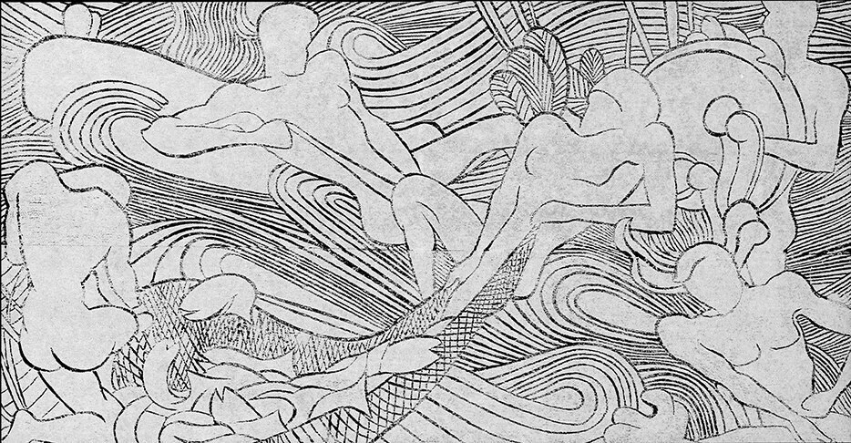
  • Rudolph’s very first professional project was the Atkinson Residence of 1940, built in Auburn, Alabama when he was 22 years old. The living room features a 6' high x 10' wide ornamental mural above the fireplace—most likely a consequence of Rudolph attending a required class on 'Mural Design' while in school. The mural’s linework is composed of V-shaped grooves, cut directly into the plaster.

  • The next time (and the last time that we know of) when we see Rudolph-as-artist is at least a quarter-century later: in his 1966 design for the Hirsch Townhouse in Manhattan (the residence that was later to become famous as the home of fashion designer Halston.) Rudolph covered a prominent wall in the living room with a large mural—about four times the area of the one done in Alabama—but also done in with the same technique: making lines by the cutting of grooves.

What the two artworks share in-common are:

  • both artworks are figurative,

  • viewers can readily discern several people and objects

  • they both have a dream-like (or story-book) quality

  • both have highly stylized imagery

The mural from Rudolph’s 1940 Atkinson Residence, in Auburn, AL, located above the Living Room’s fireplace.

The mural from Rudolph’s 1940 Atkinson Residence, in Auburn, AL, located above the Living Room’s fireplace.

The mural from Rudolph’s 1966 Hirsch Townhouse. Its scale can be judged by seeing the client standing in-front.

The mural from Rudolph’s 1966 Hirsch Townhouse. Its scale can be judged by seeing the client standing in-front.

HIS PROFESSIONAL ARTISTRY

Rudolph+book+cover.jpg

Paul Rudolph did engage in 2-dimensional artwork—but of an applied, professional nature.

We’re referring to his famous perspective renderings (especially section-perspectives). An entire book was devoted to these drawings (see cover at right)—with his section-perspective drawing of the Burroughs Wellcome building being given the front cover.

In Paul Rudolph’s renderings after he left Florida, he generally eschewed the use of continuous tone (a position consistent with his dislike for gouache renderings.) His fine control of linework (often linear, but sometimes flowing) was what Rudolph utilized when he needed to generate tonality—and he achieved that through hatching and line density, to arrive at the effects he desired.

Interestingly, Rudolph’s line-oriented techniques, which he used for his architectural renderings, are not-so-different from the techniques utilized in his two murals.

PAUL RUDOLPH AND TOPOLOGY-AS-ART

The relationship of a topo map’s curved lines (bottom) with the layers of a 3D model version (top.)

The relationship of a topo map’s curved lines (bottom) with the layers of a 3D model version (top.)

A portion of the Stafford Harbor model. The model’s topo layers, reflecting the hilly nature of the inland part of the development’s site, are most evident in the upper-right area of this photograph.

A portion of the Stafford Harbor model. The model’s topo layers, reflecting the hilly nature of the inland part of the development’s site, are most evident in the upper-right area of this photograph.

Before a more direct consideration of Paul Rudolph’s engagement with fine art, it’s worth noting the formal affinity between the sinuous sets of closely-spaced lines (that one finds in Rudolph’s two murals,) and the lines produced when making topo maps and topo models. Using a topo system, in drawings and models, was a standard practice in architectural offices—including Rudolph’s.

Most sites are not flat—so architects study such sites with “topo maps.” These maps have numerous lines, whose closeness-or-distance to each other graphically convey an area’s steepness-or-flatness. When this gets translated into 3-dimensions—to create a “topo model”—the model is made of a series of layers (of boards), the edges of which follow the curves of the map.

Rudolph’s office produced numerous models of his proposed designs—and when a site was hilly, the buildings were set upon such “topo model” bases. The flowing lines of these models (the result of showing the contours of the land in this way) was visually pleasing to Rudolph—so much so, that Rudolph “decorated” his work spaces with those models.

A prominent example of the use of the topo technique is his large model for Stafford Harbor, a project of the mid-1960’s. The Virginia project comprised a master plan, and the design for townhouses, apartment houses, a hotel, boatel, as well as commercial spaces. It embraced the site’s topography—and one can see in the model which Rudolph’s office produced for the project that each layer conveys a change in height.

The full model was gigantic—and Rudolph suspended it, vertically, in the entrance to his architectural office. He used the model’s aesthetic appeal (and surprising orientation) to create a wall-sized, art-like “hanging” that brought additional drama to his office’s multi-storey space.

Moreover, when Rudolph was Chair of the School of Architecture at Yale (in the Yale Art & Architecture Building that he designed, now rededicated as Rudolph Hall), he situated a topo-like mural by Sewell Sillman in the atrium of the main drafting space—both as inspiration and for its aesthetic appeal.

A topo-like mural by Sewell Sillman, placed above the main drafting room/atrium, in Paul Rudolph’s Yale Art & Architecture Building (now rededicated as Rudolph Hall.)

A topo-like mural by Sewell Sillman, placed above the main drafting room/atrium, in Paul Rudolph’s Yale Art & Architecture Building (now rededicated as Rudolph Hall.)

Rudolph “decorated” his work spaces with topo models—like this one of Stafford Harbor—placed dramatically at the entry of his Manhattan architectural office.

Rudolph “decorated” his work spaces with topo models—like this one of Stafford Harbor—placed dramatically at the entry of his Manhattan architectural office.

PAINTINGS BY RUDOLPH?

We’ve come across several works that have been attributed to Rudolph. Each have an aesthetic appeal—but are they really by Paul Rudolph-the-architect?

Third%252Brudolph%252Bartwork.jpg

EXAMPLE ONE:

The painting at right has been claimed to be by Rudolph. The back is has two labels giving the attribution, and the front has a signature.

While we cannot discount all possibilities, we’d say this painting’s compositional strategy is one characterized by the fracturing of the image—an aesthetic that Paul Rudolph does not usually follow. Rocco Leonardis (an architect and artist who had worked for Rudolph) says “Architects make Wholes”—and that well characterizes Rudolph’s work. In contradistinction, this painting’s collage-like conception is closer to the approach taken by Robert Delaunay in his famous depiction the Eiffel Tower (see below-left): a breaking-up of the object.

Paul Rudolph, in his perspective renderings, was noted for his linework—and the painting certainly relies on a multitude of lines to convey the subject. But whereas one senses that Rudolph’s lines are well-controlled—in the service of creating precise images of a projected architectural design—the lines in the painting are explosively staccato.

The painting’s “line quality” has more of an affinity with the work of Bernard Buffet, whose drawing-like paintings (and even his signature) are filled with a shrapnel-like energy (see below-center).

Combining the painting’s fragmented forms and line quality, we can see them used simultaneously in a canonical work of 20th century Modernism: Lyonel Feininger’s 1919 cover design for the manifesto of the Bauhaus (see below-right.)

Of course we’re not suggesting that any of those artists had a hand in the making of the painting (except, possibly, as inspirations)—but only point out that their artwork is closer to the painting than any of Paul Rudolph’s work.

A painting by Robert Delaunay

A painting by Robert Delaunay

A painting by Bernard Buffet

A painting by Bernard Buffet

A print by Lyonel Feninger.

A print by Lyonel Feninger.

Signatures on an artwork count for a great deal, and here we can see a close-up of the one on the painting:

Third%2Brudolph%2Bartwork%2Bsignature.jpg
Paul Rudolph’s actual signature.

Paul Rudolph’s actual signature.

In the course of our work at the Paul Rudolph Heritage Foundation, we’ve seen Paul Rudolph’s signature hundreds of times—and at right is a representative example.

As with any signature, one can find a bit of variation in Rudolph’s signatures—but our observation is that his signature is fairly consistent over his lifetime—and it does not seem to resemble the one in the painting. There’s also a label attached to the back, with a note on it, and it appears to be in another language (German). The name “Paul Rudolph” appears within the handwritten note—but it too does not match Rudolph’s signature.

Based on the discrepancies between the painting and Paul Rudolph’s work and signature, we do not believe the painting is by Paul Rudolph (at least not our Paul Rudolph)—but we are open to a reassessment if additional information is discovered.

EXAMPLES TWO AND THREE:

If you do a Google search for “ ‘Paul Rudolph’ painting ” only a couple of other artworks show up—and below is a screen grab of the results:

A screen capture of a portion of a page from Google Images, showing results when the search request is set for “ ‘Paul Rudolph’ painting”

A screen capture of a portion of a page from Google Images, showing results when the search request is set for “ ‘Paul Rudolph’ painting”

Both are attractive works, and each is done in oil (the left is oil-on-canvas, and the right is oil-on-paper)—and both were attributed to Paul Rudolph. They were offered or sold through galleries/auction houses who are distinguished for the quality of the artworks they offer and the depth of their knowledge. So, as with the painting in Example One, we conclude that such attributions were made in good faith, and to the best of the seller’s knowledge.

So might these be by Paul Rudolph?

We have a date for the right-hand one: 1958. The 1950’s was the era in Rudolph’s work when he began to move from Bauhaus orthogonal rectilinearly (as exemplified by the Walker Guest House, 1951-1952) towards a more muscular (and even sculptural) manifestation of that aesthetic (the most powerful example is his Yale Art & Architecture Building, 1958) and he was also beginning to incorporate dramatic curvilinear forms (as in his Garage Manager’s Office project, 1961). These Rudolph works don’t have a formal vocabulary which resonates with those paintings.

FINE ART OF THAT ERA: THE DOMINANT MODE

ABOVE: Harry Bertoia’s altar screen within the MIT Chapel;  BELOW: Jackson Pollock’s painting.

ABOVE: Harry Bertoia’s altar screen within the MIT Chapel; BELOW: Jackson Pollock’s painting.

Blue_Poles_%28Jackson_Pollock_painting%29.jpg

But, no matter how much Rudolph explored architectural forms, it must be acknowledged that he was still a child of the Modernist era—and that included being educated by the founding director of the Bauhaus itself—Walter Gropius.

When the paintings attributed to Rudolph were being made, abstraction and abstract expressionism were the popular style among painters and sculptors.

Two artists who manifested the sprit of that period were the sculptor Harry Bertoia (1915-1978) and the painter Jackson Pollock (1912-1956)—both born within about a half-decade of Paul Rudolph, and coming to prominence about the same time.

Consider two works by those artists: Bertoia’s altarpiece screen (reredos) for the MIT Chapel (the building was completed in 1956, and its architect was Eero Saarinen), and a 16 foot wide painting by Pollock from 1952.

Those two works share several characteristics—ones seen with some frequency in the artwork of the era:

  • energy/movement

  • fragmentation

  • linearity—but often without alignment

  • a discernable design—but one that embraces a mixture of chaos and order

  • generally they are non-non-figurative—or, if the figure (a building or body) is included, the imagery is pushed towards abstraction

  • a restricted palette (or limited range of tones/finishes/materials)

All of these are also shared by the paintings attributed to Paul Rudolph. You could say that those two works are consistent with the fine-arts style of the era in which they were created. In other words: they truly “make sense” for their time. But they don’t match Paul Rudolph’s form-vocabulary of that era.

THE QUESTION REMAINS: ARE THEY RUDOLPHS?

We can’t rule out that Paul Rudolph, some time mid-century, may have briefly tried his hand at painting. But, given all we know—

  • his practice was feverishly busy at the time

  • his work, at this time, does not have any formal resemblances to the artworks

  • linework—a significant part of all the artworks—is unlike the the type of linework which Rudolph used extensively in his work

  • he was simultaneously leading a major educational institution (as Chair of Yale’s School of Architecture from 1958 -to-1963), as well as engaged in the titanic work of designing its famous school building

  • his two known artworks (the murals) are figurative, and of an utterly different character

  • the signature we’ve seen (on the first painting shown above) doesn’t match the many signatures on Rudolph documents in our archive

  • no other Rudolph artworks of a similar style have come to light

So the “balance of probabilities” leads us to conclude that those paintings may be by a Paul Rudolph, but not likely by the architect Paul Rudolph.

BUT PAUL RUDOLPH DOES INSPIRES ARTISTS…

Rudolph himself might never have made two-dimensional artworks on paper or canvas—but he may have inspired the artwork of others, and below are two examples where that seems to be the case.

EMILY ARNOUX

Emilie+Arnaux+images+on+Fremin+page.jpg

Emily Arnoux is an artist from Normandy, and she has exhibited with the Fremin Gallery in New York City. Her recent show there featured vividly colored images of pool-side scenes, and her gallery says of her:

“From a young age, she became fascinated by the ocean and the laid back lifestyle surf-culture engenders. Her work captures the divine energy and the jubilation experienced when diving into cool water. . . . Arnoux’s [work feels]. . . .at once contemporary and modern, recalling beach-side postcards of the 1950s & 60s.”

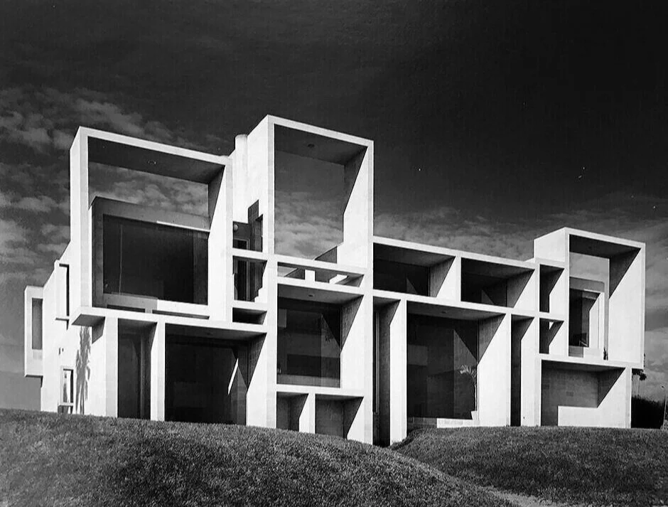
What intrigued us is some of the architecture which is included in her works, and one of her wonderful paintings in particular—“Cubes Game”—seems quite resonant with Paul Rudolph’s Milam Residence of 1959, in Ponte Vedra Beach, Florida. Above is a mosaic of images from Ms. Arnoux’s paintings—and, below, you can see her “Cubes Game” side-by-side with Rudolph’s Milam Residence.

Paul Rudolph’s celebrated Milam Residence in Florida

Paul Rudolph’s celebrated Milam Residence in Florida

Emily Arnoux’s superb painting, “Cubes Game”

Emily Arnoux’s superb painting, “Cubes Game

Emily Arnoux’s paintings are full of life and color—and if Rudolph’s work was of any inspiration to her, we are delighted.

SARAH MORRIS

Sarah Morris is a New York based artist whose works are in major museums throughout the world. Her paintings embrace color and geometry. Occasionally they utilize forms from typography, but most often they are abstract, relying on composed linear and circular elements and areas of color.

Morris’ 2018 exhibit at the Berggruen Gallery in San Francisco showed then-recent drawings and paintings (as well as a film by her.) Her gallery said of Morris (and of that exhibit) that she is:

“. . . .widely recognized for her large-scale, graphic paintings and drawings that respond to the social, political, and economic force of the urban landscape through a visual language grounded in bold and ambitious abstraction. Her probing of the contemporary city inspires a consideration of the architectural and artistic climate of modernity and humanity’s footprint—a subject that Morris energizes and invigorates through a distinct use of geometry, scale, and color. . . .Asymmetrical grids form futuristic compositions of sharply delineated shapes separated by rigid borders and acute transitions between colors.  The grid-like quality of her work evokes city plans, architectural structures (including a staircase designed by Paul Rudolph), tectonic plates, or industrial machinery. . . .”

That text referred to a work by Sarah Morris titled “Paul Rudolph”. The painting’s medium is household gloss paint-on-canvas, and it is 84-1/4” square, and was created in 2017. In this work, too, we see Rudolph inspiring an artist’s creativity.

Sarah Morris’ fascinating painting from 2017, “Paul Rudolph”

Sarah Morris’ fascinating painting from 2017, “Paul Rudolph

RUDOLPH AND ART

Paul Rudolph engaged with art in various ways—his medium is architecture—but, to the best of our knowledge, we believe that the paintings that have been attributed to him are not by Paul Rudolph-the-architect.

But we are happy to see Paul Rudolph inspire others working in the fine arts!


IMAGE CREDITS

NOTES:

The Paul Rudolph Heritage Foundation (a non-profit 501(c)3 organization) gratefully thanks all the individuals and organizations whose images are used in this non-profit scholarly and educational project.

The credits are shown when known to us, and are to the best of our knowledge, but the origin and connected rights of many images (especially vintage photos and other vintage materials) are often difficult determine. In all cases the materials are used in-good faith, and in fair use, in our non-profit scholarly and educational efforts. If any use, credits, or rights need to be amended or changed, please let us know.

When Wikimedia Commons links are provided, they are linked to the information page for that particular image. Information about the rights to use each of those images, as well as technical information on the images, can be found on those individual pages.

CREDITS, FROM TOP-TO-BOTTOM, AND LEFT-TO-RIGHT:

Tuskegee dedication by President Reagan: source unknown;  Library building, for which Desmond & Lord was the architect: photo by Daderot, via Wikimedia Commons;  Section-perspective drawing: screen grab from Framingham State University web page;  Architectural Renderings book: a copy is in the collection of the Paul Rudolph Heritage Foundation;  Rendering of Hunts Point Market: Library of Congress Prints and Photographs Division;  Interior with mural of the Yale Art & Architecture Building: photo by Julius Shulman, © J. Paul Getty Trust. Getty Research Institute, Los Angeles;  Atkinson Residence: photograph by Andrew Berman, from the archives of the Paul Rudolph Heritage Foundation;  Hirsch Townhouse longitudinal construction section drawing: © The Estate of Paul Rudolph, The Paul Rudolph Heritage Foundation;  Atkinson Residence mural: © The Estate of Paul Rudolph, The Paul Rudolph Heritage Foundation;  Hirsch Townhouse mural: © The Estate of Paul Rudolph, The Paul Rudolph Heritage Foundation;  Paul Rudolph drawing book: a copy is in the collection of the Paul Rudolph Heritage Foundation;  Topo map diagram: Romary, via Wikimedia Commons;  Stafford Harbor model: photographer unknown;  Main drafting room of the Yale Art & Architecture Building, 1963: photo by Julius Shulman, © J. Paul Getty Trust. Getty Research Institute, Los Angeles;  Paul Rudolph’s architectural office’s entry area: © The Estate of Paul Rudolph, The Paul Rudolph Heritage Foundation;  Tall painting attributed to Rudolph: supplied to us by owner;  Robert Delaunay painting: via Wikimedia Commons;  Bernard Buffet painting:  AguttesNeuilly, via Wikimedia Commons;  Lyonel Feninger print: Cathedral (Kathedrale) for Program of the State Bauhaus in Weimar (Programm des Staatlichen Bauhauses in Weimar)1919;  Close-up of painting with signature: supplied to us by owner;  Paul Rudolph signature: from the archives of the Paul Rudolph Heritage Foundation;  Paintings attributed to Paul Rudolph: screen grabs from Google Images;  Walker Guest House: photo by Michael Berio. © 2015 Real Tours. Used with permission;  Yale Art & Architecture Building: photo by Julius Shulman, © J. Paul Getty Trust. Getty Research Institute, Los Angeles;  Garage Manager’s Office: © The Estate of Paul Rudolph, The Paul Rudolph Heritage Foundation;  Bertoia altar screen within MIT chapel: Daderot, via Wikimedia Commons;  Pollock painting: via Wikimedia Commons;  Mosaic of Emily Arnoux paintings: screen grab from Fremin Gallery web page devoted to the artist;  Milam Residence: Joseph W. Molitor architectural photographs collection. Located in Columbia University, Avery Architectural & Fine Arts Library, Department of Drawings & Archives;  Arnoux painting, “Cubes Game”: from Emily Arnoux web page;  Sarah Morris painting, “Paul Rudolph”, screen grab from Berggruen Gallery web page devoted to Sarah Morris’ 2018 exhibition.

What's “REAL”? (and What’s RIGHT) In Preservation: Restoration? Recreation? Reproduction? Renovation? Rehabilitation. . ?

Mies van der Rohe’s Barcelona Pavilion—one of THE key icons and exemplars of Modern Architecture—was built for a 1929 international exposition in Spain. It lasted only briefly, and—for decades thereafter—it was only known via its floor famous plan, …

Mies van der Rohe’s Barcelona Pavilion—one of THE key icons and exemplars of Modern Architecture—was built for a 1929 international exposition in Spain. It lasted only briefly, and—for decades thereafter—it was only known via its floor famous plan, a detail drawing of a column, and a handful of photographs (of which this view is the one most repeatedly reproduced.)

Mies died in 1969, and—nearly two decades after he had passed—a reconstruction of the Barcelona Pavilion was completed on the same site as the original. It has provided interesting experiences for architects (who never had a chance to visit the shor…

Mies died in 1969, and—nearly two decades after he had passed—a reconstruction of the Barcelona Pavilion was completed on the same site as the original. It has provided interesting experiences for architects (who never had a chance to visit the short-lived original)—but whether it should ever have been re-built remains a question within the architectural community.

"Never demolish, never remove or replace, always add, transform, and reuse!"

"Demolishing is a decision of easiness and short term. It is a waste of many things—a waste of energy, a waste of material, and a waste of history. Moreover, it has a very negative social impact. For us, it is an act of violence."

— Anne Lacaton and Jean-Philippe Vassal, winners of the 2021 Pritzker Prize in Architecture

A CASE THAT RAISES QUESTIONS

The Barcelona Pavilion, designed by Mies van der Rohe, was built for an exposition in 1929—a “world’s fair” wherein 20 countries participated, and in which there were also exhibits on industry, science, art, history, crafts, science, and agriculture. The fair lasted for less than a year, and the structure which represented Germany—the Barcelona Pavilion—was demolished along with the rest of the fair’s buildings (as is usually done with such fairs).

The Barcelona Pavilion’s “cruciform column”: this plan-detail of it was one of the few original Mies drawings available—and has been the focus of attention for nearly a century.

The Barcelona Pavilion’s “cruciform column”: this plan-detail of it was one of the few original Mies drawings available—and has been the focus of attention for nearly a century.

After Paul Rudolph visited the Barcelona Pavilion, he made a series of fascinating analytical drawings—one of which is shown above—and all of which you can see here (where you can also read Rudolph’s thoughts about his moving experience of the build…

After Paul Rudolph visited the Barcelona Pavilion, he made a series of fascinating analytical drawings—one of which is shown above—and all of which you can see here (where you can also read Rudolph’s thoughts about his moving experience of the building.)

Mies’ design became famous: an “icon”—an ontological distillation of a key thrust of architectural Modernism. Mies’ building lasted for only about 8 months, yet it continues to penetrate and have hegemony over architectural imaginations to this day. It did that via a handful of photographs and a couple of drawings—and it’s a testament to the power of the Mies’ concept that the Barcelona Pavilion has remained relevant for nearly a century, even on such thin evidence.

Later in Mies’ life, he was asked about rebuilding the Barcelona Pavilion, and he’s reported to have thought that it wasn’t a bad idea, and—-as the original construction drawings had been lost—he mentioned that his office could cooperate by making drawings for it. But, during Mies life (1886-1969), nothing came of the project.

In the mid-1980’s that changed: between 1983 and 1986 the building had been permanently rebuilt—and on the same site it had originally stood.

Very few of the people who’d be the most interested in the building—the architectural community—had a chance to visit the Barcelona Pavilion when it was briefly extant (and obviously none after its destruction). So the rebuilding has been celebrated, as it has allowed one to finally experience, in person, what they’d read about, studied, obsessed over, and dreamt of. [Paul Rudolph made a visit, which he found highly moving—and which you can read all about, here.]

Even though the reappearance, “in the flesh”, of the Barcelona Pavilion has benefits, its rebuilding has also been not without controversy—and it has brought forth serious questions:

  1. Could a truly accurate rebuilding be done without the original architect’s direct involvement? [Which was clearly not possible in this case, as Mies had passed years before the rebuilding project even started.]

  2. Even if Mies had been involved, would he have made changes in the a rebuilt design?—and how would that affect its authenticity. [Paul Rudolph observed that many things he saw at the site were not architecturally “resolved”—and that, Rudolph thought, was part of its magic. That imperfection may be “par for the course” with a rapidly planned and constructed, temporary exposition building—-but the temptation to “fix” such things, later, might have been too much for anyone (especially Mies) to resist.]

  3. An important part of the experience of the Barcelona Pavilion was the effect caused by the materials used: slabs of natural stone—including some personally selected by Mies. These had been destroyed or dispersed, when the building was demolished in 1930. [How could one know that the newly chosen materials truly matched the originals in tone, grain, color, and texture?]

  4. How much documentation was actually available, in order to do an accurate rebuilding? [In this case, while valiant attempts were made to sift for all documents and archeological evidence, there was still a significant gap between whatever original information was found, and what had to be extrapolated.]

  5. Are there things that are better left in the realm of the imagination, and which should not be materialized (even when we have the power to do so)? [Philip Johnson—THE long-time associate, expert, and evangelist for Mies—said of the rebuilding project: “The problem before us is should a dream be realized or not? We have made such a myth of that building. Shouldn’t it be left in the sacred vault of the memory bank?”]

These questions remain—-and they are pertinent today, as we are, more-and-more, presented with new building projects which, allegedly, intend to rebuild, recreate, reproduce, or restore something that has been lost.

One problem is that the the thinking and language around these questions has become elastic, slippery, and with elusive meaning or intent. There is a lack of rigor in preservation—-not in the professional field, per se (about which we have immense admiration—-more about that below), but in the way that claims of preservation have been made which seem questionable. Making the situation even more difficult is that all this exists in a troublesome (and troubling) larger cultural context…

A REALITY / TRUST DEFICIT

A chart from the Pew Research Center’s study of Public Trust in Government: 1958-2019 The overall downward trend, from 1964 to the present, is evident. [Note that the largest and steepest drop was in the wake of the mid-1970’s Watergate scandal.] Wh…

A chart from the Pew Research Center’s study of Public Trust in Government: 1958-2019 The overall downward trend, from 1964 to the present, is evident. [Note that the largest and steepest drop was in the wake of the mid-1970’s Watergate scandal.] Whether such mistrust is deserved (and how one might ever determine such a titanic question) is another issue—nevertheless, the general direction of public sentiment is quite clear.

At the end of the 20th century, a symposium was held in New York on the topic of “Authenticity”. Topics ranged from the ubiquity (and intense popularity) of un-authorized “knock-off” copies of fashion items (like Gucci handbags) -to- the legitimacy of sampling in music; and—perhaps to spur new thinking about the question of “realness”—the event’s organizers had arranged for a drag queen to be the day’s host. It’s no secret that what can (and cannot) be trusted to be real, to be authentic, seems to be increasingly fluid — i.e.: the ongoing excitement about developments products for virtual reality (and their increasing consumer availability); that polls show trust in government has been on a nearly 60-year downward trend; our present (and elongating) moment when business, schooling, and socializing is done via screens; and everybody seems to have their own (and mutually exclusive) set of “facts.”

In the context of this, is it any wonder that we’re sensitive to such questions as:

  • What’s real ?

  • What’s authentic ?

  • What’s “Original” (and what’s “Original Intent”) ?

  • What has integrity ?

And these questions of integrity, of what is original, of what is authentic—the kind of truthfulness that might be found in architecture —comes up starkly in the domain of architectural preservation.

Ayn Rand’s architect hero, Howard Roark (at right) at a moment-of-truth: considering whether to compromise on the integrity of his design.

Ayn Rand’s architect hero, Howard Roark (at right) at a moment-of-truth: considering whether to compromise on the integrity of his design.

INTEGRITY aND ARCHITECTURE

Perhaps you’ve come across a building (or part of a building) which has been newly constructed—and the sponsors claim that their project is historically renovated, or that it is an authentic recreation, or that it is true to the spirit of the original architect, or that it is rehabilitated to match the original construction (or they characterize the work with similar such language.)

Do such claims have a solid basis? Or are they part of the “Creeping Surrealism” noted earlier?

Clearly, there shouldn’t be blanket verdicts on this (and one must judge on a case-by-case basis) — But, these days, one could hardly be overcautious when considering such claims, for, as Ayn Rand put it so starkly:

“A building has integrity, just as a man and just as seldom."

And that integrity (or lack thereof) can apply to preservation projects—ones which claim to be done with care, and rigor. But there’s also good news: there is a body-of-knowledge—and a profession to apply it—where such rigor can be found.

PRESERVATION—a pROFESSIONAL APPROACH

Fortunately, there is a well-developed discipline of Preservation—by which we mean the field that is historically and scientifically rigorous, professionally ethical, and which has a well-developed set of supporting institutions. activities, and tools. Some of those include:

  • standards-setting organizations

  • schools

  • certifications

  • professional groups, conferences, and ways of identifying and honoring distinguished work in the field

  • journals

  • publications

  • databases

  • government and public engagement

For example: One can see the wealth of preservation knowledge that’s been developed by looking at its publications. We asked Barbara A. Campagna, FAIA, LEED AP BD+C—a leading professional in this field, with in-depth experience in preservation—about this. We asked for the names of some of the key journals of the field—ones in which the profession of preservation shares its growing body of information and practical wisdom—and she mentioned: the Association for Preservation Technology’s APT Bulletin, the Journal of the Society of Architectural Historians, and DOCOMOMO International’s DOCOMOMO Journal—all of which are peer reviewed.

APT%252Bcover.jpg
sah%2Bcover%2Bfor%2Buse.jpg
mies%2Bjournal.jpg

PRESERVATION LANGUAGE FOR CLEAR THINKING

The profession has as worked-out an extensive vocabulary—terms which can help bring clarity to any proposed project.

For example: The National Parks Service refers to “Four Approaches to the Treatment of Historic Properties”—and offers a concise glossary of the key terms:

  • Preservation focuses on the maintenance and repair of existing historic materials and retention of a property's form as it has evolved over time.

  • Rehabilitation acknowledges the need to alter or add to a historic property to meet continuing or changing uses while retaining the property's historic character.

  • Restoration depicts a property at a particular period of time in its history, while removing evidence of other periods.

  • Reconstruction re-creates vanished or non-surviving portions of a property for interpretive purposes.

Each of the highlighted words above has their own separate set of standards (and clicking on them will bring you to the the relevant pages where that’s gone into.) The National Parks Service also offers training and an extensive set of publications which cover many areas, including general preservation strategy as well as in-depth technical information—and you can access them here.

But they is just one of numerous preservation organizations (both national and local) which also offer advice, data, and a great range of assistance—the National Trust for Historic Preservation being another major resource.

CASE STUDIES sHOWING A POSITIVE DIRECTION

There are several projects, within Rudolph’s oeuvre, where renovation was done with responsibility and care. Notable is that these were done well after Rudolph’s passing—so they show that it is possible to do such work (including bringing a building up to later standards) well, and still be loyal to the original architect’s vision.

HEALY GUEST HOUSE (THE “COOCOON” HOUSE)

The Healy Guest House (1950) in Sarasota, Florida, is a waterside vacation residence designed near the beginning of Paul Rudolph’s career. Known for its catenary roof, inventive structure, and fresh form, the design—combined with Rudolph’s virtuoso drawing technique—was to help initiate Rudolph’s fame as one of America’s most creative young architects. Much published and studied over the decades, the City of Sarasota has added it to its list of Locally Historically Designated Properties in 1985.

In 2018, the house was leased to the Sarasota Architecture Foundation. They did a number of important renovation projects at the house, and—according to David Zaccardelli, the SAF board member overseeing the process—they “. . . .replaced the front door; restored the louvers, stripping them to natural grain wood; painted the exterior; and restored the front and rear porch, including the originally designed metal bench on the porch overlooking Bayou Louise. We also repaired the driveway and walkway pavers and installed new screens.” Following the renovations, the SAF contracted a local interior designer to furnish the residence in period-appropriate 1950’s-style furniture—and then reopened it for public tours.

Paul Rudolph’s perspective rendering of the Healy Guest House—which shows its iconic catenary curve roof.

Paul Rudolph’s perspective rendering of the Healy Guest House—which shows its iconic catenary curve roof.

The guest house, a Florida vacation structure built for the Healy family, sits along the water in Sarasota.

The guest house, a Florida vacation structure built for the Healy family, sits along the water in Sarasota.

JEWETT ARTS CENTER AT WELLESLEY COLLEGE

The Mary Cooper Jewett Arts Center (1955-1958) was a breakthrough for Rudolph: it was his first major non-residential project to get built (and indeed, his latter career would include numerous buildings for education.). A complex program had to be accommodated—but, just as important: Rudolph sought to design a Modern building that would be sympathetic with the Wellesley’s existing vintage buildings. Those had been done in a “Collegiate Gothic” mode—a traditional style which had been popular approach for the design of campuses. Rudolph had no interest in reproducing the exact forms and details of the older buildings, but he did seek to resonate with them—and so he used shapes, proportions, glazing, and structure in ways that would fit well into the existing campus.

After about a half-century of use, the building needed a variety of repairs, and the college commissioned a comprehensive study of its condition. Significant work was judged to be needed for the windows: Rudolph had framed the glazing in wood, and by the mid 2010’s the window assemblies were in need of replacement. Several options were considered, but the best one—rebuilding the windows to match Rudolph’s design, but using a hardier wood, and carefully integrating double-glazing—was seen to be too expensive for the available budget. In 2019, the Paul Rudolph Heritage Foundation participated in discussions about the renovation plans, and encouraged the preservation team to hold to Rudolph’s vision—and suggested a funding and scheduling approach that would allow the university to do the renovations correctly (and be able to afford to do so.)

Paul Rudolph’s Jewett Arts Center, at Wellesley College. To resonate with campus’ other buildings (which had been designed in the Collegiate Gothic style), the new building was detailed to include coupled columns, pointed skylights, modulated metal …

Paul Rudolph’s Jewett Arts Center, at Wellesley College. To resonate with campus’ other buildings (which had been designed in the Collegiate Gothic style), the new building was detailed to include coupled columns, pointed skylights, modulated metal screening, and a carefully articulated wood-framed window system.

One of Paul Rudolph’s details of the building’s exterior. This is a plan-detail, showing a concrete column (In a 4-lobed shape, which evokes the  campus’ vintage Gothic-style building details), and a corner of the wood-framed glazing system. When co…

One of Paul Rudolph’s details of the building’s exterior. This is a plan-detail, showing a concrete column (In a 4-lobed shape, which evokes the campus’ vintage Gothic-style building details), and a corner of the wood-framed glazing system. When constructed, the building was single-glazed (which was standard for the time).

YALE ART & ARCHITECTURE BUILDING

Paul Rudolph’s most famous work, the Yale Art & Architecture Building (1958-1964, rededicated as “Rudolph Hall” in 2008) had—after a major fire, years of patchy repairs and partial/unsympathetic renovations, and four decades of hard use by students—fallen into sorry shape. Yale even considered demolishing it, but a variety of causes (including significant support from Sid. R. Bass) brought forth a respectful and comprehensive renovation. The work included a focus on major systems (HVAC, lighting) and materials (particularly the condition of the exterior concrete and the glazing): they were upgraded, brought up to code, fixed, and—most important as the guiding principle—done in a way that maintained the forms and spirit of Rudolph’s vision for the school.

Although Paul Rudolph is famous for his perspective drawings, he also sometimes chose other graphic forms—like axonometric or isometric projections (the latter of which is used here, in his drawing of the Yale building.)

Although Paul Rudolph is famous for his perspective drawings, he also sometimes chose other graphic forms—like axonometric or isometric projections (the latter of which is used here, in his drawing of the Yale building.)

Windows—their form, details, and framing—are a part of every architects palette—and Paul Rudolph varied how they were handed in his design at Yale. Here they’re shown the process of replacement during the renovation.

Windows—their form, details, and framing—are a part of every architects palette—and Paul Rudolph varied how they were handed in his design at Yale. Here they’re shown the process of replacement during the renovation.

PRESERVATION: THE ONGOING CHALLENGE

Sometimes preservation is straightforward—but more often there are difficulties—technical, budgetary, and philosophical. The ancient Greek riddle of the Ship of Theseus provides a paradigmatic example of the latter:

That legendary hero, Theseus, upon finishing his adventures and long journey, returned to Athens by ship. Honoring him, the ship was kept in the harbor for hundreds of years—held sacred as a memorial to this great and most heroic warrior. But, over centuries, the ship’s parts needed to be replaced: first a few planks, then a mast, a beam, some decking…. By end of many years, every part of the ship had—piece-by-piece—been replaced. It happened slowly—so gradually that it had hardly been noticed—but what ultimately stood in the harbor was a ship made entirely of new materials, none of which had been present in Theseus’ time. So the questions arose: Could this really be considered Theseus’ ship? Did it have a claim on authenticity? The form of the ship was the same, and the replacements were done slowly, over long years—and each time with meticulous care and good faith—but was it the same ship?

Had Theseus’ ship been preserved? That’s the essence of the question—one that’s been puzzled over for two millennia. The model can applied to many things: How much of the human body can be replaced, and still be considered human (or the same person)? How much can the staff of a design firm turn-over, before the fundamental nature of the entity is lost? How many members of a group can be replaced, and it still be the “same” band (or sports team)?

And what about when preserving a buildings? How much can be changed, and still be an authentic work of the original architect?

These issues are pertinent to the legacy of Paul Rudolph!

  • How much of a Paul Rudolph building can be changed or replaced, and it still really be a Paul Rudolph design?

  • Can one demolish a Rudolph building and re-build it later (with all or substantially new materials)—and claim that it is still a real work of Paul Rudolph?

The Paul Rudolph Heritage Foundation is pledged to protecting Rudolph’s legacy—including a focus on preservation. We are alive to these questions—and we aspire to bring integrity, knowledge, and rigor into all the cases which come to our attention. WE ARE WATCHING.

WHAT YOU CAN DO

  • If you know of any Paul Rudolph buildings that might be threatened—please contact us at: office@paulrudolphheritagefoundation.org

  • If you are thinking of renovating or changing a Paul Rudolph design, please feel truly welcome to talk to us: we’ll be happy to share our knowledge and experience.

  • Stay up-to-date with bulletins about the latest developments—and to get them, please join our foundation’s mailing list. You’ll get all the updates, (as well as other Rudolph news.)—and you can sign-up at the bottom of this page.

The Ship of Theseus, a famous and ancient riddle (and philosophical problem) with ongoing relevance for preservation—including for Paul Rudolph buildings.

The Ship of Theseus, a famous and ancient riddle (and philosophical problem) with ongoing relevance for preservation—including for Paul Rudolph buildings.


IMAGE CREDITS

NOTES:

The Paul Rudolph Heritage Foundation (a non-profit 501(c)3 organization) gratefully thanks all the individuals and organizations whose images are used in this non-profit scholarly and educational project.

The credits are shown when known to us, and are to the best of our knowledge, but the origin and connected rights of many images (especially vintage photos and other vintage materials) are often difficult determine. In all cases the materials are used in-good faith in our non-profit scholarly and educational efforts. If any use, credits, or rights need to be amended or changed, please let us know.

When Wikimedia Commons links are provided, they are linked to the information page for that particular image. Information about the rights to use each of those images, as well as technical information on the images, can be found on those individual pages.

CREDITS, FROM TOP-TO-BOTTOM, AND LEFT-TO-RIGHT:

Barcelona Pavilion, 1929: vintage photo;  Barcelona Pavilion, rebuilt in the 1980’s: Ashley Pomeroy via Wikimedia Commons;  Mies’ Barcelona Pavilion cruciform column detail: vintage drawing;  Paul Rudolph analytical drawing of the Barcelona Pavilion: © The Estate of Paul Rudolph, The Paul Rudolph Heritage Foundation;  Chart of trust in government: Pew Research Center;  Drawing of Healy Guest House: © The Estate of Paul Rudolph, The Paul Rudolph Heritage Foundation;  Photograph of Healy Guest House: courtesy of the Sarasota Architectural Foundation;  Photograph of Jewett Arts Center: © The Estate of Paul Rudolph, The Paul Rudolph Heritage Foundation;  Detail of column and glazing system at Jewett Arts Center: © The Estate of Paul Rudolph, The Paul Rudolph Heritage Foundation;  Isometric drawing of the Yale Art & Architecture Building: © The Estate of Paul Rudolph, The Paul Rudolph Heritage Foundation;  Photograph of glazing renovation at the Yale Art & Architecture Building: Hoffmann Architects, Inc., via Wikimedia Commons;  Mosaic of ancient Greek ship: Dennis Jarvis, via Wikimedia Commons

How Architects See (LITERALLY)

even+smaller+How+To+See+cover.jpg
Rudolph%25252Bwith%25252Bglasses.jpg

HOW TO SEE (AND WHO’S NOT SEEING)

Though one of America’s most famed and sought-after designers, George Nelson (a contemporary of Paul Rudolph), who worked on industrial design and architecture commissions for well-known clients—was frustrated. He found that his clients—the leaders of major institutions and corporations—just couldn’t see.

The statue of Minerva presides over the drafting room in Paul Rudolph’s Yale Art & Architecture Building. Photo by Julius Shulman.© J. Paul Getty Trust. Getty Research Institute, Los Angeles.

The statue of Minerva presides over the drafting room in Paul Rudolph’s Yale Art & Architecture Building. Photo by Julius Shulman.© J. Paul Getty Trust. Getty Research Institute, Los Angeles.

Yes, they could see well enough to drive a car or hit a golf ball, but the visual distinctions which architects and designers make—the vibrancy with which they apprehend the world, which in-turn allows them to create objects and environments of vivid creativeness—were lost on almost everyone outside of the design community (including many of Nelson’s clients).

Visual awareness of the world (beyond the most basic needed to function) was virtually non-existent for most of the people for whom Nelson was working. Taking-on this challenge like a design-problem, he developed various tools: presentations, reports, and eventually a book—"How To See—to try to introduce non-designers to a the way architects, designers, and artists see the world around them.

[There’s an interesting convergence between Rudolph and Nelson: the figure on the cover of Nelson’s book, How To See, bears a striking resemblance to the statue of Minerva, the goddess of wisdomthe sculpture which Paul Rudolph chose as the focus for the main interior of his Yale Art & Architecture Building.]

CONSEQUENCES

There are serious consequences to this mass un-seeing: decision-makers who own or determine the future of Rudolph-designed buildings—who may have little ability to see and discern those buildings’ true value—have sometimes opted for changes that are not sympathetic with Rudolph’s architecture, or they’ve even decided for wholesale demolition.

Those who seek to preserve great architecture—one of the central missions of the Paul Rudolph Heritage Foundation—go up against this “unseeing” every day. So there is a continuous need for a “How to See” campaign, to open the vision of non-designers to the splendors and value of the visual-architectural world.

Wright was undeniably a man of great style, controlling his image though an ongoing program of self-generated publicity. He’s hardly ever shown in photographs wearing glasses—yet toward the end of his life he was captured with them, as shown in this…

Wright was undeniably a man of great style, controlling his image though an ongoing program of self-generated publicity. He’s hardly ever shown in photographs wearing glasses—yet toward the end of his life he was captured with them, as shown in this article from a late 1950’s issue of Architectural Record. Courtesy of: US Modernist Library.

BUT WHAT HELPS ARCHITECTS TO SEE?

One could argue that architects have no problem with appreciating the visible world. Indeed, they embrace it with the perceptual equivalent of a craving appetite. But what happens when their own ability to see—their acuity of vision—begins to literally falter?

What happens is: Glasses—and, if you can count on anything, it’s this: architects (and their colleagues: designers and artists) will not be content with just any pair of glasses. What they seek is a personal style which fully expresses their overall design vision, including their self-image—and that extends to their choice of glasses.

And what’s more expressive of the Modern spirit than that purist, platonic, and machine-like design: the Circle.

[Note: We’ve had an article on Rudolph’s focus of the circle in his design work—Paul Rudolph and Circular Delight—which you can read HERE.]

THE LE CORBUSIER LINEAGE

The origin-point of the “lineage” of architects adopting the perfect circle for their eyeglasses seems to start with Le Corbusier. Like Wright, he was strategic about his self-presentation—from the layout of his many publications -to- the details of his attire. As the exponent of mechanization in the conception of buildings (“The house is a machine for living.”), and geometric Purism in art, it’s natural that he’d choose circular eyeglasses—and they became his personal signature.

Le_Corbusier_with%2Bround%2Bglasses.jpg
Le Corbusier, wearing the circular eyeglasses which became his his personal signature. Left, his glasses have relatively thin frames outlining the lenses. Above, he’s shown with the thicker frames with which he is more frequently associated. Photos …

Le Corbusier, wearing the circular eyeglasses which became his his personal signature. Left, his glasses have relatively thin frames outlining the lenses. Above, he’s shown with the thicker frames with which he is more frequently associated. Photos courtesy of Wikipedia

THEN JOHNSON…

The next step in the lineage seems to be Philip Johnson. In Mark Lamster’s fascinating biography of Johnson—The Man in the Glass House: Philip Johnson, Architect of the Modern Century—he speaks of Johnson’s adopting the Corbusian eyewear by the mid-1960’s:

“. . . .Philip Johnson was happily stepping into the role of ‘Philip Johnson,’ a public persona that he cultivated and refined, now augmented by the owlish glasses that he had begun to wear, another borrowed statement, this time from Le Corbusier. . . .”

Architect Philip Johnson (1906-2005), photographed late in his life—and still wearing the Corbusian circular glasses that he had adopted as part of his image, much earlier in his career. Photograph by B. Pietro Filardo, courtesy of Wikipedia.

Architect Philip Johnson (1906-2005), photographed late in his life—and still wearing the Corbusian circular glasses that he had adopted as part of his image, much earlier in his career. Photograph by B. Pietro Filardo, courtesy of Wikipedia.

A scan of the New York Review of Books web-page with the opening of Martin Filler’s review of Lamster’s biography of Philip Johnson. On that page was David Levine’s caricature of Johnson—featuring his Corbusian glasses—and a forehead evocative of th…

A scan of the New York Review of Books web-page with the opening of Martin Filler’s review of Lamster’s biography of Philip Johnson. On that page was David Levine’s caricature of Johnson—featuring his Corbusian glasses—and a forehead evocative of the broken pediment of Johnson’s AT&T Building.

I. M. Pei—the famous architect also chose the circular glasses style. Image courtesy of Wikipedia.

I. M. Pei—the famous architect also chose the circular glasses style. Image courtesy of Wikipedia.

AND THEN PEI…

The next prominent architect who was widely noted for wearing the circular style of eyeglasses was I. M. Pei. Photographs of Pei, throughout his long and prolific career, show him wearing them, generally with black (or dark) frames. But in this late photograph, from 2006, he’s shown with medium-thickness, tortoise-shell frames (instead of the more Corbusian black ones.)

AND RUDOLPH-IAN ROUNDNESS…

At this point, we have to bring in Paul Rudolph, He wore a number of different styles of glasses (mainly with strong-looking black frames)—but seems to have settled on the circular Corbusier style as his glasses-of-choice.

Indeed, Paul Rudolph appears to have become attached to using that style alone— We’ve heard an anecdote about this from a fellow who had a friend who worked for Rudolph: he encountered his friend on the street, carrying an armful of those circular glass frames. The friend explained: Paul Rudolph had heard that those round frames might go out of production—so Rudolph sent his employee to the glasses shop to buy-out the entire stock of that design!

IMG_9173.jpg
rudolph+eyeglasses+photo.jpg
The collections of the Paul Rudolph Heritage Foundation includes several pairs of Rudolph’s eyeglasses—including the an example of the circular style (the right-most one in the above photograph). © The Paul Rudolph Heritage Foundation Archives

The collections of the Paul Rudolph Heritage Foundation includes several pairs of Rudolph’s eyeglasses—including the an example of the circular style (the right-most one in the above photograph). © The Paul Rudolph Heritage Foundation Archives

CIRCULAR CIRCULATION…

After the initiation of this lineage, and its first generations of adherents— Le Corbusier > Johnson > Pei > Rudolph—it’s not hard to find these geometric glasses spreading among architects. Nicholas Grimshaw is among the more famous wearers of the style—and, if one re-defines the net to a wider circle of the creative class, we’d be amiss to not mention the circular glasses which have become a trademark of artist David Hockney.

Before leaving the topic, we want to note three more truly historic figures—who, like Paul Rudolph, have altered the course of architecture—all of whom are adherents of the circular style in eyewear: Peter Cook, Denise Scott Brown, and Peter Eisenman.

Peter Cook. Photo by CRAB, courtesy of Wikipedia.

Peter Cook. Photo by CRAB, courtesy of Wikipedia.

Peter Eisenman. Photo by Columbia GSAPP, courtesy of Wikipedia.

Peter Eisenman. Photo by Columbia GSAPP, courtesy of Wikipedia.

Denise Scott Brown. Photo by Columbia GSAPP, courtesy of Wikipedia.

Denise Scott Brown. Photo by Columbia GSAPP, courtesy of Wikipedia.

P.S. WAS LE CORBUSIER REALLY THE FIRST?

Who really first initiated the circular eyeglasses style, among architects, might be—ultimately—an unsettleable question.

We do have these intriguing photos of the architect Julia Morgan (1872-1957), and her contemporary Hans Poelzig (1869-1936). Both of their lives overlapped Le Corbusier’s—but more relevant is that both their careers started well before Corbusier’s—and one might reasonably propose that Morgan’s and Poelzig’s sense of personal style (including eyewear?) coalesced before Corb’s.

Julia Morgan (1872-1957.). A skilled architect who worked on a variety of building types, is best remembered for her her design of the Hearst Castle complex. It’s hard to tell, in this vintage photo, if her glasses were perfectly circular—but if not…

Julia Morgan (1872-1957.). A skilled architect who worked on a variety of building types, is best remembered for her her design of the Hearst Castle complex. It’s hard to tell, in this vintage photo, if her glasses were perfectly circular—but if not, they were certainly close to that geometry. Photo courtesy of Wikipedia.

The architect Hans Poelzig (1869-1936). In both images—him at work (above), or in a more formal portrait (at right)—he is pictured wearing eyeglasses which embrace the purist circular geometry. Here he is photographed circa 1927 by Alexander Binder …

The architect Hans Poelzig (1869-1936). In both images—him at work (above), or in a more formal portrait (at right)—he is pictured wearing eyeglasses which embrace the purist circular geometry. Here he is photographed circa 1927 by Alexander Binder Both photos of Poelzig (above and right) are courtesy of Wikipedia.

Poelzig’s design work could be dreamlike and fanciful, or severely functionalist—but he always showed an appreciation of the power of geometry. That concern extends even to his his personal appearance. Photograph by M.E.

Poelzig’s design work could be dreamlike and fanciful, or severely functionalist—but he always showed an appreciation of the power of geometry. That concern extends even to his his personal appearance. Photograph by M.E.

Moreover, circular forms for eyeglasses go back to the beginnings of corrective eyewear—-the circular form of lenses being easier to shape (grind). Finally, one should always recall the eternal power and fascination of that perfect form, the circle—something that has has eternally fascinated philosophers and designers!

Conrad_von_Soest%2C_%27Brillenapostel%27_%281403%29.jpg
smaller%25252Bvitruvina%25252Bman.jpg

ROLLING FORWARD WITH THE THE CIRCULAR STYLE…

If you want to join with Le Corbusier, Paul Rudolph, and Denise Scott Brown in wearing the circular style, then fear not: there are abundant examples on the the market. In fact, just putting “architect’s circular eyeglasses” into an internet search box will yield results like this, or this below—

glasses%2Bon-line.jpg
Mister+Glasses+title+card.jpg

CIRCULAR CINEMA

And, if you want to revel in the way that the circular eyeglasses mode has been integrated—with humorous thoroughness—into the conventions of architectural attire, you’ll enjoy “MISTER GLASSES”—a series of short films created by Mitch Magee.

Mr.%2BGlasses%2Bfull%2Bface.jpg

Magee is a writer, director, producer, and actor—and he adroitly applied all those talents (in collaboration with a talented ensemble) in creating this series. Mitch Magee also plays the eponymous Mister Glasses—a character whose authentic concern for others is mixed (in a wonderfully strange way) with a lack of visible emotional affect.

Each of the brief-but-sharp episodes brings the main character and his team into a series of architecturally-related preachments. But the humor—and perhaps the point—of the series emerges not so much from the plots, but rather in the way that Magee shows (and caricatures) the ways that Modern architects think and respond to the world.

One of the joys of the series is the way that Mister Glasses is portrayed as the quintessential Modern architect—“Modern” in the particular sense of adamantly adhering to the classic palette of the International Style. But he also continually manifests that strand of Modernism in a highly personal way: he conveys, in his manner, speech, and self-presentation, a sense that he’s living in a Platonic world—or at least aspires to. Thus Mister Glasses’ speech verges on clipped, his suits are consummately tailored and maximally restrained in style (much like Mies van der Rohe’s), and—of course!—he wears platonically circular glasses.

AND IN RETROSPECT…

Eyeglasses (circular and otherwise) have been an everlasting motif in art—and this is delightfully studied in LENS ON AMERICN ART: The Depiction and Role of Eyeglasses. Richly illustrated, and beautifully published by Rizzoli/Electra, art historian John Wilmerding delves into the many occurrences, uses of, and varied possible meanings of eyeglasses, as they show up in American art. Enthusiasts of the circular mode in eyeglasses will be glad to know that a notable number of examples of their favorite style are shown in his delightful book.

book+cover.jpg
John Wilmerding’s book, LENS ON AMERICAN ART: The Depiction and Role of Eyeglasses, includes numerous examples of the circular eyeglasses style in artworks made throughout American history. The author, shown above, has given an interview about the b…

John Wilmerding’s book, LENS ON AMERICAN ART: The Depiction and Role of Eyeglasses, includes numerous examples of the circular eyeglasses style in artworks made throughout American history. The author, shown above, has given an interview about the book, which was published by Rizzoli/Electra on the occasion of an exhibition at the Shelburne Museum. This insightful book can be ordered directly through the publisher.


Celebrating The Half-Century of a Modern Classic: “New Directions in American Architecture”

The cover of a much coveted book. Robert A. M. Stern’s 1969 survey and assessment offered an intelligent and concise (and well illustrated) overview of the main pathways of then-current American architecture—and the work of its most prominent practi…

The cover of a much coveted book. Robert A. M. Stern’s 1969 survey and assessment offered an intelligent and concise (and well illustrated) overview of the main pathways of then-current American architecture—and the work of its most prominent practitioners (including Paul Rudolph).

A GOLDEN ANNIVERSARY

It’s hard to believe, but New Directions in American Architecture, the landmark book by Robert A. M. Stern, came out a half-century ago. First published in 1969 (with a new, enlarged edition in 1977) it is worth acknowledging and celebrating a work that was so intensely studied, discussed, and turned-to for inspiration by architecture students and professionals. It was a book that made a difference.

A WORTHY PREDECESSOR

Paul Heyer (1936-1997) was a New York-based architect, educator, and author—and his colleagues and students remember him as the most urbane of Englishmen. His 1966 book, “Architects on Architecture” was later published in an expanded edition in 1993.

Paul Heyer (1936-1997) was a New York-based architect, educator, and author—and his colleagues and students remember him as the most urbane of Englishmen. His 1966 book, “Architects on Architecture” was later published in an expanded edition in 1993.

For context, we note another book which covered an overlapping range of work (and—at least partially—of the same era): Paul Heyer’s Architects on Architecture: New Directions in America.

Heyer’s book came out in 1966, a few years before Stern’s New Directions, and—while the territory had similarities (both showing what was being built in America, and by whom)—the material covered, and the manner it was covered, was different. Heyer’s book was, in its way, more comprehensive: it had individual chapters on many of the architects that Stern would write about—but it also included a profusion of talented, prolific American architects who would get hardly a mention (if named at all) in Stern’s book (i.e.: John Carl Warnecke, Hugh Stubbins, Craig Elwood, William Wurster…). It also had sections on architects like Mies van der Rohe and Walter Gropius—forefathers of architectural Modernism—who were, at the time of publication, still alive and practicing.

What Heyer had created could be characterized as an informationally (and visually) rich grand survey—and the book remains fascinating to dip into, and is a fine resource for researchers.

Subsequently, Paul Heyer brought out a different study: “American Architecture: Ideas and Ideologies in the Late Twentieth Century,” which looked at a similar (though updated) set of architects, and examined their work through formal./stylistic/ordering themes.

STERN’S BOOK: THE GO-TO GUIDE TO WHAT WAS HAPPENING—AND WHO THE PLAYERS WERE

A page from New Directions in American Architecture, on which are illustrated designs for the Boston City Hall. At top is Mitchell, Giurgola’s second prize-winning entry (shown in a perspective drawing); below is Kallmann, McKinnell, and Knowles win…

A page from New Directions in American Architecture, on which are illustrated designs for the Boston City Hall. At top is Mitchell, Giurgola’s second prize-winning entry (shown in a perspective drawing); below is Kallmann, McKinnell, and Knowles winning entry (shown under construction).

In contrast to Heyer’s more encyclopedic approach, Stern’s book was focused on the Now, and—just as important—the meaning of what was shown (and how those meanings might propel the design process.0 New Directions in American Architecture offered a compelling report—and provisional assessment—on the cultural churning then happening within the world of architecture, which was an era of crisis, excitement, and creativity in all domains of modern life.

Yes, several prominent architects of the post-WWII generation (like Philip Johnson and Paul Rudolph) were included—and received respectful coverage of the their work. But one can speculate that it was necessary to show them. Perhaps it was because they were not only quite active professionals, but also so that their work could act as a contrast to the the more recently risen stars shown in the rest of the book. And those pages are abundant with the exciting work of the rising (or recently risen) stars: Kahn, Charles Moore; Venturi and Rauch; Carlin and Millard (a firm whose work is not widely discussed now, but which is well worth studying); Davis, Brody and Associates; DMJM; Tigerman; Mitchell, Giurgola; Roche, Dinkeloo and Associates, and numerous others.

Stern’s voice is hardly that of a reporter aiming only for journalistic neutrality. G. E. Kidder Smith’s review of the original edition (published in the March, 1972 issue of the Journal of the Society of Architectural Historians) puts it well:

A provocative, vexing, hence far tooo brief (three-page) introduction sets the stage for New Directions in American Architecture, and one will find that the subsequent pages both inform and irritate—all of which makes for a slender but simulating volume. Beginning with the very choice of the seven bellwethers shown to typify the “new directions”—like any panel of architects or selection of buildings, a process automatically insuring challenges—a philosophy unfolds that at times will startle.

Along with his reservations, Kidder Smith does acknowledge:

The author’s critical analysis and appraisals command respect for their often penetrating incisiveness.

And those analyses and appraisals are conveyed through clear language—which today seems undervalued in architectural writing—and layered with Stern’s high intelligence and knowledge of history and the national architectural scene.

PRICE— AND TRUE WORTH

The book’s price when it first came out—as shown on the cover.

The book’s price when it first came out—as shown on the cover.

The book was a medium-size paperback of moderate length (128 pages), with numerous black & white illustrations. What would one expect the price to be for such a volume? The cover (shown at the top of this article) has a cover price of 25S—that’s twenty-five shillings, indicating that the example pictured was a British edition. The cover of the American edition—the one in the library of the Paul Rudolph Heritage Foundation—shows it in US currency: $2.95

That may seem jaw-droppingly inexpensive—can one buy anything today for such an amount?!—but that’s hardly the case. The current, inflation-adjusted equivalent for both the American and British prices is a bit over $20—which is about par for books of similar format today.

Even so, it’s worth considering the book’s “worth” in an enlarged sense—for New Directions in American Architecture that holds up well: it continues to be a fascinating resource on the creative voices of that era—a body of accomplishment and ideas which retain their presence and power.

BRAZILLER: A PUBLISHER OF DISTINCTION

braziller symbol.jpg

The book was published by Braziller—a name dear to architecture book lovers, for they published—and continue to offer—fine books on the topic. During the 1960’s-70’s, when the New Directions series came out, they were particularly prolific in architectural publishing.

George Braziller (1916-2017) and Marsha Braziller (d. 1970) started in the book business in 1940’s, and began their own publishing firm in 1955. The company is well-known for their visually-oriented books on art, as well as publishing serious works of literature, criticism, history—and architecture! After his retirement, George Braziller wrote an intriguing memoir of his publishing adventures (highlighting the fascinating characters he encountered.) The firm is run by their sons, and their books are currently distributed through another distinguished publisher: W.W.Norton.

PART OF A SERIES—AND A CROSS-CULTURAL PANORAMA

Udo Kultermann’s book on the work of African architects—one of the volumes in Braziller’s New Directions series.

Udo Kultermann’s book on the work of African architects—one of the volumes in Braziller’s New Directions series.

"New Directions in American Architecture was part of the New Directionsseries published by Braziller. Other volumes in that series, published or announced, were on:

  • Japanese Architecture

  • African Architecture

  • British Architecture

  • German Architecture

  • Soviet Architecture

  • Latin American Architecture

  • Italian Architecture

  • Swiss Architecture

These were authored by some of the most eminent architectural historians of that era—scholars like Kultermann, von Moos, Boyd, Kopp, and Gregotti. The author of the American volume, Robert A. M. Stern—relatively unknown at the time—has gone on to some prominence of his own….

A FRESH CONTINUATION…

smaller%2Bnew%2Bdirections.jpg

Less than a decade later, Robert A. M. Stern and Braziller brought out a New Enlarged Edition of the book. Published in 1977, it included the full body of the earlier, 1969 text—but the volume was extended by the addition of further works by Venturi, Moore, and Mitchell Giurgola.

An important added section, titled Postscript: At The Edge of Postmodernism, also gave coverage to newer participants whose work and voices were widening the architectural discourse: Eisenman, Meier, Greenberg, Graves, and Gwathmey / Siegel (names not even mentioned in the first edition). Stern’s office (Robert A. M. Stern and John S. Hagmann) was also represented by two of their most interesting early residential projects: the Lang House; and a newly constructed townhouse fronting on Park Avenue.

Like the original edition, the 1977 enlarged edition gave the reader a chance to encounter not just the design work of a vital group of architects, but also the ideas which were the philosophical underpinnings of this fresh oeuvre.

A Bigger Context for the Boston Government Service Center: The commitment - and tensions - of a government’s relationship with its citizens

Architectural historian Daniel M. Abramson has published an in-depth article on the history of the Boston Government Service Center—and looks at it through considering the inherent tensions of the American welfare state, of which the building is a concrete manifestation.

Kate Wagner and McMansion Hell: Deeper Into the question of Brutalism (and what it's NOT)

The popular website goes further into the question of Brutalism, in part two of their exploration of that controversial term and style.