

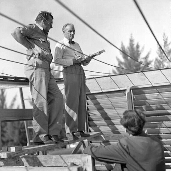
Paul Rudolph (left) with Zak Ghanim (right) during the 1994 interview at Rudolph’s Beekman Place home-office in NYC.
THE HISTORICAL MISSION
The mission of the Paul Rudolph Heritage Foundation is to spread knowledge about the profound legacy of Paul Rudolph, and to preserve the work of this great and internationally-important 20th century architect - and we do accomplish this in many ways, including:
Education
Advocating for preservation
Actively engaging with the scholars, students, and journalists
Publications
Encouraging the proper care and stewardship of Rudolph-designed buildings
And— some of our most rewarding activities involve historical research. Rudolph, across a half-century career (and hundreds of projects), created an enormous body of work. Moreover he was involved in a variety of other activities (education, writing, travel, research, entrepreneurship…). While Rudolph left a large body of documents, and several important books have been written about him, we still find that that numerous questions emerge—and the mysteries are compounded by gaps in the records. So we become detectives (which is part of a historian’s role): seeking out clues that lead to further insights and facts about Paul Rudolph. When we find another a new facet of Rudolph’s work and thought (another “piece of the puzzle”), we’re thrilled.
That is why we were happy to discover an interview with him, one which we were not aware of until recently. It was conducted in 1994 (a few years before Rudolph’s passing in 1997), at Paul Rudolph’s “Quadruplex” residence-office on Beekman Place in New York City.
At the time of the interview, Paul Rudolph was still very active, with several projects underway (especially in Asia)—but, at age 78, he also had a long-view perspective on his life and career, and ZAK GHANIM, the interviewer, was able to elicit some fascinating comments from Rudolph. The fact that Mr. Ghanim is an architect, with an active practice of his own, no doubt enhanced his ability to question Rudolph with the insight of a fellow professional.

Architect Zak Ghanim—who conducted this insightful interview with Rudolph.
THE INTERVIEWER: ARCHITECT ZAK GHANIM
Zak Ghanim is an award-winning architect, urban planner, interior designer, illustrator, writer, lecturer, editor and journalist. He was born in Egypt and received his degree in Architecture from Alexandria University. His office is based in Toronto, and he has produced over 1,000 international projects---including in the domains of commercial, hospitality, religious, retail, and residential design, as well as community centers and factories.
He has received awards from a variety of distinguished organizations—and his projects have appeared on the covers of numerous publications, and featured in international newspapers, periodicals and books—as well as having been in exhibitions and featured on television shows and primetime news.
Mr. Ghanim is in the process of publishing two books: New Visions on Architecture (which will include this interview with Paul Rudolph), and Travel Photography: a collection of architectural and artistic images photographed by him in over 5 continents. The full text of his books—as well as his comprehensive design portfolio—can be found on Mr. Ghanim’s website, which you can see here.
We are grateful to Zak Ghanim for giving us permission to share his interview with Rudolph, and to include it as part of our documentary archive.
GHANIM ON ARCHITECTURE aND INTERVIEWS
In the introduction to his book of interviews of architects, New Visions on Architecture, Mr. Ghanim offers some insights on his interest in architecture and intentions for the interviews—and here are several excerpts:
“Since my early undergraduate years, I have been fascinated with the work of the masters of architecture. I have tried to comprehend how they evolved their ideas and opinions, where they drew all that creativity from, and how can an ambitious young designer be a part of that process.”
“Frank Lloyd Wright, Le Corbusier and Mies van der Rohe had all made their marks in the early 20th Century, but now their disciples must come forth and develop their own styles. It is time for the new generation to stand on a higher plateau. Our needs have altered and our understanding of nature's role in architecture has been redefined. As lifestyles, change so do values, both artistically and socially.”
“As we come to the dawn of a new century, I wanted to present the words of these leaders to everyone who is interested in art and architecture, so that they can understand where the future of architecture is taking us. It has become more evident that the ordinary person on the street is concerned and intrigued with the role of architects. I feel by committing their words to paper, many can gain an insight into their creativity and understand the discipline and aspiration that it takes to become a pioneer in a specific domain.”
EXCERPTS FROM THE INTERVIEW
The interview covers many aspects of Paul Rudolph’s life and career, and below are several examples of Zak Ghanim’s questions and Rudolph’s responses:
ZAK GHANIM: YOUR FATHER WAS A METHODIST MINISTER, DID THIS HAVE AN EFFECT ON YOUR ARCHITECTURE AS BEING CONSERVATIVE, PRAGMATIC OR DISCIPLINED?
PAUL RUDOLPH: Most definitely. When I was six years old, my father built a church and of course an Architect was involved. When I saw his drawings and models, I knew instantly it was for me, and I have never changed my mind.
Z.G. SO, YOU ALWAYS WANTED TO BE AN ARCHITECT?
P.R. I had no choice, I was very lucky. If someone asked me should he/she be an architect, I would say, you cannot teach people to be talented, you cannot teach people to design by showing what others have done, you can only clarify principles, but you cannot really teach youth to be designers. I have always been able to draw easily, since I was a child, and still do.
* * *
Z.G. WHAT KIND OF EXPERIENCE DID YOU GAIN FROM THE BROOKLYN NAVY?
P.R. Apparently, you did some homework. They thought they could make a Naval Architect out of me, in four months, by sending me to M.I.T. for a ridiculous course. I found myself in charge of 300 people making repairs to destroyers in the Brooklyn Naval Yard. That was some fantastic experience. I saw how a very large organization went about dividing its work. Trying to utilize talents of a person was of the utmost importance, I could understand drawings while other people could not, and I began to understand the relationship between the administration and the people who were building, so I really had a fantastic job.
* * *
Z.G. BACK IN 1954, YOU WERE AWARDED THE TITLE OF "OUTSTANDING YOUNG ARCHITECT" AT THE INTERNATIONAL COMPETITION HELD IN SAO PAULO IN BRAZIL, THAT MUST HAD A THRILL FOR YOU AT YOUR EARLY STAGE OF YOUR PROFESSION.
P.R. Not only was it a thrill, it helped me financially.
Z.G. WHAT WAS THE BASIS OF YOUR SELECTION?
P.R. I entered that completion with the design of the Walker guest house that was built in Sanibel Island, Florida back in 1953. It was a 24 by 24 foot wooden house. It had three 8 by 8 foot bays. One of glass, the other two clad with solid panels. There was an arcade around the outside of the house to support the panels. These panels changed the interior space from a cozy room, in terms of closure and light, to a wide-open pavilion.
* * *
Z.G. IN YOUR EARLY CAREER, YOU SPENT SOME TIME IN EUROPE, THROUGH A SCHOLARSHIP. WHAT KIND OF IMPACT DID THIS HAVE ON YOU?
P.R. The United States was built in the nineteenth century, and has never been strong in terms of Urbanism. The U.S. is essentially based on eclecticism, where Europe is the exact opposite. The strength of Urbanism in Europe to this day is fantastic. You could not believe the effect which European Cities had on me. I began to understand that architecture is about Urbanism, that the small must be related to the large and vice versa, that you cannot ignore the environment. I began to understand the importance of the relationship between the vehicular architecture and the so-called high style architecture, the importance of building types, the relationship of transportation of all kinds to the city. I understood that the chariot entrance to the Acropolis was formed absolutely beautifully in relationship to the pedestrian entrance. Until today, we have not learned how to relate our automobile, which is our chariot, to the vehicular system in this country. We build the ugliest cities in the world and this is so painful, because I do not think it has to be that way.
* * *
Z.G. BUT YOU STUDIED UNDER GROPIUS WHO BELIEVED IN COLLABORATION IN DESIGN.
P.R. I do not work with other designers, but I do believe in that concept, because for many people it may be the only way they can work. Gropius himself would be the first one to say there are many ways for teamwork; it's a question of what you mean by teamwork. If there is a team of architectural designers, goodbye, but if the architect teams up with a structural engineer, a mechanical engineer, an acoustical engineer, an electrical engineer, a geographer, an economist and so on, but not five architectural designers. You see, Gropius believed that through discussions, one could reach a clarification and a higher level of understanding, but then I say if that is true, I believe it depends on who you are discussing things with. It is a very complicated issue. I make no bones about what I do, I know what I do well and what I don't do well. I just want to be used in a good way, that's all.
* * *
Z.G. I UNDERSTAND THAT YOU WERE NOT HAPPY WITH THE FINAL LOOK OF THE MARY COOPER JEWETT ARTS CENTRE FOR WELLESLEY COLLEGE, WELLESLEY, MASSACHUSETTS BACK IN 1955. WHY IS THAT?
P.R. In the U.S. architects tend to think that the nineteenth century has spilled over into the twentieth century, and that one should build only twentieth century architecture. I am very proud that this building was part of the very beautiful campus, and one had to say it was built in this century. That was the basic notion. In other words, I am talking about urbanism, which I did not really learn in school. I am a great believer that education is based on many things. In any event the idea of adding a 20th century building to a Gothic campus created a form of space, kind of Acropolis, looking down south to the lake. If I were to have the same commission today, I would do it the same way, in principle. The thing I feel inferior about the building, has to do with the interior space, which was not developed exactly the way I wanted. Regardless, in my opinion, Wellesley College was one of the first buildings that tried to marry the new and the old United States.
* * *
Z.G. WHAT DID YOU CONTRIBUTE AS A CHAIRMAN OF YALE SCHOOL OF ARCHITECTURE?
P.R. I do not know if I made any contribution. I patterned my eight years there very much after Gropius, not stylistically but in principle. What Gropius basically said, was that architecture, in the real sense of the word, is a means by which people express their aspiration. In that sense, we really are servants to society. I genuinely believe that things are constantly changing, and that is based on the series of principals that we started speaking of. I tried to teach that architectural space is what determines, any project whether religious, governmental or housing, and that scale is of the utmost importance, especially in terms of Urbanism.
* * *
Z.G. I WOULD LIKE TO HEAR YOUR OPINION ABOUT THE LATEST TRENDS IN ARCHITECTURE; POST- MODERNISM, DECONSTRUCTION....
P.R. The only thing I like about Post-Modernism is its light interest in urbanism, but it is far too nostalgic and stylish. If you had a bunch of Cape Cod cottages, according to Post-Modernism, the only thing to do is to build more cape cod cottage. I don't believe in this, I am totally against Post- Modernism, as conceptually seen, other than what little it has to say about urbanism. Modernism does not have all the answers, I do not think it does, but it tends to address this century's problems, and has within its concepts a great many possible solutions.
* * *
Z.G. HOW DO YOU LIKE THE AT&T BUILDING?
P.R. No comment.
* * *
Z.G. FOR THE PAST EIGHTEEN YEARS YOU HAVE BEEN DEALING WITH DIFFERENT INTERNATIONAL PROJECTS. WHAT KIND OF EXPERIENCE DID YOU OBTAIN FROM SUCH INVOLVEMENT?
P.R. I have been working mostly in South East Asia, and I have found that very rewarding on many levels. The attitudes are very different from the United States. It is also the idea that the labor is still relatively very inexpensive, and what I want to do is very labor intensive. The Pacific Rim is in its most important stage economically, but artistically it is not very clearly defined yet. I think it will be soon.
* * *
Z.G. HOW DO YOU VISUALISE THE FUTURE OF CONTEMPORARY ARCHITECTURE? ARE WE GOING IN THE RIGHT DIRECTION?
P.R. First of all, do you see that each new trend cancels out the other, and leaves you with nothing. I really, honestly believe in movements that add to urbanism or add some dimensions to human life. Then I am for it, but if I do not see that, then I am against it. I feel sad about things right now, but I also feel very hopeful. Many false paths have been perceived, and I believe the problems that one sees everywhere will not go away. Architects right now, as I see, tend to solve or address themselves to problems which are fine in terms of magazines, but have nothing to do with human needs or aspirations.
* * *
Z.G. YOU PRODUCED SOME OF THE MOST METICULOUS AND ORDERLY DETAILED BLACK AND WHITE COLLECTION OF PERSPECTIVES. HOW MUCH WERE YOU PERSONALLY INVOLVED IN THE PRODUCING OF THOSE RENDERINGS?
P.R. When I was very young, I personally drew every line. In many ways those are the only drawings which I like. Then I became very busy, and what I would do perspective and almost everything in pencil, then I had staff to fill in certain passages. But when it came a matter of gradation, I would always do that, and when it was a matter of hatching, someone else could do that. So I always had some assistance.
* * *
Z.G. WHAT IS ON THE DRAFTING BOARD NOW?
P.R. I am still working in South East Asia and Hong Kong. I don't know why, but I have a bunch of projects I'm working on, a total of six private homes and a small office building in Indonesia. An office building in Singapore, also I'm working on a town in Indonesia.
Z.G. HOW ABOUT THE US?
P.R. One house!
THE COMPLETE INTERVIEW
The complete text of Zak Ghanim’s interview with Paul Rudolph can be found at the Paul Rudolph Heritage Foundation’s ARTICLES & WRITINGS page (which has a large collection of written resources on and by Rudolph)—and a direct link to the full interview is here.
IMAGE CREDITS
NOTES:
The Paul Rudolph Heritage Foundation gratefully thanks all the individuals and organizations whose images are used in this non-profit scholarly and educational project.
The credits are shown when known to us, and are to the best of our knowledge, but the origin and connected rights of many images (especially vintage photos and other vintage materials) are often difficult determine. In all cases the materials are used in-good faith, and in fair use, in our non-profit, scholarly, and educational efforts. If any use, credits, or rights need to be amended or changed, please let us know.
When/If Wikimedia Commons links are provided, they are linked to the information page for that particular image. Information about the rights for the use of each of those images, as well as technical information on the images, can be found on those individual pages.
CREDITS:
Photos of Zak Ghanim interviewing Paul Rudolph: courtesy of Mr. Zak Ghanim; Photo of Zak Ghanim: courtesy of Mr. Zak Ghanim.


.jpg)
.jpg)
.jpg)
.jpg)
.jpg)
.jpg)
.jpg)