Rudolph’s Perspective Rendering of the unbuilt Gatot Subroto project for Jakarta, Indonesia. Image © The Estate of Paul Rudolph, The Paul Rudolph Heritage Foundation.
A Kickstarter campaign has been launched by researcher and author Eric Wolff to professionally render one of Paul Rudolph’s little-known late works, the unbuilt Gatot Subroto project in Jakarta, Indonesia.
From the kickstarter site:
Some refer to his late works in Asia as ”seven buildings including a couple of villas” and describe Rudolph’s late career as a kind of afterthought to a, at times controversial but, prolific career. My research into Rudolph’s archives, interviews with his office personnel and visits to his buildings in Asia, reveal that Rudolph‘s late career period was not only bountiful, but reflects a period where Rudolph was performing at the peak of his capabilities and sensibilities producing some of his finest works ever. In his late career (1978 - 1997), Rudolph participated in about 50 projects and completed upwards of 20 buildings in Asia, cementing his place alongside, and sometimes in direct competition with, architectural titans like Richard Meier, I.M. Pei, Kenzo Tange and John Portman. Rudolph’s late works are not well known and have not been fully evaluated, in this project I am recreating select Paul Rudolph buildings digitally from his archived drawings/material and rendering them into illustration.
Importantly, many of the ”undiscovered” Asian works exemplify Rudolph‘s specific contributions to Modernist Architecture. You do not have to love Rudolph's buildings to appreciate that he pushed the envelope in terms of sculptural design; but he also innovated in areas of sustainability and structure. In this project I will illustrate the ambitious Gatot Subroto (unbuilt), that was designed for Jakarta, Indonesia as an ”office village” with 875,000 square feet of office space, and 450,000 square feet of parking. The outcome will be a full color poster sized realistic rendering of the Gatot Subroto at dusk, as well if budget allows several close up realistic renderings of the buildings interior and roof garden spaces.
The late works in Asia demonstrate how the Modernist principles base of Le Corbusier, Mies van der Rohe and Frank Lloyd Wright were combined and evolved by Paul Rudolph to create a unique new vocabulary that would inspire today’s contemporary architects.
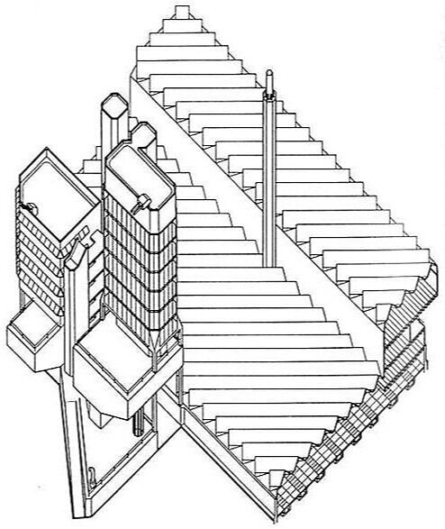
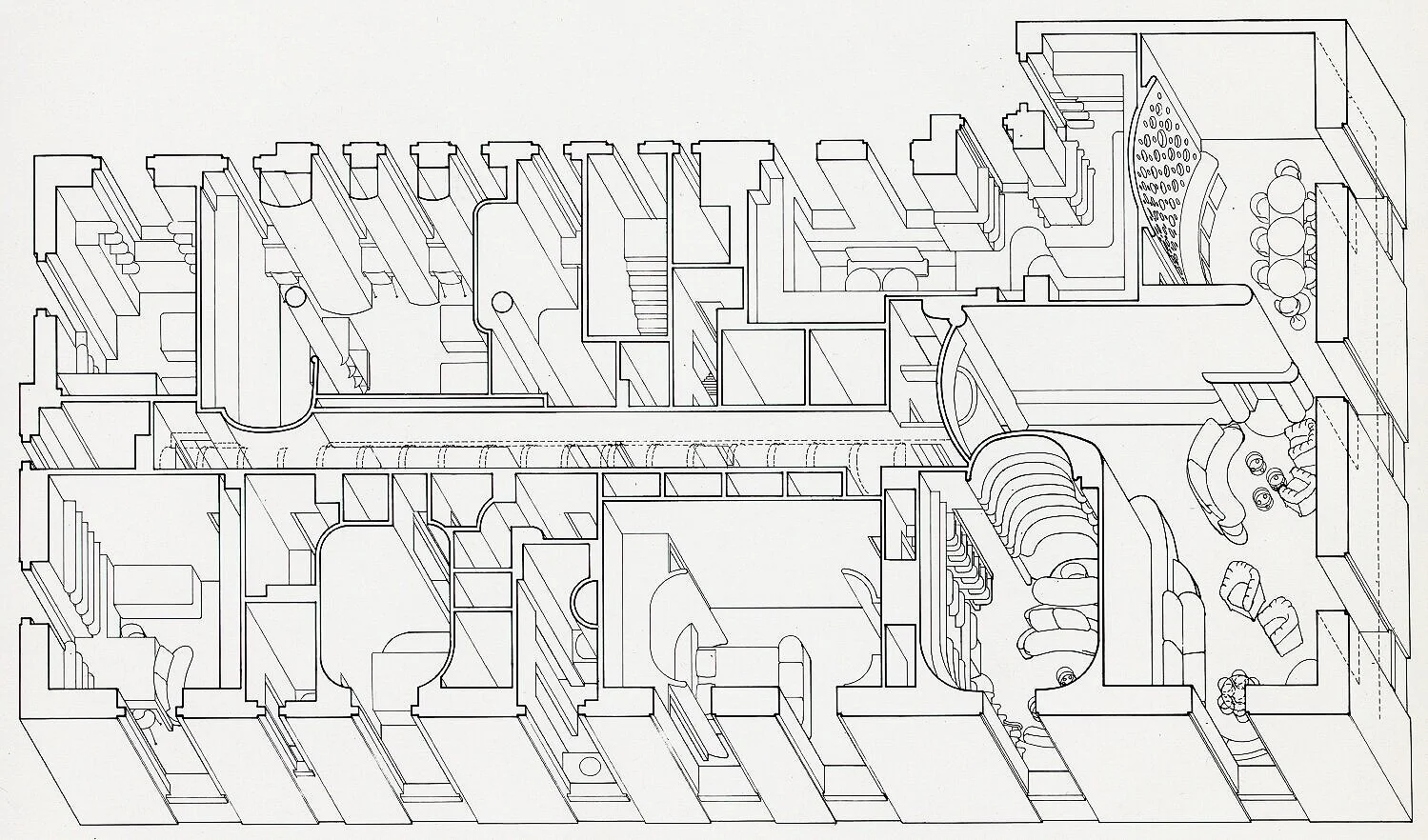
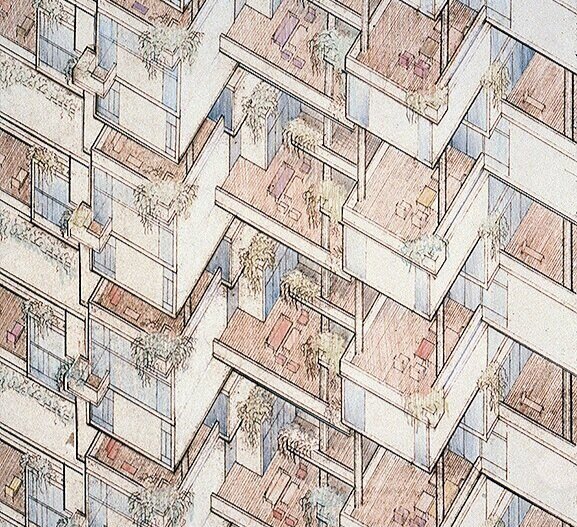
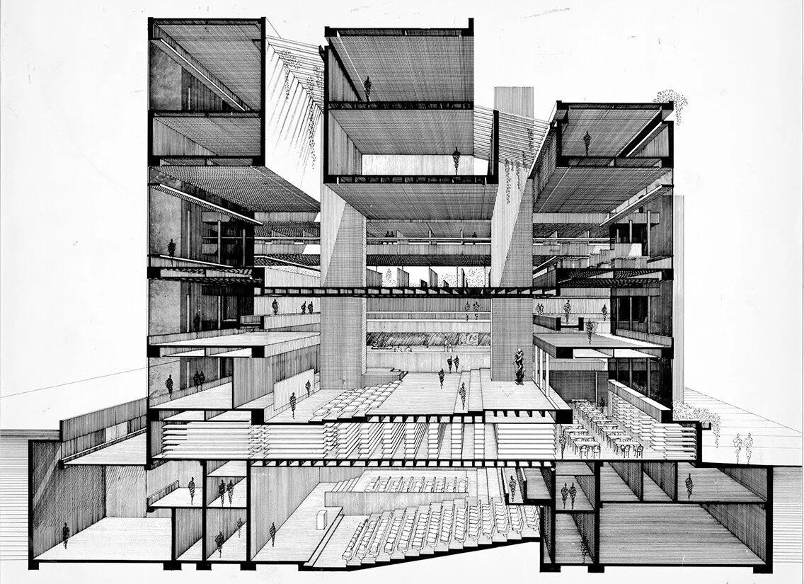
The Gatot Subroto (Jakarta, Indonesia 1990) is an example of Rudolph’s unique point of view. The client requested eight towers to be developed on an existing property as an office condominium complex in which the Dharmala group would occupy part of the space. Rudolph’s initial designs reflected the request of eight towers, joined by floors spanning the complex reading as a ”perforated wall”. The client wanted a more cohesive look from the busy street and in order to attract top clients, did not want their own anchor space to dominate the design. Rudolph, heeding the client feedback, in his final design created a masterpiece!
The Gatot Subroto represents one of the earliest examples of sustainability in architecture. its windows are slanted and shaded to deflect the mid-day Indonesian sun. Between the cantilevered three floor blocks are void-decks capped with roof garden terraces, increasing the green factor higher than the buildings footprint. A testament to sustainability before it was even in fashion.

Paul Rudolph’s original project model for the Gatot Subroto project. Image © The Estate of Paul Rudolph, The Paul Rudolph Heritage Foundation.
Mr. Wolff began researching the architect’s late designs for his upcoming book RUDOLPH :: RENAISSANCE Evaluating Paul Rudolph’s contributions to Architecture through his undiscovered late works until in-person activities were curtailed due to COVID-19. Not to be deterred, he began to recreate Rudolph's “unbuilt” designs as digital models.
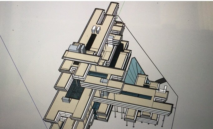
The Gatot Subroto model in progress. Image courtesy Eric Wolff.
According to Mr. Wolff,
“As part of my research I am digitally ‘building’ the Gatot Subroto based on drawings and models from Rudolph’s uncatalogued materials. I am working with a firm to render my digital ‘build’ into a life-like poster sized illustration of the building. We will render a scene with the building as seen from the street at dusk to emphasize the structure and fenestration. The output will be a large full-color poster illustration of the Gatot Subroto at dusk, which we will have professionally printed and available for donors. The illustration will later be used in the book and at events promoting the book.
To illustrate these designs an exciting collaboration with Design Distill was born. Design Distill is a multidisciplinary group that has the passion, talents and capabilities to translate my research of Paul Rudolph’s late works into visualizations, bringing the buildings to life so they can be evaluated and celebrated.
Rudolph’s buildings need to be experienced to be properly critiqued; making life-like illustrations will help viewers experience the buildings and interior spaces more completely. The digitization will help myself and other researchers study the structural and design elements intended by Rudolph. It will ”preserve” the buildings as they were intended to be built but with the ability to look at them in three dimensions and with the possibility of exporting the files for 3-D printing.
Importantly, the ‘eye candy’ of the buildings mask important contributions and innovations that Rudolph gave to the world of architecture, and through the rendering of his works his design principles can be further evaluated. This project will re-create the Gatot Subroto from blueprints, models and drawings and produce realistic renderings of the exterior, roof gardens and select interior spaces so they can be better understood and evaluated. The funding from this Kickstarter has been budgeted specifically for the work related to the Gatot Subroto.
The Paul Rudolph Heritage Foundation’s mission includes supporting research about Mr. Rudolph’s architectural legacy and we are assisting Mr. Wolff’s kickstarter campaign as well as his future book.
We encourage you to help make this project a reality by going to the kickstarter link here and please share this project with your friends. Let’s see the Gatot Subroto project as Rudolph had intended!


![Two approaches to drawing a rectilinear volume (which could be a brick, a building, a part of a building, or a room…):The isometric Drawing, at the far-Left, distorts the top and bottom [plan] surface, and all the other planes too—making them into d…](https://images.squarespace-cdn.com/content/v1/5a75ee0949fc2bc37b3ffb97/1569611468636-M4EYPT5S2Q16MOXPGFUD/axonomtric%2Bdiagram-two%2Bangles.jpg)