The cover of a much coveted book. Robert A. M. Stern’s 1969 survey and assessment offered an intelligent and concise (and well illustrated) overview of the main pathways of then-current American architecture—and the work of its most prominent practitioners (including Paul Rudolph).
A GOLDEN ANNIVERSARY
It’s hard to believe, but New Directions in American Architecture, the landmark book by Robert A. M. Stern, came out a half-century ago. First published in 1969 (with a new, enlarged edition in 1977) it is worth acknowledging and celebrating a work that was so intensely studied, discussed, and turned-to for inspiration by architecture students and professionals. It was a book that made a difference.
A WORTHY PREDECESSOR

Paul Heyer (1936-1997) was a New York-based architect, educator, and author—and his colleagues and students remember him as the most urbane of Englishmen. His 1966 book, “Architects on Architecture” was later published in an expanded edition in 1993.
For context, we note another book which covered an overlapping range of work (and—at least partially—of the same era): Paul Heyer’s Architects on Architecture: New Directions in America.
Heyer’s book came out in 1966, a few years before Stern’s New Directions, and—while the territory had similarities (both showing what was being built in America, and by whom)—the material covered, and the manner it was covered, was different. Heyer’s book was, in its way, more comprehensive: it had individual chapters on many of the architects that Stern would write about—but it also included a profusion of talented, prolific American architects who would get hardly a mention (if named at all) in Stern’s book (i.e.: John Carl Warnecke, Hugh Stubbins, Craig Elwood, William Wurster…). It also had sections on architects like Mies van der Rohe and Walter Gropius—forefathers of architectural Modernism—who were, at the time of publication, still alive and practicing.
What Heyer had created could be characterized as an informationally (and visually) rich grand survey—and the book remains fascinating to dip into, and is a fine resource for researchers.
Subsequently, Paul Heyer brought out a different study: “American Architecture: Ideas and Ideologies in the Late Twentieth Century,” which looked at a similar (though updated) set of architects, and examined their work through formal./stylistic/ordering themes.
STERN’S BOOK: THE GO-TO GUIDE TO WHAT WAS HAPPENING—AND WHO THE PLAYERS WERE

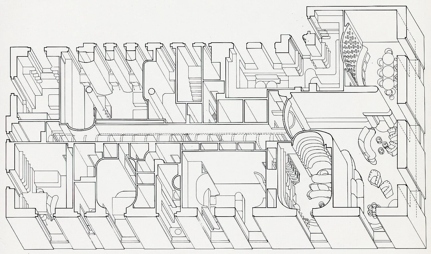
A page from New Directions in American Architecture, on which are illustrated designs for the Boston City Hall. At top is Mitchell, Giurgola’s second prize-winning entry (shown in a perspective drawing); below is Kallmann, McKinnell, and Knowles winning entry (shown under construction).
In contrast to Heyer’s more encyclopedic approach, Stern’s book was focused on the Now, and—just as important—the meaning of what was shown (and how those meanings might propel the design process.0 New Directions in American Architecture offered a compelling report—and provisional assessment—on the cultural churning then happening within the world of architecture, which was an era of crisis, excitement, and creativity in all domains of modern life.
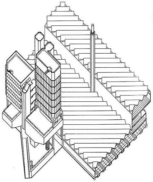
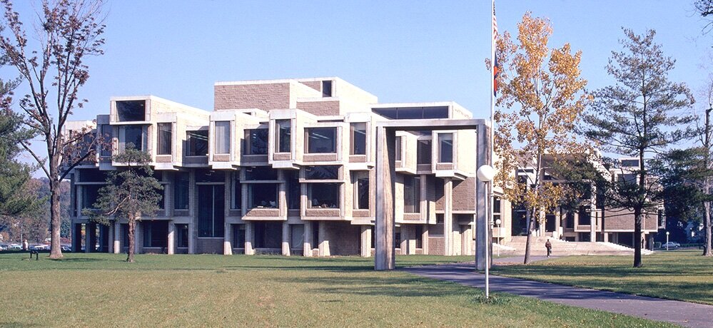
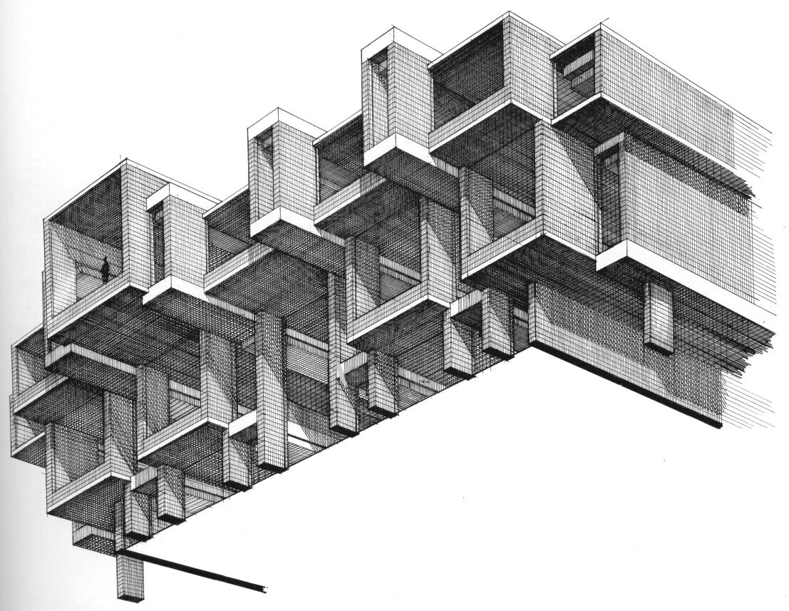
Yes, several prominent architects of the post-WWII generation (like Philip Johnson and Paul Rudolph) were included—and received respectful coverage of the their work. But one can speculate that it was necessary to show them. Perhaps it was because they were not only quite active professionals, but also so that their work could act as a contrast to the the more recently risen stars shown in the rest of the book. And those pages are abundant with the exciting work of the rising (or recently risen) stars: Kahn, Charles Moore; Venturi and Rauch; Carlin and Millard (a firm whose work is not widely discussed now, but which is well worth studying); Davis, Brody and Associates; DMJM; Tigerman; Mitchell, Giurgola; Roche, Dinkeloo and Associates, and numerous others.
Stern’s voice is hardly that of a reporter aiming only for journalistic neutrality. G. E. Kidder Smith’s review of the original edition (published in the March, 1972 issue of the Journal of the Society of Architectural Historians) puts it well:
A provocative, vexing, hence far tooo brief (three-page) introduction sets the stage for New Directions in American Architecture, and one will find that the subsequent pages both inform and irritate—all of which makes for a slender but simulating volume. Beginning with the very choice of the seven bellwethers shown to typify the “new directions”—like any panel of architects or selection of buildings, a process automatically insuring challenges—a philosophy unfolds that at times will startle.
Along with his reservations, Kidder Smith does acknowledge:
The author’s critical analysis and appraisals command respect for their often penetrating incisiveness.
And those analyses and appraisals are conveyed through clear language—which today seems undervalued in architectural writing—and layered with Stern’s high intelligence and knowledge of history and the national architectural scene.
PRICE— AND TRUE WORTH

The book’s price when it first came out—as shown on the cover.
The book was a medium-size paperback of moderate length (128 pages), with numerous black & white illustrations. What would one expect the price to be for such a volume? The cover (shown at the top of this article) has a cover price of 25S—that’s twenty-five shillings, indicating that the example pictured was a British edition. The cover of the American edition—the one in the library of the Paul Rudolph Heritage Foundation—shows it in US currency: $2.95
That may seem jaw-droppingly inexpensive—can one buy anything today for such an amount?!—but that’s hardly the case. The current, inflation-adjusted equivalent for both the American and British prices is a bit over $20—which is about par for books of similar format today.
Even so, it’s worth considering the book’s “worth” in an enlarged sense—for New Directions in American Architecture that holds up well: it continues to be a fascinating resource on the creative voices of that era—a body of accomplishment and ideas which retain their presence and power.
BRAZILLER: A PUBLISHER OF DISTINCTION

The book was published by Braziller—a name dear to architecture book lovers, for they published—and continue to offer—fine books on the topic. During the 1960’s-70’s, when the New Directions series came out, they were particularly prolific in architectural publishing.
George Braziller (1916-2017) and Marsha Braziller (d. 1970) started in the book business in 1940’s, and began their own publishing firm in 1955. The company is well-known for their visually-oriented books on art, as well as publishing serious works of literature, criticism, history—and architecture! After his retirement, George Braziller wrote an intriguing memoir of his publishing adventures (highlighting the fascinating characters he encountered.) The firm is run by their sons, and their books are currently distributed through another distinguished publisher: W.W.Norton.
PART OF A SERIES—AND A CROSS-CULTURAL PANORAMA
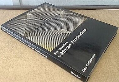
Udo Kultermann’s book on the work of African architects—one of the volumes in Braziller’s New Directions series.
"New Directions in American Architecture was part of the “New Directions” series published by Braziller. Other volumes in that series, published or announced, were on:
Japanese Architecture
African Architecture
British Architecture
German Architecture
Soviet Architecture
Latin American Architecture
Italian Architecture
Swiss Architecture
These were authored by some of the most eminent architectural historians of that era—scholars like Kultermann, von Moos, Boyd, Kopp, and Gregotti. The author of the American volume, Robert A. M. Stern—relatively unknown at the time—has gone on to some prominence of his own….
A FRESH CONTINUATION…

Less than a decade later, Robert A. M. Stern and Braziller brought out a New Enlarged Edition of the book. Published in 1977, it included the full body of the earlier, 1969 text—but the volume was extended by the addition of further works by Venturi, Moore, and Mitchell Giurgola.
An important added section, titled Postscript: At The Edge of Postmodernism, also gave coverage to newer participants whose work and voices were widening the architectural discourse: Eisenman, Meier, Greenberg, Graves, and Gwathmey / Siegel (names not even mentioned in the first edition). Stern’s office (Robert A. M. Stern and John S. Hagmann) was also represented by two of their most interesting early residential projects: the Lang House; and a newly constructed townhouse fronting on Park Avenue.
Like the original edition, the 1977 enlarged edition gave the reader a chance to encounter not just the design work of a vital group of architects, but also the ideas which were the philosophical underpinnings of this fresh oeuvre.


![Two approaches to drawing a rectilinear volume (which could be a brick, a building, a part of a building, or a room…):The isometric Drawing, at the far-Left, distorts the top and bottom [plan] surface, and all the other planes too—making them into d…](https://images.squarespace-cdn.com/content/v1/5a75ee0949fc2bc37b3ffb97/1569611468636-M4EYPT5S2Q16MOXPGFUD/axonomtric%2Bdiagram-two%2Bangles.jpg)