

Definitely designed by Paul Rudolph: the General Daniel “Chappie” James Center for Aerospace Science and Health Education, at Tuskegee University—a architectural project from the early 1980’s—shown here being dedicated by President Reagan.

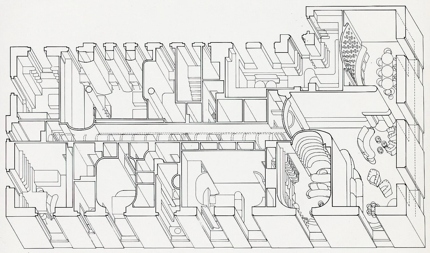
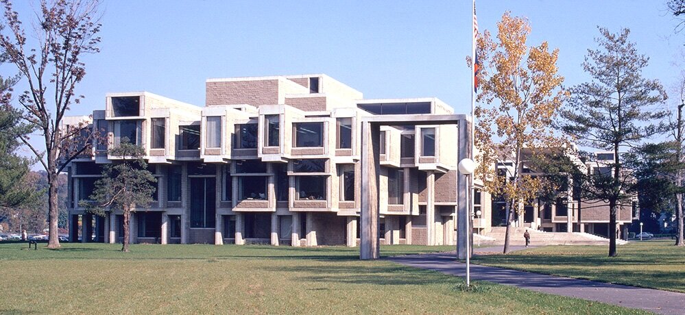
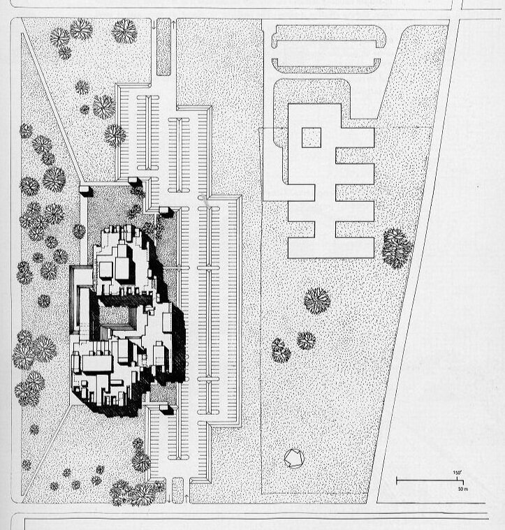
Although it has similarities to a number of Rudolph buildings (and the architect-of-record, Desmond & Lord, was a close associate of Rudolph on several projects), our assessment is that this college library is not a Paul Rudolph design.
IS IT A REALLY A RUDOLPH? - THE TASK OF ATTRIBUTION
From time-to-time, the Paul Rudolph Heritage Foundation is asked whether something is really a work of Paul Rudolph’s. That “something” might be from any facet of the great range of work to which Rudolph applied his creative energies: a building, a drawing, an object (i.e.: a light fixture), or—most intriguingly—an artwork.
In fact, we’ve recently been asked to comment on whether a painting is (or is not) by Rudolph. We’ll examine that possibility—but first: We’ll need to consider some of challenges of attribution, and also look at Paul Rudolph’s relationship to fine art.
There seems to be some cachet in having Rudolph’s name is attached to a house that’s for sale—and this even applies to houses that are not on-the-market, as some enthusiastic owners may want their home to be associated with the great architect. But not every such claim is true—and sometimes our assessment is that a building—to the best of our current knowledge—is not a Rudolph.
A CHALLENGING CASE
There are also cases where the relationship of Paul Rudolph to a project is not abundantly clear—and the matter needs investigation.

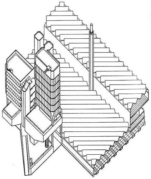
A drawing of a college library, done in Paul Rudolph’s perspective-section technique. Close inspection led us to assess that this is probably not actually a drawing by him—but rather: a drawing done in Rudolph’s spirit, possibly by someone that had worked closely with him.
For example: A staff member from a college library approached us. Their building was about to celebrate a half-century “birthday”—and they’d heard that it was designed by Paul Rudolph, and they asked us about it.
So was it? Well, it wasn’t on any of our lists of Paul Rudolph projects—but those lists were, over decades, edited and re-edited numerous times by Rudolph himself—and it’s possible that a project of his might have been left off those lists for any number of reasons. Another factor we considered was that the building’s architect-of-record had done other, important projects in close association with Rudolph. Moreover, the library building did exhibit some very Rudolph-like features. Also, the perspective-section drawing of the building was done in a manner resembling Rudolph’s graphic technique. But, after carefully looking at the building and the documents available to us, and also after consulting with some of Paul Rudolph’s past staff members, we concluded that the building was: “Rudolphian—but not a Rudolph.”
MULTIPLE RUDOLPHS?
There are other factors which, when working out an attribution, can lead one astray. One of them is when another person, with the same name, is also working in the same field and during the same era.
For example: For a long while, we were wondering about a rendering of a large, wholesale market facility for NYC: the Hunts Point Market. That’s a project which Rudolph had been asked to design—and we had documentation to prove that: the archives of the Paul Rudolph Heritage Foundation has an official press release from Mayor Lindsay’s office, explicitly announcing that Rudolph had received the commission.
The only image we’d ever seen of the proposed project looked nothing like a Rudolph design, nor was it done in his rendering style. Moreover, the rendering was done in tempera-gouache—a drawing medium which Paul Rudolph reputedly detested. Yet the drawing was signed “Rudolph”! Here was an architectural mystery.


ABOVE: A rendering found when researching Rudolph’s Hunts Point Market project. It is signed by “Rudolph”—but is nothing like a Paul Rudolph drawing. LEFT: A book celebrating winners of the Birch Burdette Long Memorial Prize for architectural rendering. The work of two different “Rudolphs”—the maker of the rendering above, and Paul Rudolph—are both in the book.
So was it? Only later did we come to understand that the Hunts Point Market rendering was by Rudolph, but a quite different one. The mysterious drawing was by George Cooper Rudolph (1912-1997)—an architect who was an almost exact contemporary of Paul Rudolph. George Cooper Rudolph’s main professional activity was as a renderer: he and his office were primarily engaged in making perspectives of proposed buildings for other architects and designers. He provided views for a large number of projects—and his prime medium was tempera-gouache, which was very popular at that time for such presentation drawings (although he did other things too.)
There’s another connection (beside the Hunts Point Market project) between the two Rudolphs. The Birch Burdette Long Memorial Prize was awarded annually for excellence in architectural rendering, and a book was published in 1966 showing drawings by 22 prominent winners. This work shown was by some of the best draftsmen/renderers of the 20th century. Here the two Rudolphs came together: included was a selection of work by George Cooper Rudolph—and on the book’s cover showed Paul Rudolph’s proposed design for the tower of the Boston Government Service Center [but, ironically, it was rendered someone else: Helmut Jacoby—yet another prize winner]
WHAT ABOUT FINE ART?
In the last few years, we’ve encountered several paintings which were attributed to Paul Rudolph. We believe these claims are made with total sincerity, and that the galleries offering these works have had some reason to assert that these are by the famous architect..
We’ll look at the three examples which we’ve come across—but before we do, we have to ask:
WAS RUDOLPH EVER KNOWN TO MAKE ART?
We come across little evidence that, as an adult, Paul Rudolph engaged in the making of fine art—and in the rare cases that he did so, it was only in connection with an architectural commission. It’s true that he appears, in his youth, to have loved to make art—and the archives of the Paul Rudolph Heritage Foundation has a vintage newspaper clipping showing a young Rudolph with a figurative sculpture that he’d made (for which he had won an award.) A memoir by his mother (also in our archives, and which you can read here) further testifies that he loved to make art when young. Doubtless, his higher education—including at architecture school—included one-or-more fine arts courses.
PAUL RUDOLPH BROUGHT ART INTO HIS BUILDINGS

An interior, circa 1963, within the recently completed Yale Art & Architecture Building—showing a large wall mural which Rudolph included in the building.
You can find Rudolph, several times, inserting art into his architectural renderings, showing where artworks might be located as part of a project’s overall design.
Not all such proposals were fulfilled, but some of his buildings did have art prominently incorporated into the architecture—like the two large murals by Constantino Nivola in his Boston Government Service Center. Artworks were also part of his interior design for his Yale Art & Architecture Building (wherein contemporary and ancient art were placed throughout the building) and in Endo Laboratories. Moreover, to the extent he could afford to do so, Rudolph included artwork in his own residences.
One further bit of data we’ve come across: there’s an interview with Rudolph—well into his career—during which he’s asked if he’d like to do fine art. He answers: Yes, he might like to do so—but doesn’t have the time.
RUDOLPH’S FIGURATIVE ART
The only times (post-youth) that we’ve found Rudolph making fine art are in two professional projects: one at the very start of his career, and the other during the decade of his greatest creative output:

ABOVE: Paul Rudolph’s Atkinson Residence, in which Rudolph’s mural was above the fireplace. BELOW: A longitudinal-section construction drawing of his Hirsch Townhouse. That house’s mural, also by Rudolph, was located in the large, open atrium space, shown in the left half of the drawing.

Rudolph’s very first professional project was the Atkinson Residence of 1940, built in Auburn, Alabama when he was 22 years old. The living room features a 6' high x 10' wide ornamental mural above the fireplace—most likely a consequence of Rudolph attending a required class on 'Mural Design' while in school. The mural’s linework is composed of V-shaped grooves, cut directly into the plaster.
The next time (and the last time that we know of) when we see Rudolph-as-artist is at least a quarter-century later: in his 1966 design for the Hirsch Townhouse in Manhattan (the residence that was later to become famous as the home of fashion designer Halston.) Rudolph covered a prominent wall in the living room with a large mural—about four times the area of the one done in Alabama—but also done in with the same technique: making lines by the cutting of grooves.
What the two artworks share in-common are:
both artworks are figurative,
viewers can readily discern several people and objects
they both have a dream-like (or story-book) quality
both have highly stylized imagery
The mural from Rudolph’s 1940 Atkinson Residence, in Auburn, AL, located above the Living Room’s fireplace.

The mural from Rudolph’s 1966 Hirsch Townhouse. Its scale can be judged by seeing the client standing in-front.
HIS PROFESSIONAL ARTISTRY

Paul Rudolph did engage in 2-dimensional artwork—but of an applied, professional nature.
We’re referring to his famous perspective renderings (especially section-perspectives). An entire book was devoted to these drawings (see cover at right)—with his section-perspective drawing of the Burroughs Wellcome building being given the front cover.
In Paul Rudolph’s renderings after he left Florida, he generally eschewed the use of continuous tone (a position consistent with his dislike for gouache renderings.) His fine control of linework (often linear, but sometimes flowing) was what Rudolph utilized when he needed to generate tonality—and he achieved that through hatching and line density, to arrive at the effects he desired.
Interestingly, Rudolph’s line-oriented techniques, which he used for his architectural renderings, are not-so-different from the techniques utilized in his two murals.
PAUL RUDOLPH AND TOPOLOGY-AS-ART

The relationship of a topo map’s curved lines (bottom) with the layers of a 3D model version (top.)

A portion of the Stafford Harbor model. The model’s topo layers, reflecting the hilly nature of the inland part of the development’s site, are most evident in the upper-right area of this photograph.
Before a more direct consideration of Paul Rudolph’s engagement with fine art, it’s worth noting the formal affinity between the sinuous sets of closely-spaced lines (that one finds in Rudolph’s two murals,) and the lines produced when making topo maps and topo models. Using a topo system, in drawings and models, was a standard practice in architectural offices—including Rudolph’s.
Most sites are not flat—so architects study such sites with “topo maps.” These maps have numerous lines, whose closeness-or-distance to each other graphically convey an area’s steepness-or-flatness. When this gets translated into 3-dimensions—to create a “topo model”—the model is made of a series of layers (of boards), the edges of which follow the curves of the map.
Rudolph’s office produced numerous models of his proposed designs—and when a site was hilly, the buildings were set upon such “topo model” bases. The flowing lines of these models (the result of showing the contours of the land in this way) was visually pleasing to Rudolph—so much so, that Rudolph “decorated” his work spaces with those models.
A prominent example of the use of the topo technique is his large model for Stafford Harbor, a project of the mid-1960’s. The Virginia project comprised a master plan, and the design for townhouses, apartment houses, a hotel, boatel, as well as commercial spaces. It embraced the site’s topography—and one can see in the model which Rudolph’s office produced for the project that each layer conveys a change in height.
The full model was gigantic—and Rudolph suspended it, vertically, in the entrance to his architectural office. He used the model’s aesthetic appeal (and surprising orientation) to create a wall-sized, art-like “hanging” that brought additional drama to his office’s multi-storey space.
Moreover, when Rudolph was Chair of the School of Architecture at Yale (in the Yale Art & Architecture Building that he designed, now rededicated as Rudolph Hall), he situated a topo-like mural by Sewell Sillman in the atrium of the main drafting space—both as inspiration and for its aesthetic appeal.

A topo-like mural by Sewell Sillman, placed above the main drafting room/atrium, in Paul Rudolph’s Yale Art & Architecture Building (now rededicated as Rudolph Hall.)

Rudolph “decorated” his work spaces with topo models—like this one of Stafford Harbor—placed dramatically at the entry of his Manhattan architectural office.
PAINTINGS BY RUDOLPH?
We’ve come across several works that have been attributed to Rudolph. Each have an aesthetic appeal—but are they really by Paul Rudolph-the-architect?

EXAMPLE ONE:
The painting at right has been claimed to be by Rudolph. The back is has two labels giving the attribution, and the front has a signature.
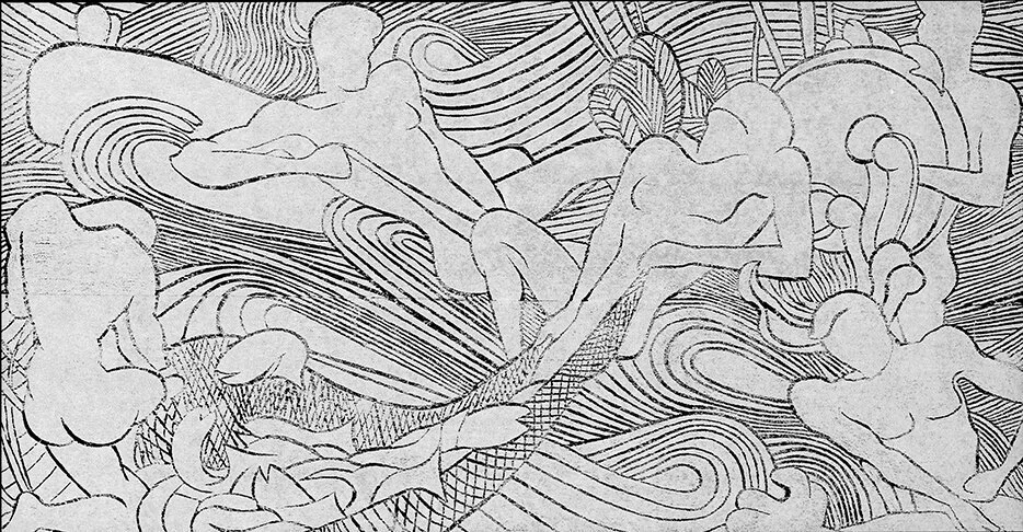
While we cannot discount all possibilities, we’d say this painting’s compositional strategy is one characterized by the fracturing of the image—an aesthetic that Paul Rudolph does not usually follow. Rocco Leonardis (an architect and artist who had worked for Rudolph) says “Architects make Wholes”—and that well characterizes Rudolph’s work. In contradistinction, this painting’s collage-like conception is closer to the approach taken by Robert Delaunay in his famous depiction the Eiffel Tower (see below-left): a breaking-up of the object.
Paul Rudolph, in his perspective renderings, was noted for his linework—and the painting certainly relies on a multitude of lines to convey the subject. But whereas one senses that Rudolph’s lines are well-controlled—in the service of creating precise images of a projected architectural design—the lines in the painting are explosively staccato.
The painting’s “line quality” has more of an affinity with the work of Bernard Buffet, whose drawing-like paintings (and even his signature) are filled with a shrapnel-like energy (see below-center).
Combining the painting’s fragmented forms and line quality, we can see them used simultaneously in a canonical work of 20th century Modernism: Lyonel Feininger’s 1919 cover design for the manifesto of the Bauhaus (see below-right.)
Of course we’re not suggesting that any of those artists had a hand in the making of the painting (except, possibly, as inspirations)—but only point out that their artwork is closer to the painting than any of Paul Rudolph’s work.

A painting by Robert Delaunay

A painting by Bernard Buffet

A print by Lyonel Feninger.
Signatures on an artwork count for a great deal, and here we can see a close-up of the one on the painting:


Paul Rudolph’s actual signature.
In the course of our work at the Paul Rudolph Heritage Foundation, we’ve seen Paul Rudolph’s signature hundreds of times—and at right is a representative example.
As with any signature, one can find a bit of variation in Rudolph’s signatures—but our observation is that his signature is fairly consistent over his lifetime—and it does not seem to resemble the one in the painting. There’s also a label attached to the back, with a note on it, and it appears to be in another language (German). The name “Paul Rudolph” appears within the handwritten note—but it too does not match Rudolph’s signature.
Based on the discrepancies between the painting and Paul Rudolph’s work and signature, we do not believe the painting is by Paul Rudolph (at least not our Paul Rudolph)—but we are open to a reassessment if additional information is discovered.
EXAMPLES TWO AND THREE:
If you do a Google search for “ ‘Paul Rudolph’ painting ” only a couple of other artworks show up—and below is a screen grab of the results:

A screen capture of a portion of a page from Google Images, showing results when the search request is set for “ ‘Paul Rudolph’ painting”
Both are attractive works, and each is done in oil (the left is oil-on-canvas, and the right is oil-on-paper)—and both were attributed to Paul Rudolph. They were offered or sold through galleries/auction houses who are distinguished for the quality of the artworks they offer and the depth of their knowledge. So, as with the painting in Example One, we conclude that such attributions were made in good faith, and to the best of the seller’s knowledge.
So might these be by Paul Rudolph?
We have a date for the right-hand one: 1958. The 1950’s was the era in Rudolph’s work when he began to move from Bauhaus orthogonal rectilinearly (as exemplified by the Walker Guest House, 1951-1952) towards a more muscular (and even sculptural) manifestation of that aesthetic (the most powerful example is his Yale Art & Architecture Building, 1958) and he was also beginning to incorporate dramatic curvilinear forms (as in his Garage Manager’s Office project, 1961). These Rudolph works don’t have a formal vocabulary which resonates with those paintings.


FINE ART OF THAT ERA: THE DOMINANT MODE

ABOVE: Harry Bertoia’s altar screen within the MIT Chapel; BELOW: Jackson Pollock’s painting.

But, no matter how much Rudolph explored architectural forms, it must be acknowledged that he was still a child of the Modernist era—and that included being educated by the founding director of the Bauhaus itself—Walter Gropius.
When the paintings attributed to Rudolph were being made, abstraction and abstract expressionism were the popular style among painters and sculptors.
Two artists who manifested the sprit of that period were the sculptor Harry Bertoia (1915-1978) and the painter Jackson Pollock (1912-1956)—both born within about a half-decade of Paul Rudolph, and coming to prominence about the same time.
Consider two works by those artists: Bertoia’s altarpiece screen (reredos) for the MIT Chapel (the building was completed in 1956, and its architect was Eero Saarinen), and a 16 foot wide painting by Pollock from 1952.
Those two works share several characteristics—ones seen with some frequency in the artwork of the era:
energy/movement
fragmentation
linearity—but often without alignment
a discernable design—but one that embraces a mixture of chaos and order
generally they are non-non-figurative—or, if the figure (a building or body) is included, the imagery is pushed towards abstraction
a restricted palette (or limited range of tones/finishes/materials)
All of these are also shared by the paintings attributed to Paul Rudolph. You could say that those two works are consistent with the fine-arts style of the era in which they were created. In other words: they truly “make sense” for their time. But they don’t match Paul Rudolph’s form-vocabulary of that era.
THE QUESTION REMAINS: ARE THEY RUDOLPHS?
We can’t rule out that Paul Rudolph, some time mid-century, may have briefly tried his hand at painting. But, given all we know—
his practice was feverishly busy at the time
his work, at this time, does not have any formal resemblances to the artworks
linework—a significant part of all the artworks—is unlike the the type of linework which Rudolph used extensively in his work
he was simultaneously leading a major educational institution (as Chair of Yale’s School of Architecture from 1958 -to-1963), as well as engaged in the titanic work of designing its famous school building
his two known artworks (the murals) are figurative, and of an utterly different character
the signature we’ve seen (on the first painting shown above) doesn’t match the many signatures on Rudolph documents in our archive
no other Rudolph artworks of a similar style have come to light
So the “balance of probabilities” leads us to conclude that those paintings may be by a Paul Rudolph, but not likely by the architect Paul Rudolph.
BUT PAUL RUDOLPH DOES INSPIRES ARTISTS…
Rudolph himself might never have made two-dimensional artworks on paper or canvas—but he may have inspired the artwork of others, and below are two examples where that seems to be the case.
EMILY ARNOUX

Emily Arnoux is an artist from Normandy, and she has exhibited with the Fremin Gallery in New York City. Her recent show there featured vividly colored images of pool-side scenes, and her gallery says of her:
“From a young age, she became fascinated by the ocean and the laid back lifestyle surf-culture engenders. Her work captures the divine energy and the jubilation experienced when diving into cool water. . . . Arnoux’s [work feels]. . . .at once contemporary and modern, recalling beach-side postcards of the 1950s & 60s.”
What intrigued us is some of the architecture which is included in her works, and one of her wonderful paintings in particular—“Cubes Game”—seems quite resonant with Paul Rudolph’s Milam Residence of 1959, in Ponte Vedra Beach, Florida. Above is a mosaic of images from Ms. Arnoux’s paintings—and, below, you can see her “Cubes Game” side-by-side with Rudolph’s Milam Residence.
Paul Rudolph’s celebrated Milam Residence in Florida

Emily Arnoux’s superb painting, “Cubes Game”
Emily Arnoux’s paintings are full of life and color—and if Rudolph’s work was of any inspiration to her, we are delighted.
SARAH MORRIS
Sarah Morris is a New York based artist whose works are in major museums throughout the world. Her paintings embrace color and geometry. Occasionally they utilize forms from typography, but most often they are abstract, relying on composed linear and circular elements and areas of color.
Morris’ 2018 exhibit at the Berggruen Gallery in San Francisco showed then-recent drawings and paintings (as well as a film by her.) Her gallery said of Morris (and of that exhibit) that she is:
“. . . .widely recognized for her large-scale, graphic paintings and drawings that respond to the social, political, and economic force of the urban landscape through a visual language grounded in bold and ambitious abstraction. Her probing of the contemporary city inspires a consideration of the architectural and artistic climate of modernity and humanity’s footprint—a subject that Morris energizes and invigorates through a distinct use of geometry, scale, and color. . . .Asymmetrical grids form futuristic compositions of sharply delineated shapes separated by rigid borders and acute transitions between colors. The grid-like quality of her work evokes city plans, architectural structures (including a staircase designed by Paul Rudolph), tectonic plates, or industrial machinery. . . .”
That text referred to a work by Sarah Morris titled “Paul Rudolph”. The painting’s medium is household gloss paint-on-canvas, and it is 84-1/4” square, and was created in 2017. In this work, too, we see Rudolph inspiring an artist’s creativity.

Sarah Morris’ fascinating painting from 2017, “Paul Rudolph”
RUDOLPH AND ART
Paul Rudolph engaged with art in various ways—his medium is architecture—but, to the best of our knowledge, we believe that the paintings that have been attributed to him are not by Paul Rudolph-the-architect.
But we are happy to see Paul Rudolph inspire others working in the fine arts!
IMAGE CREDITS
NOTES:
The Paul Rudolph Heritage Foundation (a non-profit 501(c)3 organization) gratefully thanks all the individuals and organizations whose images are used in this non-profit scholarly and educational project.
The credits are shown when known to us, and are to the best of our knowledge, but the origin and connected rights of many images (especially vintage photos and other vintage materials) are often difficult determine. In all cases the materials are used in-good faith, and in fair use, in our non-profit scholarly and educational efforts. If any use, credits, or rights need to be amended or changed, please let us know.
When Wikimedia Commons links are provided, they are linked to the information page for that particular image. Information about the rights to use each of those images, as well as technical information on the images, can be found on those individual pages.
CREDITS, FROM TOP-TO-BOTTOM, AND LEFT-TO-RIGHT:
Tuskegee dedication by President Reagan: source unknown; Library building, for which Desmond & Lord was the architect: photo by Daderot, via Wikimedia Commons; Section-perspective drawing: screen grab from Framingham State University web page; Architectural Renderings book: a copy is in the collection of the Paul Rudolph Heritage Foundation; Rendering of Hunts Point Market: Library of Congress Prints and Photographs Division; Interior with mural of the Yale Art & Architecture Building: photo by Julius Shulman, © J. Paul Getty Trust. Getty Research Institute, Los Angeles; Atkinson Residence: photograph by Andrew Berman, from the archives of the Paul Rudolph Heritage Foundation; Hirsch Townhouse longitudinal construction section drawing: © The Estate of Paul Rudolph, The Paul Rudolph Heritage Foundation; Atkinson Residence mural: © The Estate of Paul Rudolph, The Paul Rudolph Heritage Foundation; Hirsch Townhouse mural: © The Estate of Paul Rudolph, The Paul Rudolph Heritage Foundation; Paul Rudolph drawing book: a copy is in the collection of the Paul Rudolph Heritage Foundation; Topo map diagram: Romary, via Wikimedia Commons; Stafford Harbor model: photographer unknown; Main drafting room of the Yale Art & Architecture Building, 1963: photo by Julius Shulman, © J. Paul Getty Trust. Getty Research Institute, Los Angeles; Paul Rudolph’s architectural office’s entry area: © The Estate of Paul Rudolph, The Paul Rudolph Heritage Foundation; Tall painting attributed to Rudolph: supplied to us by owner; Robert Delaunay painting: via Wikimedia Commons; Bernard Buffet painting: AguttesNeuilly, via Wikimedia Commons; Lyonel Feninger print: Cathedral (Kathedrale) for Program of the State Bauhaus in Weimar (Programm des Staatlichen Bauhauses in Weimar)1919; Close-up of painting with signature: supplied to us by owner; Paul Rudolph signature: from the archives of the Paul Rudolph Heritage Foundation; Paintings attributed to Paul Rudolph: screen grabs from Google Images; Walker Guest House: photo by Michael Berio. © 2015 Real Tours. Used with permission; Yale Art & Architecture Building: photo by Julius Shulman, © J. Paul Getty Trust. Getty Research Institute, Los Angeles; Garage Manager’s Office: © The Estate of Paul Rudolph, The Paul Rudolph Heritage Foundation; Bertoia altar screen within MIT chapel: Daderot, via Wikimedia Commons; Pollock painting: via Wikimedia Commons; Mosaic of Emily Arnoux paintings: screen grab from Fremin Gallery web page devoted to the artist; Milam Residence: Joseph W. Molitor architectural photographs collection. Located in Columbia University, Avery Architectural & Fine Arts Library, Department of Drawings & Archives; Arnoux painting, “Cubes Game”: from Emily Arnoux web page; Sarah Morris painting, “Paul Rudolph”, screen grab from Berggruen Gallery web page devoted to Sarah Morris’ 2018 exhibition.


![Two approaches to drawing a rectilinear volume (which could be a brick, a building, a part of a building, or a room…):The isometric Drawing, at the far-Left, distorts the top and bottom [plan] surface, and all the other planes too—making them into d…](https://images.squarespace-cdn.com/content/v1/5a75ee0949fc2bc37b3ffb97/1569611468636-M4EYPT5S2Q16MOXPGFUD/axonomtric%2Bdiagram-two%2Bangles.jpg)


.jpg)