

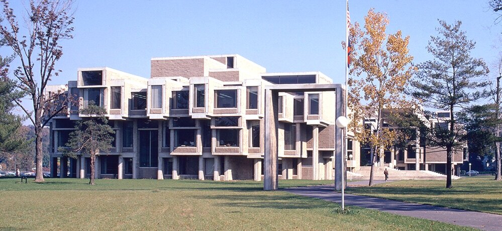
The Burroughs Welcome building, using a vocabulary of forms which combine a mountain-like profile (reflecting the context of the North Carolina terrain where it is located); along with growing cells (possibly communicating the nature of the biological research conducted within). Image courtesy of the Joseph W. Molitor architectural photographs collection, located in Columbia University, Avery Architectural & Fine Arts Library, Department of Drawings & Archives
AN ARCHITECT’S “VOCABULARY” OF FORM
Architectural historians and critics sometimes speak of an architect’s “vocabulary”—by which the don’t mean the words a designer chooses when talking or writing about their work. Rather: they primarily mean the set of forms—-volumes, shapes, geometries—with which the architect usually works, and to which they most often turn when dealing with architectural challenges. Like an individual’s most frequently used vocabulary of words, these forms are the terms which an individual architect characteristically utilizes for design solutions.

Biomorphic forms are part of the design “vocabulary” of the architect of this design: the Saldarini House by Vittorio Giorgini. Photo by MPThompsonCO1, via Wikimedia Commons.
For example, if one reviews an architect’s work, and curvaceously shaped and organically linked spaces seem to be the designer’s most often used set of shapes, then one can say their design “vocabulary” is composed primarily of organic (or biomorphic) forms of great plasticity. The work of architect Vittorio Giorgini, like the house he designed in Italy shown at right, would be an instance. Giorgini, though he could design in a variety of modes, most often seems to have used a vocabulary of organic forms.
A similar claim about “vocabulary” could be made if an architect’s work had a preponderance of rectilinear/grid-like forms, like Mies -or- alternatively, if the architect used lines that seemed to continually fracture and angle with the surprise and grace of the later work of Rudolph Steiner.
N.B.: It’s important to note that an architect’s formal “vocabulary” is a little different from an architect’s “style” (though they do overlap.) Architectural theorist Michael Brill defined style as the observable problem-solving “tendencies” of an architect. When a particular architect is confronted with a design problem, and they almost always react a particular way (that they show a tendency to approach design challenges with a frequently used solution or technique)—that would be a significant aspect of their style. Thus, if an architect always used symmetry for solving design problems, (or conversely, like Paul Rudolph, almost never used it!) that’s a facet of their style. Of if an architect, when dealing with a planning problem, often disperses the spaces over the site (or, conversely, compacts them densely,) such a tendency would be part of that architect’s “style.”
WHEN AND ARCHITECT’S VOCABULARY IS HARD TO DEFINE

We have to acknowledge that—with some architects more than others—it’s hard to define their architectural “vocabulary.” Indeed, it would be dishonest (and dishonoring) to rigidly circumscribe those designers who are amazing creative spirits, whose vocabulary has ranged over the whole universe of form—and that would certainly be true for Rudolph.
Paul Rudolph’s perspective rendering and plan for a Manager’s Office for the Parking Authority. © The Estate of Paul Rudolph, The Paul Rudolph Heritage Foundation
In a recent post—BURROUGHS WELLCOME: GEOMETRY AND RUDOLPH’S DESIGN—we focused upon geometry (and especially crystalline forms) as a possible design source or inspiration in Paul Rudolph’s work.
But that hardly defines Paul Rudolph, whose extensive work (produced over a half-century career) engaged with the greatest range of forms. A small (but telling) counter-example, to the use of crystal forms, would be this regrettably unbuilt design from 1961: a Manager’s Office for the Parking Authority for New Haven. Certainly, if one knows Rudolph’s work, one can sense that it fits well into his oeuvre. Yet it has almost nothing to do with any kind of crystalline geometry—indeed, it seems to be on the opposite end of the range of forms.
BUT AN ARCHTIECT’S VOCABULARY IS A LEGITIMATE AREA OF INQUIRY—EVEN FOR THE MOST CREATIVE DESIGNERS
Even with the caveat above—reminding of us to avoid pigeonholing architects by a too-limited view of their architectural “vocabulary”—it still can be illuminating to look for patterns that repeat in their work, as well as similar forms in the works of their contemporaries (so that the possibility of creative '“cross-pollination” can be discerned.)
There are forms which come up, repeatedly in Rudolph’s work, which have a “family resemblance"—and the form we’ll focus upon here is the most powerful to be found in nature: the Mountain.
“BUILDINGS LIKE MOUNTAINS”
Hugh Ferris (1889-1962) was the the architectural profession’s favorite renderer from the 1920’s to mid-century. He was the “go to” visualizer, whose charcoal perspective drawings were utilized by numerous (and famous) architects of the era—especially during the building boom of the teens and 1920’s, a time when hundreds of skyscrapers and ambitious projects were being proposed (and many erected) across the US.
In the early 192o’s he was called upon to create a set of renderings that would show the volumes which could arise under the proposed NYC regulations for building zoning/height/volume/floor area. The images he produced make clear that even a by-the-book adherence to the rules was no barrier to creating architectural work of profoundest power.


Although these drawings were done by Ferriss for practical, illustrative purposes, what interests us here is the mountain-like quality radiated by these images.
In another inspired drawing, captioned by Ferriss “Buildings Like Mountains,” he conveyed a sense of solidity and elemental, dramatic power—a spirit which architects could bring to their designs. His vision is of a building which seems in the process of birth, emerging from the rock of a towering mountain range.

Hugh Ferriss’ drawing, “Buildings Like Mountains.” Courtesy of Columbia University, Avery Architectural & Fine Arts Library, Department of Drawings & Archives
This is design power—and most architects embrace the dramatic possibilities of such architectonic power.
MOUNTAINS THAT ARE BULDINGS
Our earlier post, on crystalline/hexagonal form, included looking at Frank Lloyd Wright—one of the architects Rudolph supremely admired (perhaps the most of all), and Wright’s use of those geometries.
One example serves to show Frank Lloyd Wright’s work in this vein (and also that his mastery—both geometric and architectural—extended to the end of his seven active decades as a designer.) The below-left photo is of the Beth Sholom Synagogue in Elkins Park, PA, a Wright project from the 1950’s. Below-right is a model of the building, lit from within like a glowing crystal. [That’s not an illusory effect, as most of the roof of the building is made of a translucent material—so not only did this allow abundant light in during the day, but at night it sends out a glow.]


But look at the scale of the thing (which one can estimate from the size of the doors)! The building comes across as a human-constructed mountain, rising and receding with serene majesty and power, almost aloof from pedestrian concerns—or as Jane Austen put it:
“What Are Men To Rocks And Mountains?”
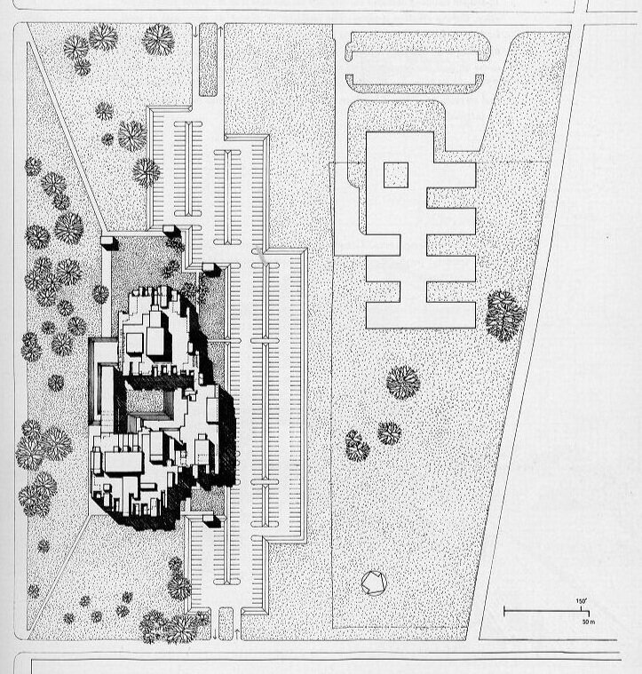
RUDOLPH AT BURROUGHS WELLCOME
For the Burroughs Wellcome Building, Paul Rudolph explicitly referenced the North Carolina context, and how it led him to a mountain-like (or hill-like) form. He wrote:
“This complex climbs up and down a beautiful ridge in the green hills of North Carolina and is architecturally an extension of its site.”
And one can see that shape in his drawings:

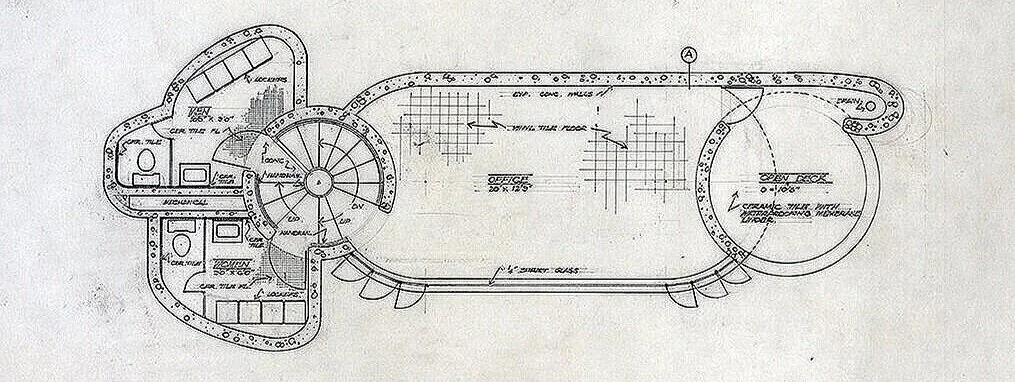
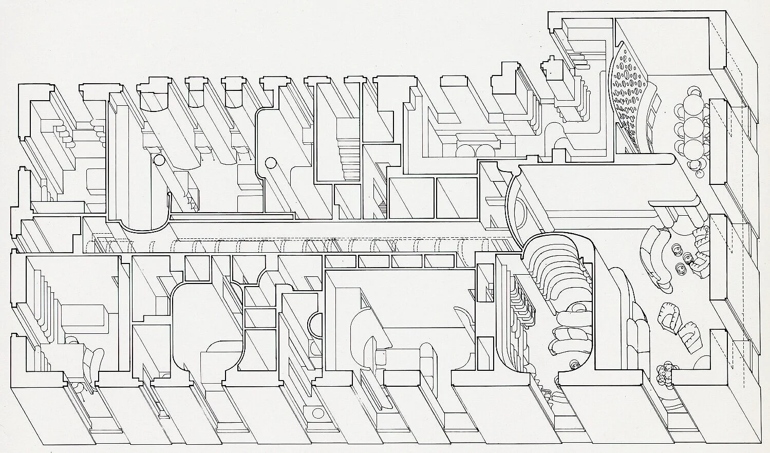
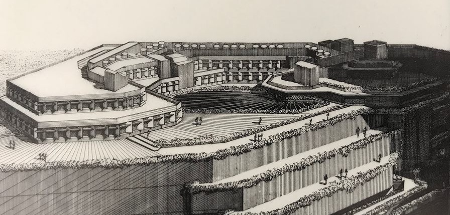
Paul Rudolph’s section drawing through the central body of the Burroughs Wellcome headquarters and research center, in North Carolina’s Research Triangle Park. This image—a “presentation drawing” meant to dramatically and convincingly convey the architect’s idea—cuts through the famous entry lobby. © The Estate of Paul Rudolph, The Paul Rudolph Heritage Foundation

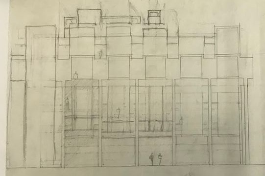
Rudolph’s construction-section drawing through the central body of the Burroughs Wellcome building, cut at almost the same spot as the drawing to the left (and it also includes part of the building’s entry lobby.) It is reproduced here at nearly the same scale as the left’s presentation drawing, so they can be easily compared. © The Estate of Paul Rudolph, The Paul Rudolph Heritage Foundation
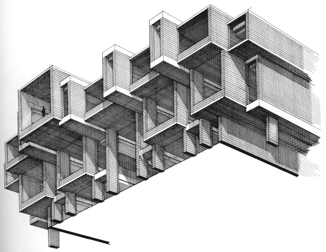
THE MOUNTAIN (AND HILLS) IN RUDOLPH’S dESIGN VOCABULARY
Paul Rudolph explored and used and abundance of forms—his design “vocabulary” was expansive and embracing of all possibilities (including some he invented).
But there are patterns. We don’t know if we’re the first to look at his extensive oeuvre for mountain-like (or hill-like) forms, but if one looks, they’re there—and in abundance. For example, his proposal for St. Boniface in Florida has the various church structures emerging from the ground, as through pushed-up by geological forces. Below is a selection of projects with such forms, from across Rudolph’s entire career.


Rudolph’s sketch for the LOMEX project—creating a mountain range?


Television Station, Amarillo, Texas The form here is particularly mountain-like, and we have written a whole article about this fascinating building, here.
YOU CAN HELP SAVE BURROUGHS WELLCOME !
The Burroughs Wellcome building is threated with imminent demolition.
It’s loss would be a disaster—a titanic waste of our nation’s cultural heritage. Remember:
When a great building is destroyed, there are no second chances.
NOW— THERE ARE TWO THINGS YOU CAN DO:
Sign the petition to save Burroughs Wellcome— Please sign it here.
We can keep you up-to-date with bulletins about the latest developments. To get them, please join our foundation’s mailing list: you’ll get all the updates, (as well as other Rudolphian news.)—you can sign-up at the bottom of this page

Even the currently empty lobby of Burroughs Wellcome still has the awe-inducing grandeur of a geological formation of mountain-range scale. Such a special work of architecture—a part of our national heritage—should not be lost. Photograph courtesy of © PJ McDonnell, The Paul Rudolph Heritage Foundation Archives
PHOTO CREDITS for the two images of the Wright temple, and the eleven examples of mountain-like forms in the work of Paul Rudolph, shown in the above post: Beth Sholom Synagogue, exterior view: photo by Smallbones, via Wikimedia Commons; Beth Sholom Synagogue, model: photo by Ricardo Tulio Gandelman, via Wikimedia Commons; Saint Boniface Episcopal Church: © The Estate of Paul Rudolph, The Paul Rudolph Heritage Foundation; Beth-El Synagogue: © The Estate of Paul Rudolph, The Paul Rudolph Heritage Foundation; LOMEX: © The Estate of Paul Rudolph, The Paul Rudolph Heritage Foundation; Apartment Hotel in Jersalem: © The Estate of Paul Rudolph, The Paul Rudolph Heritage Foundation; Morgan Annex: © The Estate of Paul Rudolph, The Paul Rudolph Heritage Foundation; Knott Residence: © The Estate of Paul Rudolph, The Paul Rudolph Heritage Foundation; East Northport Synagogue Addition: © The Estate of Paul Rudolph, The Paul Rudolph Heritage Foundation; Central Suffolk Office Park: © The Estate of Paul Rudolph, The Paul Rudolph Heritage Foundation; Maris Stella University Chapel: © The Estate of Paul Rudolph, The Paul Rudolph Heritage Foundation; Niagara Falls Central Library: Photograph by Kelvin Dickinson, archives of The Paul Rudolph Heritage Foundation; Television station, Amarillo, Texas: Photo © Ben Koush


![Two approaches to drawing a rectilinear volume (which could be a brick, a building, a part of a building, or a room…):The isometric Drawing, at the far-Left, distorts the top and bottom [plan] surface, and all the other planes too—making them into d…](https://images.squarespace-cdn.com/content/v1/5a75ee0949fc2bc37b3ffb97/1569611468636-M4EYPT5S2Q16MOXPGFUD/axonomtric%2Bdiagram-two%2Bangles.jpg)


.jpg)