Rendering Rudolph

The Plan's The Thing: Comparing the Plans of Master Architects (including Rudolph)

IMG_9175.jpg

COMPARING ARCHITECTS: DIFFICULT AND DANGEROUS

Trying to compare architects (or more precisely: comparing their bodies of work) is a dangerous game—for the challenge immediately brings up a number of thorny, imponderable questions:

Balancing the factors to be judged, as listed at left, is part of the challenge.

Balancing the factors to be judged, as listed at left, is part of the challenge.

  • Where would one begin?

  • What exactly is one comparing? [Technical mastery? Efficient planning? Aesthetic delight? Spatial variation? Contextual sensitivity? How much they changed the direction of architectural history? Diversity of building types? Energy efficiency? The satisfaction of their clients?. . . ]

  • If one is looking for an assessment of overall excellence, judging on a multi-factorial basis (including the above items), how does one balance and weight the factors?

  • For each factor, hat would one measure?

  • On what scale would one measure?

  • Is the notion of “measurement” meaningful in this domain?

  • Who are to be the judges?'

  • What values do the judges (the ones doing the comparing) bring to their decision-making?

All of these questions become ever more fraught in the context of our present culture, one whose behavior vibrates between two modes: pluralist, permissive non-judgementalism -vs- abrupt severity when making judgements. In architectural matters, we often feel sure of the rightness of our assessments (even the ones offered off-the-cuff) —yet we can crumble if ever asked to seriously and patiently address the questions of Who are we to judge? and Where do our standards originally derive from?

THE UNAVOIDABLITY OF JUDGEMENT

Philip Johnson: “We cannot Not know history” —a point which Johnson and Rudolph could both agree upon (but these long-time friends each used that lesson in very different ways.)

Philip Johnson: “We cannot Not know history” —a point which Johnson and Rudolph could both agree upon (but these long-time friends each used that lesson in very different ways.)

Paul Rudolph’s friend, Philip Johnson once scandalized the Modern architecture community by asserting:

“WE CANNOT NOT KNOW HISTORY.”

When offered, at mid-century, it seemed an outrageous claim. At that time many architects believed that (with the advent of Modernism) architecture had left history behind as something irrelevant to current practice.

[By-the-way: Johnson’s claim is one which we believe Rudolph would have agreed with—though with his own, very different ideas about what to do with such historical knowledge.]

Just as Johnson is reminding us that history is something that an honest and cultured architect cannot pretend to ever transcend, we also cannot pretend that we are exempt from making judgements—however difficult it is to try to make them.

Not only is it in our nature to offer judgement, but we are constantly called upon to do so in numerous domains and occasions, as when we are selecting collaborators, teaching, assessing what’s worth preserving, participating in juries, and prioritizing what to focus upon when working on a design (including where to allocate the budget). Most consequent of all judgements is when a client, about to enter upon a building project, makes the judgement about which architect to select for the commission. So we can make a parallel assertion to Johnson’s:

WE CANNNOT NOT MAKE JUDGEMENTS

—and, since in our education, work, and personal development, we model ourselves after the designers we admire, that inevitability of judgement applies to architects: we’ll never stop comparing them.

MAKING THE TASK A LITTLE LESS IMPOSSIBLE

Even though we’ll never stop trying to compare architects (judging their relative worth), we’ll never arrive at a broadly agreed-upon method for making “final and ultimate” assessments—and that’s owing to the fact that the scales-of-value shift in each era, as does the culture’s changing mood about what it finds interesting or crucial.

So the task is impossible—and even if it wasn’t impossible, it would be overwhelming because there are too many factors to consider. The good news is that the path is sometimes made a bit smoother for us by researchers who focus-in on a single aspect of architecture. By doing so—by showing how various architects have dealt with a specific issue—-these writers bring some clarity to the discussion. The seeming narrowness of their investigations calms the storm of mental overwhelm, and opens-up space for clearer thinking.

An excellent example is the work done by Kevin Bone and his associates, shown in the book “Lessons from Modernism,” which looked at the various ways that Modern architects—Wright, Aalto, Bo Bardi, Niemeyer, , Rudolph, and others—dealt with environmental issues, especially how they handled solar loads.

better+energy+book+cover.jpg
Lessons from Modernism, edited by architect and educator Kevin Bone, focused on strategies several prominent architects used when dealing with environmental concerns—especially solar loading. Two of Rudolph’s houses are analyzed in the book, and his…

Lessons from Modernism, edited by architect and educator Kevin Bone, focused on strategies several prominent architects used when dealing with environmental concerns—especially solar loading. Two of Rudolph’s houses are analyzed in the book, and his Walker House is shown above.

aluminum%2Bbook.jpg

Another example of this type of highly focused study are books which highlight the use of a particular architectural material (i.e.: glass, concrete, ceramics, metalwork…) and show a banquet of photos and drawings of how various architects used and detailed them. “Design With Glass” and the two-volume “Aluminum in Modern Architecture (see image at right), both by architectural writer John Peter, are classic examples of such books from the “mid-century Modern” period—and the one he wrote about glass included Paul Rudolph’s Jewett Arts Center at Wellesley College.

COMPARING ARCHITECT’S PLANS

IMG_9176.jpg

Hideaki Haraguchi’s book— A COMPARITIVE ANALYISIS OF 20TH-CENTURY HOUSES — is in this tradition of studies which concentrate on one aspect of architectural creation. The author focuses-in on floor plans designed by the most prominent and creative architects of the Modern period—and he shares his research and conclusions in three illuminating ways:

  • Chapter essays (“Tripartite Composition”, “The English Tradition”, “Towards Universal Space”…) about the various families of approaches used in the the design of house plans—richly illustrated with many examples from each era

  • An extensive timeline, from the 1400’s to the 1980’s, showing transformations in the design of residential plans—with examples of representative plans inserted within the chart

  • Numerous illustrations of the houses, based of the plans: over 100 axonometric drawings

Paul Rudolph’s work is cited in the chapter in which the author analyzes how Mid-century designers began to depart from the use of the “Universal Space” concept for residential planning (an approach which had previously been favored among Modern arc…

Paul Rudolph’s work is cited in the chapter in which the author analyzes how Mid-century designers began to depart from the use of the “Universal Space” concept for residential planning (an approach which had previously been favored among Modern architects.)

The book includes a fold-out timeline to show the evolution in Modern architects’ approaches to residential planning. Rather than just name the architects (or the houses), the author places small images of the each of the plans on the chart—a graphi…

The book includes a fold-out timeline to show the evolution in Modern architects’ approaches to residential planning. Rather than just name the architects (or the houses), the author places small images of the each of the plans on the chart—a graphically helpful method.

GRAPHIC AND SPATIAL ANALYSIS

The author’s depiction of two levels of Frank Lloyd Wright’s Robie House—one of the numerous drawings in the book which use the axonometric drawing technique to convey spatial quality as well as the plan layout.

The author’s depiction of two levels of Frank Lloyd Wright’s Robie House—one of the numerous drawings in the book which use the axonometric drawing technique to convey spatial quality as well as the plan layout.

The author, via those 3 ways of telling the story of the changes in house design, offers rich insights into master architects’ planning philosophies, techniques, and styles—and the historical context in which they operated.

But the real glory of this study are the abundance of drawings which the Haraguchi created for the book. These drawings show the plans, but also convey a sense of the each house’s spaces by also showing the walls, columns, and window & door openings—and the author does this in through axonometric drawings.

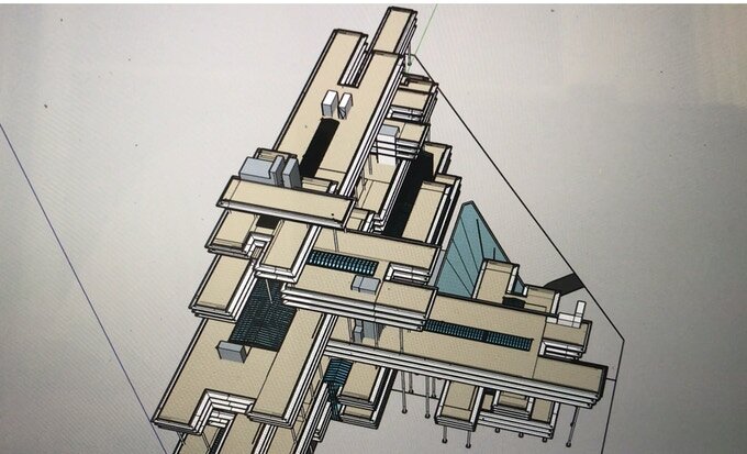
That’s a type of drawing where it looks like the walls are being extruded upward from the plan—so it an axonometric drawing not only shows the layout of the rooms, but also tangibly suggests the type of spaces which the layout gives rise to. [Although Paul Rudolph was known as a master of perspective drawing, he sometimes also utilized the axonometric drawing technique—and we posted an article about that here.]

In addition to using this explanatory drawing technique, Haraguchi’s drawings are reproduced as white images on a black background. This not only evokes the authority of traditional architectural blueprints, but this graphic approach also adds a sense of visual drama which focuses the reader’s attention.

RUDOLPH, IN WHITE ON BLACK

Those drawings are the real treasures of this book. Using that technique, Haraguchi drew over 100 axonometric plans of house designs, by forty-five 20th Century architectural masters, including:

Wright, Hoffmann, Lutyens, Niemeyer, Taut, Sharoun, Le Corbusier, Rietveld, van Doesburg, Chareau, Mies, Breuer, Neutra, Kahn, Venturi, Eisenman, Tigerman, Botta, Rossi—and Rudolph!

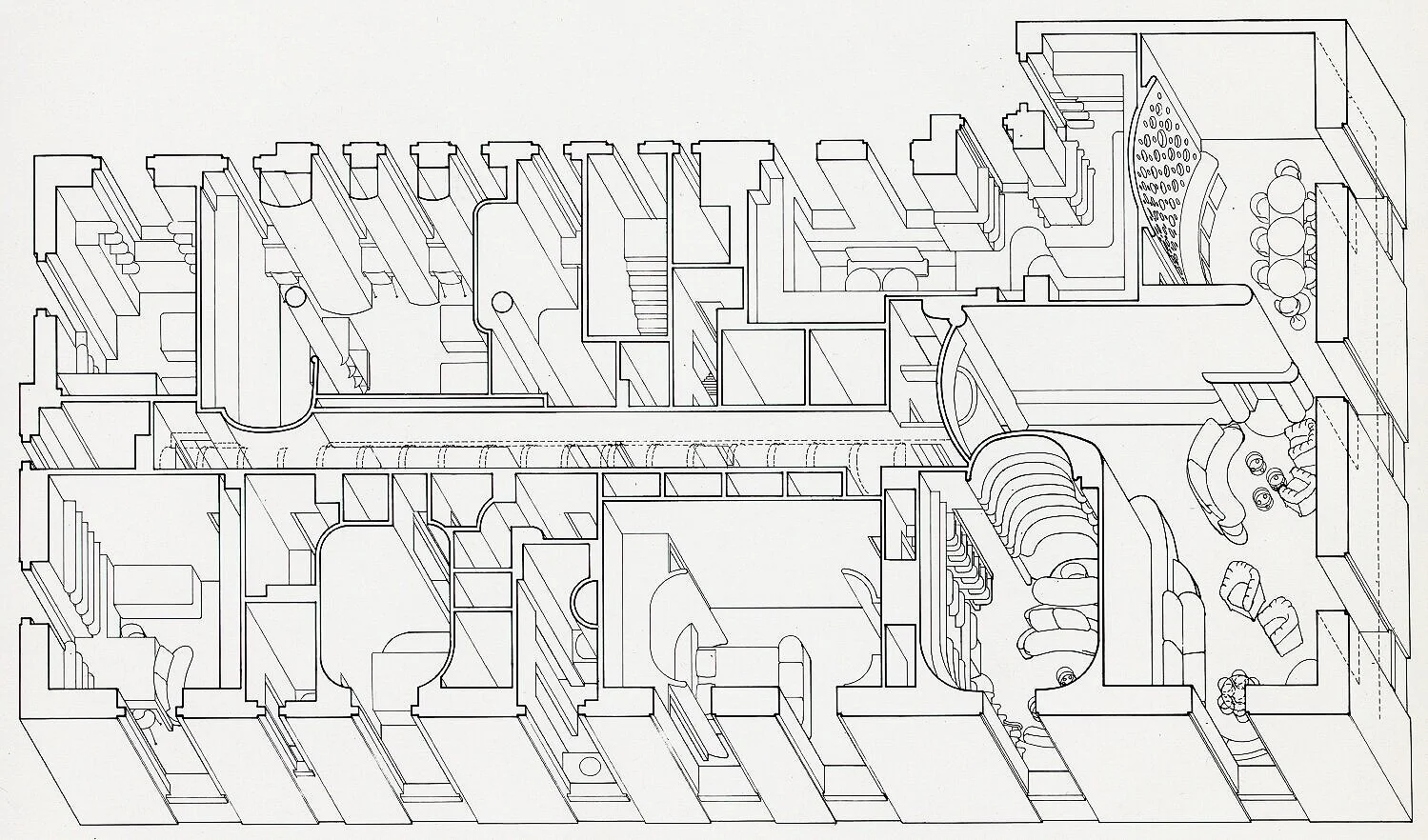
Paul Rudolph is represented by houses designed across a quarter-century of his prolific career—from the 1948 Siegrist Residence -to- the 1972 Micheels Residence. The author gives emphasis to one of Rudolph’s finest designs: the Milam Residence of 1959, showing both levels of the house.

The two-page spread wherein Haraguchi explores—via axonometric drawings—three of Rudolph’s house designs. LEFT-HAND PAGE: the 1959 Milam Residence (showing both levels.) RIGHT-HAND PAGE: the 1972 Micheels Residence (shown lower-left), and the 1948 S…

The two-page spread wherein Haraguchi explores—via axonometric drawings—three of Rudolph’s house designs. LEFT-HAND PAGE: the 1959 Milam Residence (showing both levels.) RIGHT-HAND PAGE: the 1972 Micheels Residence (shown lower-left), and the 1948 Siegrist Residence (shown upper-right.)

A closer view of the page with the Haraguchi’s drawings of Rudolph’s Milam Residence in Ponte Verda Beach, Florida. It shows the house’s two levels, and the use of axonometric drawings convey information not only abut the layout of the rooms, but al…

A closer view of the page with the Haraguchi’s drawings of Rudolph’s Milam Residence in Ponte Verda Beach, Florida. It shows the house’s two levels, and the use of axonometric drawings convey information not only abut the layout of the rooms, but also about how the walls, windows balconies (and double-height planning) shape the interior spaces.

THE POWER OF COMPARISONS

Brian Sewell was one of Britain’s most perceptive art critics (and one of the most controversial.) In this powerful video segment, about developing one’s aesthetic sense, he cites the effective use of comparison.

Comparison can be a powerful tool—especially when a scholar provides opens up the question by providing materials which allow us to intensely focus-in on an aspect of architectural design.

Brian Sewell (1931-2015), the British art critic known for his fiery opinions, as well as the depth and sensitivity of his knowledge, spoke inspiringly about the importance of comparison—what he called “a repeat experience”—for developing a deeper sense of what’s significant and beautiful. He was speaking of painting and sculpture—and the same approach can be applied to the art of architecture.

For gaining an in-depth knowledge of the approaches that were used in designing the Modern masterworks of residential architecture—how such strategies evolved, varied, an reflected larger issues and philosophies in the architecture of that century—Hideaki Haraguchi’s A Comparative Analysis of 20th-Century Houses is an indispensable resource, guide and well of insight. That he included several examples of Paul Rudolph’s work is additional evidence of the author’s wisdom.

Returning to our original theme—the difficulty of comparing architects—and the multiple obstacles entailed in such a task: this book’s concentrated examination of a single aspect of architects’ work is the sort of study that can aid—via its focus and profound clarity—in making such challenging assessments.

BOOK INFORMATION AND AVAILABILITY:

  • TITLE: A Comparative Analysis of 20th-Century Houses

  • AUTHOR: Hideaki Haraguchi

  • PUBLISHER: In Great Britain: Academy Editions; In the US: Rizzoli International

  • FORMAT: Paperback, 11-1/2” x 11-1/2”, 92 pages, hundreds of illustrations

  • YEAR OF PUBLICATION: Great Britain: 1988; US: 1989

  • ISBN: 0-8478-1023-2

  • AMAZON PAGE: here

  • ABEBOOKS PAGE: here

A broader view of the timeline in Haraguchi’s book, in which the author traces the evolution of architects’ residential planning over the course of the several centuries. Plans, representative of changing philosophies of design, are inserted into th…

A broader view of the timeline in Haraguchi’s book, in which the author traces the evolution of architects’ residential planning over the course of the several centuries. Plans, representative of changing philosophies of design, are inserted into the chart—aiding the clarity of the presentation.

IMAGE CREDITS:

Balance scale: photo by Poussin jean, via Wikimedia Commons; Photo portrait of Philip Johnson: photograph by Carl Van Vechten, from the Van Vechten Collection at the Library of Congress

Kickstarter Campaign Launched to Render Rudolph Project

Rudolph’s Perspective Rendering of the unbuilt Gatot Subroto project for Jakarta, Indonesia. Image © The Estate of Paul Rudolph, The Paul Rudolph Heritage Foundation.

Rudolph’s Perspective Rendering of the unbuilt Gatot Subroto project for Jakarta, Indonesia. Image © The Estate of Paul Rudolph, The Paul Rudolph Heritage Foundation.

A Kickstarter campaign has been launched by researcher and author Eric Wolff to professionally render one of Paul Rudolph’s little-known late works, the unbuilt Gatot Subroto project in Jakarta, Indonesia.

From the kickstarter site:

Some refer to his late works in Asia as ”seven buildings including a couple of villas” and describe Rudolph’s late career as a kind of afterthought to a, at times controversial but, prolific career.  My research into Rudolph’s archives, interviews with his office personnel and visits to his buildings in Asia, reveal that Rudolph‘s late career period was not only bountiful, but reflects a period where Rudolph was performing at the peak of his capabilities and sensibilities producing some of his finest works ever.  In his late career (1978 - 1997), Rudolph participated in about 50 projects and completed upwards of 20 buildings in Asia, cementing his place alongside, and sometimes in direct competition with, architectural titans like Richard Meier, I.M. Pei, Kenzo Tange and John Portman.  Rudolph’s late works are not well known and have not been fully evaluated, in this project I am recreating select Paul Rudolph buildings digitally from his archived drawings/material and rendering them into illustration.

Importantly, many of the ”undiscovered” Asian works exemplify Rudolph‘s specific contributions to Modernist Architecture.  You do not have to love Rudolph's buildings to appreciate that he pushed the envelope in terms of sculptural design; but he also innovated in areas of sustainability and structure.  In this project I will illustrate the ambitious Gatot Subroto (unbuilt), that was designed for Jakarta, Indonesia as an ”office village” with 875,000 square feet of office space, and 450,000 square feet of parking.  The outcome will be a full color poster sized realistic rendering of the Gatot Subroto at dusk, as well if budget allows several close up realistic renderings of the buildings interior and roof garden spaces.

The late works in Asia demonstrate how the Modernist principles base of Le Corbusier, Mies van der Rohe and Frank Lloyd Wright were combined and evolved by Paul Rudolph to create a unique new vocabulary that would inspire today’s contemporary architects.

The Gatot Subroto (Jakarta, Indonesia 1990) is an example of Rudolph’s unique point of view.  The client requested eight towers to be developed on an existing property as an office condominium complex in which the Dharmala group would occupy part of the space.  Rudolph’s initial designs reflected the request of eight towers, joined by floors spanning the complex reading as a ”perforated wall”.  The client wanted a more cohesive look from the busy street and in order to attract top clients, did not want their own anchor space to dominate the design.  Rudolph, heeding the client feedback, in his final design created a masterpiece!

The Gatot Subroto represents one of the earliest examples of sustainability in architecture.  its windows are slanted and shaded to deflect the mid-day Indonesian sun.  Between the cantilevered three floor blocks are void-decks capped with roof garden terraces, increasing the green factor higher than the buildings footprint.  A testament to sustainability before it was even in fashion.

Paul Rudolph’s original project model for the Gatot Subroto project. Image © The Estate of Paul Rudolph, The Paul Rudolph Heritage Foundation.

Paul Rudolph’s original project model for the Gatot Subroto project. Image © The Estate of Paul Rudolph, The Paul Rudolph Heritage Foundation.

Mr. Wolff began researching the architect’s late designs for his upcoming book RUDOLPH :: RENAISSANCE Evaluating Paul Rudolph’s contributions to Architecture through his undiscovered late works until in-person activities were curtailed due to COVID-19.  Not to be deterred, he began to recreate Rudolph's “unbuilt” designs as digital models.  

The Gatot Subroto model in progress. Image courtesy Eric Wolff.

The Gatot Subroto model in progress. Image courtesy Eric Wolff.

According to Mr. Wolff,

“As part of my research I am digitally ‘building’ the Gatot Subroto based on drawings and models from Rudolph’s uncatalogued materials.  I am working with a firm to render my digital ‘build’ into a life-like poster sized illustration of the building.  We will render a scene with the building as seen from the street at dusk to emphasize the structure and fenestration.  The output will be a large full-color poster illustration of the Gatot Subroto at dusk, which we will have professionally printed and available for donors. The illustration will later be used in the book and at events promoting the book.

To illustrate these designs an exciting collaboration with Design Distill was born.  Design Distill is a multidisciplinary group that has the passion, talents and capabilities to translate my research of Paul Rudolph’s late works into visualizations, bringing the buildings to life so they can be evaluated and celebrated.

Rudolph’s buildings need to be experienced to be properly critiqued; making life-like  illustrations will help viewers experience the buildings and interior spaces more completely.  The digitization will help myself and other researchers study the structural and design elements intended by Rudolph.  It will ”preserve” the buildings as they were intended to be built but with the ability to look at them in three dimensions and with the possibility of exporting the files for 3-D printing.

Importantly, the ‘eye candy’ of the buildings mask important contributions and innovations that Rudolph gave to the world of architecture, and through the rendering of his works his design principles can be further evaluated.  This project will re-create the Gatot Subroto from blueprints, models and drawings and produce realistic renderings of the exterior, roof gardens and select interior spaces so they can be better understood and evaluated.  The funding from this Kickstarter has been budgeted specifically for the work related to the Gatot Subroto.

The Paul Rudolph Heritage Foundation’s mission includes supporting research about Mr. Rudolph’s architectural legacy and we are assisting Mr. Wolff’s kickstarter campaign as well as his future book.

We encourage you to help make this project a reality by going to the kickstarter link here and please share this project with your friends. Let’s see the Gatot Subroto project as Rudolph had intended!


Burroughs Wellcome: Let the Historians Speak!

Photograph courtesy of © PJ McDonnell, The Paul Rudolph Heritage Foundation Archives

Photograph courtesy of © PJ McDonnell, The Paul Rudolph Heritage Foundation Archives

GREAT BUILDINGS: FROM BIOGRAPHY -TO- HISTORY

In our first earlier posts about the Burroughs Wellcome Building, we’ve looked at it from multiple viewpoints: its most significant features, its overall history, its use in Film and Television, and as an example of the creative process in architecture (from concept-to-details).

Buildings have biographies—just like people—and those articles could be said to be primarily “biographical”. But, just like any a person’s life story, a building is also subject to assessment—the judgement of discerning historians, as well as it’s occupants, visitors, critics, and journalists. This process starts from the time the design is unveiled, and continues through the years of its existence and memory.

Here, we’ll let several architectural historians speak: offering their insights into the building’s design, physical presence, spatial-sensual qualities, and its relation to the users’ needs and experiences.

better+tony+monk+cover.jpg

THE ART AND ARCHITECTURE OF PAUL RUDOLPH

By Tony Monk

“Stretching expansively across a wooded hillside ridge in North Carolina, this large corporate headquarters and laboratory complex for the intranational Burroughs Wellcome company typified Paul Rudolph’s dramatically sculptural style. In response the the client’s need for a distinctive image to represent the company’s performance, Rudolph designed a building which was intended to be a forceful extension of the hillside itself. Inside he created a spatial and structural solution that was uniquely original and possessed ultra-modern space-age characteristics.”

“The most dramatic feature of this design was the all-pervading characteristics that were created by the sharply angular slopes to the walls and columns. Surprisingly these were built at 22-1/2 degrees to the vertical, a device which Rudolph said echoed step inclines of the hills around the site. These interesting geometric forms were repeated extensively around the building—in windows angled downward, in the sloping seats and solid balustrades. Even the cupboards and service doors in the corridors . . . . were all built at this very steep angle.”

“A decade after this development was completed (in 1972), Paul Rudolph as asked to extend the premises to incorporate medical offices and a large dining room for the staff. He continued the theme of the angled supports, but this time used V-shaped twin columns, which created a crystalline rhythm throughout the extension. The sizeable restaurant was generally single-storey around the perimeter but then rose up dramatically to five storeys in the middle to provide roof lighting at the center with various mezzanine levels skirting this interesting space.”

“Together, the soaring internal areas, punctuated by the balconied walkways, and multi-level offices, pierced with unexpected floods of light, all contribute to make this one of Paul Rudolph’s best works.”

“The headquarters is both a credit to and a reward for the enlightened client who commissioned and then recommissioned Paul Rudolph to design this amazingly original modern building. . . .” — excerpted from: The Art and Architecture of Paul Rudolph, by Tony Monk, West Sussex, Wiley-Academy, 1999

colorful%2Bde%2Balba%2Bcover.jpg

PAUL RUDOLPH: THE LATE WORK

by Roberto de Alba

The “new wing” of the Burroughs Wellcome building (with V-shaped frames), referred to by historian Roberto de Alba. Image © the estate of Paul Rudolph, The Paul Rudolph Heritage Foundation

The “new wing” of the Burroughs Wellcome building (with V-shaped frames), referred to by historian Roberto de Alba. Image © the estate of Paul Rudolph, The Paul Rudolph Heritage Foundation

“…Rudolph devised an elongated hexagonal module that gives the building a strong horizontal reading on the long elevations. The module reveals its hexagonal geometry in the short elevations., pulling out of the building in interesting ways to express its ability to expand.”

“The interior spaces are a direct by-product of the diagonal structural geometry and are simply stunning. The entry lobby is a thing of the future. The space soars, exposing three levels of balconies, which maintain the diagonal lines of the A-frame. The lab spaces are unusual in their high ceilings and natural illumination (by skylights). It is not surprising that the futuristic interiors of the building were the setting for the movie Brainstorm.”

“The new wing adopts some of the themes of the original building, transforming them in interesting ways. The hexagonal module reappears in the long elevation, reinforcing the linearity of the wing. The A-frame of the original turns into a V that is exposed and repeated in parallel along the length of the wing.” — excerpts from: Paul Rudolph: The Late Work, by Roberto de Alba, New York, Princeton Architectural Press, 2003

The “ziggurat” character of the building, mentioned by Stimpson, is captured in this photograph. Image courtesy of Joseph W. Molitor architectural photographs. Located in Columbia University, Avery Architectural & Fine Arts Library, Department o…

The “ziggurat” character of the building, mentioned by Stimpson, is captured in this photograph. Image courtesy of Joseph W. Molitor architectural photographs. Located in Columbia University, Avery Architectural & Fine Arts Library, Department of Drawings & Archives

A FIELD GUDE TO LANDMARKS OF MODERN ARCHITECTURE IN THE UNITED STATES

by Miriam f. Stimpson

“A dynamic and expressive design was created for this administrative headquarters. Rhythm and space are achieved through the use of strong external forms arranged in a contemporary “ziggurat fashion.” Lighting within the interior spaces effectively adds to the building’s design. The interaction of bold forms with the rolling hillside is intriguing as well as harmonious. The building is one of its kind in the nation.” — adapted from: A Field Guide to Landmarks of Modern Architecture in the United States, by Miriam F. Stimpson, Englewood Cliffs, Prentice Hall, 1985

HABs+logo.jpg

HABS: THE HISTORIC AMERCAN BUILDINGS SURVEY

The Historic American Buildings Survey (HABS), founded in 1933, is part of the Historic Documentation Programs administered under the National Parks Service. HABS is charged with documenting America's architectural heritage. Their report on Burroughs Wellcome (Report No. NC-418), written by architectural historian Vyta Baselice, is currently the most comprehensive survey and assessment of of the complex.

The full report can be accessed here. It is well worth quoting extensively—and it is our pleasure to present a selection of excerpts from it:

“The Burroughs Wellcome Corporation Headquarters in Research Triangle Park, North Carolina was designed by Paul Rudolph starting in 1969 and completed by the Daniels Construction Company in 1972. Planned as an “M.I.T. of North Carolina” this area between Raleigh and Durham was developed starting in the 1950s as a center for high-tech corporate research to attract and keep a highly educated, white-collar population in a Jim Crow state. Research Triangle’s ability to lure the pharmaceuticals giant Burroughs Wellcome, a company with roots in nineteenth century England, away from their suburban New York headquarters solidified the area’s status as a significant economic center no longer merely on the regional, but now also on the national scale. The design and construction of the new Wellcome Headquarters building was a significant affair and was meant to make a statement regarding the company’s new modern image and illustrate the advanced state of laboratory research and pharmaceutical work in the Research Triangle. Paul Rudolph worked with the corporation to design facilities that would accommodate a wide range of functions. . . .”

“The building is notable for its futuristic design, frequently described as Brutalist, marked by an exposed concrete and aggregate exterior and slanted steel columns that intersect in V-shapes and give the structure its distinctive appearance.”

“The structural system employed in the building also showcases the architect’s interest in industrial construction methods and the use of prefabricated panels for exterior and interior partitions. Rudolph likewise experimented with the integration of novel materials and exterior treatments. . . .”

“In terms of interior design, the building offers expansive multi-story gathering spaces with spot lighting exposing the irregular structural system. Bright carpets that blended red, orange, and pink colors were installed in communal areas to add to the drama of the headquarters. Other spaces that received extensive attention include research laboratories with state of the art equipment and custom-fitted cabinetry. . . .”

“. . . . raised in the South, the architect had the ideal background to design a world-class building in North Carolina that was global and radical in its approach yet sensitive to local work and life patterns. In addition to his professional expertise and reputation, Rudolph brought excellent customer service. Burroughs Wellcome leadership noted the architect’s “bedside manner of a sympathetic physician” and his ability to “cushion us against the shock-waves of certain mundane realities that have a habit of looming larger and larger.”

“Despite the challenging construction process, Burroughs Wellcome was nonetheless completed in 1972 and applauded instantly for its bold appearance. The structure’s distinctive architectural character is most clearly visible at the entrance to the building. The façade is a playful arrangement of angular forms that appear to grow out of the core structure. While visually provocative, the façade fails to reveal its organizational logic. It instead suggests that the sculptural complex must serve an intrinsically futuristic and forward-thinking function whose true nature cannot be fully comprehended from the exterior. One therefore must enter the structure and learn about its activities in order to understand the architectural arrangement. In this way, Rudolph’s design contradicts the famous “form follows function” rule, first suggested by Louis Sullivan in the nineteenth century. The exterior’s formal gymnastics are accomplished through a careful arrangement of exposed structural members. Indeed, the bold white columns that sit at a 22.5-degree angle are particularly important in breaking up the building’s forceful horizontality. Other design elements, like the white window beams, repetition of the concrete panels, and even the flag pole, echo the slanted verticality of the structural columns and add to the productive tension of the design.”

“In addition to the structure, Rudolph’s careful selection of construction materials, which were limited primarily to metal, glass, and concrete, add to the building’s distinctive appearance. As discussed above, the metal superstructure, comprised of A-frames that are painted white, breaks up the building’s horizontality. Rudolph did not treat the building’s windows in a conventional manner – instead, they appear as entire surfaces that follow and accentuate the building’s shape. At times, they wrap around the structure, much like Le Corbusier’s ribbon windows at Villa le Lac. The glass is also tinted and the scale and positioning of the windows follows a rhythm established by the concrete panels. Finally, the precast concrete panels with a carefully selected medium-size grey tint gravel contribute most significantly to the design’s distinctive character. And the concrete mix is employed not only on the façade, but all throughout the building’s interior as well as some of the sidewalks that are immediately adjacent to the structure. Most notably the aggregate was also used for the reception desk.”

“Although the building is visually compelling, Rudolph’s interest in curating the visitor’s experience by playing with scale and volume is significant and typically understated, especially in photographic representations. However, this is an important aspect of the overall architectural experience, particularly the entrance, and reflects the influence that Frank Lloyd Wright had upon Rudolph’s work. Upon climbing up a set of concrete stairs up to the level of the structure (or by exiting one of the two executive carports), the visitor will encounter the large structural columns. The first columns and space encountered are distinctly smaller and compressed. As the visitor proceeds to the entrance, both the volumes and columns progressively increase in scale until the first major gathering space opens up to reveal the grand scale of the building. The third-floor balcony, which hovers over this front plaza, adds to the drama and spectacle of the design. Archival photographs reveal that the main plaza was used as an events space with seating arranged facing the glazed wall. The door to the building is notably missing from this grand space and instead is situated to the side out of sight, underneath a sizeable horizontal plane. “

“Upon entering the building, the visitor’s movement and experience are once again carefully curated in a familiar arrangement of volumes that progressively increase in size, finally revealing an impressive lobby whose height extends three levels. While undoubtedly striking, the lobby appears to be taller than it actually is due to Rudolph’s design of openings that employ the 22.5-degree angle and decrease progressively thus heightening the visitor’s sense of verticality. The lobby is an architecturally distinctive space, notably different in character from the exterior forms, that creates a cave-like environment. The laboratory wing of the structure contains a similarly open multi-level communal space.”

“Modernist architects often hoped that unusual architecture that challenged common work and living practices would encourage greater creativity and efficiency. Paul Rudolph and Burroughs Wellcome were not an exception. The design integrated some novel solutions for creating multi-purpose spaces. For example, the large auditorium located off the lobby had a mechanism that would have brought about partitions to bifurcate the large space into two for smaller viewing audiences. While actual creative output is difficult to measure, the company’s attitudes were clearly displayed in photographs of workers and their daily activities. For example, company photographs commonly featured the building as a framing device, which in one case took up more of the portrait than the workers themselves. Similarly, when advertising one of the company’s products, employees were shown interacting with the building in a creative way, climbing atop the different layered roofs and hanging out with their colleagues. Even when engaging in other types of work-unrelated leisurely activities, like participating in company-sponsored health programs or playing softball, workers could not avoid the presence of the distinctive structure. The building’s design therefore served as a tool to maintain company presence throughout the workers’ daily experiences.”

Pages from the HABS report on Burroughs Wellcome, like the one shown above, have intriguing illustrative material, generally not found outside of archives.

Pages from the HABS report on Burroughs Wellcome, like the one shown above, have intriguing illustrative material, generally not found outside of archives.

This page from the report includes a drawing produced by Rudolph’s office: a sketch showing how offices would be arranged along the building’s angled window walls.

This page from the report includes a drawing produced by Rudolph’s office: a sketch showing how offices would be arranged along the building’s angled window walls.

Heyer+american+architecture+cover.jpg

AMERICAN ARCHITECTURE: IDEAS AND IDEOLOGIES IN THE LATE TWENTIETH CENTURY

By Paul Heyer

“The dynamics of diagnonal, tapered space are further explored in the more complex program for the corporate headquarters of Burroughs Wellcome. Here, within the diagonal movement of interior space, Rudolph says that “growth and change is implicit in the concept. It is the idea of a building never finished where one can pull out parts.” Architecturally it is a delineated and tightly resolved attitude that, in spirit at least, somewhat parallels that of [John] Johansen’s more “as built,” loosely conceived and less seemingly-manipulated and open-ended approach. The building’s diagonal volume is an upward extension of the crest of a ridge on which it is built. The set back floors allow for a continuous system of skylights at each floor to pull light deep into interior spaces while enabling ceiling heights to be raised to fifteen feet at the building’s exterior edges, increasing the sense of space in movement with the interiors. As the linear planes of the building are bunched in an end expression of solid, shifting, tubelike elements, they visually evoke the idea of modular elements, although in fact they are the product of conventional steel frame construction. The groping and combining of modular elements as and expression of a technological capability, a sound idea if one not so economically possible in reality, is a notion that continues to preoccupy Rudolph and in many ways give impetus to the shifting planes that impinge upon rather than elementally define space.” — excepted from: American Architecture: Ideas and Ideologies in the Late Twentieth Century, by Paul Heyer, New York, Van Nostrand Reinhold, 1993

NORMAN FOSTER

Finally, since Rudolph’s drawings for the Burroughs Wellcome building are so compelling, here is a quote from Norman Foster. He has the advantage of a long perspective on Paul Rudolph—an historical viewpoint—going all-the-way back to the time when he had been a student and employee of Rudolph’s, while studying at Yale.

“Many of the these drawings, especially the perspective sections, would encapsulate in a single image the range of Rudolph’s concerns as an architect. There was his quest to define and model space with light and planar surfaces; his interest in climate and the relationship between structure and services; his exploration into modularity and the potential of prefabrication—a later interest in high density urban mega-structures.” — Norman Foster, from the foreword to: The Art and Architecture of Paul Rudolph, by Tony Monk, West Sussex, Wiley-Academy, 1999

Rudolph’s perspective-section drawing through the body of the building (with its famous entry lobby), indicating the dynamic spaces within. Image © the estate of Paul Rudolph, The Paul Rudolph Heritage Foundation

Rudolph’s perspective-section drawing through the body of the building (with its famous entry lobby), indicating the dynamic spaces within. Image © the estate of Paul Rudolph, The Paul Rudolph Heritage Foundation

YOU CAN HELP SAVE BURROUGHS WELLCOME !

Burroughs Wellcome’s loss would be a disaster—a titanic waste of our nation’s cultural heritage.

When a great building is destroyed, there are no second chances.

NOW, THERE ARE TWO THINGS YOU CAN DO:

  • Sign the petition to save Burroughs Wellcome. You can sign it here.

  • We’ll send you bulletins about the latest developments. To get them, please join our foundation’s mailing list: you’ll get all the updates, (as well as other Rudolphian news.)—you can sign up at the bottom of this page.

A good example of the powerful drawings, in which Rudolph explored and conveyed his vision—as spoken of in Norman Foster’s quote above. This is his perspective rendering of the dining area (about which historian Tony Monk wrote)—a dynamic space whic…

A good example of the powerful drawings, in which Rudolph explored and conveyed his vision—as spoken of in Norman Foster’s quote above. This is his perspective rendering of the dining area (about which historian Tony Monk wrote)—a dynamic space which was constructed as part of the 1976 extension. That addition has been demolished, and now the main part of the building is under threat too. Image © the estate of Paul Rudolph, The Paul Rudolph Heritage Foundation

Rudolph at Burroughs Wellcome: Concept, Development, and the Caring Details

The Burroughs Wellcome was designed for growth—and this is a section drawing study by Paul Rudolph, for an extension to the building. Such a colorful drawing might look exuberantly and boldly “arty” (as though the architect had only a nebulous relat…

The Burroughs Wellcome was designed for growth—and this is a section drawing study by Paul Rudolph, for an extension to the building. Such a colorful drawing might look exuberantly and boldly “arty” (as though the architect had only a nebulous relation to practicalities)—but a close inspection shows that, while Rudolph was developing the overall concept, he was simultaneously paying close attention to dimensions, adjacencies, floor heights, and the locations of different functions. This kind of drawing—seemingly florid, but layered with distilled, practical information—is typical of the kind of study drawings which Paul Rudolph did at the beginning of his design process. © The Estate of Paul Rudolph, The Paul Rudolph Heritage Foundation.

"We Must Understand That After All The Building Committees, The Conflicting Interests, The Budget Considerations, And The Limitations Of His Fellow Man Have Been Taken Into Consideration, The Architect’s Responsibility Has Just Begun. He Must Understand That Exhilarating, Awesome Moment.

When He Takes Pencil In Hand, And Holds It Poised Above A White Sheet Of Paper, He Has Suspended There All That Has Gone Before And All That Will Ever Be." 

—Paul Rudolph

ARCHITECTURAL DESIGN: THE MYSTERY

In looking at Burroughs Wellcome—one of Paul Rudolph’s best (and best loved) creations—one naturally wonders: How did such a design come to be? With a prolific architect like Rudolph, whose creativity took him along so many different paths, that’s a compelling inquiry.

“How does the magic happen?” That’s one way of putting one of the most fascinating questions about the creation of architecture—for it’s indeed a wonder how one gets all-the-way from a client’s request to a tangible, solid, building that’s ready-for-occupancy.

The least mysterious phase happens at the end of the process: once a “construction set” of drawings (sometimes called “working drawings” or the “contract set”) has been drawn-up by he architect and issued to the general contractor, the process of construction is fairly well understood. [Although, as anyone who’s ever been involved in building project can tell you, it is also fraught with possible pitfalls, detours, and surprises.]

But perhaps it would be useful to return to the beginning of the process….

ARCHITECTURAL DESIGN: THE PROGRAM

Initially, the architect receives requests and information from the client: the “program”. Sometimes this is nebulously articulated—or conversely, sometimes the client’s needs are enumerated in intimidatingly calibrated detail. Rudolph wrote urgently about the need to get, early on, as much info as possible:

“Always, always, always, everything, everything, everything at the beginning. I'm a great believer in the big bang. You cannot isolate parts, ever. That's the reason why it's so important to know as much detail as possible at the very beginning.”

“I'm just saying that for me it's a matter of getting your fingers on what you can and cannot do from a legal viewpoint . . . . You have to know what's possible. Architecture is not a question of the purely theoretical if you're interested in building buildings. It's the art of what is possible.”

A sketch by Paul Rudolph, in which he’s working out the design of a hallway within Burroughs Wellcome. This sort of drawing shows another aspect of the architect’s working method: the section is sketched adjacent to the plan, and at the same scale (…

A sketch by Paul Rudolph, in which he’s working out the design of a hallway within Burroughs Wellcome. This sort of drawing shows another aspect of the architect’s working method: the section is sketched adjacent to the plan, and at the same scale (so that both can be well coordinated). At top right one can clearly see part of the plan layout, including rooms and what appear to be laboratory benches. © The Estate of Paul Rudolph, The Paul Rudolph Heritage Foundation.

At Burroughs Wellcome—which functioned as not only a corporate headquarters, but as also an active pharmaceutical research center with extensive laboratories and testing facilitates (where Nobel Prize winning work was conducted!)—Rudolph would have received a careful listing of the functions that the 300,000 square foot building had to accommodate, including the approximate sq. ft. area needed for each. Sometimes programs also indicate significant “adjacencies” (what specific spaces need to be nearby each other).

Just as important (as the above “material” needs) are the intangible ones: what the project means to the client, and what it will communicate. Significance and symbolism: they’re as much part of the program as the list of required rooms. It’s not always easy to determine this, and clients are generally not used to articulating such matters. As Rudolph states, it’s important to find out..

“…what it is the owner truly wants to do— but he doesn't necessarily tell you, you have to read between the lines— and what should be done ideally.”

ARCHITECTURAL DESIGN: THE GRAND SYNTHESIS

It is at this point that the mystery truly begins. The architect creates an overall concept for the building’s organization: the “parti”—and with it will be the architect’s most central decisions about the building’s placement on the site, the organization of the plan, and the shaping of spaces and volumes—along with concepts about which structural system and what materials are to be used.

Looking over the architect’s shoulder—in the process of creation? Here Paul Rudolph is photographed working at his drawing board in his New Haven office, with members of his staff in the background.

Looking over the architect’s shoulder—in the process of creation? Here Paul Rudolph is photographed working at his drawing board in his New Haven office, with members of his staff in the background.

How this happens—the very process of creation—is one of the great human questions, whether it be examined in the context of painting, music, literature, or architecture. Some architects refuse even to talk about it, claiming it’s a very intimate matter (and likely, one they don’t even quite understand themselves.) Some are prolix in their explanations, offering either theoretical, meat-and-potatoes, or poetic rationales for what they do. At the other end of the spectrum are “functionalist” architects like Hannes Meyer (who, for several years, was director of the Bauhaus): he claimed that arriving at design solutions was like solving an a mathematical problem, and he offered a stark equation: Function x Economy = Architecture. Rudolph repudiated such such an extreme position, saying:

All I'm really saying is that the most rational architect in the world is not to be trusted at all because there is no such thing as true rationalism when you are speaking of architecture.

Rudolph himself acknowledged the mystery of the phenomena of creation:

“In terms of how one goes about designing anything, you don't really know, or at least I don't know, until after the fact. There are so many elements that come into play that if you wait to figure out what it is you truly want to do once you have a project to work on there won't be enough time. You have to, as I see it, have a reservoir of things that you feel should be done and then you draw on that reservoir and hopefully apply elements from that reservoir in an intelligent fashion. . . . . You can have one hundred reasons why you do things after the fact.”

“I can say that in spite of all the rationalizations that architects go through, including myself, you can pay no attention to what architects say, you can only pay attention to what they do.”

Because architecture must deal with very practical issues—from space needs -to- the structural capacity of steel—the truth about the nature of architectural creation would necessarily be a merging of the functional and the artistic ways of solving problems. Beyond that, the essential nature of the “synthetic leap” is conjectural (though the topic of design creativity has been an area of ongoing serious research.)

ARCHITECTURAL DESIGN: DEVELOPMENT

Burroughs Wellcome allows us to see another aspect of architectural creation: “design development.”

Architects use “development” in a different sense than is used in the real estate field. Architecturally, it means taking the designer’s original conception of the building and working out the particulars.

A section sketch drawing, by Paul Rudolph, showing him in the process of designing the canopy for the main entrance to the Burroughs Wellcome building. A good example of design development, the drawing shows how Rudolph was working out his idea abou…

A section sketch drawing, by Paul Rudolph, showing him in the process of designing the canopy for the main entrance to the Burroughs Wellcome building. A good example of design development, the drawing shows how Rudolph was working out his idea about the shaping of the space and volumes—yet simultaneously thinking through the structure (steel beams and possibly steel joists are shown), scale (his placement of figures), choice of materials, and key dimensions. His use of color, to indicate different materials and planes, is part of the language of architectural drawing which extends back to the 18th century. © The Estate of Paul Rudolph, The Paul Rudolph Heritage Foundation.

For example: it’s not enough that the architect might have started out by envisioning a lobby with cantilevered balconies, supported by a steel structure. In the design development phase, the exact heights, projection, angles, and materials of those balconies would begin to be thought through (including their relationship to the building’s structure.)

Below is Rudolph’s perspective- section rendering through the Burroughs Wellcome building and site:

Paul Rudolph’s perspective-section rendering through Burroughs Wellcome, cutting though the main entry lobby, and showing the building’s relation to the site. © The Estate of Paul Rudolph, The Paul Rudolph Heritage Foundation.

Paul Rudolph’s perspective-section rendering through Burroughs Wellcome, cutting though the main entry lobby, and showing the building’s relation to the site. © The Estate of Paul Rudolph, The Paul Rudolph Heritage Foundation.

In the middle of it, he shows one of the building’s most famous features— it’s entry lobby:

Enlargement of a portion of Paul Rudolph’s perspective-section through the Burroughs Wellcome building, focusing in on the main entry lobby. © The Estate of Paul Rudolph, The Paul Rudolph Heritage Foundation.

Enlargement of a portion of Paul Rudolph’s perspective-section through the Burroughs Wellcome building, focusing in on the main entry lobby. © The Estate of Paul Rudolph, The Paul Rudolph Heritage Foundation.

Clearly, he already—even at this stage—has a thorough conception the layout and features of this lobby. In this rendering one can see important features, including: the stepped volumes at the right side of of the second floor’s balcony, the steps and platforms in the foreground and in the distance, the beam crossing from one side of the third floor’s balcony to the other, and the angled columns.

And in the actual, built space—

Burroughs Wellcome’s main entry lobby. Image courtesy of the Massachusetts Institute of Technology, photograph by G. E. Kidder Smith

Burroughs Wellcome’s main entry lobby. Image courtesy of the Massachusetts Institute of Technology, photograph by G. E. Kidder Smith

—these aspects of the design were almost exactly carried out.

Enlarging a portion of that section-perspective rendering reveals that Rudolph was already thinking about the structural aspects of the building—and not just the diagonal columns. Below you can see that the section cuts through steel beams—and, allowing for perspective, that steel-work would have framed directly into the diagonal vertical structure.

Close-up of Paul Rudolph’s perspective-section through the Burroughs Wellcome building, here focusing in on the main lobby’s third floor balconies. © The Estate of Paul Rudolph, The Paul Rudolph Heritage Foundation

Close-up of Paul Rudolph’s perspective-section through the Burroughs Wellcome building, here focusing in on the main lobby’s third floor balconies. © The Estate of Paul Rudolph, The Paul Rudolph Heritage Foundation

One might imagine that, for an architect of Rudolph’s vast experience, inclusion of such structural elements in a rendering (and placing them in the right locations) would be almost intuitive. Perhaps—so for a clearer example of development, let’s look at what happens when the Burroughs Wellcome building section needs to move in the direction of constructable drawings.

Close-up of Paul Rudolph’s perspective-section rendering of Burroughs Wellcome, focusing on the main body of the building and its entry lobby. © The Estate of Paul Rudolph, The Paul Rudolph Heritage Foundation

Close-up of Paul Rudolph’s perspective-section rendering of Burroughs Wellcome, focusing on the main body of the building and its entry lobby. © The Estate of Paul Rudolph, The Paul Rudolph Heritage Foundation

Above is an enlargement of the main body of the building’s section-perspective. It’s beautiful to look at, and Rudolph’s legendary skill as a perspectivist pulls us in, fascinated by the forms he’s chosen and the rich ways he’s depicted them.

But this is where design development begins: those forms and spaces need to be exactly defined and dimensioned, materials need to be specified, and the relationship of all the parts needs to be coordinated with precision (including with the structural system). Below is the a drawing, from Rudolph’s office, which does this: it’s filled with notes, dimensions, and shows the relationship of the section to adjacent parts of the building which are beyond. This development will then lead to more drawings—which contain even more construction information (including final details)

Section drawing, through main entrance, of the Burroughs Wellcome building. © The Estate of Paul Rudolph, The Paul Rudolph Heritage Foundation.

Section drawing, through main entrance, of the Burroughs Wellcome building. © The Estate of Paul Rudolph, The Paul Rudolph Heritage Foundation.

ARCHITECTURAL DESIGN: CARE IN THE DETAILS

When someone refers to “details,” they are usually peaking of the smallest (or least important) aspects of a project or situation—and the use of the term is often dismissive. But in architecture, the opposite is true: the “details” are intensely important. When architects say “details,” they mean the particular ways that the parts (and assemblies of parts) and materials of a building are selected, shaped, located, and connected together.

Rudolph’s attention to the detail was comprehensive, and even extended to the drainage channels (which he used to form striking angled lines on the building’s exterior), aligning them with the window divisions (“muntins”) and designing a ground-leve…

Rudolph’s attention to the detail was comprehensive, and even extended to the drainage channels (which he used to form striking angled lines on the building’s exterior), aligning them with the window divisions (“muntins”) and designing a ground-level concrete element (“splash block”) that further carried out the linear theme. Photograph © PJ McDonnell, The Paul Rudolph Heritage Foundation Archives

This can extend to from things that occupants would hardly ever notice (like how waterproofing materials are positioned), to things they directly see and engage with daily (like the design of railings, elevator buttons, and even the choice of typeface for the building address numbers.) These visual elements may, in themselves, be small—-but cumulatively they convey a sense that the building was designed with thoroughness and unflagging attention. It shows that the architect cared, and that each decision (whether it be about the shape of a stair nosing or the tint of the windows) is consistent with an overall vision for the building. [And if such care is not exercised, even a new building can convey a sense of disheartening sloppiness.]

Rudolph cared.

He learned this not only from his teachers, like Gropius (the drawings for whose projects are detailed with surprising care), but also from the beginning of his practice, when he had to become inventive with inexpensive materials in order to work within modest construction budgets. And of course, Mies van der Rohe—one of the titans of Modernism—had a famous saying that all architects knew well: “God is in the details.”

A building’s construction set, which includes drawings of all the details, occupies a large part of an architect’s (and their staff’s) attention. This can mean generating dozens (and for some very complex buildings: hundreds) of drawings. It’s a challenge to maintain the architect’s original “vision” of the building, so that it does not get distorted or diluted in the course of creating the construction documents from which it will be built.

A CASE STUDY: DETAILS AT BURROUGHS WELLCOME

At Burroughs Welcome, we can follow an example of the care which Rudolph and his team brought to the details.

Below-left is reproduced the right side of Rudolph’s perspective-section through Burroughs Wellcome. In it we can see that the edges of the floors typically terminate in a set of continuous architectural elements: a band of angled windows, a band of angled skylights, and a band of angled portions of the exterior wall.

Below-right is an enlargement of the uppermost example of that floor-window-wall-skylight assembly. The architect, in doing the construction drawings, will be concerned about each juncture:

  • Where the top of the skylight meets the building (in this case: there’s a small upright, at the end of the floor, at the top of the skylight—possibly forming a rainwater drainage channel.)

  • The bottom of the skylight, where it meets the top of the angled wall.

  • The bottom of the angled wall, where it meets the top of the angled window.

  • The bottom of the window, where it meets the angled skylight of the next floor down.

window+side+section.jpg
Left: a portion of Rudolph’s section-perspective, showing the the right side of the building. Above: an enlargement of one of the assemblies at the edge of the uppermost floor. It includes the angled skylight, angled exterior wall, and angled window…

Left: a portion of Rudolph’s section-perspective, showing the the right side of the building. Above: an enlargement of one of the assemblies at the edge of the uppermost floor. It includes the angled skylight, angled exterior wall, and angled window. Both drawings © The Estate of Paul Rudolph, The Paul Rudolph Heritage Foundation.

Exactly how each one of these adjacencies (architects’ term for them is: “conditions”) is to be detailed is one of the great challenges of an architect’s practice—especially if they care that the details are consistent with (and supportive of) their original vision for the building.

In working out the details, an architect will not only be conscious of their general concept for the building, but they will simultaneously be focused on a large number of practical questions, such as:

  • Can these conditions be made waterproof?

  • Is there sufficient thermal insulation?

  • Are the proposed materials available?

  • Will building this assembly fit within the construction budget?

  • Can the proposed arrangement be built by available construction methods?

  • Does the proposed design allow for regular maintenance to be performed?

  • If something needs replacement(like a window pane), can it be easily repaired?

  • Will the materials age well?

And—-

  • If any of the above presents a problem, what alternatives can be devised (which will not violate the architect’s overall conception for the building)?

Below is one sheet from the extensive set of construction drawings that Rudolph and his office prepared for the Burroughs Wellcome building—and it shows the very assembly we’ve been considering!

Detail of inclined window and skylight section and construction details, from the set of construction drawings prepared by Paul Rudolph and his office for the Burroughs Wellcome building. © The Estate of Paul Rudolph, The Paul Rudolph Heritage Found…

Detail of inclined window and skylight section and construction details, from the set of construction drawings prepared by Paul Rudolph and his office for the Burroughs Wellcome building. © The Estate of Paul Rudolph, The Paul Rudolph Heritage Foundation

Below is an enlargement of the right side of that drawing. It goes into great detail about all of the adjacencies (from top-to-bottom: roof to skylight; skylight to wall; wall to window, and window to skylight.) Materials, dimensions, connections, required features, and relationships to other parts of the building are noted with thoroughness.

But even that is not sufficient. To get the building built—in the way the architect envisioned it—even more information needs to be provided to the contractor.

An enlargement of a portion of the above drawing, focusing on the inclined window and skylight. The circled area indicates the areas of the assembly where the glazing meets the building’s walls—and those adjacencies are worked-out in great detail be…

An enlargement of a portion of the above drawing, focusing on the inclined window and skylight. The circled area indicates the areas of the assembly where the glazing meets the building’s walls—and those adjacencies are worked-out in great detail below, in a sheet from the same set set of construction drawings.© The Estate of Paul Rudolph, The Paul Rudolph Heritage Foundation

The great English architect, Sir Edwin Lutyens, said construction drawings were like “a writing letter to the builder” telling him what to do. For Burroughs Wellcome, even more detail had to be put into Rudolph’s “letter” to the contractor—and within the the area we’ve circled (above) are three conditions that needed to be magnified further, in order to really show how they’re to be built.

Below is the drawing which resulted—another sheet in the construction set. These details are drawn-full size, and show precisely the shapes, configurations, materials, and dimensions of every component—metalwork, structure, glass, waterproofing, drainage channel, glazing gaskets, connectors, and even an anchor for the window washer—needed to make the assembly buildable, and practical for ongoing life of he building.

Inclined window and skylight construction details, from the set of constuction drawings prepared by Paul Rudolph and his office for the Burroughs Wellcome building. © The Estate of Paul Rudolph, The Paul Rudolph Heritage Foundation.

Inclined window and skylight construction details, from the set of constuction drawings prepared by Paul Rudolph and his office for the Burroughs Wellcome building. © The Estate of Paul Rudolph, The Paul Rudolph Heritage Foundation.

Rudolph himself recognized the challenge of doing thorough construction drawings (including the detailing)—and the consequences if the challenge is not met and the vision is lost:

“Architecture is a personal effort, and the fewer people coming between you and your work the better. … This is a very real problem, and you can only stretch one man so far. The heart can fall right out of a building during the production of working drawings, and sometimes you would not even recognize your own building unless you followed it through.”

All that work, all that thinking, all that time—just to get the details right.

Easy? No. Important? Supremely! Did Rudolph do it? Absolutely!

SAVE BURROUGHS WELLCOME !

Losing Burroughs Wellcome would be a cultural disaster—a titanic loss to our country’s cultural heritage.

When a great building is destroyed, there are no second chances.

FOR NOW, THERE ARE TWO THINGS YOU CAN DO:

  • Sign the petition to save Burroughs Wellcome. You can sign it here.

  • We’ll send you bulletins about the latest developments. To get them, please join our foundation’s mailing list: you’ll get all the updates, (as well as other Rudolphian news.)—you can sign up at the bottom of this page.

Models were also part of Rudolph’s design process. This would be a “presentation model”—shown to the client for their final approval, as well as for the corporate leadership to use to communicate about the project to stakeholders and the public. But…

Models were also part of Rudolph’s design process. This would be a “presentation model”—shown to the client for their final approval, as well as for the corporate leadership to use to communicate about the project to stakeholders and the public. But “alumni”—former staff members of his office—have also told us that Rudolph also used models to develop his designs. © The Estate of Paul Rudolph, The Paul Rudolph Heritage Foundation.

Burroughs Wellcome was a pharmaceutical company, whose corporate symbol was a unicorn. In Rudolph’s model of the building (at left), he proposed a large unicorn sculpture as part of the main entrance plaza. It did not work out to include that sculpt…

Burroughs Wellcome was a pharmaceutical company, whose corporate symbol was a unicorn. In Rudolph’s model of the building (at left), he proposed a large unicorn sculpture as part of the main entrance plaza. It did not work out to include that sculpture—so Rudolph developed and distilled the idea. What he came up with (and got built) is a prominent flagpole, angled and pointed to evoke a unicorn’s horn—a brilliant feature and detail.

A Review: The New Book of Paul Rudolph Drawings

The latest book on Paul Rudolph—one focusing on his sketches and drawings—gets a positive review.

Extraordinary Architectural Drawings--Including of Rudolph's Yale A&A Building

Visualization of the activities within Paul Rudolph’s Yale Art & Architecture Building, from Architizer’s One Drawing Competition

New Book on Paul Rudolph - focusing on his Drawings

Rudolph’s drawings, so well-known for their graphic power and inventiveness, are now seen in a beautiful new volume.

Not Just Perspectives (Rudolph Could Draw In Other Ways Too): The Axonometric FACTOR

A detail from Paul Rudolph’s drawing for the Colonnade Condominiums in Singapore (a project built in the final phase of Rudolph’s career, when he was doing much work in Asia.) While Rudolph is famous for his perspective drawings, here he is using an…

A detail from Paul Rudolph’s drawing for the Colonnade Condominiums in Singapore (a project built in the final phase of Rudolph’s career, when he was doing much work in Asia.) While Rudolph is famous for his perspective drawings, here he is using an “axononmetric” drawing technique—which was unusual for him, but is not unknown in his graphic oeuvre. © The Estate of Paul Rudolph, The Paul Rudolph Heritage Foundation.

MASTER OF PERSPECTIVE

Well of course Rudolph could draw—beautifully, masterfully, with stunning skill. His fame is intertwined with his brilliant perspective drawings (including, and especially, his perspective-sections). He made them starting right from the beginning of his career—indeed, while he was still a student, as the below example shows:

“Weekend House for an Architect”—a school project of the mid-1940’s, when Rudolph was finishing his Masters at Harvard—and an early example of the intense perspective rendering style which he’d use for the rest of his half-century career (and for wh…

“Weekend House for an Architect”—a school project of the mid-1940’s, when Rudolph was finishing his Masters at Harvard—and an early example of the intense perspective rendering style which he’d use for the rest of his half-century career (and for which he became famous.) © The Estate of Paul Rudolph, The Paul Rudolph Heritage Foundation.

While much has been written about Rudolph’s drawings, little-known is Rudolph’s own text on the topic, which speaks of his overall approach and attitude to drawing. The essay, “From Conception to Sketch to Rendering to Building" forms the introduction to the magnificent book, Paul Rudolph: Architectural Drawings. The book came out in the early 1970’s, and was published by the great Japanese architectural photographer, Yukio Futagawa. Futagawa had, in previous years, extensively photographed Rudolph’s work, and had also created a publishing firm (still extant) focused on architecture.

The best presentation of Paul Rudolph’s drawings is this large-format book, “Paul Rudolph: Architectural Drawings.” The cover features one of the perspective-sections for which the architect was so well-known—this one through the body of the Burroug…

The best presentation of Paul Rudolph’s drawings is this large-format book, “Paul Rudolph: Architectural Drawings.” The cover features one of the perspective-sections for which the architect was so well-known—this one through the body of the Burroughs Wellcome headquarters building. The book was published by Yukio Futagawa (who had made superb photographs of Rudolph’s work—and whom Rudolph greatly admired.)

In that essay, Rudolph says:

“It should be noted that the drawings and renderings shown here were done over a period of almost thirty years, but the technique used for them has changed very little. During my school years and immediately thereafter I searched for a technique of drawing which would allow my personal vision to be suggested, and after a period of searching, arrived at the systems shown in this book.”

Rudolph’s drawings (and especially his use of perspective-section drawings) has been widely remarked upon—most extensively written about by the author of the comprehensive study of Rudolph, Timothy M. Rohan—particularly in an essay by him in a recent book devoted to Rudolphian studies. In an earlier post we addressed Rudolph’s focus on sections—and there you can find further information on that topic.

Perhaps Rudolph’s most famous drawing is this one, done near the height of his career: his perspective-section through the Yale Art & Architecture Building (now known as Rudolph Hall). Space, light, scale, and structure are conveyed simultaneous…

Perhaps Rudolph’s most famous drawing is this one, done near the height of his career: his perspective-section through the Yale Art & Architecture Building (now known as Rudolph Hall). Space, light, scale, and structure are conveyed simultaneously. There is a vivid sense of depth—and a strong effort is made to communicate spacial relationships among the various levels. © The Estate of Paul Rudolph, The Paul Rudolph Heritage Foundation.

BUT RUDOLPH DID USE OTHER TECHNIQUES…

A review of Rudolph’s drawings—which number in the hundreds-of-thousands—show that he used a variety of techniques:

  • Plans

  • Sections (including Site-Sections)

  • Elevations

  • 1-Point Perspective

  • 2-point Perspective (including—though rarely—where the 2nd perspective is a vertical one, with the vanishing-point below-ground)

  • Plan-Perspectives

  • Section-Perspectives

  • Diagrams

  • Quick Sketches (ranging from schematic doodles to more advanced studies—the sorts of visual overtures a designer makes, for themselves, when considering an idea)

  • Isometrics

  • Axonometrics

That’s the graphic tool-kit of any architect—the “armamentarium” of all designers. Such techniques are used to solve problems, to present proposed solutions to clients and government bodies, and ultimately to communicate instructions and intentions to builders [and when H.H. Richardson said that the first principle of architecture is “Get the job!”, he could well have added that drawings are a marketing tool.]

Rudolph is most well-known for his section-perspectives—but he wielded all of the above. It is the last type of drawing on that list, axonometric—one rarely discussed in Rudolphian studies—which deserves attention.

PERSPECTIVE IS NOT THE ONLY WAY

Perspective drawing—that great innovation of the Renaissance—uses lines which seem to converge, and spaces the lines so that objects which are further away are drawn smaller. This gives perspective drawings a similarity to the way we naturally see.

But there are other ways to draw, used by designers, which don’t act in the same way as perspective drawings. It may seem counter-intuitive to use anything but perspective drawings, as they create a simulation which is closest to the way we perceive things—but there are times when one can covey a great deal of complex information by using other-than-perspective approaches.

Isometric drawings and Axonometric drawings are the main alternatives—and they can be combined with other techniques (like sections). Auguste Choisy, an historian and teacher of the French Beaux-Arts era, was famous for his ability to combine plan, section, and elevation into a single drawing—and thus convey architectural information about a building in a coordinated and concise way. Here’s an example from one of Choisy’s books of architectural history:

In the late 19th and early 20th century, Auguste Choisy (1841-1909) published several architectural history books, in which he used his technique of combining the plan, section, and elevation of a building (or a representative part of a building) in…

In the late 19th and early 20th century, Auguste Choisy (1841-1909) published several architectural history books, in which he used his technique of combining the plan, section, and elevation of a building (or a representative part of a building) into a single drawing. This example shows how informationally potent such a combination could be: much is conveyed—particularly how each aspect of the building coordinates with the others. In this drawing, Choisy is showing the various planes (plan, section, and elevation) as isometric views. Thus areas that would be squares or rectangles are modified into diamond-like shapes—but that seeming “distortion” allows Choisy to fit all the planes together in a coordinated way. Choisy also used axonometric drawings in his books.

How would Rudolph have come to know about such other-than-perspective drawing techniques?

Rudolph’s disparaging remark about his first architecture school (in Alabama, before he went to Harvard) has been frequently quoted. He is reported to have said that their “faculty was best when they left you alone.” That’s been taken to mean that he got nothing out of the traditional, classically-based curriculum which the school offered. Yet in his extended conversation with Peter Blake, another side emerges. Rudolph declared:

“I have always felt lucky that I started studying architecture in a school that followed the Beaux-Arts system.”

Choisy’s architectural history books were well-known within Beaux-Arts educational culture. It is possible that, in such a traditional school as Rudolph attended, he would have been exposed to them—including their drawings with their use of isometric and axonometric techniques.

ISOMETRIC VS. AXONOMETRIC

There’s some controversy about the exact terminology for those two related-but-different drawing techniques—but one thing is clear: they’re both part of the same family: Paraline drawings. Without getting into a full tutorial on drawing methodologies, it’s useful to distinguish them:

  • In the family of Paraline drawings, sets of lines—for example: the lines that define all the vertical edges of the walls) are parallel to each other.

  • With Isometric drawings, one main plane (like the plan or the roof) is distorted—for example: if a part of the plan would in reality be a square, then on the drawing it would be shown as a diamond-like shape. Also, all the vertical edges of the walls are perpendicular to the bottom of the drawing.

  • With Axonometric drawings, the main plane (for example: the plan) would not be distorted: so a square would remain a square, and a rectangle would remain a rectangle. Also, the other sets of lines (like the vertical edges of the walls) are all parallel to each other.

Here’s a drawing that shows the difference between Isometric and Axonometric drawings.

Two approaches to drawing a rectilinear volume (which could be a brick, a building, a part of a building, or a room…):The isometric Drawing, at the far-Left, distorts the top and bottom [plan] surface, and all the other planes too—making them into d…

Two approaches to drawing a rectilinear volume (which could be a brick, a building, a part of a building, or a room…):

The isometric Drawing, at the far-Left, distorts the top and bottom [plan] surface, and all the other planes too—making them into diamond-like shapes.

But the two examples of axonometric drawings shown here preserve the exact shape of the upper and bottom planes. Two variants are shown here: the Middle version, where the angle of the plan is tipped up equally on both sides (at 45 degrees); and the one at the Right, where the plan is tipped up un-equally (which leads to a more realistic look).

In both these versions of axonometric drawings, the vertical edges of the walls are perpendicular to the ground (the bottom edge of the drawing)—but sometimes, for clarity, other angles are used (like in the Edersheim Apartment example, below.)

AXONOMETRIC DRAWINGS BY ARCHITECTS

Axonometric drawings are beloved by generations of architecture students: they allow one to quickly create a convincing-looking drawing (one that has a sense of volume, but also maintains all the parts and proportions in proper relationship to each other). All one has to do is draw a plan, and then draw (“pull”) lines down from the corners to show the walls. Presto!—the drawing is ready to bring to class.

But professionals have also been using axonometric drawings for decades—and they’ve come in-an-out of popularity during the Modern movement in architecture. Some designers, like the ones associated with De Stijl, favored it (as it probably corresponded well with their overall rectilinear aesthetic.) Here’s an example from Theo Van Doesburg:

Study for “Design for Cité de Circulation,” a district with residential blocks by Theo van Doesburg: a pencil and ink drawing made circa 1929. It is a good example of an axonometric drawing: the planes of the buildings’ roofs and bases remain undist…

Study for “Design for Cité de Circulation,” a district with residential blocks by Theo van Doesburg: a pencil and ink drawing made circa 1929. It is a good example of an axonometric drawing: the planes of the buildings’ roofs and bases remain undistorted (in this case, a composition mainly of squares). The drawing shown, via Wikipedia, is in the public domain, as per PD-US or other provisions.

In the 1960’s-70’s, axonometric drawings came to prominence again, most notably in the work of James Stirling and Peter Eisenman (in the drawings for Eisenman’s early series of numbered houses).

Here’s a well-known example by Sterling:

James Stirling’s drawing for the Engineering Building at Leicester University—one of the most famous axonometric drawings of the post-World War II era. As with all axonometric drawings, the plan shapes (for example the rectilinear top surfaces the t…

James Stirling’s drawing for the Engineering Building at Leicester University—one of the most famous axonometric drawings of the post-World War II era. As with all axonometric drawings, the plan shapes (for example the rectilinear top surfaces the towers and terraces) are un-distorted: if they’re rectangles or squares in reality, then they’re shown as rectangles or squares in this axonometric drawing. As is frequently the case, the vertical lines of the walls are shown perpendicular to the ground.

RUDOLPH’S USE OF tHE AXONOMETRIC tECHNIQUE

Paul Rudolph did, from time-to-time, turn to axonometrics. But why, with his profound mastery of the perspective technique, did Rudolph sometimes use this alternative way of drawing?

To answer that, it would be good to look at some examples:

The Edersheim Apartment in New York

When we were creating 2018’s Paul Rudolph centenary exhibition, Paul Rudolph: The Personal Laboratory, one of the projects included was the apartment he had created for the Edersheim family: a complex of rooms occupying a full floor in a Manhattan apartment house. The program is complex, the rooms are plentiful, and each room is shaped to match its function (as was the custom furniture—built-in and freestanding—which Rudolph designed for those rooms.) Moreover, as is typical in New York City (even in luxury apartment houses like the one in which this apartment sits), there’s little room to spare. So all the above must be densely packed together—a challenge for any designer to work out. Then, once the design is solved, as it is a further of a challenge convey such a complex design to the client.

To make this whole assemblage of spaces understandable to the Edersheims, Rudolph created this drawing—an axonometric!

The Edersheim apartment, on New York’s Upper East Side—a Rudolph project from 1970. Rudolph used an axonometric view: and it looks as though the roof has been lifted-off and one is looking down into the apartment’s many multi-shaped spaces. Despite …

The Edersheim apartment, on New York’s Upper East Side—a Rudolph project from 1970. Rudolph used an axonometric view: and it looks as though the roof has been lifted-off and one is looking down into the apartment’s many multi-shaped spaces. Despite the complexity of the design, it is still understandable—and what helps create clarity is the fact that Rudolph here used the axonometric technique: the plan-shapes of the rooms are un-distorted, and also the building’s perimeter walls are drawn true to their actual shapes. © The Estate of Paul Rudolph, The Paul Rudolph Heritage Foundation.

Below is an enlarged portion of the above drawing, showing one of the most complex parts of the apartment. It’s a fine example of how an axonometric drawing can be used to show, with clarity, even intricate arrangements of spaces and architectural elements.

An enlargement of a portion of the above axonometric drawing of the Edersheim Apartment. © The Estate of Paul Rudolph, The Paul Rudolph Heritage Foundation.

An enlargement of a portion of the above axonometric drawing of the Edersheim Apartment. © The Estate of Paul Rudolph, The Paul Rudolph Heritage Foundation.

The Colonnade Condominiums in Singapore

The Colonnade is one of the most sought-after places to live in Singapore, with each high-rise apartment demanding luxury-level prices. In this 1970 project, Rudolph wove together a multitude of multi-level apartments into a rich composition, whose overall effect is a shimmering geometric dance.

Paul Rudolph’s Colonnade Condominium in Singapore—a project of the early 1970’s. In the subsequent decades, he would do numerous projects throughout Asia.

Paul Rudolph’s Colonnade Condominium in Singapore—a project of the early 1970’s. In the subsequent decades, he would do numerous projects throughout Asia.

To communicate his intentions—which included a complex arrangement of interleaving balconies and windows—Rudolph used a variety of types of drawings: plans, perspectives—and the axonometric drawing seen at the top of this article.

The Orange County Government Center in Goshen, NY

In the middle-1960’s, Paul Rudolph started upon one of his most compositionally and spatially rich government buildings—a civic brother to his Yale Art & Architecture Building. The structure—or rather, compound of structures—that he built in Goshen embraced a complex program to answer the civic needs of the region’s citizens: one could do anything there from getting a marriage license to being tried for serious crimes.

Paul Rudolph’s Orange County Government Center in Goshen, NYC—as seen before it was demolished and/or altered to the point where Rudolph’s design has been all-but-erased.

Paul Rudolph’s Orange County Government Center in Goshen, NYC—as seen before it was demolished and/or altered to the point where Rudolph’s design has been all-but-erased.

For this project, Rudolph used a variety of drawings to explore the design and convey his intent.

Did he use perspectives? Certainly—and here’s his perspective drawing for the exterior:

Paul Rudolph’s perspective rendering of the Orange County Government Center. © The Estate of Paul Rudolph, The Paul Rudolph Heritage Foundation.

Paul Rudolph’s perspective rendering of the Orange County Government Center. © The Estate of Paul Rudolph, The Paul Rudolph Heritage Foundation.

Did he use any isometric drawings? Yes—and here’s his study of projecting and receding masses and window openings—a tour de force of levitating masonry.

An isometric drawing, by Rudolph, looking up at a portion of the Orange County Government Center building. © The Estate of Paul Rudolph, The Paul Rudolph Heritage Foundation.

An isometric drawing, by Rudolph, looking up at a portion of the Orange County Government Center building. © The Estate of Paul Rudolph, The Paul Rudolph Heritage Foundation.

But when it came to the roof—a complex landscape of rising, overlapping, and interpenetrating rectilinear masses (in a plenitude of sizes)—he used an axonometric view:

Paul Rudolph’s drawing of the roofscape and masses of Orange County Government Center. The three main masses of the building—left, top, and right right—surround a courtyard. Rendered as an axonometric, probably no other drawing technique would have …

Paul Rudolph’s drawing of the roofscape and masses of Orange County Government Center. The three main masses of the building—left, top, and right right—surround a courtyard. Rendered as an axonometric, probably no other drawing technique would have as clearly conveyed the overall conception of the building’s massing, as well as the complexity of its composition. Rudolph, aware that dignity is as important as basic function (especially in civic buildings), created a modern version of a stately entry: there is an elongated plane, set high, spanning across the southern side of the courtyard (shown at the bottom-center of this drawing)—and that created a space-defining gateway to the complex. © The Estate of Paul Rudolph, The Paul Rudolph Heritage Foundation.

Paul Rudolph’s site plan for the Orange County Government Center. Something of the richness of the design is communicated by his using an axonometric view (conveyed by the shadows) to render the variety of masses from which the building is composed.…

Paul Rudolph’s site plan for the Orange County Government Center. Something of the richness of the design is communicated by his using an axonometric view (conveyed by the shadows) to render the variety of masses from which the building is composed. N.B.: in this drawing, the body of the building has been turned 90 degrees, clockwise, from the view above. © The Estate of Paul Rudolph, The Paul Rudolph Heritage Foundation.

AXONOMETRICS FOR RUDOLPH?—iT’S A mATTER OF PRACTICALITY

Rudolph is sometimes characterized as the very embodiment of the heroically individualist genius architect. There’s a lot of truth in that—with consequences, good and bad. One of the negatives is that one can then get tagged as being impractical or hard to work with.

Paul Rudolph shows that this is not necessarily the case: he had a 50-year career, with over 300 commissions—and some clients report on what a pleasure it was to work with him (and some became repeat clients—the ultimate accolade in client relations.) Moreover, Rudolph got things built—all over the country, internationally, doing numerous types and sizes of building, and at every budget level—so he had a track record of being practical.

Architectural drawings—though they are artistic creations—are equally tools: the means by which an architect conveys his ideas to clients and builders. Edwin Lutyens, speaking of construction drawings, likened them to writing a letter, telling the builder what to do. Drawings must communicate with clarity, whether it be the specifics of a construction detail, a building’s overall composition, or even the flavor of a design. Rudolph most often chose perspective drawings as the most effective way to communicate his intentions—but as a practical architect, he knew there were other techniques which could be more effective in specific situations. Rudolph mastered those techniques and used them too—and as a result we have some fascinating axonometric drawings from him.

Rudolph's Woman's Home Companion house rendered in 3D

Image: Woman's Home Companion

Image: Woman's Home Companion

In 1956, the Woman's Home Companion magazine commissioned a house designed by Paul Rudolph. Tim Hills, who runs a vintage design and furnishing team based in Kalamazoo, Michigan known as Trystcraft, recreated 3d renderings of the proposed home after careful study of plans and renderings found in the magazine.

Image: Woman's Home Companion

Image: Woman's Home Companion

Image: Woman's Home Companion

Image: Woman's Home Companion

Using addresses published at the time, Tim was able to track down two additional versions beyond the one that is considered online as the only realized project.

Floor Plan of the house. Image: Woman's Home Companion

Floor Plan of the house. Image: Woman's Home Companion

To read more including vintage photos and the story behind his work, follow this link and click the links below to see larger images.