

Paul Rudolph’s perspective rendering of the design for the Jewett Arts Center at Wellesley College—the distinguished liberal-arts college in Massachusetts. As director of Wellesley’s art museum, John McAndrew’s support for having Rudolph be the architect (and his input during the design process) was key to making this project go forward to success.

JOHN MCANDREW’S MODERNIST VISION is Mardges Bacon’s study of the life and accomplishments of an accomplished—but too little known—figure. McAndrew’s name often comes up in the histories of Modernism in design and the arts in the US—but, before this publication, little coherent and concentrated information had been available about him and his activities, projects, and connections.
IN THE BACKGROUND—BUT THEY’RE DECISIVE
If one studies the history of any topic, discipline, or historical era, you’ll come across an intriguing phenomenon: a few names that keep popping-up, often-enough that these persons must have had some real significance—but about whom little is known. No biographies have been published about them, their Wikipedia entries—if they exist at all—are thin, and their obituaries are brief and opaque.
Such figures are almost never in the foreground, yet there’s enough hints about their activities that they come to seem quietly ubiquitous and influential:
they’re involved in significant projects
they have key jobs/positions/appointments
they are thoroughly networked—socially, through family, class, school, profession, or other affinity
they have access to the famous and powerful people of their era or discipline
in the acknowledgements sections of project reports, speeches, books, and dedications, they’re thanked (but it’s never clear for what)
they’re a member of significant boards, committees, commissions, and juries
They just keep showing up.

John Dee (1527 –1609), who performed multiple duties for Queen Elisabeth —including as a national policy advisor, court astronomer, and science advisor. The full extent of his activates and influence still remains a tantalizing mystery.
IN FICTION AND IN LIFE
Fiction has characters similar to this: the cinema has given us Forrest Gump and Zelig; they seemed to saturate TV’s X-Files, and Robert Grossbach’s hilarious novel, A Shortage of Engineers includes the mysterious “OMIT B” (the initials standing for “Old Man In The Back”)—the hidden ultra-expert that one appealed-to when problems seemed insolvable.
But history gives us real examples in every field and era. John J. McCloy is a name that will elicit a shrug from most people—but looking at his resume, one discovers that he was central and active at some of the most important points in the history of mid-20th century international relations, war, and government affairs. François Vatel—the can-do majordomo of France’s Louis IV era—has only recently received a bit of name recognition, due to movie in which he’s depicted by Gérard Depardieu.
Because little is known of them, these figures often become subjects of suspicion: being characterized as éminence grise—one who has power, but is behind the scenes. John Dee, the multifaceted magician-scholar that worked for Queen Elizabeth I, is—four centuries after his passing—still such a figure of tantalizing mystery. But sometimes they later became known as benign or positive forces (who had been forced to remain out of the spotlight because of the prejudices of their era)—Edith Wilson and Bayard Rustin being prime examples.

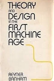
While McAndrew was associated with the Museum of Modern Art, he wrote several important publications that helped the public begin to understand the Modern movement in design: “What Is Modern Architecture?” (co-written with Elizabeth Mock), and “Guide To Modern Architecture: Northeast States”
JOHN McANDREW AND MODERNISM
JOHN McANDREW was one such figure. McAndrew (1904-1978) was active during some of the most exciting years of the introduction of Modernism in America. He was networked with other campaigners for the cause, and engaging in a wide range of projects and roles in the fields of architecture and art. Yet, until the recently published full biography by architectural historian Mardges Bacon—John McAndrew’s Modernist Vision—the full extent of his multiple contributions was not known.
Even now, McAndrew still does not have a Wikipedia page—and this indicates the intractability of anonymity. Yet his CV is broad, deep, and impressive. McAndrew—

Became a friend, associate, and/or colleague of other important activists and scholars in the field of Modern art and architecture, including Henry-Russell Hitchcock, Philip Johnson, Julien Levy, and Alfred Barr—and, later, Paul Rudolph.
Studied and practiced architecture and interior design
Was a key staff member of the Julien Levy Gallery in New York—the premiere gallery showing (and advocating for) Modern art in the US in the 1930’s and 40’s
Helped helped develop (and became head of) the Department of Architecture and Design at New York’s Museum of Modern Art—the world’s first curatorial department devoted to Modern work in those fields.
While there, he mounted landmark exhibitions on the Bauhaus, Frank Lloyd Wright’s Fallingwater, Modern Furniture, and a comprehensive show on Wright’s career. He also co-designed the first version of the museum’s garden, and was involved with numerous museum exhibits, activities, and publications.
Wrote (for the Museum of Modern Art) Guide To Modern Architecture: Northeastern States (1940), and the popular book (co-written with Elizabeth Mock, who became director after him) What Is Modern Architecture? (1942, with a second edition in 1946)
Wrote several books on architecture—modern and traditional
During World War II, while based in Mexico, coordinated inter-American affairs for the US government
Lectured internationally for the US Information Service
Taught at Vassar, Wellesley, the Hartford Art School, and New York University
Designed the Vassar College Art Library—possibly the first modern interior on a US college campus
Director of the Wellesley College Art Museum, from 1948-to-1958
Founded (and was later president) of the Save Venice fund, devoted to preserving that treasured—but ever threatened—city

A page from the Mardges Bacon’s study of McAndrew. The book delves into the subject’s networks and colleagues—making us aware of the connections, without which McAndrew’s life (or anyone’s) cannot be understood. Shown are photos of three key figures in McAndrew’s life (left-to-right): architectural historian Henry-Russell Hitchcock (who also worked closely with Philip Johnson), modern art gallery dealer Julien Levy, and museum curator A. Everett Austin.

Another page from Mardges Bacon’s McAndrew biography, showing the lively design of an invitation to a 1932 opening of Surrealist art at the Julien Levy Gallery. McAndrew was a key creative and organizational force in the gallery, and might well have coordinated the production of this graphic. This graphic object is significant because it was designed by Joseph Cornell (whom, near that year, began creating the diorama artworks which would bring him world-wide fame.)
McAndrew is well-deserving of the attention he’s now received via Madres Bacon’s book, which reveals the banquet of his involvements and accomplishments—but it’s his connection with Paul Rudolph that we seek to highlight.

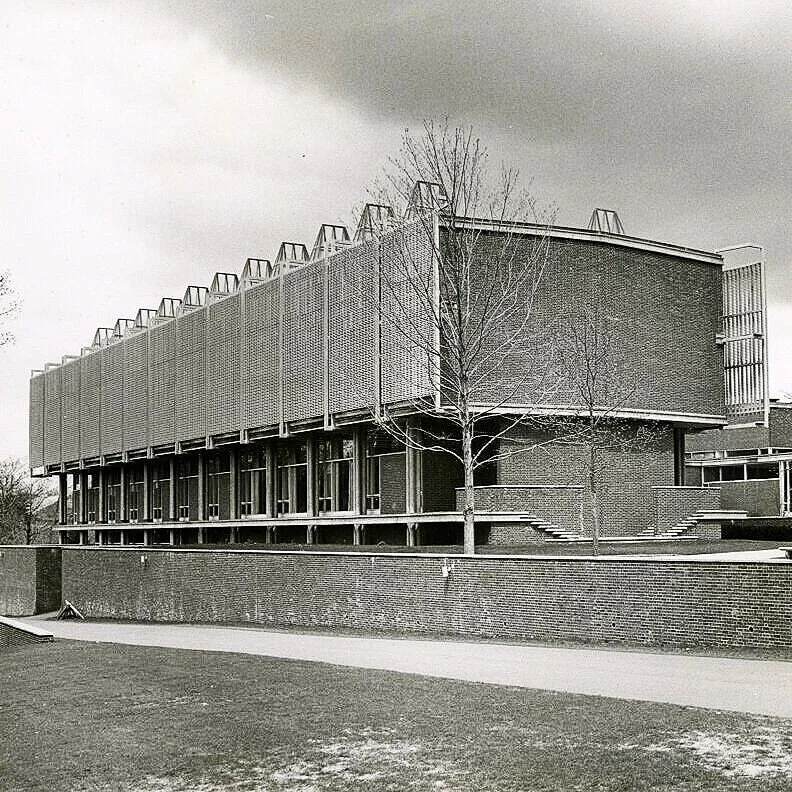
An aerial photograph of the completed Jewett Arts Center at Wellesley, showing approximately the same set of elements as in Rudolph’s perspective rendering below—including the dramatic staircases that took visitors up to the reception area and large art gallery (which bridged over a ground-level passage.)
WELLESLEY’S ARTS CENTER: A BREAKTHROUGH PROJECT FOR RUDOLPH
Up through the mid-1950’s, Paul Rudolph was primarily an architect of houses. That’s not unusual for the trajectory of most American architects, whose work usually commences with residential projects—and, in the era just after WWII, Rudolph was preeminent in designing some of the US’ most creative, inventive, and elegant Modern homes. For Rudolph, this was soon to change. He continued to do residential design throughout his half-century career, but he became as well-known for his non-residential works: civic buildings, offices, churches, laboratories—and especially educational buildings.
In that career path, the Mary Cooper Jewett Arts Center, at Wellesley College was the breakthrough project for him—the one in which Rudolph (who was always ambitious to try new design challenges) branched-out from residential work.

Paul Rudolph become known as a master of architectural perspective drawing—and above is a one of his renderings for the Jewett Arts Center at Wellesley. In this drawing, Rudolph showed some key features of the building’s design, including the rooftop skylights and the exterior screens.
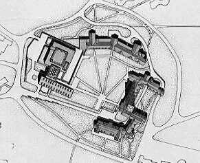
Rudolph’s site plan shows the new arts building complex at the upper-left. It completes the quadrangle which had already been partially defined by the existing Wellesley buildings at the top, right, and bottom.
THE CHALLENGE—AND RUDOLPH’S STRATEGY
Wellesley College, in Wellesley, Massachusetts, was founded in 1870, and is an elite private liberal arts college with a stellar list of alumni. When Paul Rudolph received the commission to design a new arts center, he was working within an existing context of buildings that were built in a style most often characterized as “Collegiate Gothic.”
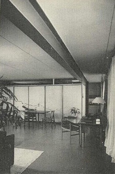
Rudolph’s challenge was to complete one side of an existing quadrangle (on whose other sides were situated the vintage college buildings.) The new complex would have to accommodate a variety of spaces and uses: a reception area, theater workshop, auditorium, two art galleries, two libraries, research facilities, classrooms, and storage.
In the 1971 book, Paul Rudolph (which featured photographs of Yukio Futagawa, and was the first independent monograph devoted to the Rudolph) Rupert Spade (the pseudonym of writer-editor-critic Martin Pawley) gives a concise description and Rudolph’s strategy:
“Built in association with Anderson, Beckwith, and Haible, and commissioned at a time when Rudolph had never designed anything larger than a three-bedroom house, the Wellesley Arts Center represents his tour de force of integration with an existing style—in this case the pseudo-gothic. Careful study of proportion and massing led him to create a design combining the dimensional basis of the original with a novel massing and use of materials—including the use of porcelain-enameled aluminum sun-screens conceived as a kind of ‘built-in ivy’. The structure of the extension is in reinforced concrete and the facing materials are brick and limestone. The art department itself is linked to a classroom and auditorium block by a bridging exhibition gallery. The conical skylights—much criticized by opponents of Rudolph’s eclecticism—are intended to echo the repeated gables of the existing building.”
[By-the-way: Spade is not-quite-accurate in saying that Paul Rudolph, up to that time, had never designed anything larger than a house. He had designed several larger buildings—but Spade is correct in spirit: none of those projects had been built. So Jewett was the first, large, non-residential design of Rudolph’s to progress all-the-way to construction.]

A Rudolph-designed construction detail of the Jewett Arts Center building, as shown in Design With Glass.
John Peter’s 1964 book on the use of glass in Modern architecture, Design With Glass, looks further at the building’s materials. Speaking of the harmony that the Rudolph’s complex achieved with the campus’ older buildings, Peter asserts:
“It would be difficult to find a better example of this in in detail than the way in which the glass is handled. The pointed skylights of the visual arts wing recall the pattern of triangular dormer visible all over the older campus. the slot-like windows of the performing arts wing echo the perpendicular windows of the existing Neo-Gothic building. The large applied wood strips provide a deep reveal with structural solidity backed by solid lumber which eliminates exposed fastener heads on the interior. Perhaps the most intriguing example of planned relationship is the great porcelain-enamel of aluminum grille protecting the north and south windows of the visual arts wing. Designed to the lacy scale of “man-made ivy” it matches in color the limestone of the other campus buildings.”
Philip Johnson, in a 1960 article in Art In America, “Great Reputations in the Making: Three Architects,” presented architects whom he [then] defined as “under-recognized artists”: Louis Kahn, Paul Rudolph, and Frederick Kiesler—and he characterized Rudolph as: “. . . .articulate, inventive, mercurial, tough.” Rudolph’s section included a photo of Jewett with its metallic screens, and Johnson uses their form to conclude:
“This is an example of Rudolph’s strong linear quality combined with his discontent with plain surfaces.”
That “discontent with plain surfaces” would manifest throughout Rudolph’s later work, as is evident in Rudolph’s most famous masterwork, the Yale Art & Architecture Building—whose ribbed concrete (and other texturing techniques) he’d continue to utilize in other projects.
Rudolph himself spoke about Wellesley’s design challenge:
“The problem was to add to a pseudo-gothic campus in such a way as to enhance the existing campus and still make a valid twentieth century building. The siting, manipulation of scale, use of materials, and silhouette helped to extend the environment.
Wellesley’s alumni magazine covered the project several times, from beginning to completion—as can be seen in these two examples:

In a March, 1956 issue: showing the proposed design in model form, in the context of the campus’ existing buildings

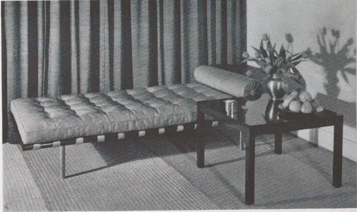
In a November, 1958 issue: after completion, showing an interior of one of the center’s two art galleries.
Looking back, more than a decade later, Rudolph was frank in his own assessment of the result:
The sequence of spaces leading under the connecting bridge up to the raised courtyard and the tower beyond works, but the interior spatial sequence is unclear, overly detailed and in many cases badly proportioned.”
Whether the Jewett Arts Center met with Rudolph’s ultimate approval is one thing—but it did get broad coverage in the architectural press, indicating that—at least to journal editors—the design seemed interesting and fresh. Wellesley maintains a website with a fascinating collection of such articles, including a 1959 issue of the distinguished French architectural journal, L'Architecture d'Aujourd'hui. Here, in one representative page from that magazine’s coverage of Rudolph’s design, one can get an idea of the visual richness that he achieved:

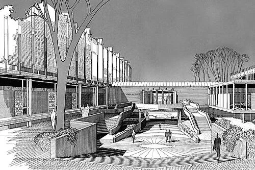
Another of Rudolph’s perspective renderings for the Jewett Arts Center: here he shows the entry plaza that was part of the arts center complex—and, centered in the near-distance, is the bridging section of the building (which connected its two main volumes.). McAndrew moved the college’s art museum into these expanded quarters in 1958.
McANDREW AND RUDOLPH
John McAndrew joined the faculty of Wellesley College’s Art Department in 1946, starting as a lecturer, and rising to a professorship—and would stay there for over two decades, retiring in 1968.
In 1948, he was appointed to be Director of the Wellesley College Museum—and remained so for a decade, until 1958. According to Wellesley’s website, “He was a robust collections builder, and under his leadership the collections came to include works by many pioneers of European modernism.”
The Jewett Arts Center commission was given to Paul Rudolph in 1955—but how did he obtain this project, one which was so important to his career?
It turns-out that the connections between McAndrew and Rudolph were multiple:
John McAndrew was familiar with Paul Rudolph’s work in Sarasota
McAndrew would have known of Rudolph’s design work for the Museum of Modern Art (where McAndrew had been a key staff member)
They both knew Philip Johnson—another major campaigner for architectural Modernism, and a pillar of the Museum of Modern Art
In 1941 McAndrew had received his graduate architecture degree at Harvard (under Gropius), and 1941 is the year that Rudolph started in the same program—so the two of them may have first intersected on the Harvard campus
Mardges Bacon is illuminating about McAndrew’s contribution to the project, and relation to Rudolph’s work there—and we’ll let her tell the story:
For a decade McAndrew served concurrently as a professor and as director of the Wellesley college Museum, known as the Farnsworth Museum (1948-1958). In that capacity he represented the college as client for the new art museum, the Mary Cooper Jewett Arts Center. In the fall of 1955 Paul Rudolph received the commission as a result of a closed competition among a short list of candidates drawn up by McAndrew, which included Eero Saarinen, Edward Durrell Stone, Marcel Breuer, Hugh Stubbins, and Paul Rudolph. Most were experienced and highly respected architects with whom McAndrew had previously worked during his curatorship at MoMA. That was not the case with the young Rudolph. McAndrew knew Rudolph and his early work with Ralph Twitchell in Sarasota, Florida, at least since the spring of 1950. . . . Impressed with Rudolph’s Sarasota buildings, McAndrew expressed the Department of Art’s preference in a letter to Wellesley president Margaret Clap inferring that Rudolph would be “likely to produce the most distinguished design . . . one of quality.”
Bacon continues:
McAndrew seemed to have had a personal stake in shaping Rudolph’s final design During the two-year phase of the project’s design development, the museum director worked with the Department of Art chair Agnes Abbot to supply Rudolph with continual critiques, especially on the articulation of the building’s exterior.
And Bacon give further confirmation of McAndrew’s own thoughts about his contribution the project:
To accompany a 1960 editorial by McAndrew, the editors Museum News included a text that. . . .also affirmed his advisory role in planning the Jewett Arts Center. Find an architect ‘sympathetic to your needs,” McAndrew counseled readers in his editorial: “if the building is fine, part of the credit is yours; if not, yours may be half the fault.” Clearly, McAndrew felt that he was responsible for selecting the right architect and helping to craft the building’s design such that he could also share its success.
The history and development of the Jewett building is complex: Rudolph struggled over the design, seeking a contextually sensitive solution that would also be true to the principles of Modernism. He came up with a succession of schemes, and the story of the building’s evolution is described in Timothy M. Rohan’s monograph on Rudolph—and also studied, in-depth, in “The Landscape & Architecture of Wellesley College.”
JOHN McANDREWS—INTO THE LIGHT
While there are a variety of sources about the history of the Jewett Arts Center (like the ones mentioned above) we are especially glad to have Mardges Bacon’s book—both for what it shares about McAndrew and Rudolph; but even more because she has brought a key “background” player in 20th culture out of the shadows, and given him the biography and acknowledgments he deserves: John McAndrew.

The proposed Revere Development, for Siesta Key, Florida, a project from 1948. The drawing appears to be a tempera-gouache rendering, and it is signed by Rudolph.
P.S. - PAUL RUDOLPH AND HIS RENDERING
The rendering of the proposed Jewett Arts Center (shown at the top of this article) is of a different character from most of the presentation drawings which Rudolph created during his half-century career. Rudolph is most well-known for his pen-and-ink perspective drawings (and especially his perspective-sections)—but this drawing was done in tempera or gouache.
We do know of a very few drawings from the Rudolph office which appear to be in that medium—notably his aerial view of the Revere Development project in Florida (which is signed by Rudolph), and a rendering of his 1957 Blue Cross-Blue Shield Building in Boston. But examples of tempera-gouache drawings become rarer as Rudolph’s career progresses.
In fact, we have some testimony about Paul Rudolph’s attitude to that drawing medium from his former student, Robert A. M. Stern. In an interview with the editors of Paprika (the student publication of Yale’s School of Architecture), Stern remarks:
Question: “Have you ever been ‘Bobbed’ during a review or presentation?”
Answer: (confused) “ ‘Bobbed’? What’s that mean? I think it’s a common term amongst students. What does that mean? You mean, given hell? (editors laugh) I think that’s down to the point. Oh, of course! First of all, as a student… I mean, Paul Rudolph took no prisoners. If you think I’m a tough critic, you don’t know what a tough critic is. (laughter) Once there was a student, I think we were in second year, and he hung up a drawing—there used to be things like sketch problems and short problems in studios in a term, you did two projects in a term, not one. Anyhow, he put up a drawing, which was a tempera rendering. Rudolph thought tempera drawings were terrible, and certainly thought this guy’s was terrible and he said, ‘Mr. X,’—I won’t use his name,—‘that is the single ugliest drawing I have ever seen.’ ”
BOOK INFORMATION AND AVAILABILITY:
TITLE: John McAndrew’s Modernist Vision
AUTHOR: Mardges Bacon
PUBLISHER: Princeton Architectural Press
PRINT FORMAT: Hardcover, 9-1/2” x 7'“, 192 pages, numerous black & white and color illustrations
ISBN: 9781616896409
ELECTRONIC FORMAT: Kindle (Amazon) and Nook (Barnes & Noble) versions available
PUBISHER’S WEB PAGE FOR THE BOOK: here
AMAZON PAGE: here
BARNES & NOBLE PAGE: here

The exterior stairs of the Jewett Arts Center at Wellesley College, centrally located in the building complex This view is looking away from the building, and towards the other side of the campus quadrangle.
IMAGE CREDITS
NOTES:
The Paul Rudolph Heritage Foundation gratefully thanks all the individuals and organizations whose images are used in this non-profit scholarly and educational project.
The credits are shown when known to us, and are to the best of our knowledge, but the origin and connected rights of many images (especially vintage photos and other vintage materials) are often difficult determine. In all cases the materials are used in-good faith, and in fair use, in our non-profit, scholarly, and educational efforts. If any use, credits, or rights need to be amended or changed, please let us know.
When/If Wikimedia Commons links are provided, they are linked to the information page for that particular image. Information about the rights for the use of each of those images, as well as technical information on the images, can be found on those individual pages.
CREDITS, FROM TOP-TO-BOTTOM and LEFT-TO-RIGHT:
Wellesley Jewett Arts Center Building, perspective rendering, in color: © The Estate of Paul Rudolph, The Paul Rudolph Heritage Foundation; Cover of Madres Bacon’s biographical study of John McAndrew, “John McAndrew’s Modernist Vision”: from the publisher’s page for that book; Line engraving portrait of John Dee: from the Wellcome Collection gallery, via Wikimedia; Cover of “What Is Modern Architecture”: from the Amazon page for that book; Cover of “Guide to Modern Architecture: Northeast States”: from the Amazon page for that book; Sample pages from Madres Bacon’s book: screen captures from on-line images of the book; Aerial view of the Jewett Arts Center: from the archives of the Paul Rudolph Heritage Foundation, © The Estate of Paul Rudolph, The Paul Rudolph Heritage Foundation; Wellesley perspective rendering (in black & white linework) by Paul Rudolph: © The Estate of Paul Rudolph, The Paul Rudolph Heritage Foundation; Wellesley campus plan, showing Rudolph’s proposed new building (drawn in black & white linework) by Paul Rudolph: © The Estate of Paul Rudolph, The Paul Rudolph Heritage Foundation; Wellesley glazing construction detail drawings, as reproduced in “Design With Glass” book, drawings by Paul Rudolph (in black & white linework: © The Estate of Paul Rudolph, The Paul Rudolph Heritage Foundation; Covers of Wellesley Alumnae Magazine: screen captures from Wellesley’s “Jewett in Print” archive page; Page from L'Architecture d'Aujourd'hui coverage of Rudolph’s building: screen capture from Wellesley’s “Jewett in Print” archive page; Wellesley perspective rendering, by Paul Rudolph: © The Estate of Paul Rudolph, The Paul Rudolph Heritage Foundation; Revere Development rendering by Paul Rudolph: © The Estate of Paul Rudolph, The Paul Rudolph Heritage Foundation; Exterior stairs at Wellesley Jewett Arts Center: from the from the archives of the Paul Rudolph Heritage Foundation, © The Estate of Paul Rudolph, The Paul Rudolph Heritage Foundation


![I. M. Pei’s Bank of China Tower (center-left) in Hong Kong, identifiable by its’ diagonal/triangular geometries, was completed in 1990. We thought it would be good to show it in proximity to one of the pair of towers of Paul Rudolph’s Bond [Lippo] C…](https://images.squarespace-cdn.com/content/v1/5a75ee0949fc2bc37b3ffb97/1619472490202-HK5KFALLDMP84GSTEAMY/Bank+of+china+and+Rudolph+tower.jpg)


![A chart from the Pew Research Center’s study of Public Trust in Government: 1958-2019 The overall downward trend, from 1964 to the present, is evident. [Note that the largest and steepest drop was in the wake of the mid-1970’s Watergate scandal.] Wh…](https://images.squarespace-cdn.com/content/v1/5a75ee0949fc2bc37b3ffb97/1616438220772-C9X7PWXIHIW0L7MK9ZX1/trust%2Bin%2Bgovt.jpg)


.jpg)
.jpg)
.jpg)
.jpg)
.jpg)
.jpg)
.jpg)
.jpg)
.jpeg)
.jpg)
.jpg)
.jpg)