

Paul Rudolph, shown in his Quadruplex Residence in New York City. This portrait is by Jeff Corwin. and is part of his American Architects series, which he photographed during 1986-1987. Rudolph is at a stairway which he created for the North-West corner of the apartment: an intriguing design of folded metal plates which flow upwards.
A PARTNERSHIP: ARCHITECTURE & PHOTOGRAPHY

Recently, we looked into the relationship of photography and architecture—and the multiple powers of architectural photographs:
To preserve images of buildings that have been lost
To influence the design of subsequent architecture. The influence of the handful of photographs of the [demolished] Barcelona Pavilion is an example.
To share the experience of architecture that one is not likely to see in-person
To create cultural landmarks of what constitutes a style, era, or region
To make reputations of architects as creative professionals
To build-a-case for preserving a great work of architecture
[You can read more about this—and see how Paul Rudolph’s work has been handled by a range of distinguished photographers—in our article: “RUDOLPH AND HIS ARCHITECTURAL PHOTOGRAPHERS”—parts one and two; as well the influence of photographs, in this article on preservation.]
THE ARCHITECTURAL PORTRAIT: iMAGE AND INSIGHT
Portraits—whether they are made with photography -or- paint—can be considered in several ways, but the most interesting perspectives are the oppositional ones:
How the subject wanted to be portrayed: the outward image they seek to present to the world. An example would be the many photographs of Frank Lloyd Wright by Pedro Guerrero—images showing Wright at his heroic best.
—and (or versus)—
Other things the portrait tells us about the subject, conveying more subtle aspects of the person’s life. [This can sometimes include aspects of their life/personality that weren’t intended to be shown.]

THE OUTWARD IMAGE
The function (and potency) of portraiture-as-publicity is attested throughout history, from the Sphinx -to- the covers of Vanity Fair and People (and hundreds of similarly celebrity-focused magazines, world-wide.)
Both the subject and the artist are complicit in telling a story—sometimes quite intentional in its goals of conveying the person depicted as heroic, dedicated, soulful, sacrificing, or any of the other virtues.
Jacques-Louis David’s 1812 painting, “The Emperor Napoleon in His Study at the Tuileries”—besides being a work-of-art—is a perfect example of the portrait-as-propaganda. It shows Bonaparte as he wanted to be seen— He’s shown a bit wrinkled: and that’s because he’s working hard for his people (and working late: the clock shows it’s 4:13 AM, and the candles have burned low). And he’s not just focused on military glory— at the moment, he’s put aside his sword and taken up the pen: he’s shown working on issues of governance (the manuscript for the Code Napoléon—the civil code that is still the basis of French law—is on the desk.)
Napoleon liked this portrait very much: it conveyed some of the positive qualities that he desired to be seen manifesting.
THE INWARD IMAGE
Many creators claim that whatever’s worth knowing about them is in their work, and delving into their personal lives is useless (and often unwelcome.) But - if you find someone’s work compelling - that stricture is never satisfying, and we do seek to get-to-know the life of the maker, including their inner lives and commitments. Deeper evidence of those lives can be found not just in letters and interviews with their associates, but in visual evidence like portraits.

The American Architects page, from Jeff Corwin’s website, showing 28 of his photographic portraits of distinguished practitioners—including two of Paul Rudolph.
Jeff Corwin is a photographer with a portfolio that includes both commissioned and artistic work. For over four decades he’s been making and taking photographs around-the-world, and of many different subjects, from industry -to- landscapes -to- military affairs—and part of his oeuvre is portraits.
During 1986-1987 he created a series of portraits of American Architects—capturing some of the most prominent practitioners of the era. Among them were Lautner, Weese, Tigerman, Goldberg—and Paul Rudolph.
One of his photographs of Rudolph is at the top of this article: it shows him in the midst of his “Quadruplex” apartment in New York City. But let’s look at the other photograph taken by Jeff Corwin, during the same session (shown below).

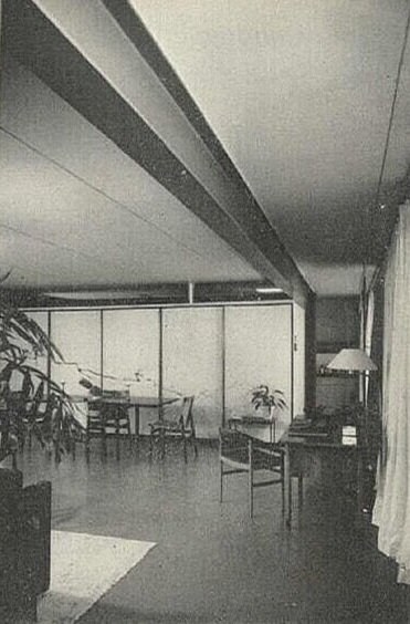
Jeff Corwin’s photographic portrait of Paul Rudolph, taken in the living room of Rudolph’s “Quadruplex” in New York.
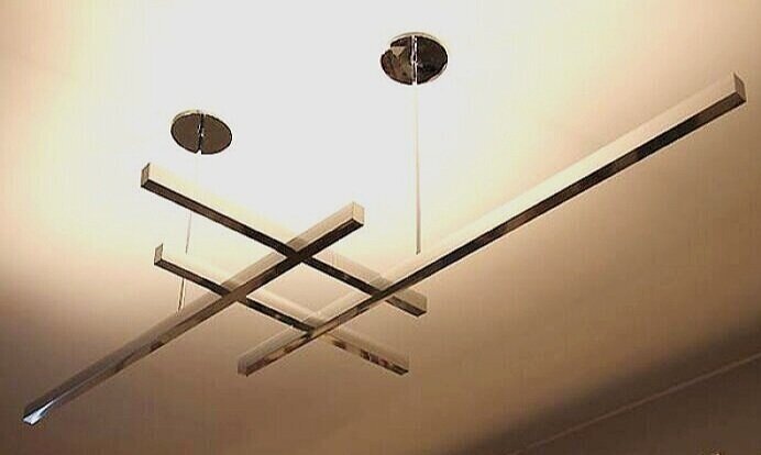
What can we see in this image? A man in his late 60’s with a sharp eye. Like David’s portrait of Napoleon, we see a man who is continually working (even at home)—and, like Bonaparte, Rudolph too is a bit rumpled from his labor. At his feet are drawings [and after all, What is Rudolph without drawings?!] They’re accompanied by pencils, and the glasses which he wore as he got older—the circular ones that have become the trademark of architects from Corbusier -to- Pei. In the background is a lamp which he designed: its’ geometric form reflects the Bauhaus purity professed by his teacher at Harvard, Gropius (and the lamp was fabricated by Modulightor - the lighting company which Rudolph founded). Rudolph liked art, however he could never afford to purchase works by famous figures of the artworld. So he filled his environment with relatively lower-cost objects which he found on his travels, and you can see them here: on the wall, the floor, and the window sill. Most telling is his expression: it’s the look of a man who’s been interrupted in his work—and he’s too committed to be happy about it. Even the setting is evidence of his creative thinking. Rudolph is shown against a background of the windows which he placed on the South side of his living room—but these are no ordinary windows. These are “lot line” windows—the type which building regulations permit to be placed at the edge of a building, when it is directly adjacent to a neighbor’s property. The size of these windows is tightly regulated - but Rudolph groups them in order to gain as large a view as possible - a creative trick to get around building code restrictions. At the lower right, we see a step—an indication of the multiple-levels which Rudolph often utilized in his designs, and which are found throughout his penthouse.
One photograph—but, in that single image, many clues of the subject are revealed.
AN AUTHOR IDENTIFIED AND NOW CREDIT IS DUE
The Paul Rudolph Heritage Foundation is thankful to Mr. Corwin who reached out to us and generously gave us permission to use his photographs for our efforts to preserve and educate the public about Rudolph’s work.
The key word is “permission”—and too often the rights of photographers and other creators are ignored. These two photographs are a case-in-point.

The Library of Congress’ page for the above photograph—and we’re glad to see that a proper credit for the photographer, Jeff Corwin, has now been added.
When Mr. Corwin emailed us offering permission to use his images, we replied that we knew of them but had not known who took the photographs.
They are both included on the Library of Congress’ website, but were not credited to the photographer - and were at one point downloadable under the (mistaken) belief that everything available at the Library of Congress is in the public domain.
When Rudolph passed away, he left his papers in the care of the Library of Congress. The staff probably found unlabeled prints of these photographs - likely after a request by a researcher - and scanned them and added them to the website. Mr. Corwin found his portraits on social media (without credit or permission), and he started looking into this. He then found the Paul Rudolph Heritage Foundation and wrote to us that he thought we could use his work in our efforts. We are glad that he did so, as it allows us to identify, thank, and highlight his work.
We sent him links to the photos at the Library of Congress and suggested he reach out to them. Now, they have amended their pages for those images so that the work is properly credited and no longer downloadable - a needed correction that is proper for them to have made.
There are lessons from this:
Social media and the ease of downloading and sharing images can make attribution difficult over time if the credit is not included when the image is shared. Key information (the name of creators, when a work was made, the circumstances of its creation) often gets separated from the work itself - and that leads to gaps in the record (and problems in attribution and credit). Institutions sometimes - if not intentionally - perpetuate this problem, by not having/including proper credits.
Not everything at the Library of Congress is in the public domain and considered free to use. While the Library Congress uses language like ‘Most of the works in the Library of Congress Paul Rudolph Archive have no known copyright restrictions.” it leaves the final responsibility up to the user. Fair use is one thing, commercial use is very different.
Creators can be most gracious in allowing the use of their work but that starts with showing a respect for their rights, and asking for permission. When known, the creators must be identified - and, if possible, links should be given to their website, or contact information, or other relevant sources
Institutions can make corrections about credit or use, when approached and given full information.
The Paul Rudolph Heritage Foundation appreciates Jeff Corwin for giving us permission to use his photos and we are glad he helped identify his original work.
IMAGE CREDITS
NOTES:
The Paul Rudolph Heritage Foundation (a non-profit 501(c)3 organization) gratefully thanks all the individuals and organizations whose images are used in this non-profit scholarly and educational project.
The credits are shown when known to us, and are to the best of our knowledge, but the origin and connected rights of many images (especially vintage photos and other vintage materials) are often difficult determine. In all cases the materials are used in-good faith, and in fair use, in our non-profit scholarly and educational efforts. If any use, credits, or rights need to be amended or changed, please let us know.
When/If Wikimedia Commons links are provided, they are linked to the information page for that particular image. Information about the rights for the use of each of those images, as well as technical information on the images, can be found on those individual pages.
CREDITS, FROM TOP-TO-BOTTOM:
Paul Rudolph at stairway: photograph by Jeff Corwin, use courtesy of the photographer, © Jeff Corwin; Paul Rudolph’s Burroughs Wellcome headquarters building, photograph by G. E. Kidder Smith, courtesy of the Massachusetts Institute of Technology; ’“The Emperor Napoleon in His Study at the Tuileries” by Jacques-Louis David, in the collection of the National Gallery of Art, via Wikimedia Commons; Paul Rudolph in front of his living room’s window: photograph by Jeff Corwin, use courtesy of the photographer, © Jeff Corwin


![A chart from the Pew Research Center’s study of Public Trust in Government: 1958-2019 The overall downward trend, from 1964 to the present, is evident. [Note that the largest and steepest drop was in the wake of the mid-1970’s Watergate scandal.] Wh…](https://images.squarespace-cdn.com/content/v1/5a75ee0949fc2bc37b3ffb97/1616438220772-C9X7PWXIHIW0L7MK9ZX1/trust%2Bin%2Bgovt.jpg)


.jpg)
.jpg)
.jpg)
.jpeg)
.jpg)
.jpg)
.jpg)