We already knew that Paul Rudolph’s work is “iconic”—especially if one goes by the dictionary definition:
widely known and recognized, and acknowledged especially for distinctive excellence

But it’s always good to have that affirmed by others—and we’re even more delighted when that assessment takes the form of a beautiful new book on residential architecture:
THE ICONIC AMERICAN HOUSE
The time-scale which the book covers is from 1900 to the present—well over a century of innovative, forward looking, elegant, and striking designs. Introducing it, Dominic Bradbury writes:
“The houses in this book chart a journey across America and across time, embracing many different aesthetics and expressions of form. . . .They are shining landmarks. . . .full of life, drama, and invention.”
The book manifests excellence by several criteria:

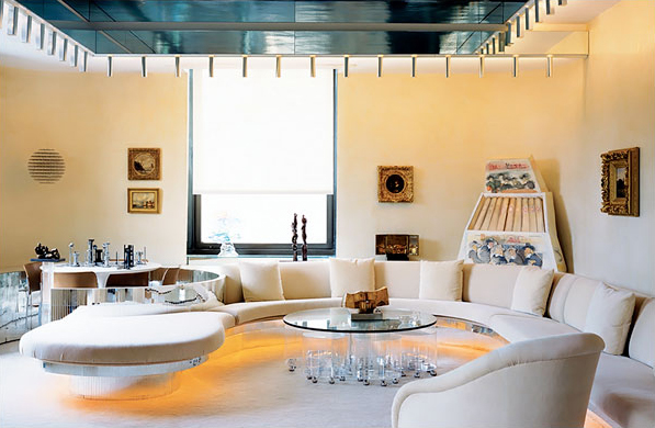
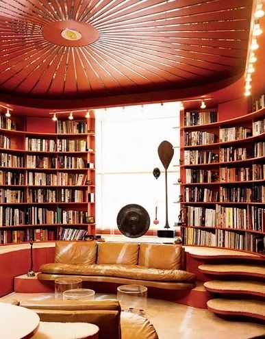
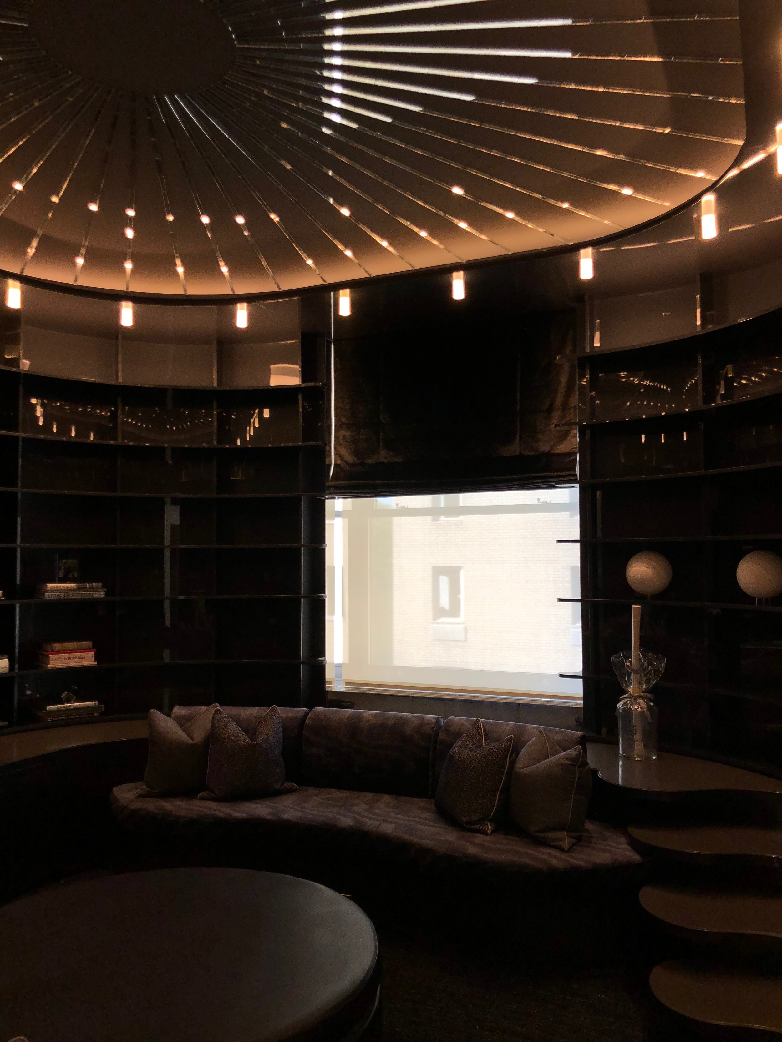
Sample spreads from the book—the ones above and below are of Rudolph’s Healy (“Cocoon”) Guest House; and the two spreads below that are of Rudolph’s Hiss (“Umbrella”) House.


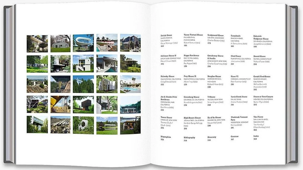
Selection and surprise: Many of the fifty houses profiled are well-known to all lovers of architecture (Fallingwater, the Eames House, the Glass House….) But part of the delight of this book is that one discovers houses that are unfamiliar, or designs that you’d only vaguely-but-intriguingly heard about. Thus, in this volume, you can finally visit the near-legendary High Desert House (Joshua Tree, CA) by Kendrick Bangs Kellogg"; and get to look inside houses you’d previously only known by a single glimpse—like the Sculptured House (Golden, CO) by Charles Deaton.
Freshness of View: Bradbury brings keen insight, and offers key information for every project—but it’s the book’s visual sense that stands-out for us. Even with buildings which we’ve looked at over-and-over, Richard Powers’ photographs help us see them with a first-time freshness—and that allows us to discover new aspects of buildings and interiors which had been as familiar as the faces of old friends.
Production Values: Reinforcing the sense of the specialness, of the houses chosen for inclusion, are the physical aspects of the book: the volume’s overall size (allowing one to even see details with clarity), the choice of paper (of a luxurious thickness), and the careful color balance of the printed images (neither dry nor saturated).
Highlighting Paul Rudolph: Of course, the book is filled with he work of some of he most famous architects of the 20th Century—boldface names like Wright, Johnson, Niemeyer, Venturi, Kahn, Shindler… But Rudolph is one of the few architects to have two houses in the book: the Healy (“Cocoon”) Guest House, and the Hiss (“Umbrella”) House (both in Sarasota, FL, where Rudolph started his career.)
Each of the book’s 50 residences is presented across several pages, with photos, descriptive text, and informative captions.
Shown here are some of the page spreads, from the sections on the two Rudolph’s houses chosen for the book. [But Note: our photos of the book cannot begin to convey the richness, sharpness, and careful color balance of the photographs in the actual book!]
WHERE CREDIT IS DUE
Our only quibble with the book—but one worth noting in the interest of historical accuracy—is in the identification of Rudolph’s design work with his early partner, Ralph Twitchell. The book seems to give an equal measure of credit for the late 1940’s Healy (“Cocoon”) Guest House to both Ralph Twitchell and Paul Rudolph. It’s true that they were partners at that time, and that Twitchell had the “contacts” to bring in work, and that he was a highly knowledgeable presence on the construction site. But the consensus among historians is that Rudolph was the firm’s prime designer—and certainly the creative source for the kind of architectural innovation shown in the Healy project. As historians, we reject any attempts to erase figures from architectural history, or to underplay authentic contributions to the design process—but we also seek accuracy, and we hope that this point about design responsibility will be adjusted in any future editions of this fine book.
RELATED VOLUMES
Writer Dominic Bradbury and photographer Richard Powers—both energetic participants in covering the world of design—have partnered on numerous other books on architecture and interiors. This new book might be considered to be part of a series, as they’ve previously published two volumes on related topics, with the same publisher, and in a matching format: The Iconic House and The Iconic Interior.

Two other of their design-focused books, forming an…

…“ICONIC” series, published by Thames & Hudson.
THE AUTHORS
DOMINIC BRADBURY - WRITER
Prolific author of books with a strong focus on architecture and design, Dominic Bradbury is a writer, journalist, consultant, and lecturer—including having been guest speaker at the Victoria & Albert Museum. His abundant books (many done with photographer Richard Powers) include: Mid-Century Modern Complete, The Iconic House, The Iconic Interior, Atlas of Mid-Century Modern Houses, and The Secret Life of the Modern House—and as a journalist he has contributed to magazines and newspapers internationally, including The Financial Times, House & Garden, World of Interiors, The Guardian, and Architectural Digest.
RICHARD POWERS - PHOTOGRAPHER
In his quarter-century of professional experience, Richard Powers has developed a remarkable oeuvre, specializing in the photography of interiors, architecture, and the built environment. With a portfolio that shows a worldwide scope, he has received commissions from design firms and publications such as Architectural Digest, The Wall Street Journal, World of Interiors, and publishers like Thames & Hudson and Rizzoli. His photographs are featured in over 20 books (many done with Dominic Bradbury), including The Iconic Interior, New Natural Home, Superhouse, and Waterside Modern.
BELOW are two further spreads from The Iconic American House, from the section on Wright’s Fallingwater—additional evidence of the beautiful and informative work of this talented partnership.


BOOK INFORMATION AND AVAILABILITY:

Shown below are the book’s Contents pages, with a grid of photos of the 50 houses which the authors chose to include—and above is a portion of one of those pages, showing Rudolph is in very good company with Frank Lloyd Wright, Eero Saarinen, the Eames, Alden B. Dow…