
Dr. Walker, his children, and his children’s children, have lived in and loved the Walker Guest House—designed by Paul Rudolph.
Beloved Rudolph Design, The Walker Guest House, To Be Auctioned
Not Just Perspectives (Rudolph Could Draw In Other Ways Too): The Axonometric FACTOR
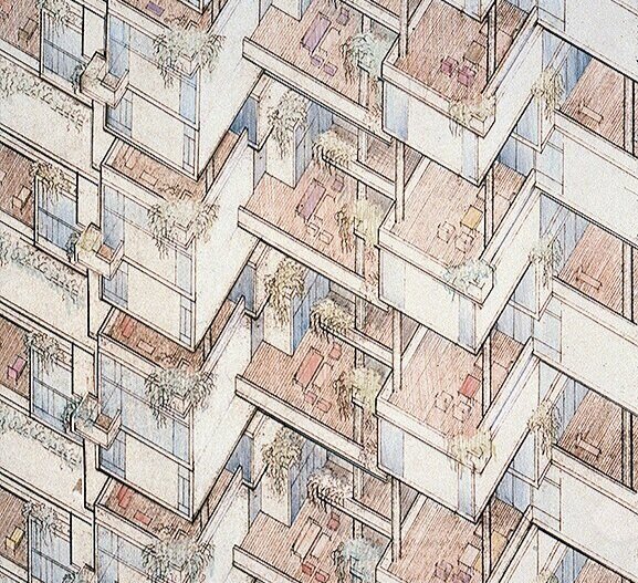
A detail from Paul Rudolph’s drawing for the Colonnade Condominiums in Singapore (a project built in the final phase of Rudolph’s career, when he was doing much work in Asia.) While Rudolph is famous for his perspective drawings, here he is using an “axononmetric” drawing technique—which was unusual for him, but is not unknown in his graphic oeuvre. © The Estate of Paul Rudolph, The Paul Rudolph Heritage Foundation.
MASTER OF PERSPECTIVE
Well of course Rudolph could draw—beautifully, masterfully, with stunning skill. His fame is intertwined with his brilliant perspective drawings (including, and especially, his perspective-sections). He made them starting right from the beginning of his career—indeed, while he was still a student, as the below example shows:

“Weekend House for an Architect”—a school project of the mid-1940’s, when Rudolph was finishing his Masters at Harvard—and an early example of the intense perspective rendering style which he’d use for the rest of his half-century career (and for which he became famous.) © The Estate of Paul Rudolph, The Paul Rudolph Heritage Foundation.
While much has been written about Rudolph’s drawings, little-known is Rudolph’s own text on the topic, which speaks of his overall approach and attitude to drawing. The essay, “From Conception to Sketch to Rendering to Building" forms the introduction to the magnificent book, Paul Rudolph: Architectural Drawings. The book came out in the early 1970’s, and was published by the great Japanese architectural photographer, Yukio Futagawa. Futagawa had, in previous years, extensively photographed Rudolph’s work, and had also created a publishing firm (still extant) focused on architecture.

The best presentation of Paul Rudolph’s drawings is this large-format book, “Paul Rudolph: Architectural Drawings.” The cover features one of the perspective-sections for which the architect was so well-known—this one through the body of the Burroughs Wellcome headquarters building. The book was published by Yukio Futagawa (who had made superb photographs of Rudolph’s work—and whom Rudolph greatly admired.)
In that essay, Rudolph says:
“It should be noted that the drawings and renderings shown here were done over a period of almost thirty years, but the technique used for them has changed very little. During my school years and immediately thereafter I searched for a technique of drawing which would allow my personal vision to be suggested, and after a period of searching, arrived at the systems shown in this book.”
Rudolph’s drawings (and especially his use of perspective-section drawings) has been widely remarked upon—most extensively written about by the author of the comprehensive study of Rudolph, Timothy M. Rohan—particularly in an essay by him in a recent book devoted to Rudolphian studies. In an earlier post we addressed Rudolph’s focus on sections—and there you can find further information on that topic.
Perhaps Rudolph’s most famous drawing is this one, done near the height of his career: his perspective-section through the Yale Art & Architecture Building (now known as Rudolph Hall). Space, light, scale, and structure are conveyed simultaneously. There is a vivid sense of depth—and a strong effort is made to communicate spacial relationships among the various levels. © The Estate of Paul Rudolph, The Paul Rudolph Heritage Foundation.
BUT RUDOLPH DID USE OTHER TECHNIQUES…
A review of Rudolph’s drawings—which number in the hundreds-of-thousands—show that he used a variety of techniques:
Plans
Sections (including Site-Sections)
Elevations
1-Point Perspective
2-point Perspective (including—though rarely—where the 2nd perspective is a vertical one, with the vanishing-point below-ground)
Plan-Perspectives
Section-Perspectives
Diagrams
Quick Sketches (ranging from schematic doodles to more advanced studies—the sorts of visual overtures a designer makes, for themselves, when considering an idea)
Isometrics
Axonometrics
That’s the graphic tool-kit of any architect—the “armamentarium” of all designers. Such techniques are used to solve problems, to present proposed solutions to clients and government bodies, and ultimately to communicate instructions and intentions to builders [and when H.H. Richardson said that the first principle of architecture is “Get the job!”, he could well have added that drawings are a marketing tool.]
Rudolph is most well-known for his section-perspectives—but he wielded all of the above. It is the last type of drawing on that list, axonometric—one rarely discussed in Rudolphian studies—which deserves attention.
PERSPECTIVE IS NOT THE ONLY WAY
Perspective drawing—that great innovation of the Renaissance—uses lines which seem to converge, and spaces the lines so that objects which are further away are drawn smaller. This gives perspective drawings a similarity to the way we naturally see.
But there are other ways to draw, used by designers, which don’t act in the same way as perspective drawings. It may seem counter-intuitive to use anything but perspective drawings, as they create a simulation which is closest to the way we perceive things—but there are times when one can covey a great deal of complex information by using other-than-perspective approaches.
Isometric drawings and Axonometric drawings are the main alternatives—and they can be combined with other techniques (like sections). Auguste Choisy, an historian and teacher of the French Beaux-Arts era, was famous for his ability to combine plan, section, and elevation into a single drawing—and thus convey architectural information about a building in a coordinated and concise way. Here’s an example from one of Choisy’s books of architectural history:

In the late 19th and early 20th century, Auguste Choisy (1841-1909) published several architectural history books, in which he used his technique of combining the plan, section, and elevation of a building (or a representative part of a building) into a single drawing. This example shows how informationally potent such a combination could be: much is conveyed—particularly how each aspect of the building coordinates with the others. In this drawing, Choisy is showing the various planes (plan, section, and elevation) as isometric views. Thus areas that would be squares or rectangles are modified into diamond-like shapes—but that seeming “distortion” allows Choisy to fit all the planes together in a coordinated way. Choisy also used axonometric drawings in his books.
How would Rudolph have come to know about such other-than-perspective drawing techniques?
Rudolph’s disparaging remark about his first architecture school (in Alabama, before he went to Harvard) has been frequently quoted. He is reported to have said that their “faculty was best when they left you alone.” That’s been taken to mean that he got nothing out of the traditional, classically-based curriculum which the school offered. Yet in his extended conversation with Peter Blake, another side emerges. Rudolph declared:
“I have always felt lucky that I started studying architecture in a school that followed the Beaux-Arts system.”
Choisy’s architectural history books were well-known within Beaux-Arts educational culture. It is possible that, in such a traditional school as Rudolph attended, he would have been exposed to them—including their drawings with their use of isometric and axonometric techniques.
ISOMETRIC VS. AXONOMETRIC
There’s some controversy about the exact terminology for those two related-but-different drawing techniques—but one thing is clear: they’re both part of the same family: Paraline drawings. Without getting into a full tutorial on drawing methodologies, it’s useful to distinguish them:
In the family of Paraline drawings, sets of lines—for example: the lines that define all the vertical edges of the walls) are parallel to each other.
With Isometric drawings, one main plane (like the plan or the roof) is distorted—for example: if a part of the plan would in reality be a square, then on the drawing it would be shown as a diamond-like shape. Also, all the vertical edges of the walls are perpendicular to the bottom of the drawing.
With Axonometric drawings, the main plane (for example: the plan) would not be distorted: so a square would remain a square, and a rectangle would remain a rectangle. Also, the other sets of lines (like the vertical edges of the walls) are all parallel to each other.
Here’s a drawing that shows the difference between Isometric and Axonometric drawings.
![Two approaches to drawing a rectilinear volume (which could be a brick, a building, a part of a building, or a room…):The isometric Drawing, at the far-Left, distorts the top and bottom [plan] surface, and all the other planes too—making them into d…](https://images.squarespace-cdn.com/content/v1/5a75ee0949fc2bc37b3ffb97/1569611468636-M4EYPT5S2Q16MOXPGFUD/axonomtric%2Bdiagram-two%2Bangles.jpg)
Two approaches to drawing a rectilinear volume (which could be a brick, a building, a part of a building, or a room…):
The isometric Drawing, at the far-Left, distorts the top and bottom [plan] surface, and all the other planes too—making them into diamond-like shapes.
But the two examples of axonometric drawings shown here preserve the exact shape of the upper and bottom planes. Two variants are shown here: the Middle version, where the angle of the plan is tipped up equally on both sides (at 45 degrees); and the one at the Right, where the plan is tipped up un-equally (which leads to a more realistic look).
In both these versions of axonometric drawings, the vertical edges of the walls are perpendicular to the ground (the bottom edge of the drawing)—but sometimes, for clarity, other angles are used (like in the Edersheim Apartment example, below.)
AXONOMETRIC DRAWINGS BY ARCHITECTS
Axonometric drawings are beloved by generations of architecture students: they allow one to quickly create a convincing-looking drawing (one that has a sense of volume, but also maintains all the parts and proportions in proper relationship to each other). All one has to do is draw a plan, and then draw (“pull”) lines down from the corners to show the walls. Presto!—the drawing is ready to bring to class.
But professionals have also been using axonometric drawings for decades—and they’ve come in-an-out of popularity during the Modern movement in architecture. Some designers, like the ones associated with De Stijl, favored it (as it probably corresponded well with their overall rectilinear aesthetic.) Here’s an example from Theo Van Doesburg:

Study for “Design for Cité de Circulation,” a district with residential blocks by Theo van Doesburg: a pencil and ink drawing made circa 1929. It is a good example of an axonometric drawing: the planes of the buildings’ roofs and bases remain undistorted (in this case, a composition mainly of squares). The drawing shown, via Wikipedia, is in the public domain, as per PD-US or other provisions.
In the 1960’s-70’s, axonometric drawings came to prominence again, most notably in the work of James Stirling and Peter Eisenman (in the drawings for Eisenman’s early series of numbered houses).
Here’s a well-known example by Sterling:
James Stirling’s drawing for the Engineering Building at Leicester University—one of the most famous axonometric drawings of the post-World War II era. As with all axonometric drawings, the plan shapes (for example the rectilinear top surfaces the towers and terraces) are un-distorted: if they’re rectangles or squares in reality, then they’re shown as rectangles or squares in this axonometric drawing. As is frequently the case, the vertical lines of the walls are shown perpendicular to the ground.
RUDOLPH’S USE OF tHE AXONOMETRIC tECHNIQUE
Paul Rudolph did, from time-to-time, turn to axonometrics. But why, with his profound mastery of the perspective technique, did Rudolph sometimes use this alternative way of drawing?
To answer that, it would be good to look at some examples:
The Edersheim Apartment in New York
When we were creating 2018’s Paul Rudolph centenary exhibition, Paul Rudolph: The Personal Laboratory, one of the projects included was the apartment he had created for the Edersheim family: a complex of rooms occupying a full floor in a Manhattan apartment house. The program is complex, the rooms are plentiful, and each room is shaped to match its function (as was the custom furniture—built-in and freestanding—which Rudolph designed for those rooms.) Moreover, as is typical in New York City (even in luxury apartment houses like the one in which this apartment sits), there’s little room to spare. So all the above must be densely packed together—a challenge for any designer to work out. Then, once the design is solved, as it is a further of a challenge convey such a complex design to the client.
To make this whole assemblage of spaces understandable to the Edersheims, Rudolph created this drawing—an axonometric!
The Edersheim apartment, on New York’s Upper East Side—a Rudolph project from 1970. Rudolph used an axonometric view: and it looks as though the roof has been lifted-off and one is looking down into the apartment’s many multi-shaped spaces. Despite the complexity of the design, it is still understandable—and what helps create clarity is the fact that Rudolph here used the axonometric technique: the plan-shapes of the rooms are un-distorted, and also the building’s perimeter walls are drawn true to their actual shapes. © The Estate of Paul Rudolph, The Paul Rudolph Heritage Foundation.
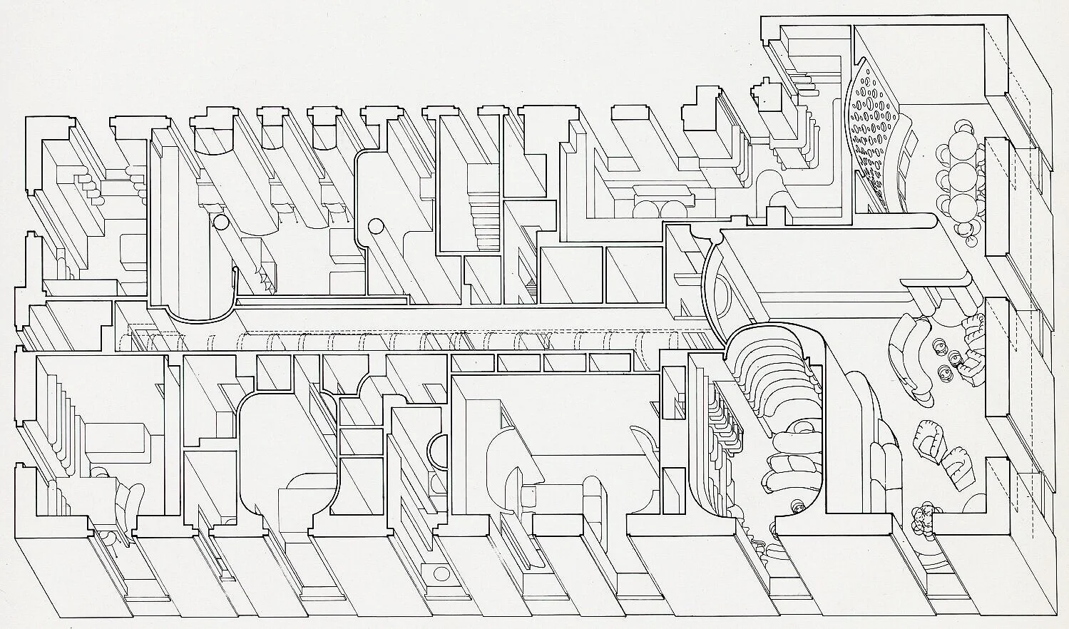
Below is an enlarged portion of the above drawing, showing one of the most complex parts of the apartment. It’s a fine example of how an axonometric drawing can be used to show, with clarity, even intricate arrangements of spaces and architectural elements.

An enlargement of a portion of the above axonometric drawing of the Edersheim Apartment. © The Estate of Paul Rudolph, The Paul Rudolph Heritage Foundation.
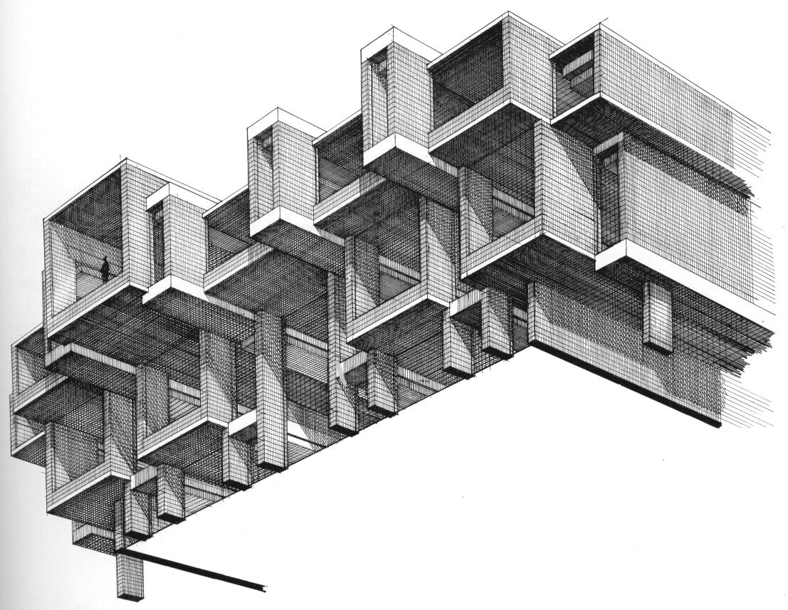
The Colonnade Condominiums in Singapore
The Colonnade is one of the most sought-after places to live in Singapore, with each high-rise apartment demanding luxury-level prices. In this 1970 project, Rudolph wove together a multitude of multi-level apartments into a rich composition, whose overall effect is a shimmering geometric dance.

Paul Rudolph’s Colonnade Condominium in Singapore—a project of the early 1970’s. In the subsequent decades, he would do numerous projects throughout Asia.
To communicate his intentions—which included a complex arrangement of interleaving balconies and windows—Rudolph used a variety of types of drawings: plans, perspectives—and the axonometric drawing seen at the top of this article.
The Orange County Government Center in Goshen, NY
In the middle-1960’s, Paul Rudolph started upon one of his most compositionally and spatially rich government buildings—a civic brother to his Yale Art & Architecture Building. The structure—or rather, compound of structures—that he built in Goshen embraced a complex program to answer the civic needs of the region’s citizens: one could do anything there from getting a marriage license to being tried for serious crimes.
Paul Rudolph’s Orange County Government Center in Goshen, NYC—as seen before it was demolished and/or altered to the point where Rudolph’s design has been all-but-erased.
For this project, Rudolph used a variety of drawings to explore the design and convey his intent.
Did he use perspectives? Certainly—and here’s his perspective drawing for the exterior:

Paul Rudolph’s perspective rendering of the Orange County Government Center. © The Estate of Paul Rudolph, The Paul Rudolph Heritage Foundation.
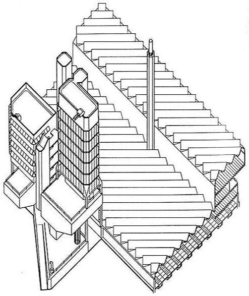
Did he use any isometric drawings? Yes—and here’s his study of projecting and receding masses and window openings—a tour de force of levitating masonry.
An isometric drawing, by Rudolph, looking up at a portion of the Orange County Government Center building. © The Estate of Paul Rudolph, The Paul Rudolph Heritage Foundation.
But when it came to the roof—a complex landscape of rising, overlapping, and interpenetrating rectilinear masses (in a plenitude of sizes)—he used an axonometric view:

Paul Rudolph’s drawing of the roofscape and masses of Orange County Government Center. The three main masses of the building—left, top, and right right—surround a courtyard. Rendered as an axonometric, probably no other drawing technique would have as clearly conveyed the overall conception of the building’s massing, as well as the complexity of its composition. Rudolph, aware that dignity is as important as basic function (especially in civic buildings), created a modern version of a stately entry: there is an elongated plane, set high, spanning across the southern side of the courtyard (shown at the bottom-center of this drawing)—and that created a space-defining gateway to the complex. © The Estate of Paul Rudolph, The Paul Rudolph Heritage Foundation.
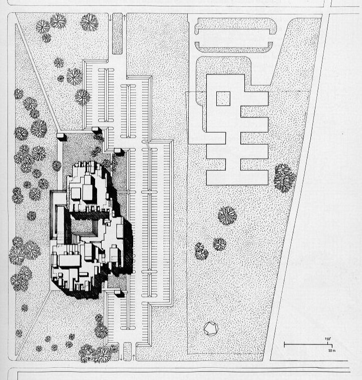
Paul Rudolph’s site plan for the Orange County Government Center. Something of the richness of the design is communicated by his using an axonometric view (conveyed by the shadows) to render the variety of masses from which the building is composed. N.B.: in this drawing, the body of the building has been turned 90 degrees, clockwise, from the view above. © The Estate of Paul Rudolph, The Paul Rudolph Heritage Foundation.
AXONOMETRICS FOR RUDOLPH?—iT’S A mATTER OF PRACTICALITY
Rudolph is sometimes characterized as the very embodiment of the heroically individualist genius architect. There’s a lot of truth in that—with consequences, good and bad. One of the negatives is that one can then get tagged as being impractical or hard to work with.
Paul Rudolph shows that this is not necessarily the case: he had a 50-year career, with over 300 commissions—and some clients report on what a pleasure it was to work with him (and some became repeat clients—the ultimate accolade in client relations.) Moreover, Rudolph got things built—all over the country, internationally, doing numerous types and sizes of building, and at every budget level—so he had a track record of being practical.
Architectural drawings—though they are artistic creations—are equally tools: the means by which an architect conveys his ideas to clients and builders. Edwin Lutyens, speaking of construction drawings, likened them to writing a letter, telling the builder what to do. Drawings must communicate with clarity, whether it be the specifics of a construction detail, a building’s overall composition, or even the flavor of a design. Rudolph most often chose perspective drawings as the most effective way to communicate his intentions—but as a practical architect, he knew there were other techniques which could be more effective in specific situations. Rudolph mastered those techniques and used them too—and as a result we have some fascinating axonometric drawings from him.
Another Rudolph Project — Revealed!

Roofscape geometry, like this one, certainly promises a building of some interest. In this case the promise is fulfilled, as it turns out to be a design by Paul Rudolph: the Harrington Cancer Center in Amarillo, Texas. Image courtesy of Google: Imagery ©2019 Google, Imagery ©2019 Maxar Technologies.
ARCHITECTS AND HISTORY
We found that, for those seeking a complete view of Paul Rudolph’s many and varied projects, Rudolph did not make it easy.
Yes: there are hundreds-of-thousands (literally!) of drawings and files.
Yes: there’s Rudolph’s own register of projects (which he kept changing throughout his career—editing projects in and out.)
And Yes: various studies and monographs have tried to give a full accounting of his oeuvre.
But even so: some projects remain just names and locations on a list—or not even that much (some are just titles of frustrating ambiguity).
A very few offices can afford to hire an in-house archivist, or think there’s a compelling reason to do so (Rudolph’s friend, Philip Johnson, was one such architect). Most firms are too focused on keeping the practice going to do more than the minimum to document projects enough to get them approved and built. In these ever-more-litigious days, that now results in mountains of documentation—but that was less the case during the era of Rudolph’s career.
Moreover, even in the context of an earlier era, firms could be more-or-less retentive (or cavalier) about what files they created and kept. We’d say that, record-keeping-wise, Rudolph was about in the middle: his prime goal was to get the buildings built, not to create piles of paper [this was confirmed to us by Rudolph’s former office manager, R.D. Chin.] There are project files of varying completeness—and he certainly did care for his drawings (Heinrich Klotz quoted Rudolph as calling them “his children”), but he regarded them as ultimately secondary—the important thing was the built architecture.
RUDOLPH IN TEXAS
We now introduce the little known Harrington Cancer Center in Texas.
“little known”?—well that’s not quite true, but it is another of those underdocumented Paul Rudolph projects for which there’s been frustratingly little information.
We had Harrington on our list of Paul Rudolph projects, but our first substantial knowledge of it was gained by way of Mark Gunderson’s article on Rudolph’s work in Texas. Here’s the passage from Mr. Gunderson’s essay which deals with Harrington:
In 1978, Dr. Phillip Periman (also a Yale graduate who attended the lectures of Vincent Scully) sent requests for qualifications to a number of architects, including Rudolph, I. M. Pei, Edward Larabee Barnes, and Philip Johnson, for the design of a new cancer research center in Amarillo. Rudolph received the commission for the Don and Sybil Harrington Cancer Center, with Wilson/Doche as associate architects, and integrated the new structure into the surrounding fabric of medical facilities. The building derives its intrinsic form from the parallelogram plan of individual exam rooms, which Rudolph proposed after intense consideration of the psychological aspects of such spaces on patients. The building is “let” into the site and falls towards the parking and entry level with two arm-like canopies over a pair of entry stairs. The brick and board-formed concrete vocabulary is again, as in the TICU project, contextually derived.
Excerpted from: Rudolph and Texas by Mark Gunderson, Texas Architect, 1998
REVEALING PHOTOS
We’re fortunate to have run into the photographs of Ben Koush, AIA, a registered architect, interior designer and writer, based in Houston, Texas. He has a strong interest in history, and is also a gifted photographer with an a sharp eye for vivid architectural views. You can see numerous examples of the images he’s captured on his Instagram page—and he’s given us permission to share the ones he’s taken of the Harrington Center.
Here are a few of them:

Photo © Ben Koush, used with permission.

Photo © Ben Koush, used with permission.

Photo © Ben Koush, used with permission.
We thank Mr. Koush for sharing with us this dynamic project—one with unique features (in a career of endlessly architectural invention.) The full set of Ben Koush’s Harrington photos is on our project page.
MORE ON HARRINGTON? YES, AND…
The Paul Rudolph Heritage Foundation’s website maintains a “project page” for each of Rudolph’s over 300 designs—and there’s one for the Harrington Cancer Center which gives some further information. If you have any information or documents on this project, we’d be grateful to know about that (and to add them to our records, and make them available for study.)
Meanwhile, if you’re headed to Texas, Paul Rudolph did a number of projects there (as described in Gunderson’s article)—-and if you’re going to be in Amarillo, you might want to drive by both Harrington and another of Rudolph’s lesser known works—his pyramid shaped television station headquarters.

Only a rendering? No! Rudolph’s television station in Amarillo was built—a pyramid for Texas!

This satellite view shows the geographical relationship between two of Rudolph’s projects in Amarillo: the Harrington Cancer Center (denoted by its street address: 1500 Wallace Boulevard) is at the far left. Rudolph’s pyramid-shaped KIIV-Channel 7 Television Station (denoted by its street address: 1 Broadcast Center) is at the far right. Some suggested travel paths between them are marked in blue—which is most convenient for Rudolph fans who want to visit these sites. Image courtesy of Google: Imagery ©2019 Google, Imagery ©2019 Maxar Technologies.
Celebrating NATIONAL AVIATION WEEK - with Paul Rudolph !

A comprehensive designer is interested in (and interested in designing) Everything! Here are two scenes from Frank Lloyd Wright’s Broadacre City proposal—these showing examples of his flying saucer-esque personal helicopters, as well as his curious and intriguing designs for various types of roadsters and ships. Image courtesy of Wikipedia.
National Aviation Week got off to a flying start on August 19th—and who better to celebrate it with than Paul Rudolph!
But hold on. Other architects have clear connections with flight. Eero Saarinen, Helmut Jahn, Minoru Yamasaki, I.M. Pei, and SOM (and, most recently, Zaha Hadid) designed some great Modern airport terminals. And Le Corbusier and Wright included aviation imagery (and fantasy) into their manifestos and projections of future living.

Le Corbusier even write a whole book expressing his delight in flight and aircraft—and used them as a symbol for forward-looking thought as well as aesthetics. His book, “Aircraft” came out in 1935, Image courtesy of Irving Zucker Art Books.
Other futurists incorporated airships into inventive notions of how constrution would proceed in days to come, as in this example from Buckminster Fuller:

This is one of Buckminster Fuller’s many inventive ideas of how we could live and build in the future. He envisioned an airship delivering one of his apartment houses—so efficiently designed that the fully constructed building was light-enough to lift by dirigible—to the site. But the building would be lowered into its foundation only after the ship first dropped an explosive charge to make the hole!
Rudolph never completed an airport. But he certainly did propose one—and it was a design with strong architectural character and inventive ideas.
Paul Rudolph: The Florida Houses, by Christopher Domin and Christopher King, is an indispensable resource for learning about the first phase of Rudolph’s career. Although the book focuses on his residential designs—the preponderance of the commissions Rudolph was receiving then—it also includes his work on other building types: schools, restaurants, beach clubs, an office building—and an airport.

Rudolph’s site plan , from the mid=1950’s, for a proposed new terminal for the Sarasota-Bradenton Airport in Florida. His terminal building is at the left side of the drawing. Image © The Estate of Paul Rudolph, The Paul Rudolph Heritage Foundation.
According to Domin’s and King’s book, Rudolph’s proposed terminal would have replaced a “primitive” existing structure, and the new building would have included “…an air traffic control tower, overnight accommodations, eating facilities, and a large swimming pool to accommodate the weary traveler.” Moreover, according to an Architectural Record article of February 1957, “The qualities of lightness and precision felt necessary to an airport have been sought throughout.”—and this was conveyed by the use of open web columns and trusses.
The building, as designed, did not proceed due to budgetary issues—but we can still see that Rudolph was as inspired by aviation as many of the other master architects of his age. So let’s celebrate National Aviation Week with a toast to Paul Rudolph’s aerial aspirations!

An aerial view of the proposed terminal (dramatically drawn in 3 point perspective—a rare technique for Rudolph, or any architect). In this rendering, originally published in Architectural Record, the roof is lifted off in order to reveal the various functional areas of the building. Toward the front is a rather sizable swimming pool (as signaled by the diving board)—a nearly-unknown feature for any airport (but one that might have fit unusually well for this building’s Florida setting). Image © The Estate of Paul Rudolph, The Paul Rudolph Heritage Foundation.

Rudolph’s rendering of the inside of the main concourse. The double-height space is supported by the kind of trussed structures whose forms were associated with airplane construction—-the high-tech of its time. Yet there are pure architectural grace-notes, like the grand spiraling stair seen at the far-right end of the space, which connects the main floor with the upper galleries. Image © The Estate of Paul Rudolph, The Paul Rudolph Heritage Foundation.
![An exterior side elevation of the terminal building. The capsule-like control tower [another saucer?—perhaps Rudolph saw Wright’s renderings?] is in the background at the right. The building’s columns appear to flare outward at their tops: a form re…](https://images.squarespace-cdn.com/content/v1/5a75ee0949fc2bc37b3ffb97/1563827539259-S0MVUHOMK3FBK8X4W0EP/Airport+side+elevation.jpg)
An exterior side elevation of the terminal building. The capsule-like control tower [another saucer?—perhaps Rudolph saw Wright’s renderings?] is in the background at the right. The building’s columns appear to flare outward at their tops: a form reminiscent of the profile of ancient Minoan columns—and a silhouette that would be seen in later architectural works—from Rudolph to Nervi to Leon Krier. Image © The Estate of Paul Rudolph, The Paul Rudolph Heritage Foundation.

Paul Rudolph’s rendering for the Greeley Memorial Laboratory for the Yale Forestry School—a building, on the Yale Campus, which he designed within a couple of years of his proposal for the Florida airport. While the columns at Greeley were of precast concrete (with mathematically-derived sculptural curves), their overall silhouette is reminiscent of the tops of the columns at for the airport—so might it be that the airport terminal project was where those forms germinated? Image © The Estate of Paul Rudolph, The Paul Rudolph Heritage Foundation.
Niagara Falls' Rudolph Masterpiece—but are we going to lose it?

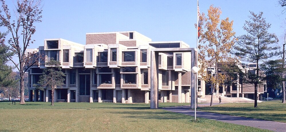
The Earl. W. Brydges Library, designed by Paul Rudolph—Niagara Falls’ main library, the city’s center of knowledge! The project commenced in Rudolph’s office in 1969, and this view of a portion of it’s lively roofscape was photographed in the mid-1970’s. Image courtesy of the Massachusetts Institute of Technology, photograph by G. E. Kidder Smith
CIVIC STANDING
Among the many types of buildings to which Paul Rudolph applied his creative & practical talents—houses (and housing), churches, schools, university buildings, campus planning, exhibit design, office buildings, medical facilities, and laboratories—there’s also the type about which architects feel proudest: their ”civic works.“ Part of that pride emerges from the City Beautiful movement—a philosophy and practice, starting in the late 19th Century, which contended that beautifully-designed cities (and well-designed public buildings within them) could bring forth a better society and promote civic virtue. That movement helped energize city (and state and federal) governments to focus more (and spend more) on their streets, buildings, public facilities (and the civil engineering that undergirded those structures.) It’s worth noting that a building type which played a role in such planning were public libraries.
RUDOLPH IN THE PUBLIC REALM
Rudolph made a strong showing in the civic domain, being given commissions for government and public-use buildings in Boston, New Haven, Goshen, NY, Syracuse, Rockford, IL, Buffalo, Siesta Key, FL, Manhattan, and Bridgeport—as well as for international locations, like Jordan and Saudi Arabia. These projects ranged from city halls, to courts, a stadium, and an embassy. [We’ve even seen a 1995 listing, in the tabulation of projects which Rudolph’s office produced for its own use, for a design of an “office for special counsel”.]
PROMINENT ON THE STREETSCAPE
Not all those projects were built (as with the career of most architects, that’s par for the course)—but enough were constructed that we can see that Rudolph’s skills “scaled” well for significant public undertakings. Among those, the main library he did for the city of Niagara Falls—the Earl W. Brydges Public Library— is remarkable. Here, he literally created a “landmark”: a prominent and sizable structure of unforgettable form—an icon within the cityscape.

The library in 2004, as seen down from within the city of Niagara Falls, NY. The tall, glazed, staggered portions of the roof (which bring light into the reading spaces within the building) are prominent parts of the building—and these strong shapes make the library a landmark within the city. Photograph by Kelvin Dickinson, © The Paul Rudolph Heritage Foundation.
LUMINOUS INTERIORS
Equally memorable are the interiors, filled with light from the clerestory windows above (whose staggered emergence from the roof helps give the building its mountain-strength character). The 3-storey space within is exciting—yet serene enough for reading, research, and study.
“It’s so bright and open without being glaring.”
—Jennifer Potter, the library’s director
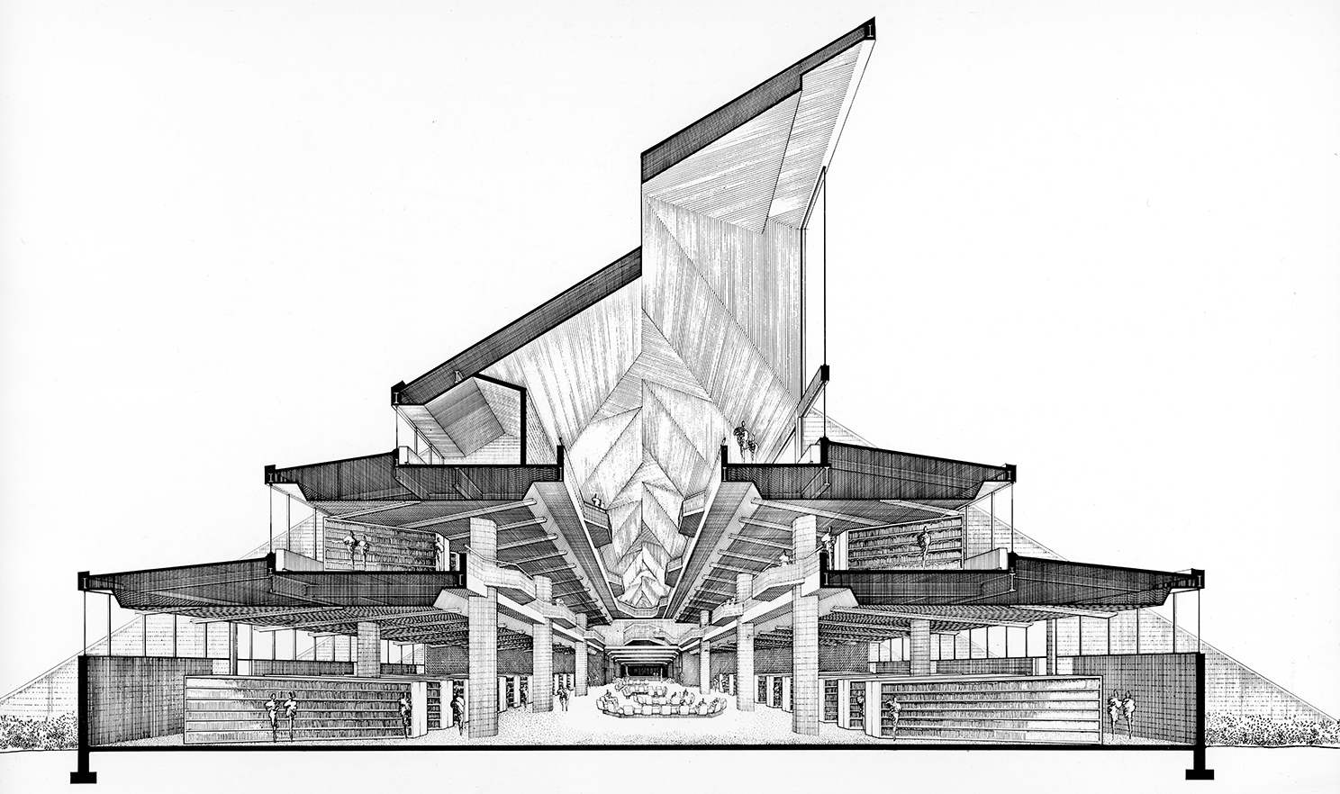
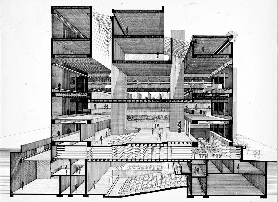
Rudolph’s section-perspective of the library, looking down its main axis. A series of tall clerestory windows, rising prominently from the roof, bring in natural light. The building rises in three stages, with each floor getting smaller than the one below—reflecting the library’s functional space needs. Image © The Estate of Paul Rudolph, The Paul Rudolph Heritage Foundation.
“I think my favorite thing about the building is looking up in the main atrium, where the adult collection is. So stunning. It feels strangely modern despite its age.”
—Library Patron

The library’s atrium-interior, as photographed in 1972. This view allows one to see all three levels, as well as the ceiling openings to the clerestory windows (in the angled roof) which bring natural light into the space. Joseph W. Molitor architectural photographs. Located in Columbia University, Avery Architectural & Fine Arts Library, Department of Drawings & Archives
A LANDMARK THREATENED?
The building’s birth had, admittedly, construction problems—ones that caused its architect and builder seeming endless grief. This history is well-told in an article by Mark Byrnes, published by CityLab a few years ago (from which the above quotes.were excerpted.) Ongoing issues continue to concern its users—to the point where the building’s future as the city’s main library is now being threatened.
Is this a case similar to another amazing civic work by Rudolph: his now-disfigured Orange County Government Center? There, a greater recognition of the building’s architectural value and excellence might have—whatever the problems—brought forth the commitment and resources to fix them. We hope that such understanding and support will come forth for the library in Niagara Falls—that it “gets some love”.
INTO THE FUTURE?
The Paul Rudolph Heritage Foundation will be following the fate of Niagara Falls’ Brydges Library (and working to preserve it.) We’ll be bringing you ongoing news of this in the coming months—and if you hear anything about the future of the building, please do let us know!

The entry side of Niagara Falls’Earl. W. Brydges Library, designed by Paul Rudolph. Image courtesy of the Massachusetts Institute of Technology, photograph by G. E. Kidder Smith
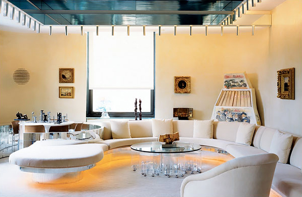
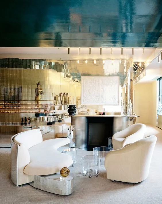
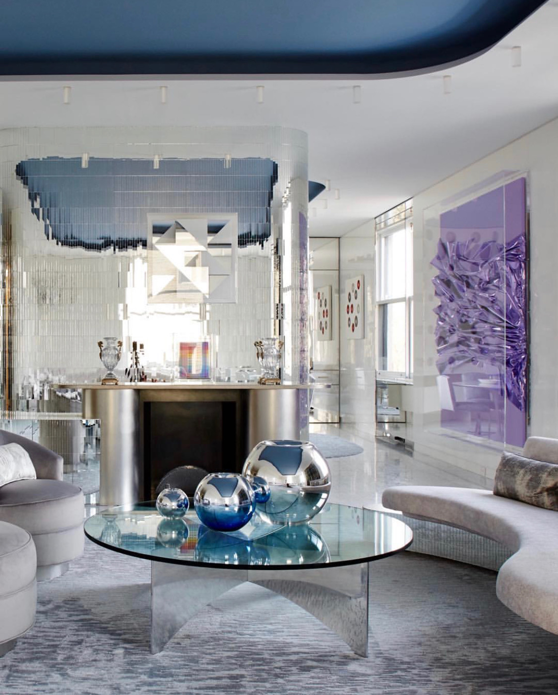
Rudolph Reimagined: A New York Family’s Reworking of an Iconic Rudolph Interior
“It’s pretty darn original,” Carolyn Rowan says with a beaming smile as she shows me into the living room of her family’s stunning apartment on Manhattan’s Upper East Side; and indeed it is. Described by Ms. Rowan as a “labor of love,” her apartment’s interior is one of particular note for more than purely aesthetic reasons. Redesigned for banker Maurits Edersheim and his wife Claire in 1970 from its original 1917 form, the interior of the 5th-floor apartment is a noted example of Paul Rudolph’s interior works.
When Ms. Rowan and her husband, Marc—longtime residents of the 6th floor—purchased the apartment, they made a promise to Claire Edersheim, who often spoke about how she and Maurits “built the apartment with Rudolph,” that it would remain largely unaltered and that she and her husband would do little to mar or obscure Rudolph’s mastery. The end result of this promise, which was lovingly undertaken with the assistance of noted interior designer Tony Ingrao, is a sleek and retro space that, while more contemporary, retains the Rudolphian whimsy that makes it so unique.
Pictured: A before shot, taken by Anthony Cotsifas courtesy of 1stDibs.com above an after shot, taken by Ethan Shapiro
The heart of Rudolph’s vision remains, but in an updated form. Original 1970’s features like track lighting have been supplanted by more modern fixtures, and features like the unique “u” shaped couch, which the Rowans remade in the exact same footprint as the one Ms. Edersheim took with her when she sold the unit, has been reupholstered in a more muted fabric.
Pictured: A before shot, taken by Anthony Cotsifas courtesy of 1stDibs.com above an after shot, taken by Ethan Shapiro
Unfortunately, many Rudolph interiors are lost, razed by later homeowners who lack a knowledge of his significance or an appreciation of his works, which is why it’s important to emphasize renovations like the one undertaken by the Rowan family. As pictured above, the Rowans’ transformed the office space from its original seventies feel to one that was better suited to their own taste, while retaining Rudolph’s couch, desk, stair-shelves, and ceiling decoration.
Pictured: A before shot, taken by Anthony Cotsifas courtesy of 1stDibs.com next to an after shot, taken by Genevieve Garruppo courtesy of Tony Ingrao Design’s Intagram
The Rowan renovation shows how an owner of a Rudolph property or interior can still allow for Rudolph’s details to shine through, like the mirrored walls and kidney-shaped sofa seen above.


Pictured: A before shot, taken by Anthony Cotsifas courtesy of 1stDibs.com next to an after shot, taken by Ethan Shapiro
The hallway, pictured above, received the most changes — however, Rudolph’s design is still present in the sloping walls that punctuate the center right of the hallway, which was once the playroom of the Edersheim children (and is now a foyer that leads to the second story of the Rowan duplex).


Pictured: A before shot, taken by Anthony Cotsifas courtesy of 1stDibs.com next to an after shot, taken by Ethan Shapiro
The dining room, seen above, has been repainted in an airy white, and retains the original Paul Rudolph dining table, which cleverly breaks apart into three smaller, circular tables whose connecting leaves fold neatly under the shelving unit against the wall. Though bereft of the delft pottery it was made to showcase, the unique feature wall Rudolph designed still remains in its original form.


Pictured: A before shot provided by Carolyn Rowan next to an after shot taken by Ethan Shapiro
It isn’t easy to be the steward of an iconic property, especially one full of original architectural details. Luckily, there are sensitive owners like the Rowan Family who value such a property and have, throughout their four-year-long renovation, kept the heart and soul of Rudolph alive in their space. Right down to the last mirrored wall pane.
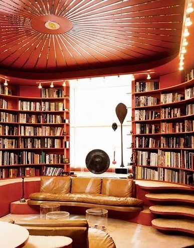
“GOD IS IN THE DETAILS” (AT LEAST IN RUDOPH’S DETAILS)

Spatial power: Paul Rudolph’s analytical drawing of his Tuskegee Chapel.
Image: Paul Rudolph Archive, Library of Congress – Prints and Photographs Division
Mies van der Rohe’s most famous saying is“God is in the details.” Of course, Mies was referring to the profound importance of carefully designed, well-considered, and fully-studied detailing in a building or object. Part of the criteria is not just whether a construction detail handles minimal practical needs (i.e.: “keep out the rain”)—but rather: the immense impact that even the smallest architectural details can have on the experience of a building (or an interior, or a piece of furniture.)
Does Mies’ exhortation about details actually have religious implications? And does it have such implications for Mies’ own architecture (and those practicing in a similar mode)? Those questions have been debated for a long time and are hard to answer, especially since Mies and other Modern architects have been relatively silent, or enigmatic, or maybe just un-committed about their spiritual inclinations.
When it comes to a spiritual interpretation of Mies’ famous saying, our best hypothesis is that Mies and his coterie believed that a superbly designed work-of-architecture (which, of course, would have very fine details) can bring forth experiences of transcendence: something akin to religious states. Well, that’s hardly to be wondered at, as such power is inherent in truly great works of art. Indeed, whether a work-of-art has that transcendence-inducing power (or not) is one of the ways we define its greatness (or lack thereof).Note well—and this is key—that we consider[some] architecture to be works-of-art, and hence open to this sort of assessment. We don’t know much about Paul Rudolph’s religious thoughts or feelings. He was the son of a minister, and Rudolph recounts that seeing his father engage with an architect (on a church that was to be built) was a key influence on his wanting to go into architecture. Some of Rudolph’s most interesting designs are for religious buildings—indeed, church, chapel, and synagogue projects punctuate his career. Here’s a drawing of a lesser-known project by him from 1956, a church for Siesta Key, Florida:
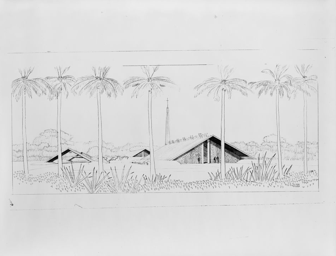
Rudolph’s perspective drawings of a design for the St. Boniface Episcopal Church, a 1956 project for Siesta Key, Florida. Image: Paul Rudolph Archive, Library of Congress – Prints and Photographs Division
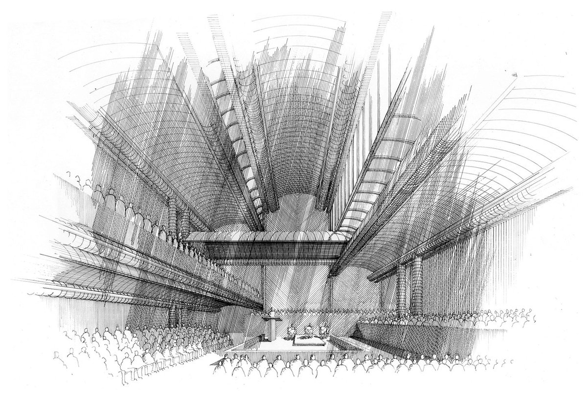
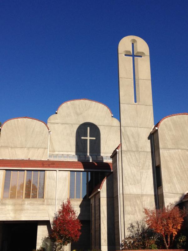
And Rudolph’s Tuskegee Chapel truly helped anchor his fame:

The interior of Paul Rudolph’s Tuskegee Chapel, at the Tuskegee Institute in Alabama. It was constructed between 1967 and 1969, and is one of his half-dozen most well-known designs. Photo:G. E. Kidder Smith Image Collection, MIT Libraries
While Rudolph’s half-century career extended until his passing in 1997—and he was prolific to the end—his Cannon Chapel at Emory University, from 1975, was one of the last major non-residential works that he completed in the US:
Paul Rudolph’s Interior perspective-rendering of his Cannon Chapel, at Emory University. This commission may have been very meaningful to Rudolph: his father, Reverend Keener Rudolph, was in Emory theology school’s first graduating class. Image: This original pen & ink drawing is in the collection of Ernst Wagner, Founder of the Paul Rudolph Heritage Foundation.
Cannon Chapel features a prominent tower-like fin, whose major symbolic motif is a cross. But Rudolph’s approach is different: instead of the cross-as-object (which is typical of almost all church buildings), he renders that cross as cut-out of the fin’s stonework, creating a cross-shaped opening. So that cross, with the sun shining through, is an embodiment of light—a highly spiritual interpretation, in architectural form. Moreover, the light and shadow effect(on the building’s adjacent surfaces) is quite striking:
Part of the exterior of Emory’s Cannon Chapel. Image: Emory University
Even though the building’s primary symbolism is Christian, the building is used by a quite diverse range of the campus’ religious groups. Here’s a passage, describing that, from a 2001 issue of Emory Magazine: an article titled “Cannon Chapel: Twenty Years of Shared Sacred Space.”
Cannon Chapel is the center of religious observances on campus for a variety of denominations and religious groups. About fifteen hundred students attend official worship services each month. “Emory claims grounding in a faith tradition, and religious and spiritual life remains a foundational root of the University,” Henry-Crowe says. “And it is appreciated.” In any given week the chapel’s sanctuary, which seats 480, might be host to an ecumenical worship service, a Roman Catholic mass, an Emory Zen Buddhist group meditation, and a Jewish High Holy Days service. “We have diversity within diversity,” Henry-Crowe says of the thirty religious groups represented on Emory’s Interfaith Council. “The genius of the building is that it is built to be an interfaith space. No symbols are immovable.”
This is not the only case of one building being able to serve various religious groups—indeed, there is a study of how such religious space-sharing can work (and the accommodations that need to be made, to try to have that succeed). Apropos this, for Emory’s Cannon Chapel, it’s that article’s last line which intrigues us: “No symbols are immovable.” What’s that about? It turns out that the reference is quite literal. In the archives of the Paul Rudolph Heritage Foundation, we came across an interesting construction detail [a godly detail?] This is a sheet from the construction drawings of Rudolph’s Cannon Chapel:

Construction detail drawing, from the set of drawings done by Paul Rudolph and his office for the Cannon Chapel at Emory University. This drawing, sheet number D-1, is dated 1981, and the title is: “Portable Cross & Portable Menorah Details.” [And below are some close-up views of portions of this drawing.]
Image: Paul Rudolph Heritage Foundation
As you can see in the details shown above, flexibility was built into Emory’s Cannon Chapel, so that it could be used by various denominations.
While the ability to change key symbolic elements (in a shared sacred structure) is a good idea, it takes serious thinking to determine how that’s to be carried out: it’s not easy to design that kind of flexibility and have it be simultaneously buildable, fit within the budget, and ongoingly practical to use. Here, at Emory, it shows that Rudolph really cared about those details.
Paul Rudolph's design for MoMA’s ‘FAMILY OF MAN’ Exhibition

Paul Rudolph’s plan-perspective drawing for the layout for the Museum of Modern Art’s Family of Man photography exhibition, which opened in 1955. Image: Library of Congress
A SPECTACULARLY SUCCESSFUL EXHIBIT
The Family of Man was a photography exhibition held at the Museum of Modern Art in New York City in 1955. Edward Steichen—himself a distinguished photographer, and the curator of the show (and whose widow eventually became a Rudolph client)—had the prodigious task of making the selection from submissions from all over the world. It ended up being a sweepingly large show, with over 500 photographs, from 69 countries, and by 222 photographers.

Edwin Steichen, the Director of the Museum of Modern Art’s Department of Photography, facing the task of selecting & organizing photographs for the exhibit. Photo: MoMA
MoMA concisely describes the exhibit as follows:
This ambitious exhibition, which brought together hundreds of images by photographers working around the world, was a forthright declaration of global solidarity in the decade following World War II. Organized by noted photographer and director of MoMA’s Department of Photography Edward Steichen, the exhibition took the form of a photo essay celebrating the universal aspects of the human experience. Steichen had invited photographers to submit photographs for consideration, explaining that his aim was to capture “the gamut of life from birth to death”—a task for which, he argued, photography was uniquely suited. The exhibition toured the world for eight years, attracting more than 9 million visitors.
The show included photos that have become absolute “classics” in the history of photography, like this famous image of an American migrant worker and her children: Dorothea Lange’s photograph, “Migrant Mother”

Image: Library of Congress
By-the-way: MoMA’s point, about the exhibit touring the world, makes it more accurate to say that this was a set of exhibitions, for - after its initial showing at MoMA in 1955 (the one designed by Paul Rudolph) - copies or versions of the exhibit were shown all over the globe, in over 3 dozen nations (and sometimes in a several cities within a country). This included exhibits in some iron-curtain countries - which, itself, might be considered quite an achievement right in the heart of the Cold War.
The show has had further life as a book which, well over half-a-century since it came out, seems to have been continuously in-print—an amazing record. [And, not long ago, a special 60th Anniversary Edition was published.]
The meaningfulness of the show’s collection of photos---that particular selection, and the way they were organized—can not only be gauged by the attendance figures to the shows, but also by comments from readers of the book version. Here are two samples from readers (who commented on Amazon):
“I have read this book over and over again … and bought copies for my children and my aged grandfather. Since the MoMA republished it, all my grandchildren are getting a copy as birthday presents. The meaning of each photograph is easily understood by all cultures, and is a timeless portrayal of life from love, birth, living life and eventually, death.”
“In the maddening fast pace time we live in, where we are presented with false dichotomies and "news" that promotes division and futility of purpose this book - this magnificent book - draws the reader into a calmer, slower pace, awe inspiring appreciation for the beauty and wonder of our species. When I first opened its pages I was skeptical - prepared to be disappointed by another commercial knock off that pretends to be one thing and ends with a solicitation to buy into some self serving, blame evoking finger pointing view, on the one hand, or an unrealistic, romanticized characterization of a simple and simplistic view of the good old days. An hour into the book I was completely captured by the poets and artists portrayal of the human family.”
AN INTEREST IN EXHIBIT DESIGN
Rudolph created a number over exhibitions over the decades (including with the Museum of Modern Art, prior to the Family of Man show), and exhibit design seems to have been an ongoing interest of his. The Rudolph-designed duplex apartment, within the Modulightor Building, has a portion of Paul Rudolph’s library—and in it we found a copy of a book he owned on Franco Albini (1905-1977)—the multi-talented Italian architect.

Photo of the book in the Library of the Paul Rudolph Heritage Foundation
Albini was a prolific designer of exhibits, as shown in these spreads from the book:

Photo of the book in the Library of the Paul Rudolph Heritage Foundation
The book came out (and was acquired by Rudolph) decades after the Family of Man show—so we cannot say this publication influenced Rudolph. We only mention it as evidence of Rudolph’s ongoing interest in the topic of exhibit design.
A SUCCESSFUL EXHIBIT DESIGN
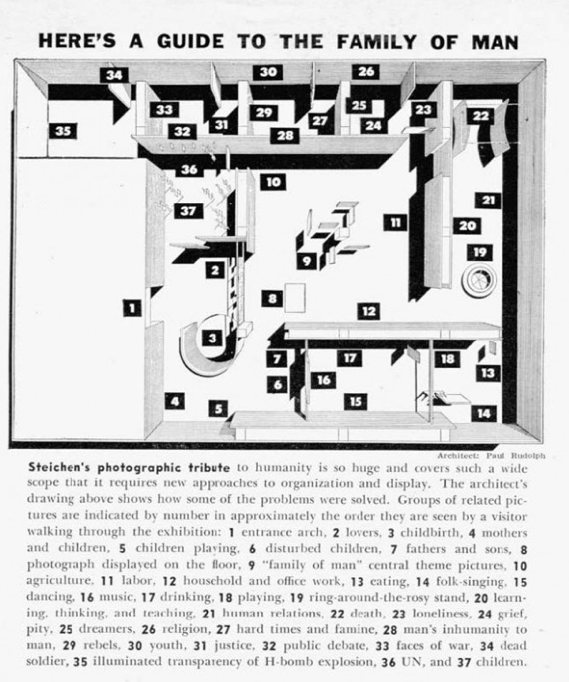
A plan of the Family of Man exhibit, with explanatory labels and notes. This version was in an article about the show that appeared in Popular Photography magazine.
Rudolph used about all imaginable methods & arrangements to display/mount/show the hundreds of photographs in the show—and sometimes it seems like he wanted to try every possible variation. Yet the show seems to have had coherence, and the multiple display techniques worked well with the photographic materials.
These many techniques included:
Large-scale (wall-spanning) enlargements of a single photograph
Wall mounting in a pattern of De Stijl-ian grids
Suspension from rods (coming from the ceiling)
Mounting on rods (coming up from the floor)
Mounting over “island”-like, space-defining platforms
Suspending within a vignette, created by a cyclorama of fabric, below a glowing circular ceiling
Showing them against a transparent background window—so as to provide glimpses through the assemblage of photos, to the next space
Suspended in groupings of large panels—and…
And thickening the edges of those panels, to give them visual substance
Collected together in smaller, more intimate sizes
Isolating a single photo, so as to give it dramatic focus
Placing a horizontal line of photos along curved convex walls—indeed, having two such matching walls face each-other, so as to create a compressed spatial transition into the next gallery
Creating free-standing, curved, island-like display “objects”—with the photos placed at low viewing angles
Cantilevering photos—fin-like—off the wall (at 90 degrees to the wall’s main plane
Cantilevering photos—fin-like—off vertical poles
Placing a giant photo on the ceiling
Suspending large photos in visually-strong, contrastingly-dark wood framing elements
There are probably more, but the above list—and the below portfolio of installation images—will give you an idea of the inventiveness that Rudolph brought to this challenge.


A BOOK ABOUT THE EXHIBIT?
We’ve mentioned the well-known Family of Man book which came out of the show (and the new, anniversary edition)—but the exhibit design, per se, certainly deserves its own monograph. Did such a book ever come out?
No and yes. There’s never been, to our knowledge, a book focused on the design of the show. But we did discover that a deluxe edition of the Family of Man book was published: a version which includes an “A special portfolio of photographs by Ezra Stoller” showing the exhibit installation. That section starts off with this page:

Photo of the book in the Library of the Paul Rudolph Heritage Foundation
Paul Rudolph’s participation in the exhibit had been fully acknowledged in MoMA’s own 1955 press release for the show—and it is also clearly indicated in the deluxe edition of the book:

Photo of the book in the Library of the Paul Rudolph Heritage Foundation
Here’s an example of the installation shots, as shown from a section of the book:

Photo of the book in the Library of the Paul Rudolph Heritage Foundation
Good news: We have a copy of that deluxe edition in the library of the Paul Rudolph Heritage Foundation. But if you would like to have one of those deluxe editions for your own, it seems that copies do show up on the websites of on-line booksellers, like Abebooks and Amazon.