

The cover of Volkskrant Magazine—the magazine section of a popular newspaper in the Netherlands. This issue, from 20 April, 2019, included an article about the Modulightor Building in New York
De Volkskrant (Dutch for The People’s Paper) is the third-largest newspaper in the Netherlands, with an approximate circulation of a quarter-million. It is headquartered in Amsterdam, and this year is the centennial of its founding. We are pleased that they recently sent a photographer to do a story about the Modulightor Building, designed by Paul Rudolph. Like many newspapers, it has a magazine section, Volkskrant Magazine, and the story appeared in the magazine’s culture section.

The contents page of Volkskrant Magazine’s culture section featured a photo of the 58th Street front of the Modulightor Building, taken as the day was approaching dusk, and wonderfully lit from within.
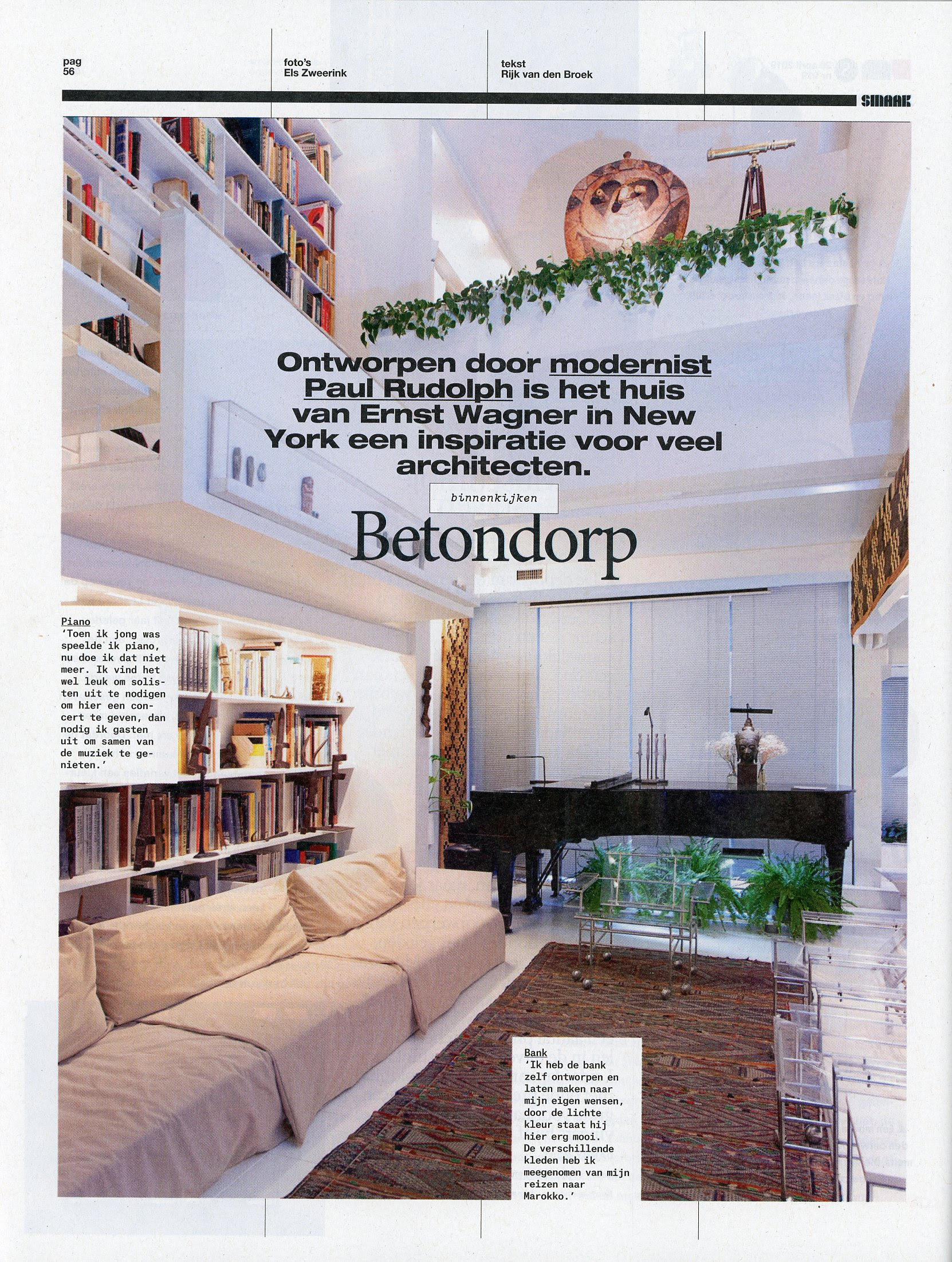
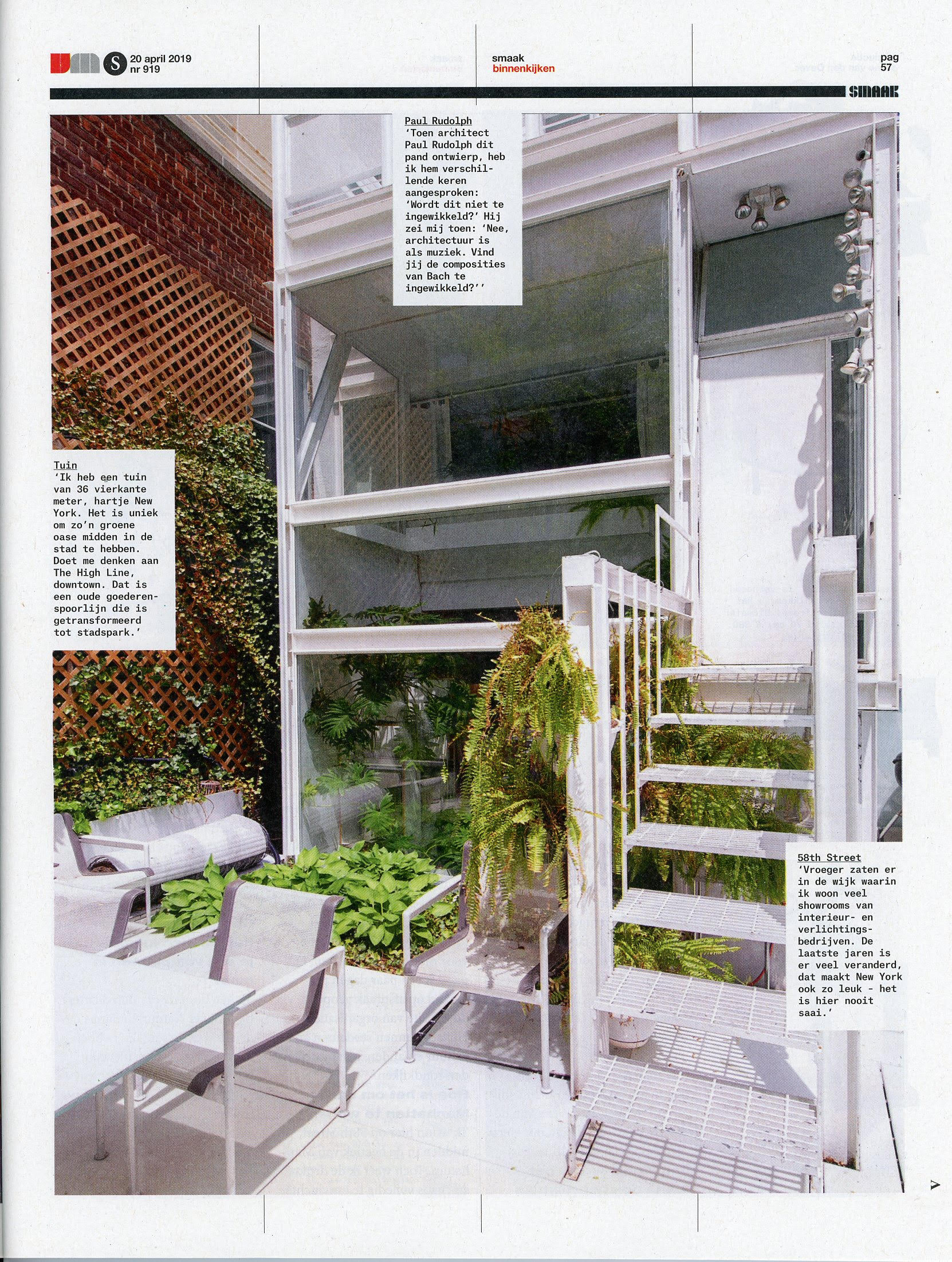
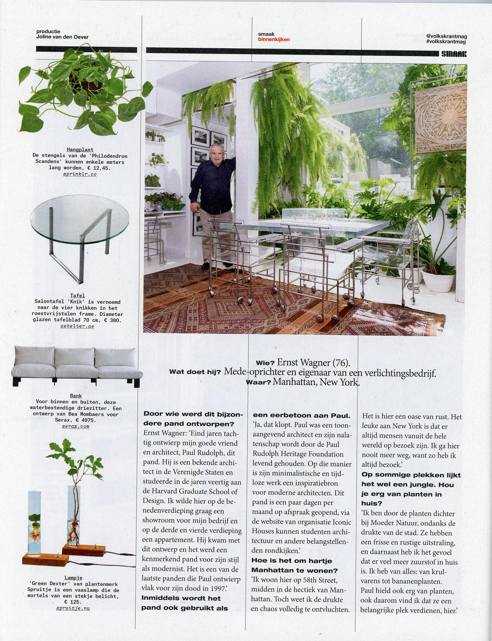
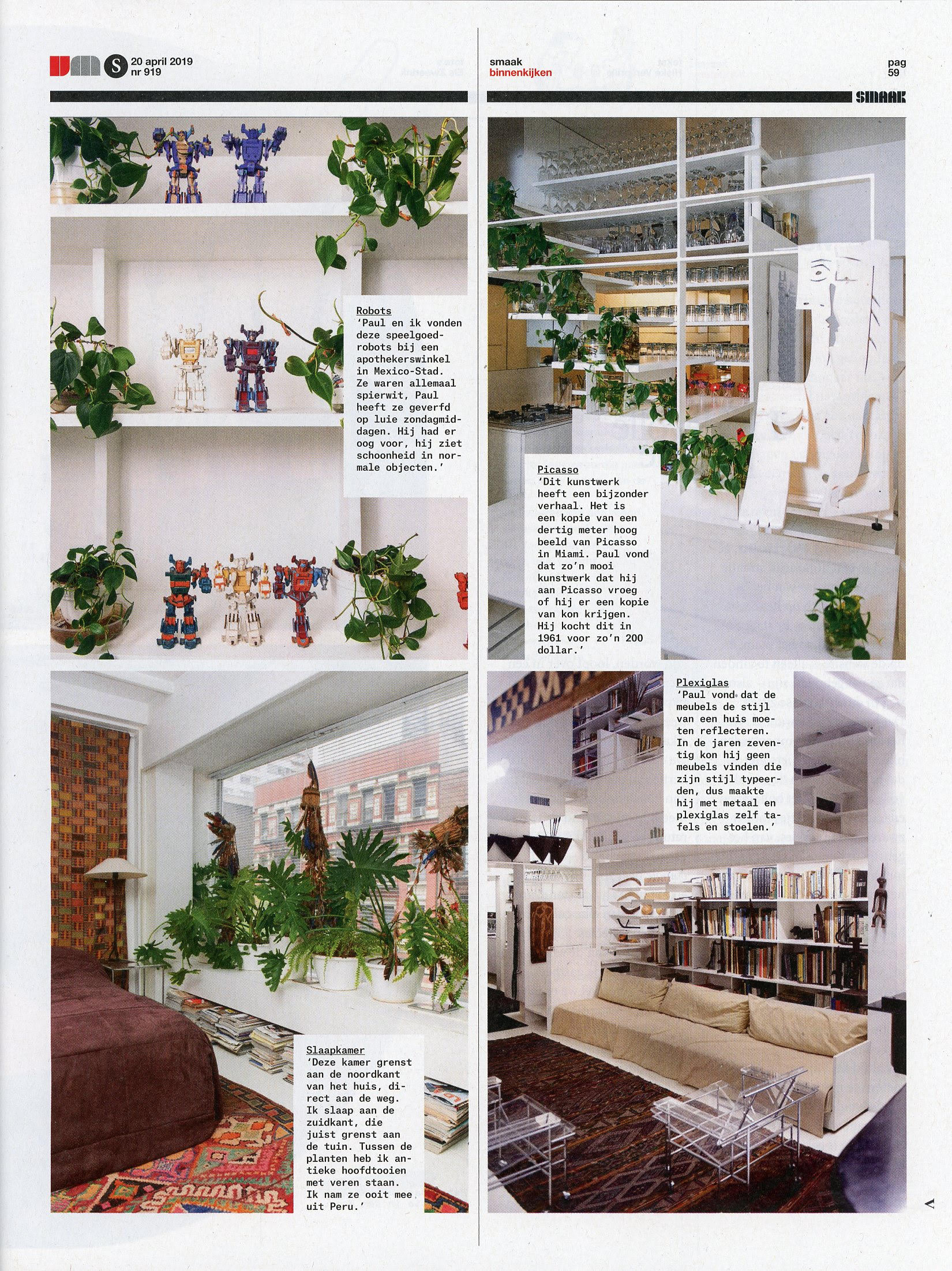
The story—a four page spread—focused on the interiors of the beautiful Paul Rudolph-designed residential Duplex, which is situated within the Modulightor Building, on the 3rd & 4th floors.
The superb photography was by Els Zweerink, and the text was by Rijk van den Broek. Here are some views of those spreads.
If you’d like to read the article on Volkskrant’s website (in Dutch)—and get a better view of these wonderful photographs—you can see the full article here:
You might say that’s Amsterdam’s view of Rudolph’s work—or at least one of his projects. But our readers might also be interested in Rudolph’s view of Amsterdam!
As far as we can tell, Rudolph didn’t keep a sketchbook: he doesn’t seem to have organized his drawings in such a way. When asked about this, one of his former staff members said when Rudolph wanted to explain something with a drawing, he’d just grab any piece of paper that was at-hand. From what we’ve seen in the archives, that’s very true: he’d use a great range of paper types, formats, and sizes,—from large vellum sheets to scraps. We even just ran across a standard oaktag file folder, filled with business papers---on which he’d drawn a tiny, intriguing sketch of a floor plan.
But, Rudolph did, at least for a while, use a system of tall, slender notepads—the type sized to be convenient for slipping into a suit jacket’s inside pocket.
In our files, we were pleased to discover across several such pads as that—one one of them had some marvelous observations on Amsterdam, written by Rudolph during a trip to Europe in the mid-1980s.
We are glad to share them below.
[Note: The titles, capitalization, underling and spelling follow the way that Rudolph marked-down his notes.]
AMSTERDAM
LIGHT
The most striking thing about Amsterdam is its light. It starts with the most precious of all reflected light from Amsterdam’s relationship to the sea & the introduction of canals into the city itself. Reflected light softens the shadows by illuminating them with a glorious diffusion of light. This is more apparent in Amsterdam than in most cities because the canals permeate the entire city as if light reflecting shafts (the canals) were there not only to serve transportation needs but to illuminate the shadows of the whole city.
Light in Dutch paintings has always been a preoccupation. Rembrandt’s handling of light relates him to Holland, but of course, he also transcends it. Sensitivity to light can be seen on the Princes Highway when traveling south to Rotterdam. The highway is covered with a structure to accommodate the Amsterdam highway. The transition from light to dark is accommodated by a series of vertical side louvers (also used to shield car lights from the opposite direction, but most uniquely by the use of overhead horizontal louvers to ease the transition.
GEOMETRY
This soft light of Amsterdam has to lead an emphasis on geometry in the buildings themselves, but also to the series of concentric rings which constitute the city plan. Of course, the plan of Amsterdam was developed for reasons of security, to obtain landfill, and to recognize its great port. The man-made, geometrical quality of Amsterdam emphasizes the fact that it was made by man.
The concentric rings of Amsterdam’s canals give it a picturesque character since the concentric rings of water constantly lead one’s eye around the curve to disappearing canals. There is no ax[i]s as in Paris where buildings are focal points for relatively short street vistas, the outcome of Haussmann’s great efforts.
It is a characteristic of Amsterdam that its buildings invariably face the canals directly, almost never recognizing their concentric relationship to each other. Neither do they recognize the vista down the canals. Those vistas, most apparent from the bridges crossing the canals, are a great source of Amsterdam’s immense environment[al] pleasure. Party walls, fire laws, and the use of load-bearing construction explain much of the concentration of buildings facing the canals and ignoring vistas, but it does not completely explain the phenomenon. It is noteworthy that the canals do not vary in width very much. Therefore important buildings do not gain importance from the development of canals, but a church, for instance, merely faces the canal with no forecourt or additional space allotted to it.
Of course, every possible use is made of the site since the land us at a great premium, & civic outdoor space is at a premium in Amsterdam. It does occur at governmental buildings, at the palace, and at the cathedral, but at this expense of the benign effects of the water. It is as if the presence of the water is resented by the occupants of Amsterdam. One cannot help but speculate that one day the canals will be filled in to accommodate parking and the entire character of Amsterdam will be changed.
The geometry of Amsterdam extends to its individual buildings, with great emphasis on the rectangular. One cannot help Mondrian, the De Stijl group and Rietveld came to their unique art in a very natural way. They abstracted what was around them, and in this sense, their work could have only come from Amsterdam.
It was astounding to see immediately outside this “American Hotel” a simple wood structure supporting a sign in relationship to a pier at the canal. It could have been a Rietveld since everything was reduced to a series of rectangles. Most surprising of all was the clarity of the structure, made clear to all by the extension of the framing members at the various joints. It was, of course, merely a vernacular utilitarian structure, but it could have been done by Rietveld.